1. Digipak Analysis – Muse “The Resistance”
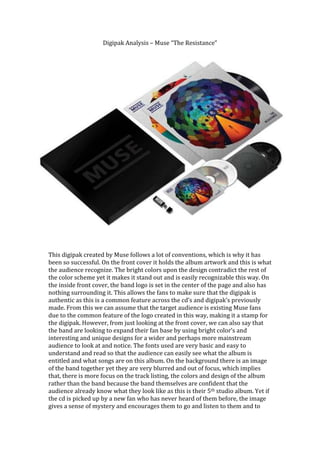
This digipak created by Muse follows a lot of conventions, which is why it has
been so successful. On the front cover it holds the album artwork and this is what
the audience recognize. The bright colors upon the design contradict the rest of
the color scheme yet it makes it stand out and is easily recognizable this way. On
the inside front cover, the band logo is set in the center of the page and also has
nothing surrounding it. This allows the fans to make sure that the digipak is
authentic as this is a common feature across the cd’s and digipak’s previously
made. From this we can assume that the target audience is existing Muse fans
due to the common feature of the logo created in this way, making it a stamp for
the digipak. However, from just looking at the front cover, we can also say that
the band are looking to expand their fan base by using bright color’s and
interesting and unique designs for a wider and perhaps more mainstream
audience to look at and notice. The fonts used are very basic and easy to
understand and read so that the audience can easily see what the album is
entitled and what songs are on this album. On the background there is an image
of the band together yet they are very blurred and out of focus, which implies
that, there is more focus on the track listing, the colors and design of the album
rather than the band because the band themselves are confident that the
audience already know what they look like as this is their 5th studio album. Yet if
the cd is picked up by a new fan who has never heard of them before, the image
gives a sense of mystery and encourages them to go and listen to them and to
2. research them on the internet in order to find out what they look like. The text
and the images show two completely different meanings as the image on the
front cover, disc and the band on the back show image of being free and having a
life full of color whereas the songs themselves and the font used give the
audience a sense of control as there are no flares or outlandish styles, everything
is very clear and easy to understand but also the same as everything else. This
gives the audience something to look into and make a decision themselves but
the songs and some of the lyrics contained are about certain people and
countries trying to control everything and take over. The image and the band
logo leave the audience to figure out their genre, many new indie and rock bands
have logo’s similar to that of Muse yet their complex album image could signify
that they are a sort of strange prog. rock band similar to that of Pink Floyd.
However, this band is an Alternate Rock band, which has attracted a wide
audience of followers and a great worldwide fan base.