
Recommended
More Related Content
What's hot
What's hot (18)
Similar to What have you learnt about technologies from the process of constructing this product?
Similar to What have you learnt about technologies from the process of constructing this product? (20)
More from Mike4231
Recently uploaded
Recently uploaded (20)
What have you learnt about technologies from the process of constructing this product?
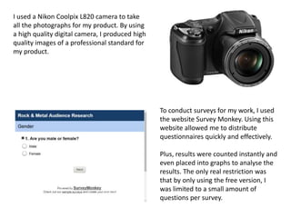
- 1. I used a Nikon Coolpix L820 camera to take all the photographs for my product. By using a high quality digital camera, I produced high quality images of a professional standard for my product. To conduct surveys for my work, I used the website Survey Monkey. Using this website allowed me to distribute questionnaires quickly and effectively. Plus, results were counted instantly and even placed into graphs to analyse the results. The only real restriction was that by only using the free version, I was limited to a small amount of questions per survey.
- 2. I used Prezi to present some of my work. It’s an interesting format that allows for more flexibility in viewing presentations vs. Powerpoint. In the Audience Research Data Prezi for example, I can freely zoom out and view the relevant chart I need quickly. All my work is present in Blogger. Placing it on here combines all my work into one website rather than many separate documents. It also makes it easier to show other people my work, as I only need to give them the web address and they can access it when they please.
- 3. I used Slideshare to present some of work. It’s a fairly simple program that allows PowerPoints to be combined into a presentation to be embedded into a website. It made my blog look more organised than many images simply uploaded. Youtube was a great tool for researching Photoshop techniques. I embedded videos into my blog to show my influences.
- 4. The main program I used for my products construction was Photoshop. It allows for extreme alterations to images to be made, which in a music magazine, is definitely essential. It’s complicated to use at first, but over time I grew more accustomed to how it works. When creating the double page spread, I moved my file from Photoshop to publisher. This was as Photoshop is at its core, an image manipulation program, it’s not designed for text. By writing my article in Publisher, it was easier to organise my text and resolve any spelling errors.
- 5. I made some dramatic alterations to my artist in Photoshop. Original (above) Edited (above) Colour was removed to create a darker, black and white look. Contrast and brightness were adjusted accordingly to create a sharper, brighter image. I used the lasoo tool to select the eyes and darken them completely by fully reducing the brightness.
- 6. Originally, the background looked blank and empty. By adding a dust and scratches effect, the background now looks worn and damaged by the loud music associated with Metal.
- 7. The background was added separately to the original image. Although, unedited, there is a risk that the fact it’s a separate location is a little too obvious. I copied the image several times and over laid the copes on top of the original background in different places. Adding “Gaussian Blur” to each image, to different extents as they got closer, meant that the image looked more realistic and not simply edited.
- 8. The difference between the draft of my front cover and the final front cover highlights the progress I made over the course of the planning. I learnt how to add paint splats through the paint tool. In the first draft, text is fairly unchanged. The second draft has a spray paint effect, as well as the fish bowl effect to give the text some shape. I used the font skills I learnt from editing the mast head to change all the font to appear more striking.