
Recommended
More Related Content
What's hot
What's hot (20)
Similar to Magazine analysis
Similar to Magazine analysis (20)
More from MaximilianStainer3138
More from MaximilianStainer3138 (20)
Recently uploaded
Recently uploaded (20)
Magazine analysis
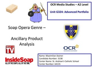
- 1. Soap Opera Genre – Ancillary Product Analysis Name: Maximilian Stainer Candidate Number: 3138 Center Name: St. Andrew’s Catholic School Center Number: 64135 OCR Media Studies – A2 Level Unit G324: Advanced Portfolio
- 2. Cover line (Secondary Story) The cover line that covers other soap operas can appeal to a wider audience by providing a variety of news from all programs. As well as this, it allows the audience to have a slight insight into the magazine on what it has to cover. Masthead The masthead is very bold making it appear even more to the audience. In addition to this the red colour adds to the appeal as it is a very bright and distinctive colour that stands out. The ‘TV’ allows the audience to recognise that this is a TV related magazine. By having the masthead in the corner allows it to stand out on the actual magazine stands out as this is what they audience will be attracted to as the rest may be covered by other magazines. Main Headline The main headline is designed in a bright and bold font to really appeal and stand out from the front cover. The colours of the font can also be argued to be more appealing to the female gender, who are the target audience of the soap opera genre. Use of Punctuation to sensationalize a story The punctuation at the end of the main headline emphasises the drama towards the main headline. Web Address (Cross Media Convergence) This allows the magazine to interact with the audience on multiple platforms and allows the audience to contact the company on any enquiries. Main Image (Usually shot at a MCU) The main image of the front cover highlights to the audience the prime attraction on the soap opera. Due to the medium close up it allows the audience to focus on the facial expression on the protagonist. For instance, this image of Phil form Eastenders looks very mischievous and intimidating and makes the audience feel uncomfortable especially with the main headline and gives the audience an enigma clue to what will happen next.
- 3. Strapline The strapline of the front cover located below the masthead stands out as is surrounded in a red bold outline. The repetition of ‘Every’ connotes that the magazine covers all areas and aspects of the soap opera genre. By adding the ‘Story’ and ‘Secret’ gives the audience an impression that they are receiving exclusive news from the magazine. Date The date allows the audience to recognise the issue of the magazine that they will buy. By having the date highlight the correct TV Guide for the audience on the variety of soap opera programmers that are on TV. This will also allow the audience to keep with the latest news by buying the latest date of the magazine, keeping the high interests from the audience Price The pricing of the magazine firstly is quite affordable as a new issue is released every week. The price is also placed at the center of the magazine to be clear and not hide the pricing of the magazine.
- 4. What should I ‘repeat’ (Steve Neale)? Firstly I would like to ‘repeat’ (Steve Neale) the masthead of InsideSoap. This s because the masthead stands out more in my opinion compared to What’s on TV as the actual font size is much bigger and covers a larger area of the front cover. As a result of this it will be much easier to identify and look more appealing with the bold red font. As well as this I would like to ‘repeat’ (Steve Neale) the cover lines styles both from What’s on TV and InsideSoap. This is because the style fills empty space on the front cover with appropriate pictures from soap operas as ‘star appeal’ (Richard Dyer). This is also assisted by the pull quotes that may intimidate the audience into reading that certain area of the magazine. From the magazine What's on TV I would like to ‘repeat’ (Steve Neale) the main headline. In my opinion the main headline its very effective due to its bold font along with the vibrant colours. This will immediately appeal to the audience as it is the biggest font on the page along with a captivating headline with a rhetorical question or exclamation mark at the end. The colours are very effective as they are associated more with the female gender. This is highly significant as the target audience is mainly females. Lastly, I would like to ‘repeat’ (Steve Neale) the main image in both front covers. The reason to this is because they both incorporate two main protagonists as ‘star appeal’ (Richard Dyer) and this will seem more appealing to the audience. As well as this to make it more effective I would have the two characters to have very contrasting emotions to provide curiosity for the audience.