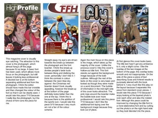
1. This magazine cover is visually eye catching. The attraction to this cover is the photograph, which almost hang’s off the page because it’s so large. A basic font has been used, which allows more focus on the photograph, but still leaves it looking less professional. A blocked bar is at the bottom separating additional text from the photograph, I think the editor should have made this bar invisible and then changed the colour of the font so that it can be clearly seen. I would rate this piece 7/10 because I really like the photograph, but the choice of font ruins the piece for me. Straight away my eye’s are driven towards the break-up between the photograph and the font boarder. I think this break-up divides people’s taste buds between liking and disliking the cover, personally I don’t like it. I think the contrast in colour between the neon blue sky against the Christmas red boarder doesn’t look visually appealing, however the break-up at the bottom of the page definitely looks better then the one at the top, I think this is because there is the addition of the sports icon. I would rate this piece 5/10 because I very much am not a fan of the colour scheme. Again the main focus on this piece is the image, which takes up the majority of the cover. Unlike the previous cover’s I like this cover’s hollow-out title font. This font stands out against the background image because of the bold outlines. Although the rest of the texts on the cover is very basic and looked as though they were made on a word document. The bubble of information in the mid-right side of the cover looks attractive. The pink rope around the boarder make the bubble look ever more professional. I would rate this piece 7/10 because I don’t like the additional font laying over the background image because they look out of place. At first glance this cover looks basic. The title text hasn’t got any ambiance to it, only a slight curve. I like the overlap of the two images at the bottom of the page; this overlap looks smooth and not inappropriate. On the side of the piece a piece of text describing Gcse and A-level results is purposely aliened with the book behind it, I very much like this play on the layout because it separates this piece from standard cover pieces. I would rate this piece 7/10 because I enjoy looking at the layered photo’s over each other and also the rotated font. Although this piece could be improved by changing the title font to a more elaborative font and by cutting out the photo’s on the right hand side so they look blended into the piece.
2. The photographs at the bottom of the page have only been placed on top on the contents page and have not been edited, I think if they had been edited or cut so that they have jagged edges it would looked a lot better. Seeing the background image’s opacity changed so that it can be seen, but so that the text is easier to read is a editing technique I am fond of. I would rate this piece 8/10 because the space in the piece has been used well by enlarging photo’s and by not leaving white spaces. This contents page looks plain; there is no variation of colour in the background which leaves the piece very un-eye catching. The text used doesn’t seem interesting either. However I like the text and photograph which are positioned at the bottom. I think by rotating the text and photo make’s the piece appear slightly more exciting. I would rate this piece 4/10 because not much editing has been used, although I do like the layout. This contents page involves a band of colour's and as a result the piece looks very busy and thrilling. I like seeing the page reference's up against the picture on the left side because it make’s the piece look as if it is full to the brim with images and text. I would rate this piece 4/10, but I think if the editor included a photograph and more editing techniques, such as changing the background's gradient it would have made the piece more professional looking. This piece immediately looks dull; there is limited colour and no pictures or photographs. The only colour is the gradient change in the background, which only involves two colours. I think this piece is poor at indulging or connecting with the viewer like some other contents pages do. I would rate this page 2/10 because it is incredibly undeveloped.