7. The design looks a lot more professional if you use columns. My fourth design shows
this, it is by far the weakest design but I do like the image placement. I have found
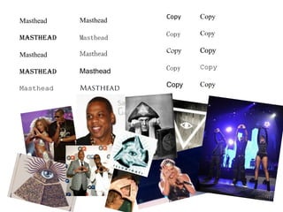
out that underlining the Masthead also makes it look more professional because it
separates it from the rest of the article. I don’t like the designs with adverts on the
side. Although it only takes up a third of the page it looks too big on the page. It
distracts you from the article which is the most important bit.
I think my favourite design is the second one, if the content advertisement at the top
were similar sizes then it would look better but it is still my favourite. There isn’t
too much white space. It has a pull quote which separates the text and doesn’t
make it look like reading it will be a chore. However if I could change it I would
make the pull quote look more like the one on my last design. An article needs a
little bit of white space to make it look more appealing.
One thing I forgot to do on my designs were to use drop capitals. I have used larger
letters at the star on my last two but they aren’t dropped. I decided to mock up all
my layouts so I could see which exactly how the elements would look. Once I’d
done this I could pick out my favourite design elements and put them into one
design.
The decision I have made is to use the copy layout for the second design but instead of
the content advertisement I’m going to the heading from my first design. I’m going
to try and make the pull quote look more like the one from my last design, maybe
change the font so it stands out more. Using the same font as the heading will link
the two together.