
Recommended
More Related Content
What's hot
What's hot (20)
Viewers also liked
Viewers also liked (15)
Similar to OCR Media Studies – AS Level Unit G321: Foundation Portfolio in Media Evaluation
Similar to OCR Media Studies – AS Level Unit G321: Foundation Portfolio in Media Evaluation (20)
Recently uploaded
Recently uploaded (20)
OCR Media Studies – AS Level Unit G321: Foundation Portfolio in Media Evaluation
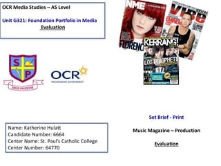
- 1. OCR Media Studies – AS Level Unit G321: Foundation Portfolio in Media Evaluation Name: Katherine Hulatt Candidate Number: 6664 Center Name: St. Paul’s Catholic College Center Number: 64770 Set Brief - Print Music Magazine – Production Evaluation
- 2. In what ways does your Media product use, develop or challenge forms and conventions of real media products? • Within the music magazine I created throughout the pages it ‘repeats’ (Steve Neale) codes and conventions from ‘Clash magazine’. The issue I chose of ‘Clash magazine’ that I used for my magazine of inspiration was the issue that featured ‘The 1975’. The reason why I chose this particular issue was because the main feature (The 1975) I wanted to incorporate within my magazine and it also linked nicely with my genre of music that I wanted my magazine to be which is alternative/indie pop. This photo of Matt Healy of the issue of ‘Clash’ was in colour and my images of the front of my magazine of ‘DropOut’ was in colour, therefore I ‘repeated’ this convention to make my ‘DropOut’ look similar to this particular issue of ‘Clash’. Following on from this, I also ‘repeated’ where I placed my main headline which was In the middle and replaced the main story name from ‘working on a dream’ to ‘the road to success’. Additionally, the masthead on ‘Clash’ is spread out and I have done that on my magazine ‘Dropout’. Below I have inserted my magazine of inspiration, ‘Clash’ front cover and my magazine ‘Dropout’ front cover. This connotes how I have used conventions effectively from existing media products. However, I didn’t want to make my magazine the exact same as ‘Clash’ therefore my magazine does ‘challenge’ some conventions that would be in a typical indie pop magazine, for example, I have ventured out and used burnt red colour instead of the trypcial colours used in a magazine like black and white. The reasoning I used a burnt red colour within my magazine is to attract the ‘pass along’ audience more.
- 3. How does your media product represent particular social groups? • In my opinion, the denotation of the representation is the ‘E’ category of the socio- economic needs table; (Unemployed, students, pensioners and casual workers). This is because my target audience of my magazine is for younger age ranges such as the 16-25 year olds of todays society. This means that the type of people that will be reading this magazine would be ‘stereotypically’ students, people in casual work or the unemployed. This means that my magazine I have created appeals to my audience profile because of the 16-25 age group. Because of the category my magazine my magazine needs to be affordable so even the unemployed can afford my magazine. My magazine will be the price of £1.00 for a month and then will go up to £1.50 which is a very affordable price for all the types of people within the ‘E’ category. Following on from this, the burnt red colour in throughout my magazine will attract my target audience and ‘pass along’ readers as it’s an appealing colour to the eye. This magazine will be especially attracted to the unemployed as these readers can ‘divert’ (Blumer and Katz) from there everyday problems and routine and have the chance to read and enjoy my magazine and build ‘personal relationships’ from the artists so this can give them inspiration to find work.
- 4. What kind of media institution (Publisher) might distribute your media product and why? • From the research that was completed pre-production, I would envisage that ‘Bauer Media Group’ may publish ‘Dropout magazine.’ This is because this publishing group has not only published very successful lifestyle magazine such as; ‘Closer, Grazia and Heat’ but very successful music magazines such as; ‘Q, Kerrang and Mojo’. This would be good for the publicity of my magazine as they are a reliable and successful publishing group. My magazine of inspiration ‘Clash’ publisher is ‘Music Republic LTD’ but they are not as big as ‘Bauer’ so my magazine wouldn’t get as much publicity. I have done a range of research regarding ‘Bauer Media Group’ and it has some similarities to ‘clash’ even though ‘Bauer’ is not its publisher. This is because ‘Clash’ is an Indie pop magazine and the music magazines that ‘Bauer’ have produced are also of that genre. ‘Clash’ magazine also ‘signifies’ (De Saussure) that the genre of my magazine will appeal to this publisher as this is the kind of magazine that they are looking to publish, considering that my magazine is of the same genre of the music magazines they produce as previously stated.
- 5. Who would be the audience for your media product and why? Hartley’s seven subjectivities According to Hartley’s seven subjectivities, the age of my audience 16-25 class ‘E’ people of society. This is shown through the low pricing of my magazine and a special opening offer of £1 for the first month, this will make sure that the people of the ‘E’ class will be able to afford my magazine. The target gender for my magazine is not specific its for both male and females who are into the indie/alternative types of music and the magazine features things that will relate to both genres. The stereotypical ethnicity for my magazine is White British Male and Females. Katz’ Uses & Gratifications theory According to Katz’ Uses & Gratifications theory, the audience can ‘personally identify’ themselves within the articles of the magazine. When the 1975 started to make music they were unemployed students but have now made It in the music industry. This is how the audience can ‘personally identify’ and help them ‘divert’ from everyday problems. My contents page is welcoming and the editorial informs the reader everything within the current issue and upcoming issues. Maslow’s Hierarchy of needs According to Maslow’s hierarchy of needs, my audience are identified as ‘social climbers’. This means that when reading this magazine they will take inspiration from the artists within the issues of ‘DropOut’ and want to aspire to be like them. This therefore means my audience will read my magazine and aspire to do something within music if that’s their passion.
- 6. How did you attract/address your audience? • The Inclusion of codes and conventions such as featuring the burnt red colour throughout my magazine rather than the standard colours of black and white typically used throughout indie/alternative music magazines. The pop of colour would attract the young audience which I am aiming my magazine a. The use of font as well is different and ‘grungy’ so automatically the audience will be aware of what music genre of my magazine. Following on from this, another code and convention I have used to attract and address my audience is the ‘puff promotion’ which is directly linked with my main story, also the first months £1 addition will be very popular as it will be saving my audience money. Finally, another code and convention that I have included in my magazine to attract my target audience is the images that I have used with thee magazine pages. The images all relate to the stories in the magazine, therefore this means that my stories attract my target audience as they are about the topics that people of those ages would be interested in.
- 7. How did you attract/address your audience? • The Inclusion of codes and conventions such as featuring the burnt red colour throughout my magazine rather than the standard colours of black and white typically used throughout indie/alternative music magazines. The pop of colour would attract the young audience which I am aiming my magazine a. The use of font as well is different and ‘grungy’ so automatically the audience will be aware of what music genre of my magazine. Following on from this, another code and convention I have used to attract and address my audience is the ‘puff promotion’ which is directly linked with my main story, also the first months £1 addition will be very popular as it will be saving my audience money. Finally, another code and convention that I have included in my magazine to attract my target audience is the images that I have used with thee magazine pages. The images all relate to the stories in the magazine, therefore this means that my stories attract my target audience as they are about the topics that people of those ages would be interested in.
- 8. Photography Planning – Front Cover 1 2
- 9. Photography Planning – Front Cover 3 4
- 10. Photography Planning - Contents 1 2
- 11. Photography Planning - Contents 3 4
- 12. Photography Planning - Interview 1 2 3
- 13. Analysing my Front Cover Masthead- The purpose of this masthead is that it informs the audience of what the magazine is and is the first thing the pass along audience look at as well the image so it needs to stand out clearly to the reader. Strapline- This is what persuades the audience to buy the magazine. Thee strapline is often catchy so the reader remembers it and encourages the audience to purchase the magazine. Cover lines- these are specifically used to attract the target audience, cover lines have to be interesting so it intrigues the audience to buy the magazine Social media- This is so the target demographic can access the magazine from a different format and can suggest their ideas for the content of the magazine on the social networking pages. Puff/Promotion- this convention is featured in my magazine because its an extra feature to grab the target audiences attention and is a specific USP to the magazine. Main image- this is the main focus of the magazine to the target audience as it’s the first thing the audience see. Main headline- this convention is also used to attract the target audience, because if they are interested in the story then it then persuades the audience to buy the magazine so that they can read that story, the main headline is usually something very interesting.
- 14. Analysing my Contents Page Editorial- I have included an editorial as it welcomes the pass along audience and helps them feel at ease. It helps to create a ‘personal relationship’ (Katz) with the target audience. Screen grab of Magazine page positioned in the Center of the slide (Remove the BLUE box once placed in as well) Masthead- this is carried on from the front cover. This helps the reader to feel a sense of continently and the pages then link together, this use of ‘repeating’ (Steve Neale) this convergence is already existing in professional magazines. Image- the image is a small indication to one of the features/regulars are going to be about. They can visually imagine what the story is going to be about. Page numbers- this kindly allows the audience to see clearly what pages link to what story which is a neat aspect. Regulars/Features- this gives a quick idea to the target audience what the content of the magazine is going to be. Social Media- is again something I have ‘repeated’ (Steve Neale) from the front cover. Its another reminder to the audience how the can access the magazine in another format if they are in touch with the media side of the magazine.
- 15. Analysing my Double Page spread Interview Quote- The quote is the most interesting and eye catching part of the interview, it is also what attracts the reader to read the interview. Masthead- This has been clearly repeated through the pages that I have created. It again creates continuity between each of the pages because the masthead is clearly and neatly shown. Credits- this tells the reader the people who assisting in the article, it gives a professional- like touch to the double page spread. Convergence- This allows the reader to access the article in different formats. Main headline- Clear establishment of what/ who the magazine is about so the reader knows before they start reading. Following on from this, the summery is used to clearly show what will be covered in the interview. Interview- the interview is based on one subject and the sub questions are asked around the topic. This gives the reader information that they wanted to hear as its usually ‘gossip’ ‘must know’ topics. By reading about a certain artist/band allows the reader to ‘personally identify’ (Katz) with them as they feel as if they know them
- 16. Looking back at your Preliminary task, what do you feel you have learnt in the progression from it to the full product? I feel that, having completed the preliminary task and learning about the demands of this production process. Following on from this, doing the preliminary task helped me to refresh my memory on Photoshop from GCSE, so that therefore my final product of my music magazine looked, organized, professional, and to a good quality. I have learnt to use extended tools on Photoshop that I previously didn’t know how to use. By doing the preliminary task and the main task it gave me a chance to show of my creative skills and what I previously learnt from GCSE media, this meant I had a slight advantage to some of the people in my glass who didn’t study media for GCSE or have never used Photoshop.
Editor's Notes
- Once Complete you MUST: 1) Ensure all slides are neatly and consistently (i.e Same Background/colour scheme) presented 2) You have filled in ALL the details (Name, Candidate number, Center number) on Slide 1 3) Check you have completed EVERYTHING you have been asked to complete 4) Remove this comment