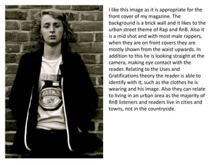
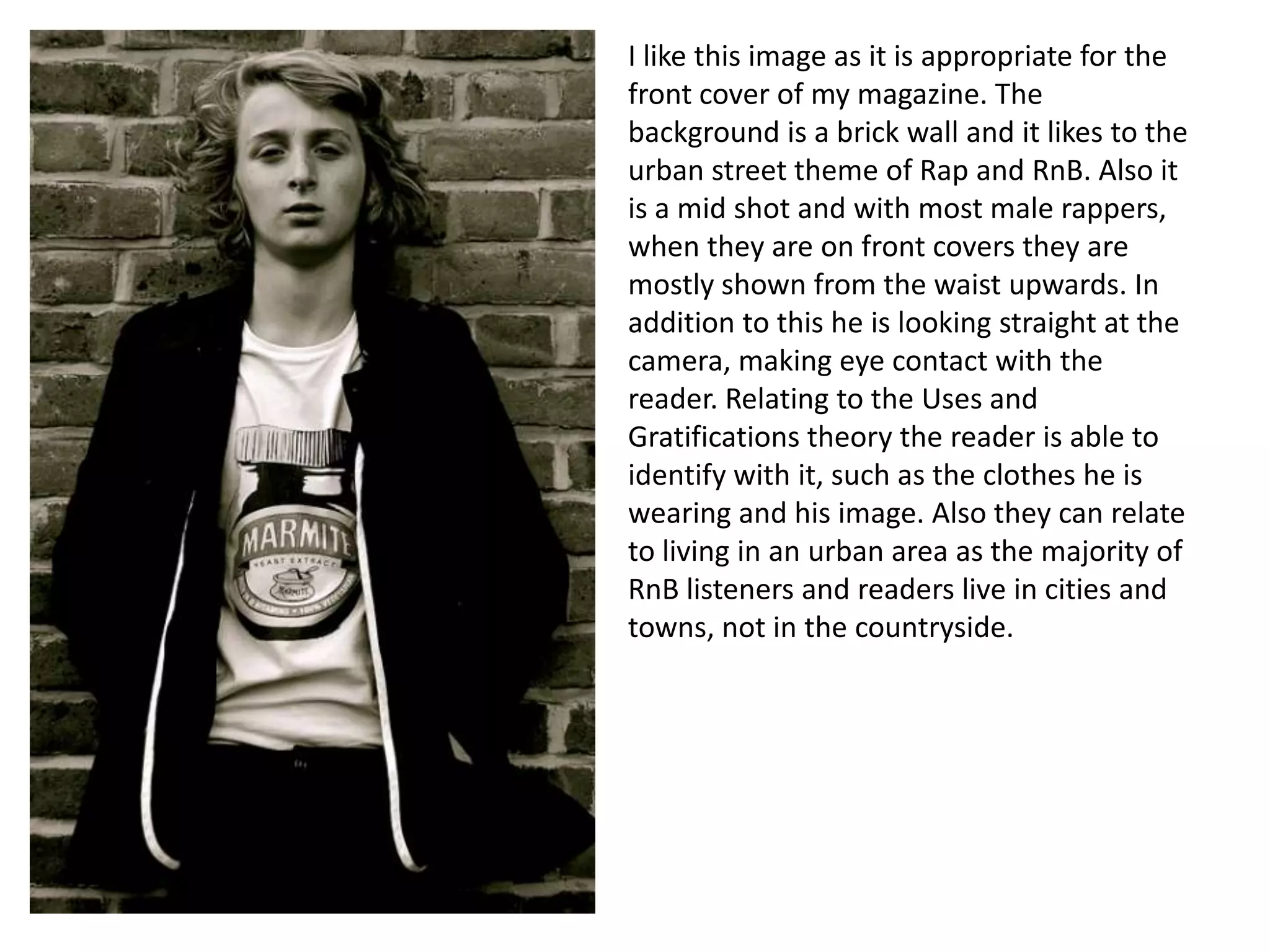
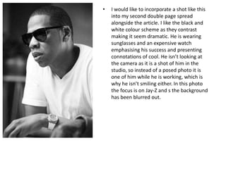
I like this image as it is appropriate for the
front cover of my magazine. The
background is a brick wall and it likes to the
urban street theme of Rap and RnB. Also it
is a mid shot and with most male rappers,
when they are on front covers they are
mostly shown from the waist upwards. In
addition to this he is looking straight at the
camera, making eye contact with the
reader. Relating to the Uses and
Gratifications theory the reader is able to
identify with it, such as the clothes he is
wearing and his image. Also they can relate
to living in an urban area as the majority of
RnB listeners and readers live in cities and
towns, not in the countryside.
•

I would like to recreate this image for my
double page spread as it follows the urban
theme that the target audience of my
magazine can relate to. Also he is wearing
clothes similar to the clothes I am planning
on wearing in my photoshoot, dark jeans,
trainers, a snapback and a chain, but instead
wearing a t-shirt and hoodie instead of a
baggy top. I want to find a location similar to
this, sitting on a bench, with a building that
has graffiti on. He isn't looking at the camera
and has a serious expression on his face,
creating a thoughtful, closed off atmosphere,
with his arms folded as well. For the double
page, this photo takes up a whole page and I
would like to do this with my magazine, as
this is how most double page spreads are in
RnB magazines such as Vibe.
•

In RnB magazines the contents page
usually has only one main images,
whereas other genres have several
images. I would like to have all the
writing, information, page numbers etc.
one side of the page and the picture on
the other side. I would like the model to
be leaning as if he is leaning against the
side of the page, showing his whole
body. If he has his hands by his side,
leaning, and isn’t making eye contact
with the reader it makes him look
relaxed and casual.
•

I would like to incorporate a shot like this
into my second double page spread
alongside the article. I like the black and
white colour scheme as they contrast
making it seem dramatic. He is wearing
sunglasses and an expensive watch
emphasising his success and presenting
connotations of cool. He isn’t looking at
the camera as it is a shot of him in the
studio, so instead of a posed photo it is
one of him while he is working, which is
why he isn’t smiling either. In this photo
the focus is on Jay-Z and s the background
has been blurred out.

Photography ideas

  • 1.
    I like thisimage as it is appropriate for the front cover of my magazine. The background is a brick wall and it likes to the urban street theme of Rap and RnB. Also it is a mid shot and with most male rappers, when they are on front covers they are mostly shown from the waist upwards. In addition to this he is looking straight at the camera, making eye contact with the reader. Relating to the Uses and Gratifications theory the reader is able to identify with it, such as the clothes he is wearing and his image. Also they can relate to living in an urban area as the majority of RnB listeners and readers live in cities and towns, not in the countryside.
  • 2.
    • I would liketo recreate this image for my double page spread as it follows the urban theme that the target audience of my magazine can relate to. Also he is wearing clothes similar to the clothes I am planning on wearing in my photoshoot, dark jeans, trainers, a snapback and a chain, but instead wearing a t-shirt and hoodie instead of a baggy top. I want to find a location similar to this, sitting on a bench, with a building that has graffiti on. He isn't looking at the camera and has a serious expression on his face, creating a thoughtful, closed off atmosphere, with his arms folded as well. For the double page, this photo takes up a whole page and I would like to do this with my magazine, as this is how most double page spreads are in RnB magazines such as Vibe.
  • 3.
    • In RnB magazinesthe contents page usually has only one main images, whereas other genres have several images. I would like to have all the writing, information, page numbers etc. one side of the page and the picture on the other side. I would like the model to be leaning as if he is leaning against the side of the page, showing his whole body. If he has his hands by his side, leaning, and isn’t making eye contact with the reader it makes him look relaxed and casual.
  • 4.
    • I would liketo incorporate a shot like this into my second double page spread alongside the article. I like the black and white colour scheme as they contrast making it seem dramatic. He is wearing sunglasses and an expensive watch emphasising his success and presenting connotations of cool. He isn’t looking at the camera as it is a shot of him in the studio, so instead of a posed photo it is one of him while he is working, which is why he isn’t smiling either. In this photo the focus is on Jay-Z and s the background has been blurred out.