
Recommended
More Related Content
What's hot
What's hot (18)
Viewers also liked
Viewers also liked (17)
Similar to Dsp analyise
Similar to Dsp analyise (20)
Dsp analyise
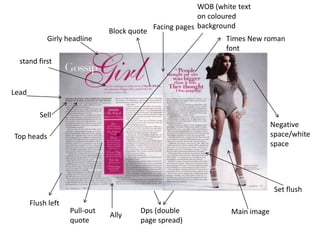
- 1. Girly headline Ally Times New roman font Lead Facing pages Flush left Pull-out quote Negative space/white space Block quote Dps (double page spread) Sell Main image stand first Top heads Set flush WOB (white text on coloured background
- 2. Name of the person who wrote the article, this gives the reader a chance to find out who they are writing about and who interviewed her A brief introduction prepares he reader and audience for the article providing them information about the star/person it is on The pull out quote here is providing the reader/audience with any entry point also it is good because it is in a different colour to stand out to the audience. The pull out quote is nicely fitted around the text so it is not all cramped and clashing with the house style colours Quotes from the star herself, which makes the article more like and interview so you are reading her own personal views A page number allows the reader to navigate the magazine easier and find particular articles The colours used on these pages are grey, white, pink and black. These are the main house colour. These colours go together well and don’t clash and make it look messy The gapes in the article also knows as ‘ally’s’ are to separate text and make the presentation neat and tidy and not cluttered The large image on the other side of the page is to keep the reader intrigued to read on and find out, also the picture is the main thing which you see on this DPS A caption in the form of a quote or information text provides the reader with any entry point This is another pull out quote which is used to notify the audience with the style trend of the girl who the article is on about, this is a way of getting the audience involved The pink text and the fancy font makes the reader know that the article is on a girl and will be quite ‘girly’ The heading is the largest text on the page to make the reader see this title first and will let them know what they are going to read about if they read this article This call out is used to give a short story introduction towards the article which the audience is about to read A pull out quote is used in order to anchor the image to provide the reader with an entry point
- 3. This pull out quote is used for entertainment to the audience itself, it uses a type of language which is seen as a ‘joke’ or a ‘funny’ sentence This is personal identity as you are finding out personal information about the person Personal information about the persons everyday life style Real life comparisons More adult content than something a child should read Information about her life which is revealed to the general public and audience
- 4. Main headline/heading Pull out quotes Stand first DPS – double page spread Negative space/black space Flush left Alley Sans-serif text Facing pages Main image WOB – white text on coloured background Block quote
- 5. The main article has information about the brand new TV show to inform the general public and readers about what is going to happen and what it is about This text box provides information which is relating to the article and also to the picture which is above Images of the star or stars who are involved in the show which are talking about in the article are used as visual information for the reader to easily read quickly The website at the bottom of the page is to promote their website and inform the reader on where it will be aired A camera roll of pictures along the bottom of the page is also a visual way of giving out information to the reader A logo to promote Sub heading/quote to give out information for the reader An alley to separate the text and make sure that it isn't looking cluttered The big text logo in the picture is to promote what the television show is called for the readers to instantly draw their attention to it The house colours set for this article are black, pink and white mostly. This makes the article not look ‘busy’ and makes the article not look too clashing with colours A caption from the television show to give off information from the show or either the characters
- 6. Education on what the television show is about Personal information about the TV and also the conversation Real life comparison's and what the programme is about
- 7. main headline Alley Main text image Visual information Pull out quotes House style Stand firsts Questions from the person themselves Page numbers Small text image DPS
- 8. main header to show instantly what the article is about and is clear enough to read, with the house colours it blends in nicely House style colours are red, black and white which makes it not too busy and is not over-powering with the colours Negative white space, this is shown as the blank spaces on the page In this article there is questions, this means that the article is based on an interview with the star. This is easier for the audience to read as it is not too over loading with all the text and information. The colour change from where it’s showing the interviewer reading his questions is easy for the reader to pick out who is who in this article The pull out quote is simply a bit of information which is taken away from the article so it pops out and the reader will instantly see it The main text image is show clearly so the reader then knows who the article is about without even having to read anything The website for the magazine is promoted at the bottom on the left side small but also readable so their website is also being used if the public want to find out more The two images which are used are clear enough for the public to see. The smaller image is used for visual information as you then know that they are going to talk about the stars love life which draws people in At the top of the page there is a pull out, this says ‘exclusive interview’ this will draw more attention to the article
- 9. Information about this personal life, which drags the reader in to read more.. Its more like an autobiography Personal identification Personal informatio n on his life and family life, this gives an idea of what the pop stars life is really like Personal information on the stars clothing and style Personal questions on his love life and questions about girls
- 10. Top tips to use when creating a double page spread magazine - Main headline - Main image, visual information which could be a smaller image - Masthead - Make sure that the colours don’t clash - Facing pages - No noisy images which make the magazine ‘busy’ - Pull outs - banner on the magazine which will appear at the top clear for the reader to see - Block quote, which is a long quotation info for the magazine - Caption to illustrate the image - Copy of the main text of a story - A deck ; a headline made up of decks set in the same style and size type - Flush left - Educational information on the story - Information to do with the personal life and stories - Stand firsts