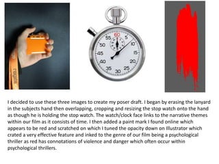
1. I decided to use these three images to create my poser draft. I began by erasing the lanyard
in the subjects hand then overlapping, cropping and resizing the stop watch onto the hand
as though he is holding the stop watch. The watch/clock face links to the narrative themes
within our film as it consists of time. I then added a paint mark I found online which
appears to be red and scratched on which I tuned the opacity down on Illustrator which
crated a very effective feature and inked to the genre of our film being a psychological
thriller as red has connotations of violence and danger which often occur within
psychological thrillers.
2. On Photoshop I then turned the image “Black &
White” which created a much more intense feel to
the image.
I then added the red, scratched paint mark over the
image and turned the opacity down.
I then added the tagline “Don’t Let The Timer
Run Out!” in red matching the scratch mark.
I transferred the poster onto Illustrator and
decided to explore the different font styles.
3. Here is the poster after adding the font and
added images. I used “Steel Tongs” to download and edit a
billing block for the bottom of the poster.
I downloaded the font
onto Illustrator and added
original names including
the members of our
production group.