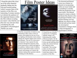
1. Film Poster Ideas The distorted and blurred
vision was a feature we
planned on incorporating
within our teaser trailer and
is something to consider
within the production of our
teaser trailer. This blurred
perspective creates a chaotic
and dream-like illusion to the
Psychological Thriller. I also
find the dramatic low-key
lighting very effective along
with the bold red font which
has stereotypical
connotations of danger which
is often incorporated in
Psychological Thrillers.
I found the ghost-like close-
up of the main character
gradually fading into the
relevant location/setting
which I assume links to the
narrative of the film very
interesting. It creates mystery
yet informs the audience of
the important features within
the film without revealing
too much. I also find the cool
blue tint very relevant when
considering the cold
atmosphere a Psychological
Thriller can create.
I find the concept/idea of shadows very
interesting as they create a sense of
mystery and enigma by the use of low-
key lighting with dramatic tonal contrast
making the situation appear more serious
and dramatic. The use of a close up on
the character’s face exposes his true
emotions through the exposure of his
facial expressions in detail and depth to
the audience. Indirect mode of address
has been used which creates a sense of
mystery and intrigue as it entices the
audience making them question what he
is looking at in the distance.
I found the use of double
exposure by overlapping
separate images very
interesting and visually
effective/complex. By the
use of different camera shots
(close up and mid/long shot)
makes the contrast between
the characters more
noticeable. This overlap
makes an obvious link
between the characters
which then relates to the
narrative of the film.
2. #1 Film Poster Sketch/Idea
We decided to sketch a close up point of view
shot of a timer being held by an unknown
character. This shot allows the audience to
clearly understand that the prop used is in fact a
timer and also creates a sense of perspective
whilst maintaining a sense of mystery
surrounding the identity of the male antagonist
who would be holding the timer. We displayed
the film title “Times Up!” within the timer
which relates to the timer ending of the timer in
the teaser trailer. The tier has been used as a
main feature within the film poster as it is a
reoccurring feature within the teaser trailer as it
displays the time running out which creates
suspense and intense anxiousness for the
audience. Time I one of our main themes as it
holds the fait of the female protagonist's life.
4. #2 Film Poster Sketch/Idea
We decided to sketch an hourglass timer
which would consist of fake blood instead of
sand. This idea/theme of time is being used
constantly which is a main feature within the
teaser trailer so, to reinforce continuity
within our production thought it would be
wise to carry on the theme. The hourglass
timer displays the gradual loss of time much
like the digital timer. The fake blood used
would suggest some violence and danger is
involved within the teaser trailer like most
typical Psychological Thriller film. The fake
blood used also suggests the fait of the
protagonist when the timer runs out, this
leaves a sense of mystery for the audience
making them question the safety and fait of
the female protagonist. We decided to
display the film title “Time Up!” to
resembled the fake blood dripping down the
side of the glass hourglass which appear
effective ad striking as a Psychological
Thriller film.