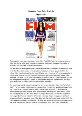
Magazine Front Cover Analysis
“Total Film”
This magazine front cover promotes a horror film. “Total Film” uses conventional features
that I will also be using when creating my magazine front cover. This way, I am hoping to
achieve a successful and effective media product.
The masthead of the magazine takes up a lot of space and it is written in bright red and bold
font. Therefore, it stands out as the predominant colours are blue, grey and white. The
colour of the masthead matches the blood dripping from the character’s hand, suggesting it
is promoting a horror film. The masthead is therefore eye-catching and will appeal to the
audience. The word “Total” gives the magazine a colloquial feel as it sounds very casual. This
will strengthen the magazine’s appeal as, although the magazine is professional looking, it
gives the readers a sense of familiarity and perhaps friendship.
The main image stands out as it is a long shot of the main character of the film “Jennifer’s
body”. The long shot is used to show her body and her costume, we would usually expect to
see a close up or a medium close up when a horror filmis promoted. It is made quite
difficult to see the blood dripping down from her hand, meaning that the audience has to
pay attention to observe this detail. She is wearing a cheerleader uniform that objectifies
her body and will appeal attractive to the male audience. Megan Fox’s posture and body
language makes her look quite powerful and the fact that she is making eye contact with the
camera can be considered intimidating. The blood and her facial expression can suggest that
she is the antagonist of the film, however, the audience is not given much information.
The colours used can be considered conventional for a horror film, as we see a lot of red
which is a symbol for blood. Also, white suggests purity and innocence. However, the
magazine front cover doesn’t entirely suggest it is promoting a horror film. This might be
due to the fact that the magazine doesn’t focus on a single genre, therefore the audience it
attracts is wider and they might not necessarily be horror fans. This helps the magazine
maintain its identity and appeal to its audience without creating any discomfort, as a gory
image might not interest everyone. The sell-lines promote other films such as “Harry Potter”
or “Twilight”, however, one of them stands out “The deadly Megan Fox”. This is written in
red and it links with the image. However, the fact that it says the actress’s name and not the
character’s name suggests that it will be an interview that is focusing on the actress and not
the film exactly. This once again helps maintain the professionalismand identity of the
magazine. The mode of address is indirect, there is nothing aimed personally at the readers,
despite the fact that the language is quite informal.
This magazine front cover seems to maintain its professionalismthrough the image
provided, the sell lines and the colours used. I aim to create a professional looking magazine
front cover, however, this magazine seems to avoid direct address or presenting a filmin a
way that will appeal to the film’s audience. For example, people who have seen “Jennifer’s
Body” and enjoyed it, might not be too happy with this representation, as it doesn’t entirely
reflect what the filminvolves. Therefore, when I will be developing my product, I will make
it more personal and more appealing to the horror fans.

Mag analysis 2 (2)

  • 1.
    Magazine Front CoverAnalysis “Total Film” This magazine front cover promotes a horror film. “Total Film” uses conventional features that I will also be using when creating my magazine front cover. This way, I am hoping to achieve a successful and effective media product. The masthead of the magazine takes up a lot of space and it is written in bright red and bold font. Therefore, it stands out as the predominant colours are blue, grey and white. The colour of the masthead matches the blood dripping from the character’s hand, suggesting it is promoting a horror film. The masthead is therefore eye-catching and will appeal to the audience. The word “Total” gives the magazine a colloquial feel as it sounds very casual. This will strengthen the magazine’s appeal as, although the magazine is professional looking, it gives the readers a sense of familiarity and perhaps friendship. The main image stands out as it is a long shot of the main character of the film “Jennifer’s body”. The long shot is used to show her body and her costume, we would usually expect to see a close up or a medium close up when a horror filmis promoted. It is made quite difficult to see the blood dripping down from her hand, meaning that the audience has to pay attention to observe this detail. She is wearing a cheerleader uniform that objectifies her body and will appeal attractive to the male audience. Megan Fox’s posture and body language makes her look quite powerful and the fact that she is making eye contact with the camera can be considered intimidating. The blood and her facial expression can suggest that she is the antagonist of the film, however, the audience is not given much information.
  • 2.
    The colours usedcan be considered conventional for a horror film, as we see a lot of red which is a symbol for blood. Also, white suggests purity and innocence. However, the magazine front cover doesn’t entirely suggest it is promoting a horror film. This might be due to the fact that the magazine doesn’t focus on a single genre, therefore the audience it attracts is wider and they might not necessarily be horror fans. This helps the magazine maintain its identity and appeal to its audience without creating any discomfort, as a gory image might not interest everyone. The sell-lines promote other films such as “Harry Potter” or “Twilight”, however, one of them stands out “The deadly Megan Fox”. This is written in red and it links with the image. However, the fact that it says the actress’s name and not the character’s name suggests that it will be an interview that is focusing on the actress and not the film exactly. This once again helps maintain the professionalismand identity of the magazine. The mode of address is indirect, there is nothing aimed personally at the readers, despite the fact that the language is quite informal. This magazine front cover seems to maintain its professionalismthrough the image provided, the sell lines and the colours used. I aim to create a professional looking magazine front cover, however, this magazine seems to avoid direct address or presenting a filmin a way that will appeal to the film’s audience. For example, people who have seen “Jennifer’s Body” and enjoyed it, might not be too happy with this representation, as it doesn’t entirely reflect what the filminvolves. Therefore, when I will be developing my product, I will make it more personal and more appealing to the horror fans.