
Recommended
More Related Content
What's hot
What's hot (20)
Similar to Ahs entertainment weekly
Similar to Ahs entertainment weekly (20)
More from Jasmine Changnai
Recently uploaded
Recently uploaded (20)
Ahs entertainment weekly
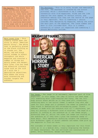
- 1. The Banner - The black font on light background brings attention to this feature. Additionally, they have used the word ‘gift’ which can be considered a buzzword. This doesn’t necessarily have to relate to anything mentioned on the page and is a good way of anchoring the audience even more. The Masthead – This is in bold, bright and memorable red font. The masthead is covered by the actors pictured, which I discovered to be a common convention with film magazines. Films and the like require the star appeal of certain actors, and therefore making sure they are the centre of the page is very important. This is something I should consider when designing my magazine, making the actor the main part of the magazine. The issue number and date is also included here. This is a common convention of almost all magazines and something I should definitely include. The Image - The image is an extremely important part of film magazines. In this image, the idea of horror has been made into something more light-hearted and funny. The two full body actors share smirks as if they have evil intentions, referring back to the horror theme. A medium long shot was used for this image and it presents the women as powerful as they stand in dominating and intimidating poses. Direct address is made with the audience with all 3 characters, yet they all portray a different kind of mind-set. The head on a platter is looking at the audience as if she needs helps, anchoring them in, whilst the other two women are staring at the audience as if they have a plan the audience needs to know about. This impressive anchoring targets the audience with different types of direct address and makes them pick up the magazine to find out more. The costumes of these women is very important for this front cover as it is a medium shot, clearly displaying the bodies of these characters. The red and black are connotations of power, evil, dominance, danger and death. Main cover Line – This clearly states what the story is about ‘American Horror Story’. The white font is perfectly placed on the black clothing so it stands out. The white, red and black colour scheme is effect throughout the whole magazine and connotes a number of things but mainly power and danger. This cover line has used the effective literacy rules such as the rule of 3 with the 3 descriptive adjectives. This makes the story more interesting and further targets the audience.