Science 7 - LAND and SEA BREEZE and its Characteristics
Lesson 8 brochure worksheet new
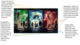
1. Layout- the rule of
thirds is aesthetically
pleasing to look at.
The 3 pictures are
perfectly aligned
and the contrast
with the black and
the strong green,
blue , red really
stand out.
Typography- the font at
the bottom middle is like
a medieval fairy tale font
and the two either side
is the classic Disney font
which makes the middle
one stand out more.
Photographic
techniques- the
image quality is
really good with
no blurs and the
rule of thirds is
very obvious and
helps you look at
the images
without being
confused
Image editing
techniques- the
editor was clever
making this image as
they used a strong
contrast of colours to
draw you in and
interest you.
2. Layout- this is a double
page spread with mostly
images but some
information on the side for
the reader once finished
looking at the main image
which draws your eyes in
straight away- the main
image has been given a
filter to interest you so it’s
the first thing you look at.
Typography- the writing is
smaller because its not the
main thing on the page so
you look at it second.
Photographic
techniques- the rule of
thirds also applies for
this page, for the first
page, iron man is made
up of 4 thirds and
beneath him is the
other 3 third of images
of less importance.Image editing techniques-
The background is blurred
to make it look like iron
man is moving quickly