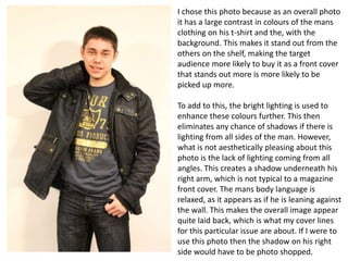
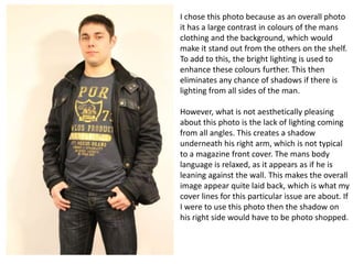
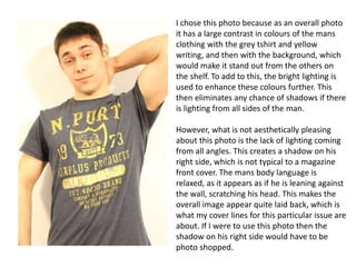
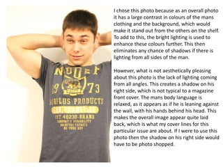
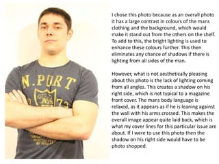
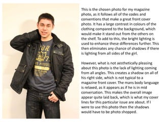
SlideShare a Scribd company logo
1 of 7
Cover 2 selection
Danny Sutch
I chose this photo because as an overall photo
it has a large contrast in colours of the mans
clothing on his t-shirt and the, with the
background. This makes it stand out from the
others on the shelf, making the target
audience more likely to buy it as a front cover
that stands out more is more likely to be
picked up more.
To add to this, the bright lighting is used to
enhance these colours further. This then
eliminates any chance of shadows if there is
lighting from all sides of the man. However,
what is not aesthetically pleasing about this
photo is the lack of lighting coming from all
angles. This creates a shadow underneath his
right arm, which is not typical to a magazine
front cover. The mans body language is
relaxed, as it appears as if he is leaning against
the wall. This makes the overall image appear
quite laid back, which is what my cover lines
for this particular issue are about. If I were to
use this photo then the shadow on his right
side would have to be photo shopped.
I chose this photo because as an overall photo
it has a large contrast in colours of the mans
clothing and the background, which would
make it stand out from the others on the shelf.
To add to this, the bright lighting is used to
enhance these colours further. This then
eliminates any chance of shadows if there is
lighting from all sides of the man.
However, what is not aesthetically pleasing
about this photo is the lack of lighting coming
from all angles. This creates a shadow
underneath his right arm, which is not typical
to a magazine front cover. The mans body
language is relaxed, as it appears as if he is
leaning against the wall. This makes the overall
image appear quite laid back, which is what my
cover lines for this particular issue are about. If
I were to use this photo then the shadow on
his right side would have to be photo shopped.
I chose this photo because as an overall photo
it has a large contrast in colours of the mans
clothing with the grey tshirt and yellow
writing, and then with the background, which
would make it stand out from the others on
the shelf. To add to this, the bright lighting is
used to enhance these colours further. This
then eliminates any chance of shadows if there
is lighting from all sides of the man.
However, what is not aesthetically pleasing
about this photo is the lack of lighting coming
from all angles. This creates a shadow on his
right side, which is not typical to a magazine
front cover. The mans body language is
relaxed, as it appears as if he is leaning against
the wall, scratching his head. This makes the
overall image appear quite laid back, which is
what my cover lines for this particular issue are
about. If I were to use this photo then the
shadow on his right side would have to be
photo shopped.
I chose this photo because as an overall photo
it has a large contrast in colours of the mans
clothing and the background, which would
make it stand out from the others on the shelf.
To add to this, the bright lighting is used to
enhance these colours further. This then
eliminates any chance of shadows if there is
lighting from all sides of the man.
However, what is not aesthetically pleasing
about this photo is the lack of lighting coming
from all angles. This creates a shadow on his
right side, which is not typical to a magazine
front cover. The mans body language is
relaxed, as it appears as if he is leaning against
the wall, with his hands behind his head. This
makes the overall image appear quite laid
back, which is what my cover lines for this
particular issue are about. If I were to use this
photo then the shadow on his right side would
have to be photo shopped.
I chose this photo because as an overall photo
it has a large contrast in colours of the mans
clothing and the background, which would
make it stand out from the others on the shelf.
To add to this, the bright lighting is used to
enhance these colours further. This then
eliminates any chance of shadows if there is
lighting from all sides of the man.

However, what is not aesthetically pleasing
about this photo is the lack of lighting coming
from all angles. This creates a shadow on his
right side, which is not typical to a magazine
front cover. The mans body language is
relaxed, as it appears as if he is leaning against
the wall with his arms crossed. This makes the
overall image appear quite laid back, which is
what my cover lines for this particular issue are
about. If I were to use this photo then the
shadow on his right side would have to be
photo shopped.
This is the chosen photo for my magazine
photo, as it follows all of the codes and
conventions that make a great front cover
photo. It has a large contrast in colours of the
clothing compared to the background, which
would make it stand out from the others on
the shelf. To add to this, the bright lighting is
used to enhance these differences further. This
then eliminates any chance of shadows if there
is lighting from all sides of the girl.
However, what is not aesthetically pleasing
about this photo is the lack of lighting coming
from all angles. This creates a shadow on all of
his right side, which is not typical to a
magazine front cover. The mans body language
is relaxed, as it appears as if he is in mid
conversation. This makes the overall image
appear quite laid back, which is what my cover
lines for this particular issue are about. If I
were to use this photo then the shadows
would have to be photo shopped.

More Related Content

What's hot (20)

Photograph selection for outfit 2 (lo4)
Photograph selection for outfit 2 (lo4)  Photograph selection for outfit 2 (lo4)
Photograph selection for outfit 2 (lo4)
 
Final images
Final imagesFinal images
Final images
 
Analysis of professional photographs
Analysis of professional photographsAnalysis of professional photographs
Analysis of professional photographs
 
Lit photo selection 4
Lit photo selection 4Lit photo selection 4
Lit photo selection 4
 
Fashion photography
Fashion photographyFashion photography
Fashion photography
 
Critiquing a Photo
Critiquing a PhotoCritiquing a Photo
Critiquing a Photo
 
Cinematographic Research
Cinematographic ResearchCinematographic Research
Cinematographic Research
 
Media evaluation question 2
Media evaluation question 2Media evaluation question 2
Media evaluation question 2
 
Mario Testino Analysis Work Sheet
Mario Testino Analysis Work SheetMario Testino Analysis Work Sheet
Mario Testino Analysis Work Sheet
 
Analysing photographs
Analysing photographsAnalysing photographs
Analysing photographs
 
Magazine cover influence
Magazine cover influenceMagazine cover influence
Magazine cover influence
 
Poster influences
Poster influencesPoster influences
Poster influences
 
Photographer Image Analysis
Photographer Image AnalysisPhotographer Image Analysis
Photographer Image Analysis
 
Top five 22
Top five 22Top five 22
Top five 22
 
Mario testino
Mario testinoMario testino
Mario testino
 
Fashion Photography
Fashion PhotographyFashion Photography
Fashion Photography
 
Photoshoot
PhotoshootPhotoshoot
Photoshoot
 
Unit 31 l01
Unit 31 l01Unit 31 l01
Unit 31 l01
 
Photo shoot planning
Photo shoot planning Photo shoot planning
Photo shoot planning
 
Media photos
Media photosMedia photos
Media photos
 

Viewers also liked

Mapa conceptual blog marbella j. marcano ramirez
Mapa conceptual blog marbella j. marcano ramirezMapa conceptual blog marbella j. marcano ramirez
Mapa conceptual blog marbella j. marcano ramirezSagrario Gallardo J
 
Mslmanlarin blme-katkilari-1212174961666820-9
Mslmanlarin blme-katkilari-1212174961666820-9Mslmanlarin blme-katkilari-1212174961666820-9
Mslmanlarin blme-katkilari-1212174961666820-9Erol Kocabaş
 
Anyela 20
Anyela 20Anyela 20
Anyela 20yoseob
 

Viewers also liked (7)

Mapa conceptual blog marbella j. marcano ramirez
Mapa conceptual blog marbella j. marcano ramirezMapa conceptual blog marbella j. marcano ramirez
Mapa conceptual blog marbella j. marcano ramirez
 
Mslmanlarin blme-katkilari-1212174961666820-9
Mslmanlarin blme-katkilari-1212174961666820-9Mslmanlarin blme-katkilari-1212174961666820-9
Mslmanlarin blme-katkilari-1212174961666820-9
 
โครงงาน
โครงงานโครงงาน
โครงงาน
 
Timeline
TimelineTimeline
Timeline
 
Alain city
Alain cityAlain city
Alain city
 
Anyela 20
Anyela 20Anyela 20
Anyela 20
 
Gutierrez diana aa5_2
Gutierrez diana aa5_2Gutierrez diana aa5_2
Gutierrez diana aa5_2
 

Similar to Cover 2 selection

Photography planning media
Photography planning mediaPhotography planning media
Photography planning mediaNatt Suchecki
 
Annie leibovitz Photograph Analysis
Annie leibovitz Photograph AnalysisAnnie leibovitz Photograph Analysis
Annie leibovitz Photograph AnalysisbiZuil
 
Music Magazine - Photo Options
Music Magazine - Photo OptionsMusic Magazine - Photo Options
Music Magazine - Photo OptionsEliza09ec
 
Contact sheet- Outside
Contact sheet- OutsideContact sheet- Outside
Contact sheet- OutsideEmilyRoseMedia
 
15 photos outfit 2
15 photos outfit 215 photos outfit 2
15 photos outfit 2benhyde1996
 
5 photos outfit 21
5 photos outfit 215 photos outfit 21
5 photos outfit 21benhyde1996
 
Photo shoot for Magazine
Photo shoot for Magazine Photo shoot for Magazine
Photo shoot for Magazine emilycarberry
 
Nathan, 5 images from photoshoot
Nathan, 5 images from photoshootNathan, 5 images from photoshoot
Nathan, 5 images from photoshootlucydeakin1
 
Evaluation question pictures
Evaluation question  picturesEvaluation question  pictures
Evaluation question picturespaigejones1234
 
Photoshoot- Raw Photo Analysis
Photoshoot- Raw Photo AnalysisPhotoshoot- Raw Photo Analysis
Photoshoot- Raw Photo Analysiscowlingalice
 
Do all my images meet my intentions
Do all my images meet my intentionsDo all my images meet my intentions
Do all my images meet my intentionsjakestar09
 
15 photos outfit 4
15 photos outfit 415 photos outfit 4
15 photos outfit 4benhyde1996
 
15 photos outfit 4
15 photos outfit 415 photos outfit 4
15 photos outfit 4benhyde1996
 
Photoshoot Front Cover
Photoshoot Front CoverPhotoshoot Front Cover
Photoshoot Front CoverIsabelWorrell
 
Magazine and phots powerpoint1
Magazine and phots powerpoint1Magazine and phots powerpoint1
Magazine and phots powerpoint1benhyde1996
 
Magazine and phots powerpoint1
Magazine and phots powerpoint1Magazine and phots powerpoint1
Magazine and phots powerpoint1benhyde1996
 

Similar to Cover 2 selection (20)

Cover 3 selectionn
Cover 3 selectionnCover 3 selectionn
Cover 3 selectionn
 
Test shots
Test shotsTest shots
Test shots
 
Photography planning media
Photography planning mediaPhotography planning media
Photography planning media
 
Annie leibovitz Photograph Analysis
Annie leibovitz Photograph AnalysisAnnie leibovitz Photograph Analysis
Annie leibovitz Photograph Analysis
 
Music Magazine - Photo Options
Music Magazine - Photo OptionsMusic Magazine - Photo Options
Music Magazine - Photo Options
 
Contact sheet- Outside
Contact sheet- OutsideContact sheet- Outside
Contact sheet- Outside
 
15 photos outfit 2
15 photos outfit 215 photos outfit 2
15 photos outfit 2
 
5 photos outfit 21
5 photos outfit 215 photos outfit 21
5 photos outfit 21
 
Photo shoot for Magazine
Photo shoot for Magazine Photo shoot for Magazine
Photo shoot for Magazine
 
Nathan, 5 images from photoshoot
Nathan, 5 images from photoshootNathan, 5 images from photoshoot
Nathan, 5 images from photoshoot
 
Evaluation question pictures
Evaluation question  picturesEvaluation question  pictures
Evaluation question pictures
 
5 photos1
5 photos15 photos1
5 photos1
 
Photoshoot- Raw Photo Analysis
Photoshoot- Raw Photo AnalysisPhotoshoot- Raw Photo Analysis
Photoshoot- Raw Photo Analysis
 
Do all my images meet my intentions
Do all my images meet my intentionsDo all my images meet my intentions
Do all my images meet my intentions
 
15 photos outfit 4
15 photos outfit 415 photos outfit 4
15 photos outfit 4
 
15 photos outfit 4
15 photos outfit 415 photos outfit 4
15 photos outfit 4
 
Magazine picture practice
Magazine picture practiceMagazine picture practice
Magazine picture practice
 
Photoshoot Front Cover
Photoshoot Front CoverPhotoshoot Front Cover
Photoshoot Front Cover
 
Magazine and phots powerpoint1
Magazine and phots powerpoint1Magazine and phots powerpoint1
Magazine and phots powerpoint1
 
Magazine and phots powerpoint1
Magazine and phots powerpoint1Magazine and phots powerpoint1
Magazine and phots powerpoint1
 

More from rebecca_andrewss

Fashion spread photoshoot new
Fashion spread photoshoot newFashion spread photoshoot new
Fashion spread photoshoot newrebecca_andrewss
 
Fashion spread printscreens of it being editied
Fashion spread printscreens of it being editiedFashion spread printscreens of it being editied
Fashion spread printscreens of it being editiedrebecca_andrewss
 
Microelements of a storyboard of a Horror Film
Microelements of a storyboard of a Horror FilmMicroelements of a storyboard of a Horror Film
Microelements of a storyboard of a Horror Filmrebecca_andrewss
 

More from rebecca_andrewss (9)

Model release form
Model release formModel release form
Model release form
 
Fashion spread photoshoot new
Fashion spread photoshoot newFashion spread photoshoot new
Fashion spread photoshoot new
 
Fashion spread printscreens of it being editied
Fashion spread printscreens of it being editiedFashion spread printscreens of it being editied
Fashion spread printscreens of it being editied
 
Microelements of Skins
Microelements of SkinsMicroelements of Skins
Microelements of Skins
 
Microelements of a storyboard of a Horror Film
Microelements of a storyboard of a Horror FilmMicroelements of a storyboard of a Horror Film
Microelements of a storyboard of a Horror Film
 
Microelements of Deja Vu
Microelements of Deja VuMicroelements of Deja Vu
Microelements of Deja Vu
 
Contact sheets
Contact sheetsContact sheets
Contact sheets
 
Cover 4 photoshoot
Cover 4 photoshootCover 4 photoshoot
Cover 4 photoshoot
 
Cover 3 photoshoot
Cover 3 photoshootCover 3 photoshoot
Cover 3 photoshoot
 

Cover 2 selection

  • 2. I chose this photo because as an overall photo it has a large contrast in colours of the mans clothing on his t-shirt and the, with the background. This makes it stand out from the others on the shelf, making the target audience more likely to buy it as a front cover that stands out more is more likely to be picked up more. To add to this, the bright lighting is used to enhance these colours further. This then eliminates any chance of shadows if there is lighting from all sides of the man. However, what is not aesthetically pleasing about this photo is the lack of lighting coming from all angles. This creates a shadow underneath his right arm, which is not typical to a magazine front cover. The mans body language is relaxed, as it appears as if he is leaning against the wall. This makes the overall image appear quite laid back, which is what my cover lines for this particular issue are about. If I were to use this photo then the shadow on his right side would have to be photo shopped.
  • 3. I chose this photo because as an overall photo it has a large contrast in colours of the mans clothing and the background, which would make it stand out from the others on the shelf. To add to this, the bright lighting is used to enhance these colours further. This then eliminates any chance of shadows if there is lighting from all sides of the man. However, what is not aesthetically pleasing about this photo is the lack of lighting coming from all angles. This creates a shadow underneath his right arm, which is not typical to a magazine front cover. The mans body language is relaxed, as it appears as if he is leaning against the wall. This makes the overall image appear quite laid back, which is what my cover lines for this particular issue are about. If I were to use this photo then the shadow on his right side would have to be photo shopped.
  • 4. I chose this photo because as an overall photo it has a large contrast in colours of the mans clothing with the grey tshirt and yellow writing, and then with the background, which would make it stand out from the others on the shelf. To add to this, the bright lighting is used to enhance these colours further. This then eliminates any chance of shadows if there is lighting from all sides of the man. However, what is not aesthetically pleasing about this photo is the lack of lighting coming from all angles. This creates a shadow on his right side, which is not typical to a magazine front cover. The mans body language is relaxed, as it appears as if he is leaning against the wall, scratching his head. This makes the overall image appear quite laid back, which is what my cover lines for this particular issue are about. If I were to use this photo then the shadow on his right side would have to be photo shopped.
  • 5. I chose this photo because as an overall photo it has a large contrast in colours of the mans clothing and the background, which would make it stand out from the others on the shelf. To add to this, the bright lighting is used to enhance these colours further. This then eliminates any chance of shadows if there is lighting from all sides of the man. However, what is not aesthetically pleasing about this photo is the lack of lighting coming from all angles. This creates a shadow on his right side, which is not typical to a magazine front cover. The mans body language is relaxed, as it appears as if he is leaning against the wall, with his hands behind his head. This makes the overall image appear quite laid back, which is what my cover lines for this particular issue are about. If I were to use this photo then the shadow on his right side would have to be photo shopped.
  • 6. I chose this photo because as an overall photo it has a large contrast in colours of the mans clothing and the background, which would make it stand out from the others on the shelf. To add to this, the bright lighting is used to enhance these colours further. This then eliminates any chance of shadows if there is lighting from all sides of the man. However, what is not aesthetically pleasing about this photo is the lack of lighting coming from all angles. This creates a shadow on his right side, which is not typical to a magazine front cover. The mans body language is relaxed, as it appears as if he is leaning against the wall with his arms crossed. This makes the overall image appear quite laid back, which is what my cover lines for this particular issue are about. If I were to use this photo then the shadow on his right side would have to be photo shopped.
  • 7. This is the chosen photo for my magazine photo, as it follows all of the codes and conventions that make a great front cover photo. It has a large contrast in colours of the clothing compared to the background, which would make it stand out from the others on the shelf. To add to this, the bright lighting is used to enhance these differences further. This then eliminates any chance of shadows if there is lighting from all sides of the girl. However, what is not aesthetically pleasing about this photo is the lack of lighting coming from all angles. This creates a shadow on all of his right side, which is not typical to a magazine front cover. The mans body language is relaxed, as it appears as if he is in mid conversation. This makes the overall image appear quite laid back, which is what my cover lines for this particular issue are about. If I were to use this photo then the shadows would have to be photo shopped.