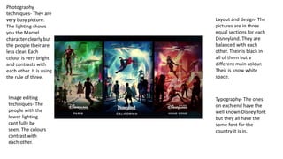
1. Layout and design- The
pictures are in three
equal sections for each
Disneyland. They are
balanced with each
other. Their is black in
all of them but a
different main colour.
Their is know white
space.
Typography- The ones
on each end have the
well known Disney font
but they all have the
some font for the
country it is in.
Photography
techniques- They are
very busy picture.
The lighting shows
you the Marvel
character clearly but
the people their are
less clear. Each
colour is very bright
and contrasts with
each other. It is using
the rule of three.
Image editing
techniques- The
people with the
lower lighting
cant fully be
seen. The colours
contrast with
each other.
2. Layout and design-
There is one big
picture which takes up
two thirds and two
smaller pictures at the
bottom. There is some
small white space in
between each picture.
Typography- There is
little text but where
there is it is very small
in the corners out of
the way.
Photography
techniques- behind
Iron Man the back
ground is blurry to
create the effect that
he is moving fast. His
posture makes him
look strong and that
he is looking for
something.
Image editing
techniques- The
top picture has a
red theme while
the bottom
images are more
blue. There is little
lighting