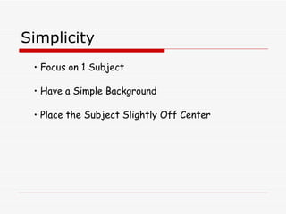
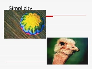
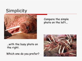
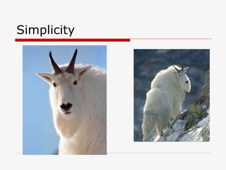
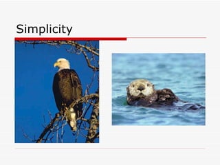
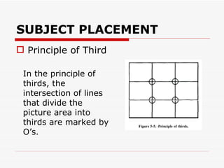
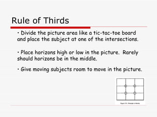
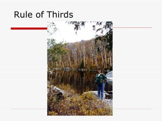
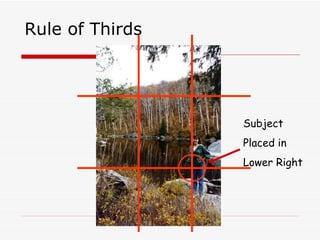
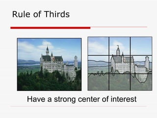
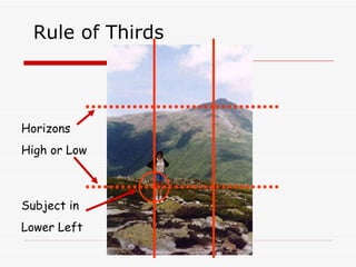
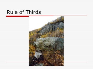
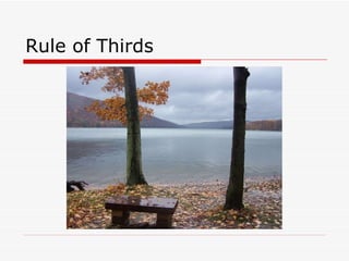
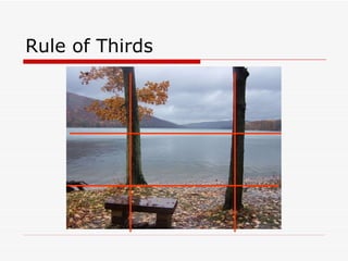
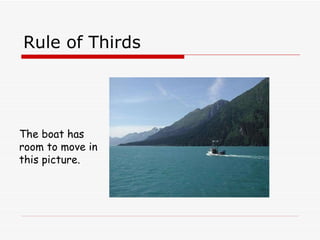
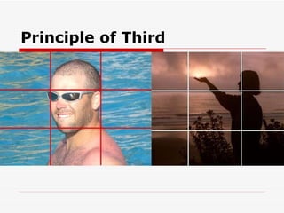
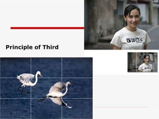
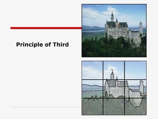
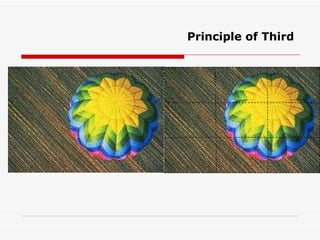
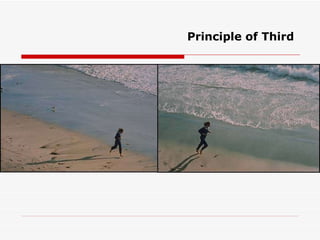
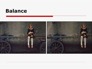
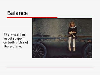
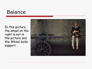
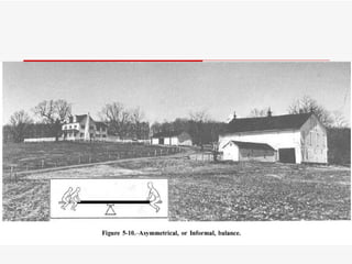
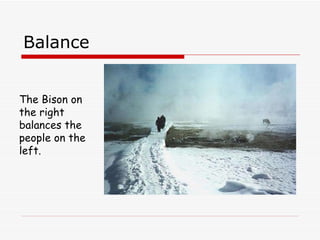
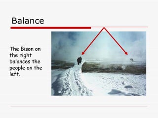
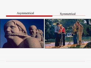
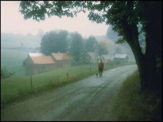
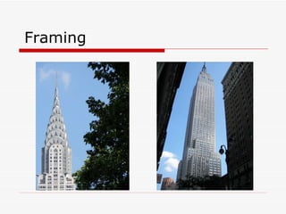
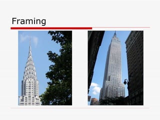
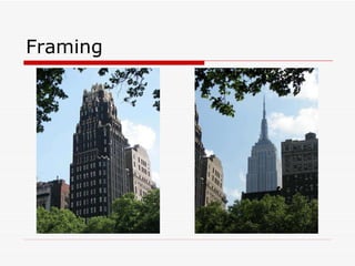
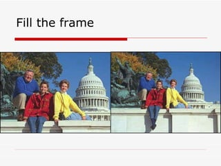
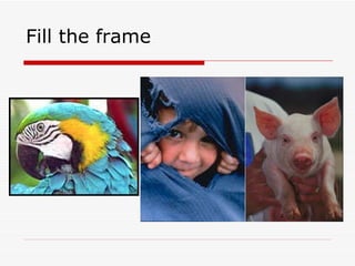
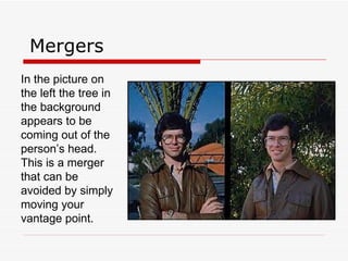
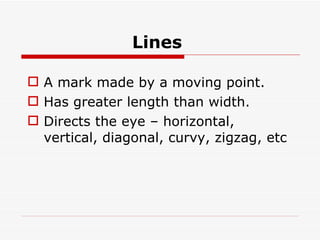
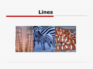
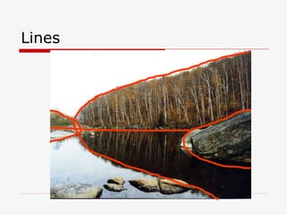
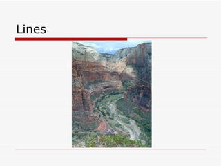
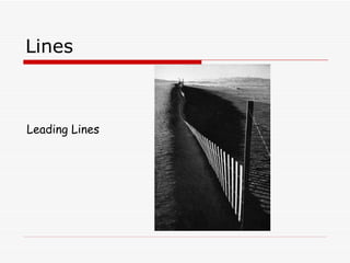
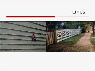
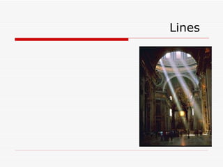
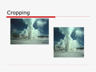
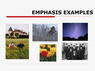
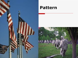
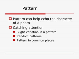
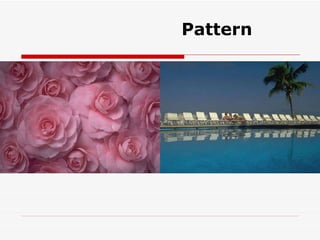
Photographic Composition – M.V.Ramachandran
Photographic composition is  the pleasing arrangement of subject matter elements within the picture area The camera sees and records only a small isolated part of the larger scene, reduces it to only two dimensions, frames it, and freezes
Composition Composition is the selection and arrangement of objects in the picture area.  A well composed photograph is more attractive and pleasing to the viewer.  There are 6 guidelines to follow to get well-composed photographs.
Composition 1. Simplicity 2. Rule of Thirds 3. Lines 4. Balance 5. Framing 6. Mergers
Simplicity Focus on 1 Subject Have a Simple Background Place the Subject Slightly Off Center
Simplicity
Simplicity Compare the simple photo on the left... … with the busy photo on the right. Which one do you prefer?
Simplicity
Simplicity
Simplicity
How are photographic composition skills developed?  You look,  You study You practice.
Think through your Camera
Analyze various media  Motion pictures, Television,  Magazines Books and newspapers,  valuate what you see  What is good about this picture or that TV image? What is bad about it?
SUBJECT PLACEMENT  Principle of Third In the principle of thirds, the intersection of lines that divide the picture area into thirds are marked by O’s.
Rule of Thirds Divide the picture area like a tic-tac-toe board and place the subject at one of the intersections. Place horizons high or low in the picture.  Rarely should horizons be in the middle. Give moving subjects room to move in the picture.
Rule of Thirds
Rule of Thirds Subject  Placed in  Lower Right
Rule of Thirds Have a strong center of interest
Rule of Thirds
Rule of Thirds Horizons High or Low Subject in Lower Left
Rule of Thirds
Rule of Thirds
Rule of Thirds
Rule of Thirds The boat has room to move in this picture.
Rule of Thirds
Principle of Third
Principle of Third
Principle of Third
Principle of Third
Principle of Third
Dynamic symmetry
Dynamic symmetry Symmetrical, or formal, balance in a photograph is achieved when elements on both sides of the picture are of equal weight . Symmetrical pictures, in which both presumed to be approximately equal.
Balance
Balance Having good balance can help to prevent having a picture that looks lopsided.  Provide objects and shapes on either side of the picture to compliment each other.  Also provide visual support to objects that need it.
Balance The wheel has visual support on both sides of the picture.
Balance In this picture the wheel on the right is not in the picture and the Wheel lacks support.
 
Balance The Bison on the right balances the people on the left.
Aspects of Balance An object far from the center of the picture seems to have more weight than one near the center.  Objects in the upper part of a picture seem heavier than objects of the same size in the lower part of a picture.  Isolation seems to increase the weight of an object.  Intensely interesting objects seem to have more compositional weight.  Regular shapes seem to have more weight than irregular shapes.  Elements on the right side of an asymmetrical picture appear to have more weight than elements of the same size on the left side of the picture.
Symmetrical Asymmetrical
 
Framing Use Foreground Objects to Highlight the Subject and Give the Picture Depth Pictures of Scenery should have a foreground and background.  Provide some visual depth to the picture.
Framing The trees in the foreground provide a frame for the mountain in the background.  Also, the mountain has been placed in the upper left corner to meet the rule of thirds.
Framing This photograph does not have a lot of framing but it has an obvious foreground, middle ground and background.
Framing
Framing Overhanging branches and plants in the foreground provide a frame for the lake and trees.  The person has been placed in the lower right.
Framing
Framing
Framing
Framing This photograph does not have a lot of framing but it has an obvious foreground, middle ground and background.
Fill the frame
Fill the frame
Mergers Mergers are something to avoid! A merger could be a background object that interferes with the subject... or an object that is too close to the subject that takes attention away from the subject. A border merger is when people’s heads or feet are cut off at the edge of the picture.
Mergers In the picture on the left the tree in the background appears to be coming out of the person’s head.  This is a merger that can be avoided by simply moving your vantage point.
Mergers A common mistake when photographing large groups of people is to not fit everyone in the picture.  This results in people being cut off.  This is a Border Merger.
Mergers Balloon Head? Much Better!
Lines Use Dynamic Lines to Make the Picture Interesting Use Leading Lines to Draw attention to the Subject The S-curve is a popular line used in photos.
Lines   A mark made by a moving point. Has greater length than width. Directs the eye – horizontal, vertical, diagonal, curvy, zigzag, etc
Lines
Lines
Lines
Lines
Lines
Lines
Lines S-Curve
Lines S-Curve
Lines Leading Lines
Lines Leading Lines
Lines Leading Lines
Lines
Lines
Lines
Cropping
 
 
Composition Remember, these are guidelines, not Rules. You may only use 1 or 2 of these guidelines at a time.  Try them and see if your photos improve.
Tone is probably the most intangible element of composition TONE Tone may consist of shadings from white-to-gray-to-black The use of dark areas against light areas is a common method of adding the feeling of a third dimension  to a two-dimensional black-and-white picture. Tones are mostly light and airy, the picture portrays lightness, joy, or airiness .
EMPHASIS or Focal Point Emphasis  in a composition refers to developing points of interest to pull the viewer's eye to important parts of the body of the work.
EMPHASIS EXAMPLES
Example of digital refocusing
Pattern
Pattern Pattern can help echo the character of a photo Catching attention Slight variation in a pattern Random patterns Pattern in common places
Pattern
Texture How an object feels, or how it looks like it feels. Rough, smooth, bumpy, gooey, sharp, etc. Adds interest! Sense of sight and sense of touch involved.
Texture
 

Photographic composition

  • 1.
  • 2.
    Photographic composition is the pleasing arrangement of subject matter elements within the picture area The camera sees and records only a small isolated part of the larger scene, reduces it to only two dimensions, frames it, and freezes
  • 3.
    Composition Composition isthe selection and arrangement of objects in the picture area. A well composed photograph is more attractive and pleasing to the viewer. There are 6 guidelines to follow to get well-composed photographs.
  • 4.
    Composition 1. Simplicity2. Rule of Thirds 3. Lines 4. Balance 5. Framing 6. Mergers
  • 5.
    Simplicity Focus on1 Subject Have a Simple Background Place the Subject Slightly Off Center
  • 6.
  • 7.
    Simplicity Compare thesimple photo on the left... … with the busy photo on the right. Which one do you prefer?
  • 8.
  • 9.
  • 10.
  • 11.
    How are photographiccomposition skills developed? You look, You study You practice.
  • 12.
  • 13.
    Analyze various media Motion pictures, Television, Magazines Books and newspapers, valuate what you see What is good about this picture or that TV image? What is bad about it?
  • 14.
    SUBJECT PLACEMENT Principle of Third In the principle of thirds, the intersection of lines that divide the picture area into thirds are marked by O’s.
  • 15.
    Rule of ThirdsDivide the picture area like a tic-tac-toe board and place the subject at one of the intersections. Place horizons high or low in the picture. Rarely should horizons be in the middle. Give moving subjects room to move in the picture.
  • 16.
  • 17.
    Rule of ThirdsSubject Placed in Lower Right
  • 18.
    Rule of ThirdsHave a strong center of interest
  • 19.
  • 20.
    Rule of ThirdsHorizons High or Low Subject in Lower Left
  • 21.
  • 22.
  • 23.
  • 24.
    Rule of ThirdsThe boat has room to move in this picture.
  • 25.
  • 26.
  • 27.
  • 28.
  • 29.
  • 30.
  • 31.
  • 32.
    Dynamic symmetry Symmetrical,or formal, balance in a photograph is achieved when elements on both sides of the picture are of equal weight . Symmetrical pictures, in which both presumed to be approximately equal.
  • 33.
  • 34.
    Balance Having goodbalance can help to prevent having a picture that looks lopsided. Provide objects and shapes on either side of the picture to compliment each other. Also provide visual support to objects that need it.
  • 35.
    Balance The wheelhas visual support on both sides of the picture.
  • 36.
    Balance In thispicture the wheel on the right is not in the picture and the Wheel lacks support.
  • 37.
  • 38.
    Balance The Bisonon the right balances the people on the left.
  • 39.
    Balance The Bisonon the right balances the people on the left.
  • 40.
    Aspects of BalanceAn object far from the center of the picture seems to have more weight than one near the center. Objects in the upper part of a picture seem heavier than objects of the same size in the lower part of a picture. Isolation seems to increase the weight of an object. Intensely interesting objects seem to have more compositional weight. Regular shapes seem to have more weight than irregular shapes. Elements on the right side of an asymmetrical picture appear to have more weight than elements of the same size on the left side of the picture.
  • 41.
  • 42.
  • 43.
    Framing Use ForegroundObjects to Highlight the Subject and Give the Picture Depth Pictures of Scenery should have a foreground and background. Provide some visual depth to the picture.
  • 44.
    Framing The treesin the foreground provide a frame for the mountain in the background. Also, the mountain has been placed in the upper left corner to meet the rule of thirds.
  • 45.
    Framing This photographdoes not have a lot of framing but it has an obvious foreground, middle ground and background.
  • 46.
  • 47.
    Framing Overhanging branchesand plants in the foreground provide a frame for the lake and trees. The person has been placed in the lower right.
  • 48.
  • 49.
  • 50.
  • 51.
    Framing This photographdoes not have a lot of framing but it has an obvious foreground, middle ground and background.
  • 52.
  • 53.
  • 54.
    Mergers Mergers aresomething to avoid! A merger could be a background object that interferes with the subject... or an object that is too close to the subject that takes attention away from the subject. A border merger is when people’s heads or feet are cut off at the edge of the picture.
  • 55.
    Mergers In thepicture on the left the tree in the background appears to be coming out of the person’s head. This is a merger that can be avoided by simply moving your vantage point.
  • 56.
    Mergers A commonmistake when photographing large groups of people is to not fit everyone in the picture. This results in people being cut off. This is a Border Merger.
  • 57.
  • 58.
    Lines Use DynamicLines to Make the Picture Interesting Use Leading Lines to Draw attention to the Subject The S-curve is a popular line used in photos.
  • 59.
    Lines A mark made by a moving point. Has greater length than width. Directs the eye – horizontal, vertical, diagonal, curvy, zigzag, etc
  • 60.
  • 61.
  • 62.
  • 63.
  • 64.
  • 65.
  • 66.
  • 67.
  • 68.
  • 69.
  • 70.
  • 71.
  • 72.
  • 73.
  • 74.
  • 75.
  • 76.
  • 77.
    Composition Remember, theseare guidelines, not Rules. You may only use 1 or 2 of these guidelines at a time. Try them and see if your photos improve.
  • 78.
    Tone is probablythe most intangible element of composition TONE Tone may consist of shadings from white-to-gray-to-black The use of dark areas against light areas is a common method of adding the feeling of a third dimension to a two-dimensional black-and-white picture. Tones are mostly light and airy, the picture portrays lightness, joy, or airiness .
  • 79.
    EMPHASIS or FocalPoint Emphasis  in a composition refers to developing points of interest to pull the viewer's eye to important parts of the body of the work.
  • 80.
  • 81.
  • 82.
  • 83.
    Pattern Pattern canhelp echo the character of a photo Catching attention Slight variation in a pattern Random patterns Pattern in common places
  • 84.
  • 85.
    Texture How anobject feels, or how it looks like it feels. Rough, smooth, bumpy, gooey, sharp, etc. Adds interest! Sense of sight and sense of touch involved.
  • 86.
  • 87.