SlideShare a Scribd company logo
1 of 11
Evaluation
Media Conventions Throughout the course we have been told how each magazine has certain conventions, e.gThe Gutenberg Diagram and the left third etc. However depending on the genre of you magazine you can change these conventions and challenge the usual media forms.   For my front cover I chose to follow some of these forms as it would make my work more successful, I know this because most popular magazines use these forms and sell well with using them.  Here is an example of a Rolling Stones front cover. Although the Gutenberg diagram is not clear, it is still there. The Masthead is at the top and the writing ends in the bottom right. The left third is also clear as there is more writing on the left hand side. As the Rolling Stones magazine is very popular I knew following their style would make mine look more professional too.
My Media Conventions Here is my strap line, strap lines are made so they stick in the audiences head, ‘the worlds number one music magazine’ shows that the magazine popular world wide showing it must be good. Again this is a typical magazine convention. The name of my magazine is ‘Signed’ Implying being ‘signed’ as a band or an artist, I thought this would represent that in this magazine is all good music as all the artists in it are ‘signed’ artists. I used bold black writing as it went well with the dress in my main image and it suited the house style. Plus, black stands out as it is bold and can catch the readers attention. Usually on magazine, Mastheads are at the top of the magazine in bold writing, again I have followed this convention. Here again i have added a little tag to the Masthead, it makes the writing stand out as it is read and it reads ‘all of 2009’s best music inside’ this attracts all the big music fans as they want to know what the best music was. Here are some offers, words like ‘free’ attract the readers attention as they know they’re getting more for their money. Many magazines use this technique in order to sell their magazines. I made the word ‘free’ bigger and in a different colour in order to make it stand out. These cover lines are ones I made up in order to catch the readers attention, I used very famous celebrities  to engage star appeal. I made the more eye-catching words different bolder colours in order again to catch the audiences eye. I used these in the left third so when the magazine is on the shelf these cover lines can be seen and read easily.  This is a magazine conventions which I've followed. I feel that the main image is a powerful image and would instantly engage the audience and cause them to want to find out more, the image denotes a girl with a knife but connotes danger, fear and suicide. Again the image is holding eye contact with the audience like most main images on magazine covers and her outfit matches the house style. The main cover line is simply the artists name ‘Pixie Lott’ i used this name as Pixie is an up and coming star that some people my not know a lot about and my want to find out about. I chose black with a white outline as it stands out again on the background and the dress. Additionally it fits the house style of the magazine. Barcode, Date and Price. These are something every magazine have. I chose a reasonable price that my audience research proved was acceptable and I used the date that I finished the magazine.
The main image is of the same girl on the front but a more emotional image as she looks quite down, however again she is  holding eye contact, engaging the audience. With this image I tried to follow the principle of thirds, this makes the image/composition more interesting. Most magazines and photographers use the principle of thirds in order to make their images different to everyone else's. I used the right hand third for smaller images, this make the page look nicer to the audience and stops them being put off by a lot of writing, it also makes the page more interesting and shows other sides to the artists personality. The introductory paragraph is a short paragraph in which gives brief details into the article, nearly every article has one, I used two thirds of the page for mine. I used a dark background on the right hand side in order to balance the double page with the image on the other side as this image is lighter coloured. Here I have challenged the Gutenberg diagram and chosen to put the artists name at the bottom of the left hand page and slightly to the right. I ussed a light grey with a black outline to soften the image as the picture behind the writing is more soft then the one on the cover, grey also goes well with the background of the image as there is grey flowers.  I used some pull quotes in the article to help catch the readers attention, i used some of the more interesting sections of the article and made them bolder, most magazines do this to catch the audiences eye and make them want to read more. It also breaks the article up making it look easier to read for the audience. This is another convention I used. Here I have used the same headline that is on the front cover, this allows the audience to know which article they are reading and makes it easier for them to find it after seeing it on the front. It also gives the reader an idea of  what they are about to read, however it doesn’t give them that much of an idea that they already know the story. I used a smaller different font compared to the artists name so that the audience can tell the difference between the two texts. I wrote the article according to what a lot of celebrities have problems with but never actually talk about themselves, we usually just hear the rumours. I chose to write about a celebs problem as it make the audience feel better, the audience the realise that everyone has problems and that the people you see in the media everyday are not perfect. I also thought that it would be interesting for the audience to see what a certain celebrities past is like.
I used the pattern from the original background as the background for this page in order to make it look more interesting and less plain. For the contents title I have kept the same font and colour as the front cover, this is so the house style remains throughout and the magazine looks more professional as everything matches. I have used  bigger text for the title of the pages and then smaller for the details, this allows the audience to scan quickly to see what their looking for without having to read the details if they don’t want too. Here I have used extra images in order to give the audience an idea of what’s going on in the pages mentioned and also to make the page look more interesting. I have stuck with the house style of the magazine for the contents, I have used black reds and greys like I have one the front cover.  This makes the magazine look more professional and tidier.  For the main image on my contents page I have used the cover star again with eye contact, this catches the audience’s attention and again  lures them in. The girl I have used as my artist is pretty and attractive, this again catches peoples attention and lures them in. I have used a red background behind the page number in order to catch the readers attention, after all a contents page is meant to tell you page numbers.
My Social Group Normally in the media certain social groups are represented in certain ways, for example rock stars will be represented as rebels and bad, however I have tried to break this and I have used a young blond girl but I have made her look powerful and rebellious. I have done this so that the audience are drawn in, it is an unusual image as she is holding a knife to her throat, this instantly connotes danger and death. This is usual to see used with a young innocent looking girls. Therefore I think that I have broken the stereotype of how young female pop stars are usually represented as my artist is not a innocent feminine artist. I have used a very neutral house style, this helps appeal to a wider audience. The red grey and black colours suggest danger and warning, red is usually used to alert someone and catch their eye so the red represents importance and catches the audiences eye. This again represents the artists to be important but maybe in trouble, this links to the audience as it may attract people who have encountered a problem with death or knife crime. However the audience most likely to read my magazine would be teenagers and older adults, anyone who didn’t read the magazine but seen the cover might get the wrong idea from the cover as it could be interoperated as  teenagers and knifes.
Institution IPC Media is one of the biggest music magazine distributors, it is the business behind the likes of NME, i thought this would be the best institution to have behind my magazine. This is because NME is one of music's biggest magazines and has a huge fan base. NME has been around for a long time and has covered the likes of Morrissey and U2, this obviously shows that IPC Media is a wealthy company worthy of having good advertising and looking after their clients. This would benefit my magazine as it would need good advertising in order to become popular. Also NME is similar to my genre of magazine, this would help as the audience that has already been created by NME would think that as it is made by the same company they must be similar and equally as good. It would also widen my audience as NME is associated with punk rock, there is an element of that in my magazine and with it being through the same company NME could advertise my magazine in theirs. However I think Emap would also be a good company to have involved with my magazine as it has 59 magazines of mixed genres, this means the company has a very wide audience and could do a lot of advertising for my magazine in these other magazines. Emap is the institution behing Smash Hits which was one of the biggest music magazines ever, this shows the company are good at advertising and already have a large audience. Smash Hits is similar to my magazine as it deals with music and real life events. This shows that it is popular with the public and could help my magazine.
Audience The audience for my music magazine would mainly be teenagers as the main music era is the modern day music and what is in the charts that week. I also found out through my audience research that female artist are bigger in the charts today, this is why I used a female on the front, however, less men are likely to buy a magazine with another male on the front then they are a woman on the front.  This again widens my audience to more men, because there is a pretty woman on the front attracts more men as well as women. Women aspire to be like her and men want to see more of her so here I am attracting a wider audience.  My audience research shown that more people wanted to buy music or music magazines weekly, this made me decide to sell my magazine weekly as it would make more money and attract my audience.  It also shown that neutral colours were more attractive, the majority of my audience preferred the front cover with colours like black white and another colour, this is because it made the cover look more bold and attractive.
Attracting the Audience.  To make my magazine stand out and jump out at the audience i have made sure i have used bold writing with bright colours, for example the writing is bold and in red, this connotes danger and is instantly catches the readers eye as we are used to looking out for red as danger. The house style is simple which makes it easy on the eye and easy to read. It attracts the audience because it is simple and they want something easy to read and flick through. I have kept images to a minimal on the front so I could fit more cover lines on, this gives an insight to the contents on the magazine and the genre. I kept most writing in the left third, this is so when stacked on a magazine stand the cover lines can be seen and read easily.  This again makes it easier for the audience to distinguish what magazine it is and whether or not they would like to read these articles.  The image I have used on the front is a young girl pop star, this attracts a female audience as the aspire to be like her, also, the cover line ‘the truth behind the fairytale’ suggest that there is something wrong in her life. This shows that not all celebrities have a perfect life style and the audience can relate the problems. This is key to the thought of people only buying magazines because of the notion of self identity.  I have kept the language to a informal simple language as it makes it easier to read and can appeal to a wider audience, the younger audience can then understand it more and again this will help decide if they should buy it or not.
Skills One of the most important skills I learnt about the programs used was how to refine edges on Photoshop, I used this on nearly everyone of my pictures in order to make the page look smoother and more professional. I also added shadows to all the images and texts to again make it look more professional and realistic.  In these images I also made them look more professional by changing the contrast and brightness, I thought this skill was very useful as it gave the images a complete new look.  I found taking the pictures quite hard as the lighting never seem to be right at first, however after some practice and experimenting with the camera it became easier and I learned that putting the light behind the camera gave a nice effect and made the image clearer. I also made sure my front cover artist had good eye contact, I found that this make the image more powerful.  To do the background on my contents I had to find a pattern and cut it out using the magic wand tool, I then had to change the appearance to black and white and then make it more opaque, I did this by going to tools, and changing to black and white and then in the top right had side of Photoshop there is a slide bar which changes the opaqueness, I used this to create and fainter effect. Here I have cut out the white background from around the text, added a border and a shadow, this makes it stand out and look more professional. I did this using Photoshop, the magic wand tool and then changing the FX of the image.
What I Have Learnt In my preliminary task I used bright but quite pale colours, which overall didn’t make the product eye catching, this made to realise that bold colours are more easy on the eye and attractive. Also with the Preliminary project I rushed through it and didn’t pay attention to detail, I also realised with my main project that the littlest detail can make a big difference.  With my final piece I made sure I was more careful when cutting images and text out as smooth edges make a magazine look more professional. I found this out by looking at my preliminary project and the images on the pictures weren’t very neat. This made it look messy and rushed. However when creating my preliminary task I learnt how to used the functions on Photoshop well, it made me feel comfortable with what I was doing and made it quicker for me to use. It help me become more familiar with the programme and how it works.

More Related Content

What's hot

Evaluation
EvaluationEvaluation
Evaluationadinewenner
 
Evaluation 2
Evaluation 2Evaluation 2
Evaluation 2chloegs
 
My evaluation
My evaluationMy evaluation
My evaluationKaris Hays
 
Evaluation of my own music magazine product
Evaluation of my own music magazine productEvaluation of my own music magazine product
Evaluation of my own music magazine productASmediastudies12
 
Media evaluation
Media evaluationMedia evaluation
Media evaluationmegan
 
My evaluation
My evaluationMy evaluation
My evaluationKaris Hays
 
Evaluation
EvaluationEvaluation
Evaluationadinewenner
 
Evaluation
EvaluationEvaluation
Evaluationadinewenner
 
Music magazine evaluation 3
Music magazine evaluation 3Music magazine evaluation 3
Music magazine evaluation 3Kiran Jandu
 
Magazines in the uk
Magazines in the uk Magazines in the uk
Magazines in the uk Hannah-cowling
 
Music magazine analysis
Music magazine analysisMusic magazine analysis
Music magazine analysisDemiRowley
 
Evaluation 1
Evaluation 1Evaluation 1
Evaluation 1asdfghannah
 
Q1 in what ways does your media product use
Q1 in what ways does your media product useQ1 in what ways does your media product use
Q1 in what ways does your media product use8060media
 
Q1 in what ways does your media product use
Q1 in what ways does your media product useQ1 in what ways does your media product use
Q1 in what ways does your media product use8060media
 

What's hot (17)

Evaluation
EvaluationEvaluation
Evaluation
 
Evaluation 2
Evaluation 2Evaluation 2
Evaluation 2
 
My evaluation
My evaluationMy evaluation
My evaluation
 
Evaluation
EvaluationEvaluation
Evaluation
 
Evaluation of my own music magazine product
Evaluation of my own music magazine productEvaluation of my own music magazine product
Evaluation of my own music magazine product
 
Media evaluation
Media evaluationMedia evaluation
Media evaluation
 
My evaluation
My evaluationMy evaluation
My evaluation
 
Evaluation
EvaluationEvaluation
Evaluation
 
Evaluation
EvaluationEvaluation
Evaluation
 
Music magazine evaluation 3
Music magazine evaluation 3Music magazine evaluation 3
Music magazine evaluation 3
 
Magazines in the uk
Magazines in the uk Magazines in the uk
Magazines in the uk
 
Music magazine analysis
Music magazine analysisMusic magazine analysis
Music magazine analysis
 
Evaluation 1
Evaluation 1Evaluation 1
Evaluation 1
 
Q1 in what ways does your media product use
Q1 in what ways does your media product useQ1 in what ways does your media product use
Q1 in what ways does your media product use
 
Q1 in what ways does your media product use
Q1 in what ways does your media product useQ1 in what ways does your media product use
Q1 in what ways does your media product use
 
Evaluation
EvaluationEvaluation
Evaluation
 
Evaluation
EvaluationEvaluation
Evaluation
 

Similar to Evaluation[1]

Media Evaluation Lewis Cooke
Media Evaluation Lewis CookeMedia Evaluation Lewis Cooke
Media Evaluation Lewis Cookeguest8e34681
 
Evaluation of music magazine
Evaluation of music magazineEvaluation of music magazine
Evaluation of music magazines0527
 
Evaluation of my music magazine hannah's work
Evaluation of my music magazine hannah's workEvaluation of my music magazine hannah's work
Evaluation of my music magazine hannah's workS0935
 
Evaluation of my music magazine hannah's work
Evaluation of my music magazine hannah's workEvaluation of my music magazine hannah's work
Evaluation of my music magazine hannah's workS0935
 
Megan Howarth media AS evaluation
Megan Howarth  media AS evaluationMegan Howarth  media AS evaluation
Megan Howarth media AS evaluationablizz
 
Evaluation question 1
Evaluation question 1Evaluation question 1
Evaluation question 110afrmal
 
Emma whitehand
Emma whitehandEmma whitehand
Emma whitehandafrench14
 
Media Studies Presentation
Media Studies PresentationMedia Studies Presentation
Media Studies PresentationSwoobat
 
Emma whitehand 2
Emma whitehand 2Emma whitehand 2
Emma whitehand 2afrench14
 
Sians evaluation
Sians evaluationSians evaluation
Sians evaluationsianamber
 
Sians evaluation
Sians evaluationSians evaluation
Sians evaluationsianamber
 
Evaluationneed to finish
Evaluationneed to finishEvaluationneed to finish
Evaluationneed to finishsarahwalley
 
Presentation1 music magazine (4)
Presentation1 music magazine (4)Presentation1 music magazine (4)
Presentation1 music magazine (4)billiewilson_
 
Making of my magazine
Making of my magazineMaking of my magazine
Making of my magazinebilliewilson_
 
Evaluation question 1
Evaluation question 1Evaluation question 1
Evaluation question 1jodiea
 
Evaluation
EvaluationEvaluation
Evaluationsarahwalley
 
Media evaluation
Media evaluationMedia evaluation
Media evaluationJenna Pinder
 
As media foundation portfolio evaluation
As media foundation portfolio evaluationAs media foundation portfolio evaluation
As media foundation portfolio evaluationhannahwoolcott
 
As media foundation portfolio evaluation
As media foundation portfolio evaluationAs media foundation portfolio evaluation
As media foundation portfolio evaluationhannahwoolcott
 

Similar to Evaluation[1] (20)

Media Evaluation Lewis Cooke
Media Evaluation Lewis CookeMedia Evaluation Lewis Cooke
Media Evaluation Lewis Cooke
 
One.
One.One.
One.
 
Evaluation of music magazine
Evaluation of music magazineEvaluation of music magazine
Evaluation of music magazine
 
Evaluation of my music magazine hannah's work
Evaluation of my music magazine hannah's workEvaluation of my music magazine hannah's work
Evaluation of my music magazine hannah's work
 
Evaluation of my music magazine hannah's work
Evaluation of my music magazine hannah's workEvaluation of my music magazine hannah's work
Evaluation of my music magazine hannah's work
 
Megan Howarth media AS evaluation
Megan Howarth  media AS evaluationMegan Howarth  media AS evaluation
Megan Howarth media AS evaluation
 
Evaluation question 1
Evaluation question 1Evaluation question 1
Evaluation question 1
 
Emma whitehand
Emma whitehandEmma whitehand
Emma whitehand
 
Media Studies Presentation
Media Studies PresentationMedia Studies Presentation
Media Studies Presentation
 
Emma whitehand 2
Emma whitehand 2Emma whitehand 2
Emma whitehand 2
 
Sians evaluation
Sians evaluationSians evaluation
Sians evaluation
 
Sians evaluation
Sians evaluationSians evaluation
Sians evaluation
 
Evaluationneed to finish
Evaluationneed to finishEvaluationneed to finish
Evaluationneed to finish
 
Presentation1 music magazine (4)
Presentation1 music magazine (4)Presentation1 music magazine (4)
Presentation1 music magazine (4)
 
Making of my magazine
Making of my magazineMaking of my magazine
Making of my magazine
 
Evaluation question 1
Evaluation question 1Evaluation question 1
Evaluation question 1
 
Evaluation
EvaluationEvaluation
Evaluation
 
Media evaluation
Media evaluationMedia evaluation
Media evaluation
 
As media foundation portfolio evaluation
As media foundation portfolio evaluationAs media foundation portfolio evaluation
As media foundation portfolio evaluation
 
As media foundation portfolio evaluation
As media foundation portfolio evaluationAs media foundation portfolio evaluation
As media foundation portfolio evaluation
 

Recently uploaded

BASLIQ CURRENT LOOKBOOK LOOKBOOK(1) (1).pdf
BASLIQ CURRENT LOOKBOOK  LOOKBOOK(1) (1).pdfBASLIQ CURRENT LOOKBOOK  LOOKBOOK(1) (1).pdf
BASLIQ CURRENT LOOKBOOK LOOKBOOK(1) (1).pdfSoniaTolstoy
 
Accessible design: Minimum effort, maximum impact
Accessible design: Minimum effort, maximum impactAccessible design: Minimum effort, maximum impact
Accessible design: Minimum effort, maximum impactdawncurless
 
Presiding Officer Training module 2024 lok sabha elections
Presiding Officer Training module 2024 lok sabha electionsPresiding Officer Training module 2024 lok sabha elections
Presiding Officer Training module 2024 lok sabha electionsanshu789521
 
Incoming and Outgoing Shipments in 1 STEP Using Odoo 17
Incoming and Outgoing Shipments in 1 STEP Using Odoo 17Incoming and Outgoing Shipments in 1 STEP Using Odoo 17
Incoming and Outgoing Shipments in 1 STEP Using Odoo 17Celine George
 
SOCIAL AND HISTORICAL CONTEXT - LFTVD.pptx
SOCIAL AND HISTORICAL CONTEXT - LFTVD.pptxSOCIAL AND HISTORICAL CONTEXT - LFTVD.pptx
SOCIAL AND HISTORICAL CONTEXT - LFTVD.pptxiammrhaywood
 
microwave assisted reaction. General introduction
microwave assisted reaction. General introductionmicrowave assisted reaction. General introduction
microwave assisted reaction. General introductionMaksud Ahmed
 
Employee wellbeing at the workplace.pptx
Employee wellbeing at the workplace.pptxEmployee wellbeing at the workplace.pptx
Employee wellbeing at the workplace.pptxNirmalaLoungPoorunde1
 
Science 7 - LAND and SEA BREEZE and its Characteristics
Science 7 - LAND and SEA BREEZE and its CharacteristicsScience 7 - LAND and SEA BREEZE and its Characteristics
Science 7 - LAND and SEA BREEZE and its CharacteristicsKarinaGenton
 
Call Girls in Dwarka Mor Delhi Contact Us 9654467111
Call Girls in Dwarka Mor Delhi Contact Us 9654467111Call Girls in Dwarka Mor Delhi Contact Us 9654467111
Call Girls in Dwarka Mor Delhi Contact Us 9654467111Sapana Sha
 
18-04-UA_REPORT_MEDIALITERAĐĄY_INDEX-DM_23-1-final-eng.pdf
18-04-UA_REPORT_MEDIALITERAĐĄY_INDEX-DM_23-1-final-eng.pdf18-04-UA_REPORT_MEDIALITERAĐĄY_INDEX-DM_23-1-final-eng.pdf
18-04-UA_REPORT_MEDIALITERAĐĄY_INDEX-DM_23-1-final-eng.pdfssuser54595a
 
Solving Puzzles Benefits Everyone (English).pptx
Solving Puzzles Benefits Everyone (English).pptxSolving Puzzles Benefits Everyone (English).pptx
Solving Puzzles Benefits Everyone (English).pptxOH TEIK BIN
 
Crayon Activity Handout For the Crayon A
Crayon Activity Handout For the Crayon ACrayon Activity Handout For the Crayon A
Crayon Activity Handout For the Crayon AUnboundStockton
 
Contemporary philippine arts from the regions_PPT_Module_12 [Autosaved] (1).pptx
Contemporary philippine arts from the regions_PPT_Module_12 [Autosaved] (1).pptxContemporary philippine arts from the regions_PPT_Module_12 [Autosaved] (1).pptx
Contemporary philippine arts from the regions_PPT_Module_12 [Autosaved] (1).pptxRoyAbrique
 
Enzyme, Pharmaceutical Aids, Miscellaneous Last Part of Chapter no 5th.pdf
Enzyme, Pharmaceutical Aids, Miscellaneous Last Part of Chapter no 5th.pdfEnzyme, Pharmaceutical Aids, Miscellaneous Last Part of Chapter no 5th.pdf
Enzyme, Pharmaceutical Aids, Miscellaneous Last Part of Chapter no 5th.pdfSumit Tiwari
 
KSHARA STURA .pptx---KSHARA KARMA THERAPY (CAUSTIC THERAPY)————IMP.OF KSHARA ...
KSHARA STURA .pptx---KSHARA KARMA THERAPY (CAUSTIC THERAPY)————IMP.OF KSHARA ...KSHARA STURA .pptx---KSHARA KARMA THERAPY (CAUSTIC THERAPY)————IMP.OF KSHARA ...
KSHARA STURA .pptx---KSHARA KARMA THERAPY (CAUSTIC THERAPY)————IMP.OF KSHARA ...M56BOOKSTORE PRODUCT/SERVICE
 
call girls in Kamla Market (DELHI) 🔝 >༒9953330565🔝 genuine Escort Service 🔝✔️✔️
call girls in Kamla Market (DELHI) 🔝 >༒9953330565🔝 genuine Escort Service 🔝✔️✔️call girls in Kamla Market (DELHI) 🔝 >༒9953330565🔝 genuine Escort Service 🔝✔️✔️
call girls in Kamla Market (DELHI) 🔝 >༒9953330565🔝 genuine Escort Service 🔝✔️✔️9953056974 Low Rate Call Girls In Saket, Delhi NCR
 
Hybridoma Technology ( Production , Purification , and Application )
Hybridoma Technology  ( Production , Purification , and Application  ) Hybridoma Technology  ( Production , Purification , and Application  )
Hybridoma Technology ( Production , Purification , and Application ) Sakshi Ghasle
 

Recently uploaded (20)

BASLIQ CURRENT LOOKBOOK LOOKBOOK(1) (1).pdf
BASLIQ CURRENT LOOKBOOK  LOOKBOOK(1) (1).pdfBASLIQ CURRENT LOOKBOOK  LOOKBOOK(1) (1).pdf
BASLIQ CURRENT LOOKBOOK LOOKBOOK(1) (1).pdf
 
Accessible design: Minimum effort, maximum impact
Accessible design: Minimum effort, maximum impactAccessible design: Minimum effort, maximum impact
Accessible design: Minimum effort, maximum impact
 
Model Call Girl in Bikash Puri Delhi reach out to us at 🔝9953056974🔝
Model Call Girl in Bikash Puri  Delhi reach out to us at 🔝9953056974🔝Model Call Girl in Bikash Puri  Delhi reach out to us at 🔝9953056974🔝
Model Call Girl in Bikash Puri Delhi reach out to us at 🔝9953056974🔝
 
Presiding Officer Training module 2024 lok sabha elections
Presiding Officer Training module 2024 lok sabha electionsPresiding Officer Training module 2024 lok sabha elections
Presiding Officer Training module 2024 lok sabha elections
 
Incoming and Outgoing Shipments in 1 STEP Using Odoo 17
Incoming and Outgoing Shipments in 1 STEP Using Odoo 17Incoming and Outgoing Shipments in 1 STEP Using Odoo 17
Incoming and Outgoing Shipments in 1 STEP Using Odoo 17
 
SOCIAL AND HISTORICAL CONTEXT - LFTVD.pptx
SOCIAL AND HISTORICAL CONTEXT - LFTVD.pptxSOCIAL AND HISTORICAL CONTEXT - LFTVD.pptx
SOCIAL AND HISTORICAL CONTEXT - LFTVD.pptx
 
microwave assisted reaction. General introduction
microwave assisted reaction. General introductionmicrowave assisted reaction. General introduction
microwave assisted reaction. General introduction
 
Employee wellbeing at the workplace.pptx
Employee wellbeing at the workplace.pptxEmployee wellbeing at the workplace.pptx
Employee wellbeing at the workplace.pptx
 
Science 7 - LAND and SEA BREEZE and its Characteristics
Science 7 - LAND and SEA BREEZE and its CharacteristicsScience 7 - LAND and SEA BREEZE and its Characteristics
Science 7 - LAND and SEA BREEZE and its Characteristics
 
Call Girls in Dwarka Mor Delhi Contact Us 9654467111
Call Girls in Dwarka Mor Delhi Contact Us 9654467111Call Girls in Dwarka Mor Delhi Contact Us 9654467111
Call Girls in Dwarka Mor Delhi Contact Us 9654467111
 
18-04-UA_REPORT_MEDIALITERAĐĄY_INDEX-DM_23-1-final-eng.pdf
18-04-UA_REPORT_MEDIALITERAĐĄY_INDEX-DM_23-1-final-eng.pdf18-04-UA_REPORT_MEDIALITERAĐĄY_INDEX-DM_23-1-final-eng.pdf
18-04-UA_REPORT_MEDIALITERAĐĄY_INDEX-DM_23-1-final-eng.pdf
 
Solving Puzzles Benefits Everyone (English).pptx
Solving Puzzles Benefits Everyone (English).pptxSolving Puzzles Benefits Everyone (English).pptx
Solving Puzzles Benefits Everyone (English).pptx
 
9953330565 Low Rate Call Girls In Rohini Delhi NCR
9953330565 Low Rate Call Girls In Rohini  Delhi NCR9953330565 Low Rate Call Girls In Rohini  Delhi NCR
9953330565 Low Rate Call Girls In Rohini Delhi NCR
 
Crayon Activity Handout For the Crayon A
Crayon Activity Handout For the Crayon ACrayon Activity Handout For the Crayon A
Crayon Activity Handout For the Crayon A
 
Contemporary philippine arts from the regions_PPT_Module_12 [Autosaved] (1).pptx
Contemporary philippine arts from the regions_PPT_Module_12 [Autosaved] (1).pptxContemporary philippine arts from the regions_PPT_Module_12 [Autosaved] (1).pptx
Contemporary philippine arts from the regions_PPT_Module_12 [Autosaved] (1).pptx
 
Enzyme, Pharmaceutical Aids, Miscellaneous Last Part of Chapter no 5th.pdf
Enzyme, Pharmaceutical Aids, Miscellaneous Last Part of Chapter no 5th.pdfEnzyme, Pharmaceutical Aids, Miscellaneous Last Part of Chapter no 5th.pdf
Enzyme, Pharmaceutical Aids, Miscellaneous Last Part of Chapter no 5th.pdf
 
KSHARA STURA .pptx---KSHARA KARMA THERAPY (CAUSTIC THERAPY)————IMP.OF KSHARA ...
KSHARA STURA .pptx---KSHARA KARMA THERAPY (CAUSTIC THERAPY)————IMP.OF KSHARA ...KSHARA STURA .pptx---KSHARA KARMA THERAPY (CAUSTIC THERAPY)————IMP.OF KSHARA ...
KSHARA STURA .pptx---KSHARA KARMA THERAPY (CAUSTIC THERAPY)————IMP.OF KSHARA ...
 
call girls in Kamla Market (DELHI) 🔝 >༒9953330565🔝 genuine Escort Service 🔝✔️✔️
call girls in Kamla Market (DELHI) 🔝 >༒9953330565🔝 genuine Escort Service 🔝✔️✔️call girls in Kamla Market (DELHI) 🔝 >༒9953330565🔝 genuine Escort Service 🔝✔️✔️
call girls in Kamla Market (DELHI) 🔝 >༒9953330565🔝 genuine Escort Service 🔝✔️✔️
 
Hybridoma Technology ( Production , Purification , and Application )
Hybridoma Technology  ( Production , Purification , and Application  ) Hybridoma Technology  ( Production , Purification , and Application  )
Hybridoma Technology ( Production , Purification , and Application )
 
TataKelola dan KamSiber Kecerdasan Buatan v022.pdf
TataKelola dan KamSiber Kecerdasan Buatan v022.pdfTataKelola dan KamSiber Kecerdasan Buatan v022.pdf
TataKelola dan KamSiber Kecerdasan Buatan v022.pdf
 

Evaluation[1]

  • 2. Media Conventions Throughout the course we have been told how each magazine has certain conventions, e.gThe Gutenberg Diagram and the left third etc. However depending on the genre of you magazine you can change these conventions and challenge the usual media forms. For my front cover I chose to follow some of these forms as it would make my work more successful, I know this because most popular magazines use these forms and sell well with using them. Here is an example of a Rolling Stones front cover. Although the Gutenberg diagram is not clear, it is still there. The Masthead is at the top and the writing ends in the bottom right. The left third is also clear as there is more writing on the left hand side. As the Rolling Stones magazine is very popular I knew following their style would make mine look more professional too.
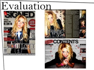
  • 3. My Media Conventions Here is my strap line, strap lines are made so they stick in the audiences head, ‘the worlds number one music magazine’ shows that the magazine popular world wide showing it must be good. Again this is a typical magazine convention. The name of my magazine is ‘Signed’ Implying being ‘signed’ as a band or an artist, I thought this would represent that in this magazine is all good music as all the artists in it are ‘signed’ artists. I used bold black writing as it went well with the dress in my main image and it suited the house style. Plus, black stands out as it is bold and can catch the readers attention. Usually on magazine, Mastheads are at the top of the magazine in bold writing, again I have followed this convention. Here again i have added a little tag to the Masthead, it makes the writing stand out as it is read and it reads ‘all of 2009’s best music inside’ this attracts all the big music fans as they want to know what the best music was. Here are some offers, words like ‘free’ attract the readers attention as they know they’re getting more for their money. Many magazines use this technique in order to sell their magazines. I made the word ‘free’ bigger and in a different colour in order to make it stand out. These cover lines are ones I made up in order to catch the readers attention, I used very famous celebrities to engage star appeal. I made the more eye-catching words different bolder colours in order again to catch the audiences eye. I used these in the left third so when the magazine is on the shelf these cover lines can be seen and read easily. This is a magazine conventions which I've followed. I feel that the main image is a powerful image and would instantly engage the audience and cause them to want to find out more, the image denotes a girl with a knife but connotes danger, fear and suicide. Again the image is holding eye contact with the audience like most main images on magazine covers and her outfit matches the house style. The main cover line is simply the artists name ‘Pixie Lott’ i used this name as Pixie is an up and coming star that some people my not know a lot about and my want to find out about. I chose black with a white outline as it stands out again on the background and the dress. Additionally it fits the house style of the magazine. Barcode, Date and Price. These are something every magazine have. I chose a reasonable price that my audience research proved was acceptable and I used the date that I finished the magazine.
  • 4. The main image is of the same girl on the front but a more emotional image as she looks quite down, however again she is holding eye contact, engaging the audience. With this image I tried to follow the principle of thirds, this makes the image/composition more interesting. Most magazines and photographers use the principle of thirds in order to make their images different to everyone else's. I used the right hand third for smaller images, this make the page look nicer to the audience and stops them being put off by a lot of writing, it also makes the page more interesting and shows other sides to the artists personality. The introductory paragraph is a short paragraph in which gives brief details into the article, nearly every article has one, I used two thirds of the page for mine. I used a dark background on the right hand side in order to balance the double page with the image on the other side as this image is lighter coloured. Here I have challenged the Gutenberg diagram and chosen to put the artists name at the bottom of the left hand page and slightly to the right. I ussed a light grey with a black outline to soften the image as the picture behind the writing is more soft then the one on the cover, grey also goes well with the background of the image as there is grey flowers. I used some pull quotes in the article to help catch the readers attention, i used some of the more interesting sections of the article and made them bolder, most magazines do this to catch the audiences eye and make them want to read more. It also breaks the article up making it look easier to read for the audience. This is another convention I used. Here I have used the same headline that is on the front cover, this allows the audience to know which article they are reading and makes it easier for them to find it after seeing it on the front. It also gives the reader an idea of what they are about to read, however it doesn’t give them that much of an idea that they already know the story. I used a smaller different font compared to the artists name so that the audience can tell the difference between the two texts. I wrote the article according to what a lot of celebrities have problems with but never actually talk about themselves, we usually just hear the rumours. I chose to write about a celebs problem as it make the audience feel better, the audience the realise that everyone has problems and that the people you see in the media everyday are not perfect. I also thought that it would be interesting for the audience to see what a certain celebrities past is like.
  • 5. I used the pattern from the original background as the background for this page in order to make it look more interesting and less plain. For the contents title I have kept the same font and colour as the front cover, this is so the house style remains throughout and the magazine looks more professional as everything matches. I have used bigger text for the title of the pages and then smaller for the details, this allows the audience to scan quickly to see what their looking for without having to read the details if they don’t want too. Here I have used extra images in order to give the audience an idea of what’s going on in the pages mentioned and also to make the page look more interesting. I have stuck with the house style of the magazine for the contents, I have used black reds and greys like I have one the front cover. This makes the magazine look more professional and tidier. For the main image on my contents page I have used the cover star again with eye contact, this catches the audience’s attention and again lures them in. The girl I have used as my artist is pretty and attractive, this again catches peoples attention and lures them in. I have used a red background behind the page number in order to catch the readers attention, after all a contents page is meant to tell you page numbers.
  • 6. My Social Group Normally in the media certain social groups are represented in certain ways, for example rock stars will be represented as rebels and bad, however I have tried to break this and I have used a young blond girl but I have made her look powerful and rebellious. I have done this so that the audience are drawn in, it is an unusual image as she is holding a knife to her throat, this instantly connotes danger and death. This is usual to see used with a young innocent looking girls. Therefore I think that I have broken the stereotype of how young female pop stars are usually represented as my artist is not a innocent feminine artist. I have used a very neutral house style, this helps appeal to a wider audience. The red grey and black colours suggest danger and warning, red is usually used to alert someone and catch their eye so the red represents importance and catches the audiences eye. This again represents the artists to be important but maybe in trouble, this links to the audience as it may attract people who have encountered a problem with death or knife crime. However the audience most likely to read my magazine would be teenagers and older adults, anyone who didn’t read the magazine but seen the cover might get the wrong idea from the cover as it could be interoperated as teenagers and knifes.
  • 7. Institution IPC Media is one of the biggest music magazine distributors, it is the business behind the likes of NME, i thought this would be the best institution to have behind my magazine. This is because NME is one of music's biggest magazines and has a huge fan base. NME has been around for a long time and has covered the likes of Morrissey and U2, this obviously shows that IPC Media is a wealthy company worthy of having good advertising and looking after their clients. This would benefit my magazine as it would need good advertising in order to become popular. Also NME is similar to my genre of magazine, this would help as the audience that has already been created by NME would think that as it is made by the same company they must be similar and equally as good. It would also widen my audience as NME is associated with punk rock, there is an element of that in my magazine and with it being through the same company NME could advertise my magazine in theirs. However I think Emap would also be a good company to have involved with my magazine as it has 59 magazines of mixed genres, this means the company has a very wide audience and could do a lot of advertising for my magazine in these other magazines. Emap is the institution behing Smash Hits which was one of the biggest music magazines ever, this shows the company are good at advertising and already have a large audience. Smash Hits is similar to my magazine as it deals with music and real life events. This shows that it is popular with the public and could help my magazine.
  • 8. Audience The audience for my music magazine would mainly be teenagers as the main music era is the modern day music and what is in the charts that week. I also found out through my audience research that female artist are bigger in the charts today, this is why I used a female on the front, however, less men are likely to buy a magazine with another male on the front then they are a woman on the front. This again widens my audience to more men, because there is a pretty woman on the front attracts more men as well as women. Women aspire to be like her and men want to see more of her so here I am attracting a wider audience. My audience research shown that more people wanted to buy music or music magazines weekly, this made me decide to sell my magazine weekly as it would make more money and attract my audience. It also shown that neutral colours were more attractive, the majority of my audience preferred the front cover with colours like black white and another colour, this is because it made the cover look more bold and attractive.
  • 9. Attracting the Audience. To make my magazine stand out and jump out at the audience i have made sure i have used bold writing with bright colours, for example the writing is bold and in red, this connotes danger and is instantly catches the readers eye as we are used to looking out for red as danger. The house style is simple which makes it easy on the eye and easy to read. It attracts the audience because it is simple and they want something easy to read and flick through. I have kept images to a minimal on the front so I could fit more cover lines on, this gives an insight to the contents on the magazine and the genre. I kept most writing in the left third, this is so when stacked on a magazine stand the cover lines can be seen and read easily. This again makes it easier for the audience to distinguish what magazine it is and whether or not they would like to read these articles. The image I have used on the front is a young girl pop star, this attracts a female audience as the aspire to be like her, also, the cover line ‘the truth behind the fairytale’ suggest that there is something wrong in her life. This shows that not all celebrities have a perfect life style and the audience can relate the problems. This is key to the thought of people only buying magazines because of the notion of self identity. I have kept the language to a informal simple language as it makes it easier to read and can appeal to a wider audience, the younger audience can then understand it more and again this will help decide if they should buy it or not.
  • 10. Skills One of the most important skills I learnt about the programs used was how to refine edges on Photoshop, I used this on nearly everyone of my pictures in order to make the page look smoother and more professional. I also added shadows to all the images and texts to again make it look more professional and realistic. In these images I also made them look more professional by changing the contrast and brightness, I thought this skill was very useful as it gave the images a complete new look. I found taking the pictures quite hard as the lighting never seem to be right at first, however after some practice and experimenting with the camera it became easier and I learned that putting the light behind the camera gave a nice effect and made the image clearer. I also made sure my front cover artist had good eye contact, I found that this make the image more powerful. To do the background on my contents I had to find a pattern and cut it out using the magic wand tool, I then had to change the appearance to black and white and then make it more opaque, I did this by going to tools, and changing to black and white and then in the top right had side of Photoshop there is a slide bar which changes the opaqueness, I used this to create and fainter effect. Here I have cut out the white background from around the text, added a border and a shadow, this makes it stand out and look more professional. I did this using Photoshop, the magic wand tool and then changing the FX of the image.
  • 11. What I Have Learnt In my preliminary task I used bright but quite pale colours, which overall didn’t make the product eye catching, this made to realise that bold colours are more easy on the eye and attractive. Also with the Preliminary project I rushed through it and didn’t pay attention to detail, I also realised with my main project that the littlest detail can make a big difference. With my final piece I made sure I was more careful when cutting images and text out as smooth edges make a magazine look more professional. I found this out by looking at my preliminary project and the images on the pictures weren’t very neat. This made it look messy and rushed. However when creating my preliminary task I learnt how to used the functions on Photoshop well, it made me feel comfortable with what I was doing and made it quicker for me to use. It help me become more familiar with the programme and how it works.