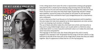
1. In this rolling stones front cover the artist is represented as being quite gangster
and powerful this is shown by him wearing a big and long chain also by having
piercings such as his ears and nose and by wearing a bandana this makes him look
more unusual as not many men have these types of piercings and don’t always
wear jewellery. around his head as this shows he still shows he still represents
where he comes from and that he hasn’t just changed because he is now famous
and a millionaire.
It uses a close up so that it just focuses on his facial expression and his jewellery
this also makes him look more powerful as his facial expressions are more serious
as he’s not showing much emotion or feelings.
The use of black and white makes the artist look more artistic and masculine as
they aren’t using childish bright colours such as pink which is a feminine colour
unlike black which is a more masculine and harsh colour so it makes the artist look
more masculine and powerful.
The language on the front cover also shows what genre the artist is mainly
targeted to for example it said ‘50 greatest hip-hop songs of all time’ which is in big
bold font to the left of the main part of the image which shows that they are linked
together. Also his appearance shows that he is in the hip-hop genre.
2. In this rolling stones double page spread Solange Knowles is
seen as being quite fun and unique as seen in the smaller
images in the black and which at the top of the double page
spread whereas in the larger image in bright colours she is
seen as being more serious this is shown by her facial
expressions this shows there are more than one side to her
characteristics as she is being represented as being fun and
outgoing but can also be serious and more mature which is
shown by her facial expressions and by the way she is standing
as in the smaller background images she is jumping around
and dancing.
The language and text makes her seem more forward and rude
as it says ‘the outspoken solange Knowles’ this represents that
she isn’t just a nice, well mannered female.
The colours used for the back ground images are mainly black
and white this stops it from standing out as much from the
brighter images. The brighter colour images makes her stand
out more as being a more serious and less fun person as it
makes this image sand out more.
3. In this contents page the artist is seen as being
more feminine as she is wearing quite a bit of
make up and has big curly hair, she is also seen
as being more serious and mature as seen by
her facial expressions. As she is pulling more of
a stern and serious face this could be seen as
being more sex appealing as she is also pulling
her hair away from her face. She is also in
mainly dark colours which make her look more
mysterious and sophisticated as she is not in all
bright colours and been made to look silly and
childish.