
Recommended
Recommended
More Related Content
What's hot
What's hot (20)
Viewers also liked
Similar to Analysis of music magazine
Similar to Analysis of music magazine (20)
Recently uploaded
Recently uploaded (20)
Analysis of music magazine
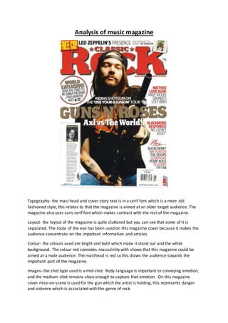
- 1. Analysis of music magazine Typography- the mast head and cover story text is in a serif font which is a more old fashioned style, this relates to that the magazine is aimed at an older target audience. The magazine also uses sans serif font which makes contrast with the rest of the magazine. Layout- the layout of the magazine is quite cluttered but you can see that some of it is separated. The route of the eye has been used on this magazine cover because it makes the audience concentrate on the important information and articles. Colour- the colours used are bright and bold which make it stand out and the white background. The colour red connotes masculinity with shows that this magazine could be aimed at a male audience. The masthead is red so this draws the audience towards the important part of the magazine. Images- the shot type used is a mid-shot. Body language is important to conveying emotion, and the medium shot remains close enough to capture that emotion. On this magazine cover mise-en-scene is used for the gun which the artist is holding, this represents danger and violence which is associated with the genre of rock.
- 2. Language- the language that is used it laidback and approachable for the audience which is good because it would be more appealing to the audience. The language used is short and straight to the point. An example of this is “Axl VS the World!” this would grab the audience’s attention because they would be eager to know what is going on with the artist. Conventions- this magazine is conventional for this type of genre which is classic rock. This magazine is conventional because the font used is bold and looks slight old fashioned and rugged which fits the genre of classic rock. The page layout is conventional because it follows the route of the eye and the masthead and cover story text are both in large font and the cover lines are in a smaller font.
- 3. Typography- they use serif font which fits the genre because the magazine is retro and vintage. The headers are bold which grabs the audience’s attention. Everything else is in small print. Layout- the layout of the contents page is very ordered because everything is based around the image of the artist in the middle of the page. This shows that the artist is significant and that the information on the page may be about him. The route of the eye has not really been used on the contents page because all of the information has been set to one side. The route of the eye may have been used if the publishers want the audience to see the header and the image and then the image which says subscribe in it at the bottom of the page. Colour- the colours on the contents page are mainly black and white which fits in with the retro and vintage theme which works well to represent the genre. The colour red has been used which shows masculinity and violence in some cases. The magazine might have an aggressive vibe to it which works well with the genre of rock.
- 4. Images- the shot type used is a medium-long shot which shows his guitar and leather jacket which a stereotypical for the classic rock genre. The use of mise-en-scene is conventional and the leather jacket shows he is rebellious. Language- the language used is short and simple which makes it appealing to the audience and it would attract them to the magazine because it is easy to read and understand. Conventions- the image of the artist is conventional because it fits in with the genre and fits the magazine type because the mise-en-scene used is appropriate and conventional for the classic rock genre. The font is conventional as well because is retro and vintage which suites the genre.
- 5. Typography- they have used serif fonts for this magazine spread page and this makes it seem like a more formal which doesn’t really suite the genre because the rock genre isn’t seen as being formal. The font is in the colour red which shows masculinity and could show aggression. Layout- the layout of the contents page is very ordered because everything is based around the image of the artists/band to the left hand side of the page. This shows that the artists/band is significant and that the information on the page may be about them. There isn’t really any use of the route of the eye in this magazine spread because all the information is placed to one side and the image is the centre of attention. Colour- the colours used are masculine because they are black and red. The colour black is usually seen as a sinister colour which works well with the image because in the image two people have axes at their throat which is a very evil and sinister act. This could also represent the type of band and genre. The colour red is associated with blood which fits in with the sinister act of the image. Images-the shot used is a medium long shot which shows the full image and some of the background. The mise-en-scene used in the image is like what a criminal would wear so it goes with the genre because it is rebellious and aggressive. Language-the language used is short and simple which makes it appealing to the audience and it would attract them to the magazine because it is easy to read and understand. This is good because it would attract them to begin to read the article. Conventions- the image is conventional because it looks aggressive and rebellious which fits the genre and the colours used are also conventional because they show masculinity and aggressiveness.