
Recommended
Recommended
More Related Content
What's hot
What's hot (20)
Similar to Magazine cover analysis
Similar to Magazine cover analysis (20)
More from GurjitSembi
Recently uploaded
Recently uploaded (20)
Magazine cover analysis
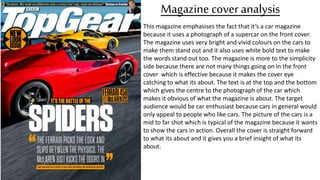
- 1. Magazine cover analysis This magazine emphasises the fact that it’s a car magazine because it uses a photograph of a supercar on the front cover. The magazine uses very bright and vivid colours on the cars to make them stand out and it also uses white bold text to make the words stand out too. The magazine is more to the simplicity side because there are not many things going on in the front cover which is effective because it makes the cover eye catching to what its about. The text is at the top and the bottom which gives the centre to the photograph of the car which makes it obvious of what the magazine is about. The target audience would be car enthusiast because cars in general would only appeal to people who like cars. The picture of the cars is a mid to far shot which is typical of the magazine because it wants to show the cars in action. Overall the cover is straight forward to what its about and it gives you a brief insight of what its about.
- 2. The atmosphere of the magazine is very dark, negative and the colours are very basic. This shows that the magazine is about business and it sends a serious mood. The model is in the front of the main title and he covers most of the magazine to show that he's the main figure. The font is bold and stands out from the rest of the magazine cover because of its light colours and bold writing. The model is wearing a suit which shows that this magazine is very formal and he is holding a baseball bat to hint of what the magazine is going to be about. Overall the magazine cover is very uncomplicated and simplistic which shows that the magazine just want to make a point. The thing I dislike about the cover is that the models suit matches in with the background because they are almost the same colour. I dislike this because the model could stand out more in a different colour which will make the cover overall stand out more. The reason I like the cover is because it has a neat layout which suggests that the magazine is clear and the content is straight forward. Magazine cover analysis
- 3. Magazine cover analysis The magazine cover has very large title to make it eye catching and to make sure it can be seen from far distances. The masthead dictates around half the magazine cover which suggests that is wants to promote its branding to make people more aware of the logo. The colour of the text is black and white which gives a formal/business look which the magazine must be aiming for. The background of the magazine cover is grey which makes the content on the magazine cover stand out and it also gives a neutral feel. The atmosphere of the magazine is calm and peaceful because there's not many things going on in the magazine cover and the colour scheme is not bright with exotic colours such as yellow, orange and lime. In the lower half of the magazine cover there's a picture of Jay-z and Warren Buffett, the picture of Jay-z is in front of Warren Buffett and Jay-z is also taller which suggests that the newer generation is taking over the businesses. The reason I like the magazine cover is because it sends a calm atmosphere and it has a formal and professional look which suggests it has useful information. The reason I dislike the magazine is because it is to simplistic and I think the masthead should be smaller and the photographs of the Jay-z and Warren Buffet should be bigger so they can dominate the page
- 4. Magazine cover analysis The magazine covers title is in lower case capitals and its in bold writing, it also has a red outline to make it stand out further so it can raise its brand awareness and advertising. The background of the magazine is yellow which makes the magazine cover stand out and it makes the objects on the magazine cover look more defined and clear such as the cars and the texts. The colour of texts are red, black and white. The red text is used to give a warning, the white text is used to give a neutral feel and the black text is used to tell the basics of what is needed to know e.g. the brand of the car. On the top and bottom of the magazine there are adverts of other cars which are placed there to not take attention from the spotlight car (Lamborghini). The magazine has a very faded Lamborghini logo in the background which creates the effect of the Lamborghini being the domination and the main subject of the magazine. I like this magazine because it is distinct from other magazine covers because of its colour choices, layouts and how it is mostly made by computer generated imagery. I dislike this magazine because I think it needs to have more photographs of cars to make it seemed more filled and less empty.
- 5. The magazine has a colour scheme of white, yellow and black. The yellow and white gives a positive and bright appearance to the magazine cover. The writing is big and bold so its clear to the audience and easy to read from further distances. The title is on the top of the cover and it is behind the rappers head to show that he's one of the main things the magazine is about. The rapper is wearing casual clothing to show that the magazine must be about events of the peoples life. His clothing is also very simplistic and basic so he can relate to audience the magazines appealing to. I like the colour scheme of the magazine cover because it gives off a fun and creative mood and it sends a very calm atmosphere. I dislike the way the sub headings are covering parts of the singer because it makes the magazine look over the top . Magazine cover analysis
- 6. The magazine is controlled and dominated by the rappers face to hint that the magazine is mainly focusing on him or he might have the most important story in the magazine. Also around the rappers head there is a white outline which fades to black as it goes to the edge of the magazine to suggest that he is powerful or there is a meaning to his story in the magazine. Also the white outline maybe used to make his face leap out of the magazine cover, almost to give a 3D affect to feel more interactive with the audience. The text has colours of white and black to show that it wants to be simplistic , basic and it wants to match in with the rappers clothes which makes most of the magazine synced in colour. The masthead of the magazine cover has a text colour of white and it is in a rectangle which is red to make it more clear. The masthead is very basic which could suggest that the company wants the logo to be easily remembered. As the size of the text increases it gets outlined to show that its important but the most largest text is just made of an outline(50) which must suggest that they don’t want to cover a lot of the image. The reason I like this magazine cover is because of the black and white colour scheme and the simplicity of the content although the magazine cover still looks full. All of this put to together makes it look professional. The reason I don’t like the magazine cover is because the magazine logo covers some of the rappers head which interrupts the cover and the colour of the logo does not compliment any of the other parts of the magazine which makes the logo not fit in. Magazine cover analysis