
Recommended
More Related Content
Similar to Content page analysis 3
More from GurjitSembi
Recently uploaded
Recently uploaded (20)
Content page analysis 3
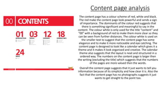
- 1. Content page analysis The content page has a colour scheme of red, white and black. The red make the content page look powerful and sends a sign of importance. The dominants of the colour red suggests that there is something significant and meaningful to say in the content. The colour white is only used for the title “content” and “00” with a background of red to make them more clear so they can be seen from further distances. The colour white is used on the smaller text to suggest that the content page has some elegance and to make it more noticeable and eye catching. The content page is designed to look like a calendar which gives it a theme and it makes it look organised and creative. The calendar theme also suggests that the layout is neat and structured in a ordered way. The numbers on the content page is larger then the writing (excluding the title) which suggests that the numbers of the pages are more valued then the words. Overall the content page suggests that it just wants to tell you information because of its simplicity and how clear it is. Also the fact that the content page has no photographs suggests it just wants to get straight to the point too.