
Recommended
More Related Content
What's hot
What's hot (17)
Viewers also liked
Similar to Contents page analysis
Similar to Contents page analysis (20)
More from GurjitSembi
Recently uploaded
Recently uploaded (20)
Contents page analysis
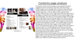
- 1. Contents page analysis The layout of the contents page is very spread out which suggests it wants to be basic and clear. The font of the content page is very average with no bold or italic effect to maybe show that it wants to get straight to the point. The content page has a mix of colours such as green, pink, orange, red and blue on the edge of the left and right side of the page to make the atmosphere of the content page more vivid and bright. The colours at the bottom edges of the page have a high opacity but as you go higher the colours opacity starts to decrease which makes it stand out and interesting. The colours that are on the edge of the page on the left are parallel to the right(vise-versa) . The content page has got 8 photographs from the other pages in the books to show what's included which gives a brief image of what the book is going to have init. The photographs and text are not very colourful which doesn’t make you focus on them when you first look at the content page, instead you focus on the edge of the page due to the vibrant colours. Overall most of the content page is very basic and simplistic which makes it dull and boring, although the colours on the edge of the page make parts of it stand out and give off a nice effect, the majority is dominated by dull colours.
- 2. Contents page analysis The contents page has very few things on it but sections of it still look filled due to the large and bold font of the text. The large text dictates and fills up the right side of the contents page to maybe show how powerful and meaningful the words are to the book. It also shows that these words send a message of importance and they summarise what the whole book is about. The text must also be large to see from far distances. The colour scheme is very simple-minded because the there are two colour scheme combinations used which are black on white or white on black. The colour scheme makes the book look professional because it shows that they have used a limited amount of colours and they have made the most of it. Under the large texts there is very small writing which acts as a underline to the larger texts. The atmosphere of the content page is calm due to its simplicity of content included and serious due to its black and white colour scheme. In the top left corner there is writing included which doesn’t fill all the page, maybe to suggest that it doesn’t want to shock the reader of how much content is included. Overall the contents page is basic and the size of the text controls most of the content page to show that it wants to focus of what's in the book.
- 3. Contents page analysis The contents page has a colour scheme of red, white and black. The red make the content page look powerful and sends a sign of importance. The dominants of the colour red suggests that there is something significant and meaningful to say in the contents. The colour white is only used for the title “contents” and “00” with a background of red to make them more clear so they can be seen from further distances. The colour white is used on the smaller text to suggest that the content page has some elegance and to make it more noticeable and eye catching. The contents page is designed to look like a calendar which gives it a theme and it makes it look organised and creative. The calendar theme also suggests that the layout is neat and structured in a ordered way. The numbers on the contents page is larger then the writing (excluding the title) which suggests that the numbers of the pages are more valued then the words. Overall the contents page suggests that it just wants to tell you information because of its simplicity and how clear it is. Also the fact that the content page has no photographs suggests it just wants to get straight to the point too.
- 4. Contents page analysis The contents page doesn’t use large size text like other contents pages but instead this contents page uses more pictures to fulfil the lack of large text. The contents page focuses more on the photographs then the text because the photographs dictate a higher percentage of the page and they are much more eye-catching then the text. The colour scheme is mainly red and white, the red is used to make the important sections of the contents page more noticeable because there is some sort of red surrounding them and the white is used for the background which gives a neutral and bright atmosphere. The contents page can be separated into three section vertically which could be left, right and centre. The left side has photographs, the right side has text and the centre has a small amount of text and a higher amount of photographs. The contents page is filled up with writing and pictures which symbolises that it is complete with information and it suggests that there must be useful information. Overall the contents page has well layout because it looks organized and neat. The colour scheme makes everything look clear and helps certain things more noticeable.