Z Score,T Score, Percential Rank and Box Plot Graph
As media magazine cover + contents analysis.
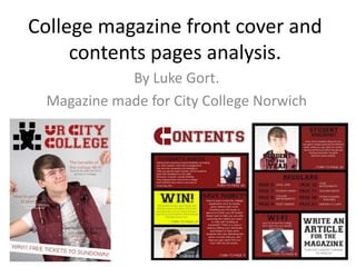
1. College magazine front cover and
contents pages analysis.
By Luke Gort.
Magazine made for City College Norwich
2. What works?
What I think works in my magazine front cover is the masthead, I have developed the name of the magazine
to look very formal as it is going to be targeted at college students by using a serif font in which is used in
many colleges so the college students will relate to the magazine. Also what I thought worked in the
masthead was that I used the city college logo and developed it into characters such as the ‘U’ and the ‘C’ to
be used in my name of the magazine and the students will know that the magazine is specifically made for
City College Norwich. I have also made the masthead at the top of the magazine like mastheads on other
magazines so they are visible when on shelves.
Here you can see
Here you can see the that I have used a
usage of the City Serif font used in
College Norwich logo in many colleges for
the ‘U’ of my masthead. the masthead name
of the magazine.
What else I think that works is the house style of the magazine as it has a constant colour throughout the
Magazine being a dark red, white and black as it is used in the font, the background and even in some of the
pictures such as the lead image.
Here you can see a dark red used in many
instances of the magazine.
Here you can see white used in many
instances of the magazine.
3. What else works?
What else I think that works in my college magazine is the logo in the masthead as I have developed the City
College logo into a logo for the magazine and I have placed it in the top left hand corner so it is easy to view
when on the shelves and is viewed as part of the masthead.
Here you can see that I have used the City College logo to make a logo for the
magazine in which also I made black to fit in with the house style of red, white
and black.
What else I think that works is a box on the first contents page in which contains where the reader can win a
prize, I feel that this works as it stands out from everything else drawing the reader in to read it and possibly
skip straight to the page that they can win the prize on.
You can see this box draws in the reader as it uses a bold font saying win
and a very bright colour being yellow in which is very noticeable around the
other darker colours.
The opacity of the boxes on the contents page also works well as you could
easily see both the text aswell as the image/background behind it.
The models I have used in all of my images also work as they are
students at City College Norwich making them relevant to the magazine.
4. What doesn’t work?
What I feel doesn’t work is the subheads as they are all the same size with no main story on the front, the colour
of the subheads also make they fairly hard to read as it was there was littler colours that you could see on all the
different colours of the picture behind it. The opacity of them was therefore not very good.
Here you can see hardly see the subhead as the picture behind it is a mixture
of both dark and light colours so I was unable to find a colour that fit in with
the house style and went over the picture as well.
What else I think that doesn’t work is the background of the pictures, I feel that the pictures that should have been
taken are action shots of the students in other environments such as outside or at least the photos could have
been taken professionally with a more consistent background in all of the pictures.
Here you can see that the background is not consistent as it has a black line
through it which doesn’t show a students environment or a professional
photo background.
5. What I found difficult:
What I found difficult was the adjusting of the gutter on my magazine contents page as it was hard to keep the
boxes with information on where to find certain stories within the magazine in line with each other.
Here is the gutter that I found hard to adjust.
What else I found difficult was the making up of the stories and keeping an even amount of both features and
regulars in the same page attempting to not put them on the same page, I found it hard also writing what was
contained within these stories to tell the reader in the contents page. I also found it difficult to take pictures for
the separate articles such as the part on the City College Wi-Fi.
I found it difficult in matching colours with the house style and the background as it was hard to find colours
that I could put over certain pictures as the pictures had a variety of dark and light colours on them.
I also found it difficult making a font for each of my articles on the contents page in which resembled the
name of the college magazine on the masthead.
6. What I found easy:
What I found easy was the taking of the pictures as the camera that I used was a professional camera and it used
and auto-focus feature in which helped me get a good quality image.
What else I found easy was the matching of colours of the boxes, masthead and pictures with my house style as
the three colours I find very attractive and use in most of my work and pictures I take during my life anyway.
I also found it easy making and positioning the logo for my magazine as all I had to do was take the logo from City
College Norwich and transform it into my own logo and then get an idea of where the logo would be on other
magazines and move it into the top left hand corner making it into the masthead.
I also found it easy making the banner as all I did was think to myself what people want to see and that is that
there is prizes available so I put the available prize in the banner, made it clearly visible by making the banner
white and making the text a dark colour.
Here is the clearly visible banner.
I found it easy placing the different objects and boxes on the front cover and contents page into attractive
looking places.
7. What I have learned:
What I have learned is to use advanced tools and techniques on Photoshop at a good pace in which I can
successfully created objects such as my logo to a good standard.
I have learned the professional names for things such as the masthead and the definition for these such things.
I have learned what the expectation of a magazine front cover is.
8. If I had all the money and time in the world I would:
- Take much more professional photographs with models, better camera and a more appropriate background.
- Spend more time matching colours and making the opacity of everything a lot better for the reader to see.
- Think up better ideas of articles or hire people to do so for me.
- I would research further into other magazines to get a better idea on how magazines are set out.
- I would send out a questionnaire asking people what they would want to see in a college magazine and what their
favourite colours are to make the magazine more attractive to a college audience.
- I would see what kind of people would actually buy a college magazine and when I think I have finished my
magazine I would see if people like it and what they would change about it so I could develop it further.
- I would make things more detailed such as the masthead for my magazine and I would position things better.