SlideShare a Scribd company logo
1 of 2
CD FRONT COVER AND
BACK COVER
BY LUKE GORT
I made a Cd front and back cover for a made up group ‘fixaz’ and gave it a made up title ‘cutting shapes’ and the genre for this album was
dubstep.
I felt that this album artwork fit in very well with the genre dubstep as I used many words that people nowadays use to refer to dubstep. As
the background I used a plain black piece with ‘wub’ written all over, on both the front and the back cover as ‘wub’ it what the how the beats
in dubstep sound so therefore when the audience sees the album art they will notice that the genre is dubstep. I also named the album
‘cutting shapes’ because that phrase refers to partying hard (parties being where the majority of dubstep is played). I made the title of the
album and the album artist in a font in which resembles concrete as the people who tend to listen to dubstep refer to it as ‘hard’ and
‘heavy’. The names of my songs, written on the back too fit in well with the genre of music with songs relating to party and bass. On the
front cover of the CD I used many pictures of me making a ‘dubstep face’ in which is a crazy face people supposedly get when listening to
dubstep.
On the front and back I used a pitch black background with ‘wub’ in bright colours such as green, yellow and purple all over it to make the
album artwork colourful and eye-catching. On the front cover I used a white, concrete-like font in which was sans-serif so it would stand out
from the background; I also made it fairly large so it was clearly visible to the customer. On the front cover of the CD I also place many
pictures of me making a dubstep face as I thought the CD cover wouldn’t look at attractive without actually pictures taken and placed on it;
the effect I gave with these pictures was a reflecting effect by duplicating images and placing them opposite each other. I felt that all these
features worked and look well on my final CD cover.
Some of the features I thought that didn’t work are the names of the songs, not the names themselves but how they are placed on the back
cover of the CD as they are placed on some white spray paint like backgrounds each in which all look fairly amateur. Also the back of the
CD has its credits and barcode in the right position but I feel I have worked my artwork around them and not worked them around my
artwork as they now stand out too much; I also made the font for the credits too large as well.
I felt that the most difficult part of designing the CD cover on Photoshop was the cutting out of the pictured of me using the magnetic-lasso
as if a mistake was made I would have to start it over again and it was tricky getting the cutting out of the shape accurate. This also made it
hard to fit it onto my CD cover as certain pictures were abnormal shapes and didn’t fit together.
I learnt from making this CD how to cut out specific parts from pictures, how to get rid of white blanks from pictures etc, how to edit fonts
e.g. distort them and how to edit the colours of pictures. I have also learnt how to use the tools efficiently and how to create things as quickly
as possible.


If I had more time then I would take better pictures with a better quality camera using better lighting etc. and I would cut them out better
on Photoshop if I had more time. I would also take more time producing the names into the same font as the title and artist name of the
album however that would have been a lengthy process. I would make the credits and barcode stand out less and also add a record label.

More Related Content

What's hot

What's hot (18)

Digipak
DigipakDigipak
Digipak
 
DIGI AND MAGAZINE ADVERT
DIGI AND MAGAZINE ADVERTDIGI AND MAGAZINE ADVERT
DIGI AND MAGAZINE ADVERT
 
In vibes
In vibesIn vibes
In vibes
 
Digipak Design Ideas
Digipak Design IdeasDigipak Design Ideas
Digipak Design Ideas
 
DIGIPAK ANALYSIS
DIGIPAK ANALYSISDIGIPAK ANALYSIS
DIGIPAK ANALYSIS
 
Digipak production
Digipak productionDigipak production
Digipak production
 
First draft
First draftFirst draft
First draft
 
Digipak Planning & Creation Process Powerpoint
Digipak Planning & Creation Process PowerpointDigipak Planning & Creation Process Powerpoint
Digipak Planning & Creation Process Powerpoint
 
More digipak changes!
More digipak changes!More digipak changes!
More digipak changes!
 
Dan Croll Evaluation
Dan Croll EvaluationDan Croll Evaluation
Dan Croll Evaluation
 
Digipak Conventions
Digipak ConventionsDigipak Conventions
Digipak Conventions
 
Digipak planning
Digipak planningDigipak planning
Digipak planning
 
Ancillaryworkoutside
AncillaryworkoutsideAncillaryworkoutside
Ancillaryworkoutside
 
Album cover final evaluation
Album cover final evaluationAlbum cover final evaluation
Album cover final evaluation
 
AS Media Evaluation Q2
AS Media Evaluation Q2 AS Media Evaluation Q2
AS Media Evaluation Q2
 
CD Case Study 1
CD Case Study 1CD Case Study 1
CD Case Study 1
 
Cd research
Cd research Cd research
Cd research
 
Cd research
Cd research Cd research
Cd research
 

Similar to Cd front and back cover evaluation

The process of creating my cd cover
The process of creating my cd coverThe process of creating my cd cover
The process of creating my cd coverbethanywchs
 
Ancillary texts draft 2
Ancillary texts draft 2Ancillary texts draft 2
Ancillary texts draft 2jodieleighx
 
Following/Challenging Conventions: Digipak
Following/Challenging Conventions: DigipakFollowing/Challenging Conventions: Digipak
Following/Challenging Conventions: Digipaktalitha-roberts
 
Ancillary Tasks: CD Digipak
Ancillary Tasks: CD DigipakAncillary Tasks: CD Digipak
Ancillary Tasks: CD DigipakLeah Hancox
 
Evaluation question 2
Evaluation question 2Evaluation question 2
Evaluation question 2Katie Rickett
 
How effective is the combination of your main updated
How effective is the combination of your main updatedHow effective is the combination of your main updated
How effective is the combination of your main updatedFergus Bell
 
G324 Shane Dobbing Media Evaluation
G324 Shane Dobbing Media EvaluationG324 Shane Dobbing Media Evaluation
G324 Shane Dobbing Media Evaluationmediaksgs
 
Design process of digipak and album advertisement
Design process of digipak and album advertisementDesign process of digipak and album advertisement
Design process of digipak and album advertisementChloe Howcroft
 
Design process of digipak
Design process of digipakDesign process of digipak
Design process of digipakChloe Howcroft
 
Digipack presentation
Digipack presentationDigipack presentation
Digipack presentationABM06
 
Ideas for a promotional package 2
Ideas for a promotional package 2Ideas for a promotional package 2
Ideas for a promotional package 2Gatkinson27
 
Evaluation Question 1
Evaluation Question 1Evaluation Question 1
Evaluation Question 1laurenturell
 
Evaluation: Question 2
Evaluation: Question 2Evaluation: Question 2
Evaluation: Question 2LouiseJHudson
 
Evaluation Question
Evaluation Question  Evaluation Question
Evaluation Question Jack Chapman
 

Similar to Cd front and back cover evaluation (20)

The process of creating my cd cover
The process of creating my cd coverThe process of creating my cd cover
The process of creating my cd cover
 
Ancillary texts draft 2
Ancillary texts draft 2Ancillary texts draft 2
Ancillary texts draft 2
 
Following/Challenging Conventions: Digipak
Following/Challenging Conventions: DigipakFollowing/Challenging Conventions: Digipak
Following/Challenging Conventions: Digipak
 
Digipak ideas
Digipak ideasDigipak ideas
Digipak ideas
 
Ancillary Tasks: CD Digipak
Ancillary Tasks: CD DigipakAncillary Tasks: CD Digipak
Ancillary Tasks: CD Digipak
 
Evaluation question 2
Evaluation question 2Evaluation question 2
Evaluation question 2
 
Digipak ideas
Digipak ideasDigipak ideas
Digipak ideas
 
How effective is the combination of your main updated
How effective is the combination of your main updatedHow effective is the combination of your main updated
How effective is the combination of your main updated
 
G324 Shane Dobbing Media Evaluation
G324 Shane Dobbing Media EvaluationG324 Shane Dobbing Media Evaluation
G324 Shane Dobbing Media Evaluation
 
Design process of digipak and album advertisement
Design process of digipak and album advertisementDesign process of digipak and album advertisement
Design process of digipak and album advertisement
 
Design process of digipak
Design process of digipakDesign process of digipak
Design process of digipak
 
Digipack presentation
Digipack presentationDigipack presentation
Digipack presentation
 
Evaluation
EvaluationEvaluation
Evaluation
 
Ideas for a promotional package 2
Ideas for a promotional package 2Ideas for a promotional package 2
Ideas for a promotional package 2
 
Evaluation
EvaluationEvaluation
Evaluation
 
eval q1
eval q1eval q1
eval q1
 
Evaluation Question 1
Evaluation Question 1Evaluation Question 1
Evaluation Question 1
 
Evaluation: Question 2
Evaluation: Question 2Evaluation: Question 2
Evaluation: Question 2
 
Evaluation Question
Evaluation Question  Evaluation Question
Evaluation Question
 
Eq 1
Eq 1Eq 1
Eq 1
 

More from Luke Gort

Evaluation continued
Evaluation continuedEvaluation continued
Evaluation continuedLuke Gort
 
Feedback on snarekick magazine
Feedback on snarekick magazineFeedback on snarekick magazine
Feedback on snarekick magazineLuke Gort
 
Skills development
Skills developmentSkills development
Skills developmentLuke Gort
 
As media tv drama task
As media tv drama taskAs media tv drama task
As media tv drama taskLuke Gort
 
My survey used in my exhibition
My survey used in my exhibitionMy survey used in my exhibition
My survey used in my exhibitionLuke Gort
 
As media magazine cover + contents analysis.
As media   magazine cover + contents analysis.As media   magazine cover + contents analysis.
As media magazine cover + contents analysis.Luke Gort
 
Luke gort AS MEDIA chosen album artwork
Luke gort AS MEDIA chosen album artworkLuke gort AS MEDIA chosen album artwork
Luke gort AS MEDIA chosen album artworkLuke Gort
 

More from Luke Gort (7)

Evaluation continued
Evaluation continuedEvaluation continued
Evaluation continued
 
Feedback on snarekick magazine
Feedback on snarekick magazineFeedback on snarekick magazine
Feedback on snarekick magazine
 
Skills development
Skills developmentSkills development
Skills development
 
As media tv drama task
As media tv drama taskAs media tv drama task
As media tv drama task
 
My survey used in my exhibition
My survey used in my exhibitionMy survey used in my exhibition
My survey used in my exhibition
 
As media magazine cover + contents analysis.
As media   magazine cover + contents analysis.As media   magazine cover + contents analysis.
As media magazine cover + contents analysis.
 
Luke gort AS MEDIA chosen album artwork
Luke gort AS MEDIA chosen album artworkLuke gort AS MEDIA chosen album artwork
Luke gort AS MEDIA chosen album artwork
 

Cd front and back cover evaluation

  • 1. CD FRONT COVER AND BACK COVER BY LUKE GORT
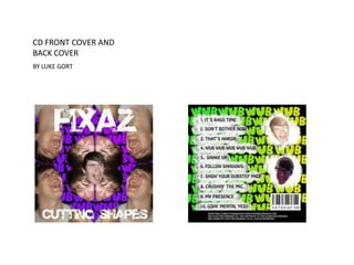
  • 2. I made a Cd front and back cover for a made up group ‘fixaz’ and gave it a made up title ‘cutting shapes’ and the genre for this album was dubstep. I felt that this album artwork fit in very well with the genre dubstep as I used many words that people nowadays use to refer to dubstep. As the background I used a plain black piece with ‘wub’ written all over, on both the front and the back cover as ‘wub’ it what the how the beats in dubstep sound so therefore when the audience sees the album art they will notice that the genre is dubstep. I also named the album ‘cutting shapes’ because that phrase refers to partying hard (parties being where the majority of dubstep is played). I made the title of the album and the album artist in a font in which resembles concrete as the people who tend to listen to dubstep refer to it as ‘hard’ and ‘heavy’. The names of my songs, written on the back too fit in well with the genre of music with songs relating to party and bass. On the front cover of the CD I used many pictures of me making a ‘dubstep face’ in which is a crazy face people supposedly get when listening to dubstep. On the front and back I used a pitch black background with ‘wub’ in bright colours such as green, yellow and purple all over it to make the album artwork colourful and eye-catching. On the front cover I used a white, concrete-like font in which was sans-serif so it would stand out from the background; I also made it fairly large so it was clearly visible to the customer. On the front cover of the CD I also place many pictures of me making a dubstep face as I thought the CD cover wouldn’t look at attractive without actually pictures taken and placed on it; the effect I gave with these pictures was a reflecting effect by duplicating images and placing them opposite each other. I felt that all these features worked and look well on my final CD cover. Some of the features I thought that didn’t work are the names of the songs, not the names themselves but how they are placed on the back cover of the CD as they are placed on some white spray paint like backgrounds each in which all look fairly amateur. Also the back of the CD has its credits and barcode in the right position but I feel I have worked my artwork around them and not worked them around my artwork as they now stand out too much; I also made the font for the credits too large as well. I felt that the most difficult part of designing the CD cover on Photoshop was the cutting out of the pictured of me using the magnetic-lasso as if a mistake was made I would have to start it over again and it was tricky getting the cutting out of the shape accurate. This also made it hard to fit it onto my CD cover as certain pictures were abnormal shapes and didn’t fit together. I learnt from making this CD how to cut out specific parts from pictures, how to get rid of white blanks from pictures etc, how to edit fonts e.g. distort them and how to edit the colours of pictures. I have also learnt how to use the tools efficiently and how to create things as quickly as possible. If I had more time then I would take better pictures with a better quality camera using better lighting etc. and I would cut them out better on Photoshop if I had more time. I would also take more time producing the names into the same font as the title and artist name of the album however that would have been a lengthy process. I would make the credits and barcode stand out less and also add a record label.