Kisan Call Centre - To harness potential of ICT in Agriculture by answer farm...
Font research
1. FREDDIE C
Font Research
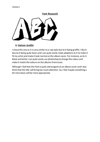
1) DaFont- Graffiti
I chosethis one as it is very similar to a rap style due to it being graffiti. I like it
due to it being quite basic and I can quite easily make adaptions to it to make it
fit my artist and makeit look normal on the album cover. For instance, as its it
black and white I can quite easily use photoshop to change the colour and
make it match the colours on the albums frontcover.
Although I feel that this font is quite extravagant on an album cover and I also
think that the title will bring too much attention. So, I feel maybe something a
bit morebasic will be moreappropriate.
2. FREDDIE C
2) DaFont- Western
I chosethis font as its very bold and really stands out, also I feel it will look
more appropriateon an album cover than the previous one. Despite it not
really fitting in with the genre I feel it will still look good with a rap style album
cover. As it has quite dull looking colours and is not very extravagant.
Modifications can also be made to this one using photoshop so it will fit the
rest of the album cover.
3. FREDDIE C
3) DaFont- Modern
I chosethis font as I feel it is different and is not like any other font. I also feel
it will fit in with the rap style album cover, it is quite bold meaning it will
attract lots of attention frompotential customers. Although the only problem
that may occur with this font is that it can easily be misread, and if this font is
on an album cover that may be an issue.
All in all, I have decided to go with font 3 because I think that it suits both the
genre of music and will look good on an album cover. Despite the slight
dilemma of it being easily misread, I feel this can be combatted by
modifications on photoshop.