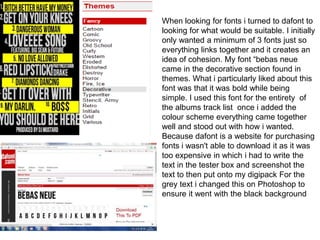
1. When looking for fonts i turned to dafont to
looking for what would be suitable. I initially
only wanted a minimum of 3 fonts just so
everything links together and it creates an
idea of cohesion. My font “bebas neue
came in the decorative section found in
themes. What i particularly liked about this
font was that it was bold while being
simple. I used this font for the entirety of
the albums track list once i added the
colour scheme everything came together
well and stood out with how i wanted.
Because dafont is a website for purchasing
fonts i wasn't able to download it as it was
too expensive in which i had to write the
text in the tester box and screenshot the
text to then put onto my digipack For the
grey text i changed this on Photoshop to
ensure it went with the black background
2. After completing the album track-list i used
the same font to get the artists name
although when i put it onto my artwork i
thought it looked too plain and the artists
name didn't stand out enough so i decided
to go back onto dafont this time i had the
intentions of looking for something the
opposite of the previous font so i decided to
look on themes and then the calligraphy
font section here i found colours of autumn
which funnily enough has a strong
resemblance to the fonts used on
Rihannas album unapologetic. The text has
an elegance while being sharp and pointy
which still gives the font its edge like the
artist herself if links with the pop art vibe
well and stands out against the other fonts
which is what i wanted to do. I would say
upon the initial look of the album cover this
font is most dominant as the name is the
2nd largest item
3. the album is named after the lead single and
the video which is bitch better have my money.
Since I only used two fonts throughout the
digipak. I decided to make mock-ups so I
could decide which fit better and looked more
appropriate initially looking at the font colours
of autumn I liked the scruffiness and graffiti
vibe it had it conformed to the genre well but
unfortunately didn't look as good on the black
background as I wanted my digipak to have a
running theme of a black background which is
why i went with the second option it also went
in continuity to the video the boldness of the
font fit with the yellow banner and gave it that
police warning tape vibe which i have in my
video as apart of the mise en scene.
4. With the digipak inside covers, a lot of my
inspiration from typography which i found
from Google. Using my font i played around a
lot with the sizing and positioning in order to
make something different and more modern. I
played around with some of the lyrics from the
song itself to create an effect for the audience
and obviously make my product more
profitable by making it more visually
appealing. The two image below are what I
looked towards to get the effect. I only used
part of one of the verse and made what in my
opinion where the most important lyrics to be
significantly larger.