1. Proposal
I’m going to be making a rock magazine for the ages of 16-35. My magazine will be aimed at both genders however my primary
audience is girls as I’m going to analyse the fashion and makeup choices of some specific rock artists. My target audience will be ABC1
as they have disposable income so they will be able to afford to by my magazine every time it comes out. I’m going to create a
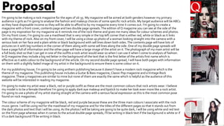
magazine with a front cover, contents page and two double page spreads.The edition of Q magazine you can see at the side of the
page is my inspiration for my magazine as it reminds me of the rock theme and gives me many ideas for colour schemes and photos.
On my front cover, I’m going to use a masthead that is very simple in the top left corner that is either red, white or black as it links
with my theme of rock. Also on my front cover, I will be using a close up photo of a woman looking straight into the camera with a
serious look on her face and a plain white or black background with sell lines down both sides.The contents page will have lots of
pictures on it with big numbers in the corner of them along with some sell lines along the side. One of my double page spreads will
have a page full of information and the other page will have a large image of the artist on it.The photograph of my main artist will be
a full body shot so that I can get in one of the outfits a rock artist would wear so when I can use it when I come to analysis of fashion.
In Q magazine they include a big red letter in the background of the text that is the first letter of the artists first name which is
effective as it adds colour to the background of the article. On my second double page spread, I will have both pages with information
on them with a slightly faded image of my artist in the background to ensure there is some colour on it.
For my publishing house, I’m going to be using anthem publishing because it doesn’t have a modern rock magazine which is the
theme of my magazine.This publishing house includes aGuitar & Bass magazine, Classic Pop magazine and aVintage Rock
magazine.These 3 magazines are similar to mine but none of them are exactly the same which is helpful as the audience of this
website will be interested in reading my magazine.
I’m going to make my artist wear a black, red or purple outfit as these are the most common colours that rock artists wear. I believe
my model is to be a female therefore I’m going to apply dark eye makeup and lipstick to make her look even more like a rock artist.
I’m going to use a photo of my artist staring straight at the camera with a serious facial expression as this is the most common pose
found on rock magazines.
The colour scheme of my magazine will be black, red and purple because these are the three main colours I associate with the rock
music genre. I will be using red for the masthead of my magazine and for the titles of the different pages so that it stands out from
the dark photos and text that I will be using.As the photos I will be taking are going to be quite dark, I will be using white and red text
on the front page whereas when it comes to the actual double page spreads, I’ll be writing in black text if the background is white or if
it’s a dark background I’ll be writing in black.