
Recommended
More Related Content
What's hot
What's hot (20)
Similar to Sketches for R&B music magazine
Similar to Sketches for R&B music magazine (20)
More from hanaa_m
More from hanaa_m (20)
Recently uploaded
Recently uploaded (20)
Sketches for R&B music magazine
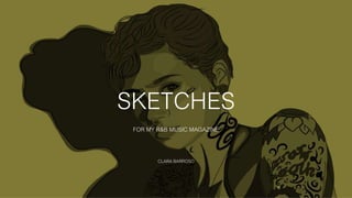
- 1. SKETCHES FOR MY R&B MUSIC MAGAZINE CLARA BARROSO
- 2. FRONT COVER This the front cover/ page sketch. I want to do a close-up or a mid shot of the model so the audience can engage with the magazine more easily. I also want for the masthead to be at the top left corner of the page and for the V, the initial for ‘Vocals’ to take most of the space on the page. This would be a way for the audience to identify the my magazine, by the use of the font and also the large capital V. The next thing that I would want it to be on large scale would be the name of the artist ‘Lisandra Silva’ on that type of font in gold so it would stand out from the whole writing on the front cover. I will also be writing cover lines on both sides as they’re important and cover lines is a huge key when it comes for my target audience to identify my magazine. The use of the barcode, price, website and date would all be placed around the top in small font of the page so it won’t get as much attention from the target audience, as all the attention should be focused on the full bleed image from this exact layout I’m thinking of creating on my front cover
- 3. INTRODUCTION PAGE I decided to create an introduction page before the contents page because I think it looks interesting and unique and because my magazine is only released monthly, I feel like the idea of creating one of these will help the target audience to keep track what issue belongs to what month. The title of this page would be the month and year the issue is released with a simple and modern layout to the page. The big introduction paragraph would be a paragraph written from the ‘founder/editor-in-chief’ of this music magazine, which would be me. The introduction paragraph would have to have information linking with the whole magazine, as next to it would be an image of the main singer of the magazine, which would be the same one from the front cover, so it all flows together.
- 4. CONTENTS PAGE I want to create a double page for my contents page however I was thinking on only including the writing on the right hand side of the page. I also wanted to have a full bleed image for the double page of Lisandra Silva for the contents page. One shot for the double page would be enough as I am trying to only make the target audience focus on the main artist for this whole issue, bare in mind there would be other artist at some point of the magazine so it doesn’t look repetitive. The colour of the full bleed image would be in black and white as it would look more effective and it would link with the magazine easily. The font for the word ‘contents’ would have been the same as the masthead so it all has a connection and I would want it to be in gold, so it followed the colour scheme of the magazine. I would wan to find the same or similar fonts to use for each category column.
- 5. FIRST DOUBLE PAGE The first double page that had to be included on my magazine, I was thinking of being a double page of introduction to the artist with her name on the left side (the same font and colour from the front cover so it has a connection), with a big bold introduction to the magazine’s article about Lisandra Silva. I would use a full bleed image from the photo shoot that I did, using the school’s studio, using a black backdrop with the studio lighting. I would want to take a mid-long shot for this page, so I would have enough black space around the artist to start writing the article. The colour on the article would be in white but the first letter of the article would have been in gold so it will have connotations with the big introduction and the small paragraph on the left side of the page.
- 6. SECOND DOUBLE PAGE From my second photo shoot, I would be using a long or mid shot for this page (so the model’s instruments are also on the shot). I would want the image to take most of the space of the page, as the right side of the image the image is fading itself with the white blind that was provided on the model’s room while shooting. The image would be placed on the left side of the page, overlapping onto the right side of the page. I will edit this shot in black and white because it would look more effective and it would flow with the whole magazine and the idea of my magazine representing the genre of R&B. I will also add gold paint strokes on the right hand side of the page, to look more effective and to go with the colour scheme so the whole page doesn’t just look black and white, so the gold paint stroke will balance out the page. I will also add the text next to it from the article and having the first letter in bigger size so the audience can recognize where the article starts.
- 7. THIRD DOUBLE PAGE The third double page is where I want my magazine to have the continuous article. I design a modern layout, as I wanted my magazine to be seen as a recent and modern magazine. The idea of the paint strokes gave an identity to the model, especially for being the colour gold, it would stand out of the page. This would link to the idea of ‘bling’ and how the magazine itself, not just the appearance from the model. I’m not quite sure what images I will be using from my photo shoot. I will be using images photos from my second photo shoot, because I feel that was the strongest photo shoot out of all the three photo shoots. The article is as important as the front cover of the magazine The pictures that I will be using will be in black and white so it matches the colour scheme and the R&B genre. The text from the article and pull quotes will be filled on the white spaces, it will look busy but at the same time it will look modern and balance.
- 8. FOURTH DOUBLE PAGE This would be the last page of my magazine that involves the article from Lisandra Silva. I was thinking of laying this page out in a more modern way compared to the previous article page. The photos that I will be using on the left side will be photos from the second photo shoot as it would link with the use of the pictures on the previous page. I was thinking of placing the rest of the text from the article on the right hand side. Also adding a pull quote on the left side as a vertical way and also on the top left side of the page in a font that would look like as of the artist/model herself has written the quote on the magazine. Hopefully there will be good a good handwritten font on ‘DaFont’ website, where it would fit with my magazine and t would link to the codes ad conventions of any other magazine.
- 9. POSTER DOUBLE PAGE This page would be more of like a page with pictures, unique and modern. I wad going to use just a full bleed image but because I already did that to a lot of my previous pages on my music magazine and I didn’t want it to look repetitive throughout the magazine, I decided to scan the polaroid's that I took during the second photo shoot and I could use them and keep them in colour, so I have colour somewhere else on my magazine not just on my front cover and also having a paint stroke at the tope of the polaroid’s, as if it was stuck with the gold paint. Next to it I will be adding a mid-long shot of the model in black and white with a pull quote in it and her signature. I’m thinking of adding another stroke of gold paint on the right side of the page. And at the bottom, from my research I found out that all magazine give thanks and shout outs to the people that helped on this to happen, so this page and my magazine can fit the codes and conventions of a music magazine.
- 10. Q&A DOUBLE PAGE For my music magazine to still follow the codes and conventions of a typical magazine, any reader would always find a Q&A that would be answered by an musician or even the same one that is the front cover of that particular magazine. I would be using a mid-shot photo from the third photo shoot, onto my magazine especially on this page. The photo will be a full bleed image so it will take the whole space of the double page. The questions and answers will be paced on the right page and maybe two little paragraphs about the introduction about this page. I will also be adding gold paint brush stroke as it will relate to the artist and make the magazine stand out, especially this page as it will look really dark. As the full bleed image itself is already dark but still effective.
- 11. REVIEWS DOUBLE PAGE I am adding a reviews page onto my magazine so it doesn’t all look repetitive and it shows variety on my magazine, it won’t just be about Lisandra Silva. I am thinking of including a male for the reviews double page spread, so at least this page be mainly aimed at my secondary audience, which is males. And from my survey results, according to my primary and secondary audience, they mainly wanted to see, firstly an R&B solo female artist and secondly an R&B solo male artist. Even though the colour scheme is equally aimed at females and males, this specific page is mainly aimed at males. I will be also writing a small interview about the album, as ‘Ross Ocean’ hit his number one on the R&B music charts. The image that I will be using will be a full bleed image, as it will be easier for me to layout the whole page and to make the page link with the colour scheme.
- 12. REVIEWS & ADVERT PAGE The left side of the page will be the continuing of the reviews double page spread, this page is where the vocals magazine will be creating their own R&B music chart, for R&B albums, the top 20 album reviews. This makes my magazine link to the codes and conventions of a typical music magazine by having reviews which makes the magazine just like any other. Next to the album I will be having out of 5 rating and what singles include on the specific albums. The right side of the page still makes my magazine link to a typical music magazine as an advert is something that you would expect on a music magazine to meet the codes and conventions. Because I had so many different shots from the third photo shoot, I decided to make an advert tour page for my magazine based on Lisandra’s U.K. ‘Bad Reputation Tour’.