Instant Digital Issuance: An Overview With Critical First Touch Best Practices
Evaluation
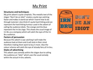
1. My Print
Structures and techniques
My print advert is quite simplistic. The metallic text of the
slogan “Don’t be an idiot” creates a quite eye catching
factor and makes it stand out which I learnt how to do
through tutorials I also think it’s quite hard hitting and can
represent the hard hitting humour used in the advert of
calling the audience idiots. The orange and the blue
represent the Irn bru logo. This shows the usual image of
Irn Bru as a company which will catch the eyes of the Irn
Bru audience.
Factors of persuasion
Because this advert is eye catching it will make the
audience look at them and it will stick in their mind
therefore making them want to buy it more. Also the
colour scheme will catch the eye of already fans of Irn bru.
Styles of advertising
This advert uses comedy within the slogan due to calling
the audience an “idiot” which uses the usual comedy
within the actual irn bru adverts.
2. Actual Print advert
Structures and techniques of tv
advertising
This uses the classic colour scheme like
mine with the usual blue writing and
orange background which shows the
normal image of the company. The image
is in black and white so it doesn’t take
your eye off the usual colour scheme. It’s
very simplistic as well.
Factors of Persuasion
The colours of the print are eye catching
again therefore make the audience is
more likely to look at it which makes it
more likely for them to go out and buy it.
Styles of Advertising
This uses comedy to sell which is Irn Bru’s
usual style of advertising and gets to their
specific audience.
3. Print Comparison
They both use the same simplistic designs with mostly text with one image. They also
use the same colour scheme with the classic blue and orange to represent Irn bru and
then anything else is in either black or white so they don’t distract the eye from the
original colour scheme. They are also laid out similarly with the image at one side and
the slogan/joke at the opposite side.
Some strengths of my advert are that the colour scheme flows well and is eye catching
to the audience a sit is the classic blue and orange which will really reach out te fans
of Irn Bru. The metallic lettering of “don’t be an idiot” is also quite hard hitting and is
what you first notice in the advert therefore that helps with the eye catching side of
the advert.
However there are also some weaknesses such as the simplicity of it I think makes it
look slightly boring to some people, if I could change anything in my advert I would of
added a little bit more detail, not too much though otherwise it would look too busy
and messy.
4. My Tv Advert
https://www.youtube.com/watch?v=jKI-
wBEB5Ww
Structures and techniques of Tv
advertising
This tv advert was put together on the
basis of the slogan “Don’t be an idiot”
in the advert the actor is tryin to open a
door, he can’t open the door then he
drinks the irn bru and works out that
the door is a pull, this a comedic way of
selling the product.
Factors of Persuasion
This advert makes it seem like the
product makes you less of an “idiot” it
also uses comedy to draw you into the
advert.
Styles of Advertising
This again uses comedy as this is a very
common thing within the Irn Bru
advertisements as it is what they’re
most well known for.
5. Actual Tv Advert
Structure and techniques of Tv advertising
This advert is about a man having a baby and how his
wife wants to name her “fanny” this again links with
the “Irn Bru gets you through” This again uses the
comedic way of advertising and this is again because
of the classic Irn Bru adverts using comedy as a
selling point.
Factors of persuasion
They have again used comedy like a lot of other Irn
Bru adverts and their rather inappropriate sense of
humour aswell.
Styles of Advertising
They use humour again and the same “Irn Bru gets
you through” humour
6. Tv advert comparison
My Tv advert shows the use of humour throughout the advert much like the actual Irn
Bru Tv advert as that is always what they are well known for and what makes their
adverts stick in peoples minds so we used that to our advantage. However the actual
advert uses it more in the idea that Irn bru will help you through things where as ours
is more of an insult like “don’t be an idiot” and that is you don’t drink Irn Bru you wont
be able to do these day to day things such as open a door. Obviously the production is
a lot better on the actual advert also but that is due to recourses.
Some strengths of my advert are that it flows really well and the shots all go well
together with the variety of shots and angles within the advert. The advert is also
fairly comedic and takes inspiration from the usual Irn Bru adverts.
However I think the main weakness was how hard it was to put sound effects onto it
and that was my main problem I managed but I think I could’ve found something that
would have worked better.
7. My Advergame
https://www.youtube.com/edit?o=U&
=wmlWJd0KApw
Structure and techniques of Tv advertising
This has been put together as it links with the other
adverts within the idea of not being able to do
everday actions. The colour scheme and the images
are to match the usual orange and blue colour
scheme with neutral colours in the background so it
doesn’t distract the usual idea. The game is a simple
space bar game therefore when you play it the
completion bar goes up.
Factors of persuasion
This as I’ve pointed out, follows the theme
throughout the different adverts, it also it fairly
comedic due to it being a simple everyday task that
the character is having to do and is struggling with.
Styles of Advertising
This is an enjoyable way of selling the product and
just makes theproduct name stick in he players name
due to them playing the game. It is also again,
comedic due to the character struggling with an
everyday job.
8. Actual Advergame
Structures and techniques of Tv
advertising
This is a simple key pressing game where the
scottish man lifts up two cans of Irn bru and
has to keep balancing the Irn bru cans which
is very simplistic but also enjoyable. It carries
on linking with the usual comedic and
scottish theme.
Factors of Persuasion
This is just a general simple game which
again keeps the name of the product in the
audiences mind. It also continues usal
themes throughout the normal adverts that
Irn Bru produe to it sticks with their
audience.
Styles of Advertising
This uses comedy and continues usual
themes throughout the other adverts with
the scottish theme.
9. Advergame Comparison
Both games are pretty simple and use a one/two button game, they are both pretty easy to
do and again both use the similar colour schemes therefore runs with their style which is
ideal. However the actual advergame sticks with a scottish theme where as my advergame
sticks to a more specific theme throughout my adverts of the not being able to do daily
tasks. The actual advergame is also a lot more detailed than mine and the differences are
more prominent than the similarities.
Some strengths of my advergame is that the colour scheme of the clothes are orange and
blue, the usual colour theme of irn Bru. It is also as detailed as I could make it due to my
lack of skills in pixel art. The flow of the animation works well with the changing completion
bar and the facial expressions. Additionally the music in the background of the 8Bit version
of David Bowies “Changes” works very well with the style of the game.
I think one of the weaknesses is the lack of sound effects and I wish I had added more
sound effects into the background other than just the background music. However the
main weakness I think is that it isnt as detailed as I would like it to be and if I could change
one thing it would be to practice more pixel art before I went onto creating the game.