Contemporary philippine arts from the regions_PPT_Module_12 [Autosaved] (1).pptx
Poster photoshoot
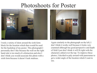
1. Photoshoots for Poster
I took a variety of shots around the sixth form
block for the location which then would be used
for the backdrop of my poster. This photograph I
personally don’t like because the wall on the right
hand side is too much of a distraction and also I
don’t think you would associate this photo with a
sixth form because it doesn’t look studious.
Again similarly to the photograph on the left, I
don’t think it works well because it looks very
crammed although has good perspective and depth
of field I just don’t think it will fit right with the
characters edited over the top. To improve these
photos, I decided to paly around with panoramas to
get a wider angle of the location which I want to
use.
2. Already, just by using panorama, the outcome is much
better. I think this works very well because it has
many layers to it and depths, however I still need to
work on perspective of the photo to get a better one. I
took these photographs on my phone, which might be
a downfall to the quality of my poster the only reason
why I did this was because of the panorama effect
available on the phone.
This is the best outcome
from the above selction
because its got a nice
perspective and I think it
will really pick out the
characters well, with one
standing in the middle
and others either side. I
think this will be effective
because it shows hints of
a school location more so
than the other photos as
there is a bin, sofa’s and
corridor showing the sixth
form common room.
3. I found the head of sixth form and took photos of him for the main attention point of my poster. I asked him to pose with
different facial expressions showing anger or concern. As seen above he did so, my favourite is the right hand one because
it really captures his emotion in his face and the way he is scrunched up looking quite sinister. I tried to find a location in
the school where the lighting was good and it was quite crammed because I wanted to get the scrunched position purposely
to really emphasis his emotion. The first one is also good because he looks very happy and pleased, this is highlighted
through his body language and again his emotion. I'm unsure yet which photograph I am to edit and manipulate into
photoshop.
Head of Sixth form
4. Students
I took photos of some students against a plain
background making it easier to manipulate into
photoshop. I asked this student to the right to hold
some folders and books to represent a student rather
than a straight on portrait. I think the clothing
represents the sixth form well, not only that but the
students.
I asked this student to look directly at the camera this
time to get a bit of variation between characters. I like
the one on the left because the lighting on her face
isn't too direct and washy and also the facial
expressions are simple so we aren’t drawn away from
the main protagonist(s) on the poster.