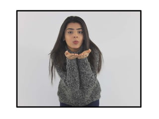
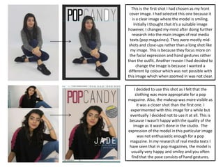
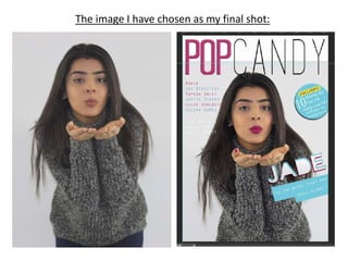
3. This is the first shot I had chosen as my front
cover image. I had selected this one because it
is a clear image where the model is smiling.
Initially I thought that it’s a suitable image
however, I changed my mind after doing further
research into the main images of real media
texts (pop magazines). They were mostly mid-
shots and close-ups rather than a long shot like
my image. This is because they focus more on
the facial expression and hand gestures rather
than the outfit. Another reason I had decided to
change the image is because I wanted a
different lip colour which was not possible with
this image which when zoomed in was not clear.
I decided to use this shot as I felt that the
clothing was more appropriate for a pop
magazine. Also, the makeup was more visible as
it was a closer shot than the first one. I
experimented with this image for a while but
eventually I decided not to use it at all. This is
because I wasn’t happy with the quality of the
image as it wasn’t done in the studio. The
expression of the model in this particular image
was not enthusiastic enough for a pop
magazine. In my research of real media texts I
have seen that in pop magazines, the model is
usually very happy and smiley and you often
find that the pose consists of hand gestures.
5. I have chosen this image as my final shot because I feel that it is
very well suited to a pop magazine. The pose relates well to pop as
it is fun and enthusiastic and engages the audience well as the
artist is blowing a kiss towards them. The outfit is not very bright
however, I can use this to my advantage as I can choose which
colours to make my magazine and it wont take the focus away from
the facial expressions and hand gestures which is more important
in a pop magazine. I am also experimenting with changing the
colours of the lips and nails as it adds a noticeable but subtle
change to the look of the image as a whole. This image is clearer
and closer than the first studio image I chose and so it’s possible
for me to change the colour of the lips and nails. This pose reflects
the personality of the artists and shares her fun nature with the
audience before they have even opened the magazine. The angle
of gaze is facing directly towards the camera which will people
want to pick it up. I have taken the image on a plain background
but I might change it to a colour. I am very happy using this image.