
Recommended
More Related Content
What's hot
What's hot (20)
Similar to Test shots poster
Similar to Test shots poster (20)
Recently uploaded
Recently uploaded (20)
Test shots poster
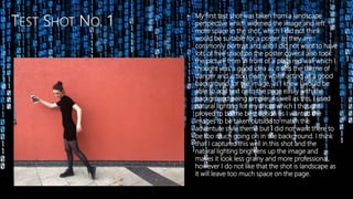
- 1. • My first test shot was taken from a landscape perspective which widened the image and left more space in the shot, which I did not think would be suitable for a poster as they are commonly portrait and also I did not want to have lots of free space on the poster cover. I also took the picture from in front of a plain red wall which I thought was a good idea as it sets the theme of danger and action clearly whilst acting as a good background for the image, as I knew I would be able to add text onto the page easily with the background being simpler. As well as this, I used natural lighting for my shots which I thought proved to be the best option as I wanted the images to be taken outside to match the adventure style theme but I did not want there to be too much going on in the background. I think that I captured this well in this shot and the natural lighting brightens up the image and makes it look less grainy and more professional, however I do not like that the shot is landscape as it will leave too much space on the page.
- 2. • Test shot number two was fairly similar to test shot number one in the sense that it was taken landscape again and the body movements and composition of my model was the same, except for her head positioning. On my poster, I wanted the actress to appear as though she is running from something so that the poster immediately demonstrates the theme of the film and gives an insight into the style of the film but still looks professional. Therefore, I decided to ask Jasmine to pose as though she is running, which I believe she did well – however I do not like so much that her arm is outstretched due to the fact that this makes the image look slightly less natural. I did prefer her head positioning in this frame though as I wanted her to look like she is looking over her shoulder, but her facial expression does not show as much fear as I would have liked. I also do not like the landscape camera angle as it leaves too much space.
- 3. 3 4 • Test shots 3 and 4 looked better than both previous test shots due to the fact that I asked Jasmine to improve her body movements which made it look much more natural as she did not look as stiff now. I was happy with her facial expression as she looked as though she was looking at someone chasing her which is the effect that I wanted. However, I feel that her arm may have been stretched out slightly too much which made it look a bit false and perhaps not so realistic. Apart from this, her mobile phone was on show and was visible to the camera which is what I wanted as the film trailer is mainly based off o technology and is focused on her mobile phone. From looking at these shots I discovered in which ways I wanted to improve in my following shots. These were to possibly take the shot from a portrait angle so that there would be less open space on the page and I could make it look more busy. Also, the camera angle is slightly wonky which I wanted to perfect so that the images looked more professional – and in test shot 3 there is a part of the window shown in the background, which I edited out in test shot 4 as this makes the image look less professional and distracts from the focus of the overall shot.
- 4. On test shot 5 I decided to improve the framing of the image by taking it from a portrait angle. This instantly made the shot look better as it left less space around Jasmine which meant that I could fill the poster easier and there would not be so many gaps. This style of framing also matches well with the common use of portrait posters used in the media and typically film posters are taken from a portrait angle. I was fairly happy with the body positioning of Jasmine in this shot as I thought that it looked natural and realistic however I still wanted her arm to be slightly more bent, so that it did not look as stiff. This is an aspect that I focused on in my final shot as I recognised the ways in which I wanted to improve from this image. I also thought about the composition of the shot, as the wall and floor in this image is slightly wonky and this makes the overall shot look slightly less professional as it is not in place and does not line up, which shows that it has not been edited or enhanced much. Other than those minor factors, I was content with this image and knew after this one that I would be close to finding the final shot I wanted to use in my poster.
- 5. • This is the image I chose to use for my final shot. I chose this one due to the fact that it is portrait and there is not too much open space to the right of Jasmine, which I was concerned about as I wanted to make sure my poster was exciting and had lots of information and features on it. Also, I edited this shot to make sure that the wall and floor was in line and straight, which makes the shot look a little bit more professional as it now looks polished rather than unfinished like before. The main aspect of this shot that I wanted to add from my previous test shots was Jasmine’s body positioning, as I wanted her arm to be slightly more bent so that the motion of her running looked more natural and realistic – which I think it now does; and the mobile phone can still clearly be seen. I thought about clearing the leaves in the bottom of the image so that they did not distract from Jasmine or look messy – but I then decided that this would enforce the idea that the trailer is based outdoors, and I wanted to portray this in my shot, even if the leaves were on the floor, as this made it look slightly more realistic. As well as this, the natural lighting gives the effect of the trailer being based outdoors as it is clear that no media equipment has been used, but still brightens up the image and creates a contrast between the dark and light areas.