Revell turvey georgia as cw production feedback sheet
Evaluation of exhibiton
1. EVALUATION:
(PART 1- step by step)
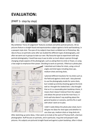
My exhibition ‘Force of Judgement’ features six black and white portrait pictures. All six
pictures feature a straight faced and expressionless subject against a brick wall backdrop, in
a passport style shot. The eyes of my subjects have been scribbled out in Photoshop. My
idea to focus on portraits came after we studied the different types of photography, and
after we went out in groups to take our own. My favourite type to experiment with was
portrait photography; I loved how easy it was to alter so much about a person through
changing simple aspects of the photograph, such as asking them to smile or frown, or using
a low angle to emphasise their power. Deciding to work on portrait, I filled out a photo plan.
I sketched out 6 ideas for shots, using a mix of
angles and shot types including close ups,
medium shots and long shots.
I planned different locations for my shots such as
the field and against a brick wall. I also planned
to use the photography studio for some shots,
but I ended up entirely shooting against the brick
wall as I thought this looked best. I also thought
that as it is a reasonably plain backdrop choice, it
means that it doesn’t distract from the subject
and allows the person to be the main focus. A
brick wall also doesn’t say anything about the
general location or scenario, and this fits in well
with what I went on to plan.
I didn’t really follow this photo plan sheet, but it
did give me ideas for shot types and whether to
use close ups, medium shots or long shots etc.
After sketching up some ideas, I then went on to look at the work of Thomas Ruff, a German
photographer. Ruff focuses on portraits, and in particular, mug shot and passport style
pictures. His subjects are pictured straight faced and against a plain backdrop, often in black
2. and white too. All of his portraits force you to make your own assumptions about the
person in them, as you had nothing to go on other than their physical appearances and this
is an idea that I liked. It was at this point that I came up with the theme: ‘Force of
Judgement’. Instead of doing basic portrait pictures, I planned to do something similar to
the work of Thomas Ruff. My plan changed to photographing both Matt and Jack
individually, asking them to keep straight faces as they stand against a brick wall backdrop. I
wanted to do a mix of mainly close ups and medium shots. I then went out to take them.
To take my pictures I used the Canon 1100D on the portrait setting. I worked on manual
focus and I am happy with how the majority of them came out. I then narrowed them down
to the ones that my subjects were straight faced and expressionless in, and then down
further to the ones that could potentially go into my final six exhibition pictures. I then went
to Photoshop to edit these pictures. My first idea was to just play with different edits, so I
started with the ‘Posterize’ effect on some of the photographs and then also worked with
black and white. My final type of edits where the ones in which I blacked out the eyes of my
subjects- these were my favourite.
POSTERIZE
BLACK & WHITE
3. BLACKED OUT EYES
My final six were selected from the edits in which the subjects had blacked out eyes. I think
this really fits in my theme ‘Force of Judgement’ in which I wanted the viewer to have to
make their own assumptions about the subjects in the image. I coloured out the eyes in
Photoshop as I think that the eyes give out a lot about a person, and so keeping them
hidden will force the viewer to judge even more. This aspect, as well as the expressionless
faces and bland backdrops really gives the viewer very little to go on, which is something
that links well with my exhibitions name and overall idea.
These edits, however, did take a lot of time on Photoshop. For each photograph, I began by
cropping it down. I would then change the image to Black and White through adjustments
and I’d then get the pencil tool set up. At first, I experimented with a black coloured
scribble, but I then found that white looked the best. I coloured over the eyes with an
extremely thin version of the tool, covering the pupils and whites and making it look rough
and untidy. I repeated this for each picture, making sure that I used a thin white line every
time as this gave the best results. My other edits were a lot easier to achieve. The simple
black and white versions, for
example, just involved going to
adjustments and then changing the
layer to black and white.
Posterize was just as easy as well, as
this also involved simply going to
adjustments and clicking on the pre-set
effect. My favourite edits are
definitely the ones with the
scribbled out eyes, even if they were
the most time consuming of the lot.
All the photographs were edited
using Photoshop. Photoshop is a
program that I have used a lot in the
past and one that I am extremely
familiar with. This meant that this time around, I didn’t come across any tools that I hadn’t
used before, partly because I stuck to what I knew and also because I didn’t need to use
anything I hadn’t used before for what I wanted to achieve. The main tools I stuck to were
quick selection and cropping. Consequently, the editing was a simple stage for me.
4. (PART 2-evaluation)
Overall, I am happy with my final six pictures. In particular, I am happy with how they have
been edited. In my opinion, the scribbled out eyes play a huge effect on the overall images
and ensure that they fit my idea of ‘Force of Judgement’. I am pleased with how little my
photographs give away; the subjects are expressionless and their eyes are hidden. This
forces the viewer to make their own assumptions which was my aim. I also like the black
and white as it makes the photograph even more bland, but intense. Another strength of my
photographs is that they show a mix of shot types. Some are close ups whilst others are
medium shots, and I think that this presents more about my knowledge of photography.
Although I am happy with my results in general, there are definitely a few weaknesses with
them. I am concerned that some people could find my pictures boring, as they don’t vary in
backdrops or facial expressions, and some may find this uninteresting.
Another negative is that my two subjects are wearing different clothes in the pictures. I
think that if they were simply both wearing plain white t-shirts then the photos may have
been more effective, as often dress sense says a lot about a person and since I’m aiming to
give as little away about my subjects as possible, this may have been a better option. I also
think that plain and matching t-shirts would make my subjects appear more equal, so dress
code is something that I would focus more on if I was to re-do this unit. I would also like to
work a lot more in Photoshop, experimenting with new tools and being a lot more creative
with my work in general. I’d also want to spend more time in planning. For this unit, I have
found that I haven’t been following my original plans, mainly because I wasn’t entirely
happy with them and didn’t give myself enough time to think them through. If I would have
spent time producing more thorough plans, I would have been keener to stick to them and
I’d therefore have something to constantly refer back to. Since this was not the case, my
final six images are quite different to my first plans for the unit. Even though my final
photographs are not as I had originally planned, I am happy with them. I think that doing
this work has improved my photography skills, and in particular my camera skills. I have had
to experiment with the different settings of the camera, and I entirely used manual focus.
Spending lengthy amounts of time taking these pictures has definitely improved me as a
photographer.
So to conclude, I am pleased with my final 6 pictures for my exhibition: ‘Force of
Judgement’. I think that although they haven’t turned out as I had planned, I am still happy
with the end result and I am confident that I have produced a set of effective photographs. I
think the unit has improved me as a photographer and I now know what I would do
differently if I was repeating the tasks. I have really enjoyed this unit.
5. (PART 3- feedback)
In order to see how others felt about my photographs, I produced a questionnaire and
asked 5 people for their opinions. I asked questions such as ‘Do you like the title of my
exhibition?’ and ‘Do you think I have edited my photographs well?’ I seemed to get very
positive responses, and it also gave me areas to improve on.
QUESTION YES/NO COMMENTS
Do you like the title of my exhibition?
Yes
Yes
Yes
Yes
Yes
I think it is short and simple which is good.
It’s very clever.
Great pun yo.
Do you think the title of my exhibition fits
well with my photograph?
Yes
Yes
Yes
Yes
yes
Yes because the way you’ve edited your
images really ties in with the title.
The way the eyes are edited make the title
more effective, almost like they get ‘judged
blindly’ when people don’t know them.
Yes as you are judging a book by its cover
Do you have a favourite photograph out of
the six? (If so, list under ‘comments’ and
give reasons)
Yes
Yes
Yes
Yes
no
Image 2 because I think the clothing stands
out against the background and works well
with the edited eyes.
Image 2 because I think the clothing stands
out against the background and works well
with the edited eyes.
Image 2 because I love the model.
Do you think I have edited my photographs
well?
Yes
Yes
Yes
Yes
Yes
Yes because they are different and make
the images look mysterious.
Yes it is so quirky and unique!
Very cool very stylish I like it
Do you like my overall concept and ideas?
Yes
Yes
Yes
Yes
yes
I think they’re good.
It’s a very unique way of capturing a
portrait exhibition.
Have you seen photographs that follow the
same concept before?
No
NO
No
No
no
Not really.
They are very original
Very you gee
Do you think I photographed enough
people?
Yes
No
No
No
no
It means that you haven’t overcomplicated
the exhibition.
It could be made more interesting with
more people.
A wider range would have been better.
Do you think that my exhibition could be
improved? If so, give suggestions under
‘comments’.
Yes
Yes
Yes
No
no
Jack should be wearing similar clothing to
Matt.
Maybe a few more people in the shoot.
More people.
I think keeping it simple has more affect to
the outcome.
Can you think of any positives of my
photographs? List under ‘comments’.
Yes
Yes
Yes
Yes
Yes
I like the editing and the sharpness.
I like how it links to the title and the theme
of the shoot is really unique.
Your exhibition is a pleasure to look at.
Can you think of any weaknesses of my
photographs? List under ‘comments’.
Yes
No
No
No
No
The two subjects should be wearing the
same clothing.