The document discusses test shots taken of Jasmine for the front cover of a magazine. The first shot was outside with a plain background to focus on Jasmine's dramatic expression. Subsequent shots tested different angles, distances, backgrounds, and lighting to improve focus on Jasmine's face and features while maintaining a serious tone. The final shot was chosen for having natural lighting that defined Jasmine's face against a red wall, keeping within the color scheme and matching the outdoor setting of the film trailer discussed in the magazine.
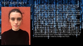
1. • For my magazine front cover, I wanted the main image to be
serious and dramatic to draw attention and to show a different
side of Jasmine to the image on the film poster. Due to this, I
decided to shoot Jasmine front on with a dramatic expression in
front of a plain background so that I could edit around the image
and make her face the main focus point. I took the image outside
so that there would be natural lighting and this showed more
definition in her face as it highlighted the contrasting points –
which I like. I think that this image maybe has too much clothing
and shoulders in it and I want the shot to focus more on Jasmine’s
face, so that was an aspect that I wanted to change and improve
– however I was happy with her facial expression and the
surroundings did not matter, as I knew I would be getting rid of
the background anyway. Looking back at the image now, I think
that I maybe could have made the shot more polished by using
professional lighting and correcting Jasmine’s makeup and hair so
that she looked more slick, however I am happy with my first test
shot and do not think I need to change too much.
2. • In my second test shot, I decided to think about what areas I
wanted to improve on in test shot one and to think about that
when taking this shot. Therefore, I took this image much closer
to Jasmine’s face so that the overall shot looked more dramatic
and her features are more prominent, which adds effect and will
draw attention on the magazine cover as people will notice this
image quickly due to the fact that it is more focused and her
features stand out more. As well as this, the natural lighting
makes the dark and lower points of her face stand out and also
the higher points of her face too, which is more appealing and
looks eye catching, and matches with the colour scheme too of
using black and white and neutral colours. Due to the fact that
this shot was taken outdoors, she has a few loose hairs and this
causes the shot to look slightly less professional, however I can
edit this out and also it may add effect to leave them in as it
shows the theme of action and emphasises that the trailer is
based mainly outside.
3. • My third and fourth test shots were taken from a slightly different
angle so that I could look at different possibilities for my
magazine cover and assess which type of shot would look best. I
took these images from the right and left hand sides of Jasmine
to highlight her prominent facial features and to add definition to
these areas making the image look more high profile and top
model. Jasmine’s eyes engage with the camera effectively as she
portrays dramatic emphasis through them and shows what
genre the magazine is – which is more serious.
The red background is a good canvas for
these images as it does not distract from
the main image of Jasmine and does not
busy the shot too much. However, it is red
and I want my magazine main image to be
darker and duller colours so that I can use
a red colour for the font and this will stand
out more. I chose a plain background as it
was an easy backdrop to use in which I
could edit around it or change the colour.
3
4
4. • For my fifth shot I took it straight on again because I wanted to
keep the theme of it being dramatic like in the first shot but I
wanted it to be closer up to intensify this and to focus the
attention on Jasmine as the main article in the magazine is about
Jasmine as an actress. Jasmine’s facial expression is slightly more
vacant in this image which means that she does not connect as
much with the camera and therefore may make the readers feel
as though the magazine is less personal and could possibly be
less inclined to buy the magazine. Also, the wind in this picture is
blowing Jasmine’s hair all in one direction, which could be a good
effect as it looks as though she almost has a ‘Superhero’ vibe as
this is a typical theme in Marvel style posters and magazines.
However, this may make it more difficult to edit the image as it
may delete her hair or keep the red background in, which means
that the backdrop or choice to shoot the picture outside was not
the best idea. Overall though, this shot has improved from the
previous test shots and I am happy with it.
5. • My sixth test shot was taken from an above angle, as I thought
that this made Jasmine look more fierce and portrayed her
character more. Although I considered this image for my final shot,
I did not like that there was too much space above Jasmine’s head
and it left a bigger gap which I thought would make the magazine
cover look to spacious – which is not the theme that I wanted to
go for as I wanted it to look busy. It also distracts slightly from
Jasmine as she is no longer the main focus point which I want her
to be so that readers get an initial impression of what to expect
inside the magazine and can be drawn to the magazine from the
dramatic theme of the front page.
6
7
Due to the idea of having my sixth shot taken from a high angle,
I decided to test out taking my seventh shot from a low angle. I
thought that this would make Jasmine’s character look dominant
and powerful, which is a good aspect of the magazine however I
did not want to portray Ebony as an authoritative figure as she is
a victim in the trailer. Also, from looking into the image more, I
did not like the idea of having lots of open space at the bottom
of the page as I knew that most of the text would therefore have
to go at the bottom of the page, and I wanted it to be spread
evenly across the whole front cover so that it was not cluttered.
6. • My final shot is very similar to the last test shots due to the fact
that it is still a front on image and I chose to shoot Jasmine in
front of a red wall for the background. I mainly chose to shoot
here as I knew that the natural lighting would create good
lighting and brighten the image, as well as creating a contrasting
between shadows and highlights on Jasmine’s face – defining her
features and making the shot look more professional and
attractive. Also, the wall adds texture in the background which,
although I knew I would be changing the colour, adds further
depth to the image rather than just a plain background which
could look boring or less professional. Also, I thought about
shooting Jasmine inside so that I could use proper media
equipment and also the wind would not affect her hair at all
which would make the shot more sleek, however I then thought
that this would emphasise the fact that the film trailer is based
outside and would make it look more realistic, whilst keeping the
dramatic theme current which is shown through the facial
expression of Jasmine. As well as this, to match the running
colour scheme of reds, blacks, whites, and greys, I asked Jasmine
to wear black clothing so that it suited the theme whilst also
making it easier for me to edit on top of this as I could use
coloured text and it would not blend into the background.