
Recommended
More Related Content
Similar to Double page analysis
Similar to Double page analysis (20)
Recently uploaded
Recently uploaded (20)
Double page analysis
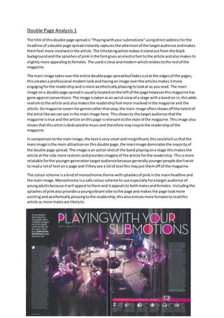
- 1. Double Page Analysis 1 The title of thisdouble page spreadis“Playingwithyoursubmotions”usingdirectaddressforthe headline of adouble page spreadinstantlycapturesthe attentionof the targetaudience andmakes themfeel more involvedinthe article. The titlebeingwhite makesitstandoutfrom the black backgroundand the splashesof pinkinthe fontgivesanelectrofeel tothe article andalsomakesits slightlymore appealingtofemales. The usedisclearandmodernwhichrelatestothe restof the magazine. The main image takesoverthe entire doublepage spreadbutfadesoutat the edgesof the pages, thiscreatesa professional modernlookandhavinganimage overthe articlesmakesitmore engagingforthe readershipandismore aestheticallypleasingtolookat as youread. The main image ona double page spreadisusuallylocatedonthe leftof the page howeverthismagazine has gone againstconventions. The image istakenasanaerial view of a stage witha band on in,thisadds realismtothe article and alsomakesthe readershipfeel more involvedinthe magazine and the article. Onmagazine coversforgenresotherthanpop,the main image oftenshowsoff the talentof the artist like we cansee inthe mainimage here.Thisshowsto the targetaudience thatthe magazine istrue and the article onthispage isrelevant tothe style of the magazine.Thisimage also showsthat thisartistisdedicatedtomusicand therefore mayinspirethe readershipof the magazine. In comparisontothe mainimage,the textisverysmall and insignificant,thiscouldtell usthatthe mainimage isthe main attractionon thisdouble page,the mainimage dominatesthe majorityof the double page spread. The image isan actionshotof the band playingona stage thismakesthe article at the side more realisticandprovidesimageryof the article forthe readership. Thisismore relatable forthe youngergenerationtargetaudiencebecause generallyyoungerpeople don’twish to reada lotof textona page and if theysee a lotof textthismayput themoff of the magazine. The colour scheme isa kindof monochrome theme withsplashesof pinkinthe mainheadline and the mainimage.Monochrome isa safe colourscheme to use especiallyforatarget audience of youngadultsbecause itwill appeal tothemanditappealsto bothmalesandfemales. Includingthe splashesof pinkalsoprovidesayoungvibrantvibe tothe page and makesthe page lookmore excitingandaesthetically pleasingtothe readership;thisalsoenticesmore femalestoreadthis article as more malesare likelyto.
- 2. Double Page Analysis 2 The title of thisdouble page spreadis“Place of worship”,theyare referringarave to a place of worship;somewhere youcanspeaktoGod and feel free.Thisisaclevermetaphorbecause theyare sayinga rave has the same powerandaffect as a place of worshipdoestoreligiouspeople.The title beingwhite makesitstandoutfromthe greenpuff whichitissituatedinside,the backgroundof the page is takenupmainlybydifferentactionshotstakenatraveswhilstthe textsitsona white background.Usingwhite asthe backgroundfor textallowsittostand outand be read more easily. On thisdouble page spreadthere isn’tone mainimage,insteadwe are presentedwithlotsof smallerimagesputtogethertomake a collage.These imagestake overalmostthe entire double page spreadbut stopwhere the article starts,thiscreatesa professionalmodernlookandhavingan image above andbelowthe article makesitmore engagingforthe readershipandismore aestheticallypleasingtolookat as youread.The imagesare takenat differentanglesof people dancingat a rave,thisaddsrealismtothe article and alsomakesthe readershipfeel more involved inthe magazine andthe article.The readershipknow the article theyare readingistrue andthey can trust it as there ispicture evidence of it.These imagesalsoshow thatshow thatthese people enjoyhouse/dancemusic(the maintheme of thismagazine) andtherefore maybe inspiredbythese imagestoattendmore raves andhear theirfavourite musiclive. In comparisontothe images,the textisverysmall andinsignificant,thiscouldtellusthatthe images are the mainattractionon thisdouble page andthisis whatthe writerwantsus to focuson,the imagesdominate the majorityof the doublepage spread.The imagesmake the article inthe middle more realisticandprovidesimageryof the article forthe readership. Thisismore relatableforthe youngergenerationtargetaudience becausegenerallyyoungerpeopledon’twishtoreada lot of texton a page and if theysee a lotof textthismayput themoff of the magazine. The imagesare whatwill straightawayentice the readershipintoreadthe article. The colour scheme isa kindof monochrome theme withsplashesof ayellowygreencolourinthe puff andincorporatedinwiththe images.Monochrome isa safe colourscheme touse especiallyfor a target audience of youngadultsbecause itwill appeal tothemanditappealsto bothmalesand females.Includingthe splashesof colouralsoprovidesayoungvibrantvibe tothe page and makes the page lookmore excitingandaesthetically pleasingtothe readership.