
Recommended
More Related Content
What's hot
What's hot (20)
Similar to Dr. Rajeshree Khande :Introduction to Java AWT
Similar to Dr. Rajeshree Khande :Introduction to Java AWT (20)
More from DrRajeshreeKhande
More from DrRajeshreeKhande (20)
Recently uploaded
Recently uploaded (20)
Dr. Rajeshree Khande :Introduction to Java AWT
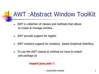
- 1. AWT :Abstract Window ToolKit AWT is collection of classes and methods that allows to create & manage window. AWT provide support for Applet. AWT contains support for windows_ based Graphical Interface. To use the AWT classes & method we have to import awt package as import java.awt.*; 1RAJESHREE KHANDE
- 2. AWT:classes Different window classes are defined by AWT which add functionality with each level. Component Container Window Panel Frame Applet 2RAJESHREE KHANDE
- 4. AWT:classes Component : It’ an abstract class. All GUI component that interact with user are subclasses of component class. Defines various methods for managing event such as keyboard & mouse input. Also defines attribute to store current foreground & background colors and fonts 4RAJESHREE KHANDE
- 5. AWT:classes Container: Inherits various methods & attribute of component class Having additional methods of nesting other component object. A container position various GUI component within it with the help of different Layout manager 5RAJESHREE KHANDE
- 6. AWT:classes Panel : It is a window which does not contain title bar, menu bar, border. It is super class of Applet class. Any screen output written on applet is drawn on the surface of panel object. AppletViewer provide titlebar & border to an applet. We add GUI component such as buttons ,list box to a panel. 6RAJESHREE KHANDE
- 7. AWT:classes Window : Window class is used to create top level window. Window object are not created directly. Subclass of window is used to place on desktop. 7RAJESHREE KHANDE
- 8. AWT:classes Frame: It is subclass of window. It has title bar , menu bar & border etc To create a normal window in Java application Frame class is used. In Applet we does not use Frame class, since AppletViewer provide titlebar, menubar & boarder to an applet. 8RAJESHREE KHANDE
- 9. AWT:classes Canvas: It is not subclass of window or panel. It is another type of window. This widow is blank window upon which we can draw. 9RAJESHREE KHANDE
- 10. Layout Managers It is an object which determine the way that component are arranged in frame window. It arranges a control within a window using some type of an algorithm. Each window has a layout manager associated with it. 10RAJESHREE KHANDE
- 11. Layout Managers LayoutManager is set by the setLayout() method to a window. syntax void setLayout(LayoutManager layobj) If it is not set then default layout manager is used If layobj parameter set to null then control are positioned manually using the setBound() method 11RAJESHREE KHANDE
- 12. LayoutManager Classes 1.FlowLayout Default frame layout. Places Components in successive rows in window fitting as many as in each row as possible. When the row is full it start fitting the components on the next row. This is similar to how word flow in text editor A small space is left in each component. 12RAJESHREE KHANDE
- 13. LayoutManager Classes :FlowLayout Following are constructor for FlowLayout. 1. FlowLayout() Centers all component and leves 5 pixel space between each component 2. FlowLayout(int align) Flowlayout.LEFT Flowlayout.CENTER Flowlayout.RIGHT Flowlayout.LEADING Flowlayout.TRAILING 3. FlowLayout(int align, int hspace, int vspace) Example 13RAJESHREE KHANDE
- 14. LayoutManager Classes :BorderLayout Frame is divided into north, south, east, west, and center Components are placed by the programmer in the desired location using the add method 14RAJESHREE KHANDE
- 16. LayoutManager Classes :BorderLayout Following are constructor for BorderLayout 1) BorderLayout() 2) BorderLayout(int hspace, int vspace) To add a component in BorderLayout use following format of add() method Syntax : void add(Component-obj, Object Region) 16RAJESHREE KHANDE
- 17. LayoutManager Classes :BorderLayout Where region specifies following five constant: 1. BorderLayout.EAST 2. BorderLayout.WEST 3. BorderLayout.SOUTH 4. BorderLayout.NORTH 5. BorderLayout.CENTER Example 17RAJESHREE KHANDE
- 18. LayoutManager Classes :GridLayout 2.GridLayout Frame is declared as a grid of fixed size (e.g. two rows and three columns) Components are placed in the grid left to right and top to bottom 18RAJESHREE KHANDE
- 19. LayoutManager Classes :GridLayout GridLayout uses following Constructor 1) GridLayout() Creates a single column grid Layout 2) GridLayout(int nrows, int ncols) Creates a grid layout with specified no. of rows and columns 3) GridLayout(int nrows, int ncols, int hspcae, int vspace) Creates a grid layout with specified no. of rows and columns and specifies horizontal and vertical space between the component 19RAJESHREE KHANDE
- 20. LayoutManager Classes :GridLayout Example1 Example1 20RAJESHREE KHANDE
- 21. AWT Component Adding a control 1. Create an instance of desired control 2. Then add it to window by calling add() method which is define by container 3. The add method has several form 4. Once the control has been added it will be automatically visible whenever it’s parent window is display Syntax Component add(Component compObj) 21RAJESHREE KHANDE
- 22. AWT Component Removing a control If control no longer need we will remove that control by remove() method This method also defined by Container class Syntax void remove (Component compObj) We can remove all controls by removeAll() method 22RAJESHREE KHANDE
- 23. AWT Component Responding to controls 1. All control except label generates events when they are accessed by user. 2. In general , your program simply implements the appropriate interface & register an event listener for each control that need to monitor. 23RAJESHREE KHANDE
- 24. AWT Component Label 1. It is an object type Label 2. It is a passive control 3. Do not support any interaction Following Constructor 1. Label() : Construct blank label 2. Label(String) : construct a label containing string 3. Label(String, int) : Alignment ( Label.LEFT,Label.RIGHT, Label.CENTER) 24RAJESHREE KHANDE
- 25. AWT Component :Label Methods Sr. No Methods Description 1 void setText(String) Set or change a text of label 2 String getText() Obtain the text of label 3 void setAlignment(int) Set or change the alignment of text in the label 4 int getAlignment() Obtain the current alignment 25RAJESHREE KHANDE
- 26. AWT Component :Push Button 1. It is push button component 2. Contain a label 3. Generate a event when it is pressed 4. It is an object of type Button 5. Button defines two constructor 1. Button() : Create a buttton without label 2. Button (String str) :Creates a button with label 26RAJESHREE KHANDE
- 27. Methods Sr. No Methods Description 1 void setLabel(String) Set or change a label of Button 2 String getLabel() Obtain the label Button AWT Component :Push Button 27RAJESHREE KHANDE
- 28. AWT Component :TextField TextField class is used to create a single line text entry edit box. Constructor 1. TextField() : Creates a default textfield 2. TextField(int) : Creates a textfield which wide as specified number of characters. 3. Textfield(String) : Creates a textfield with specified string initially. 4. TextField(String, int) : Creates a textfield with initial text and set it’s width. 28RAJESHREE KHANDE
- 29. AWT Component :TextField Methods Sr. No Methods Description 1 String getText() Return the content of TextField. 2 void setText(String) Set or change the text of TextField. 3 String getSelectedText() To get currently selected text 4 void select(int startIndex, int endIndex) To select portion of text 5 boolean isEditable() To determine editability 6 void setEditable(boolean) To set or reset editability 29RAJESHREE KHANDE
- 30. AWT Component :TextField Example1 :Button and Label Example2 : Conversion to binary ,Hexadecimal, Octal Example 3: Converting String to Uppercase and Lowercase 30RAJESHREE KHANDE
- 31. AWT Component :Check Box Used to toggle an option A Checkbox class is used to create an object Constructor 1. Checkbox() : Creates a checkbox without label. 2. Checkbox(String) : Creates a checkbox with label specified initial state is unchecked. 3 Checkbox(String, boolean) : Creates a checkbox with label specified initial state is either true or false. 31RAJESHREE KHANDE
- 32. AWT Component :Check Box Methods Sr. No Methods Description 1 Boolean getState() Retrieve the current state 2 void setState(boolean) Set the state true or false 3 String getLabel() Retrieve the label associated 4 Void setLabel(String) Sets the label as specified 32RAJESHREE KHANDE
- 33. AWT Component :CheckBoxGroup It is also called radio buttons CheckBoxGroup class is used to create group of check boxes. From list of choices we select only one at a time. Constructor CheckboxGroup() e.g. CheckBoxGroup cbg = new CheckBoxGroup() c1 = new Checkbox("check-1“,cbg,true); c2 = new Checkbox("check-2“,cbg,false); c3 = new Checkbox("check-3“,cbg,false); 33RAJESHREE KHANDE
- 34. AWT Component :CheckBoxGroup Method : 1)getSelectedCheckbox() : determine which checkbox in a group is currently selected Checkbox getSelectedCheckbox() 2)setSelectedCheckbox() : set a check box void setSelectedCheckbox(Checkbox obj)) 34RAJESHREE KHANDE
- 35. AWT Component :List Provide a list of items, which can be scrolled From list of items single or multiple item can be selected. Constructor 1. List() : Creates a listbox in which single selection is possible. 2. List(int) :Creates a listbox , specified number of items always to visible selection. Selection is possible 35RAJESHREE KHANDE
- 36. AWT Component :List 3. List(int, boolean) : Specified no. of items To be visible Specifies wheather multiple selection is allowed True Indicate multiple Selection 36RAJESHREE KHANDE
- 37. AWT Component :List Sr. No Methods Description 1 Void add(string) Add item to the end of list 2 Void add(String,int) Add the item at the index specified in second parameter. 3 String getSelectedItem() Returns a string which is selected 4 int getSelectedIndex() Return an index of selected item 5 String[] getSelectedItems() Returns an array contains string which are selected.(Multiselect) 37RAJESHREE KHANDE
- 38. AWT Component :List Sr. No Methods Description 6 Int[] getSelectedIndexes() Returns an array containing indexes of selected items. 7 Int getItemCount() Returns no. of items in the list 8 Void select(int) Select the item of specified index 9 String getItem(int) Obtain the name of item having specified index. 38RAJESHREE KHANDE
- 39. AWT Component :List Example1 Example2 39RAJESHREE KHANDE
- 40. AWT Component :Choice list The class Choice is used to create a drop-down or pop-up list of string It requires less space than the list box control It uses only default constructor Choice() 40RAJESHREE KHANDE
- 41. AWT Component :Choice list Sr. No Methods Description 1 void add(String) To add a string in choice list 2 String getSelectedItem() Determine which item is currently selected 3 int getSelectedIndex() Determine the index of currently selected item. 4 int getItemCount() Returns no. of items in the list 5 void select(int) Select the item whose index is specified 6 void select(String) Select the item match with string parameter 7 String getItem(int) Obtain the name associated with the item at specified index 41RAJESHREE KHANDE
- 42. AWT Component :Choice list Example of Choice list 42RAJESHREE KHANDE
- 43. AWT Component :TextArea TextArea class is used to create a multiline textbox Following constructor are available 1. TextArea() : Creates a default TextArea 2. TextArea(int, int) : Creates a TextArea with specified no. of lines & characters. 43RAJESHREE KHANDE
- 44. AWT Component :TextArea 3. TextArea(String) : Create with initial string. 4. TextArea(Sring, int, int) : Creates a TextArea with initial string and for specified no. of lines & characters. 5. TextArea(String, int numlines, int nchar, int s bars) Creates a TextArea with Scroll Bars. The value of sBars must be one of the following SCROLLBAR_BOTH, SCROLLBAR_NONE, SCROLLBAR_HORIZONTAL_ONLY, SCROLLBAR_VERTICAL_ONLY 44RAJESHREE KHANDE
- 45. AWT Component :TextArea Support all the methods of TextField & some additional method Sr. No Methods Description 1 void append(String) Append Specified string at the end. 2 void insert(string,int) Insert a string at specified index 3 void replace(String, int startIndex, endIndex) It replaces the character from start index to end with given string 45RAJESHREE KHANDE
- 46. AWT Component :Scroll Bars Scrollbar class is used to create scrollbar. Scrollbar may be either vertical or horizontal. Constructor 1. Scrollbar() : Create vertical scrollbar. 2. Scrollbar(int style) : Create a scrollbar of specified style. It can be Scrollbar.HORIZONTAL Scrollbar.VERTICAL 46RAJESHREE KHANDE
- 47. AWT Component :Scrollbar 3. Scrollbar(int style, int start, int thumb,int min, int max) : Create a scrollbar with specified style. Initial Value Thumbsize 47RAJESHREE KHANDE
- 48. AWT Component :Scrollbar Sr. No Methods Description 1 int getValue() To get the current value of scroll bar 2 void setValue(int) Set new value 3 int getMinimum() To get minimum value of scrollbar 4 int getMaximum() To get maximum value of scrollbar 5 void setUnitIncrement(int) To change unit increment. Default is 1 6 void setBlockIncrement(int) To change block increment. Default is 10 48RAJESHREE KHANDE
- 49. Graphics AWT support a rich assortment of Graphics methods. All graphics are drawn relative to window. This can be main window of an applet, Child window of an applet or stand alone application window The origin of window is at the Top-left corner and is (0,0). Co-ordinates is specified in pixel. All output to a window takes place through a graphics context. 49RAJESHREE KHANDE
- 50. Graphics Graphics Context is encapsulated by Graphics class & is obtained in two ways. 1. It is passed to an applet when one of it’s various methods, such as paint() or update() . 2. It is returned by getGraphics() method of Component The Graphics class defines the a number of drawing functions Each shape can be drawn edge-only or filled 50RAJESHREE KHANDE
- 51. Graphics Object are drawn and filled in currently selected graphics color, which is black by default. When a graphics object is drawn that exceeds the dimension of the window, output is automatically clipped 51RAJESHREE KHANDE
- 52. Drawing Lines Lines are drawn by means of the drawLine() method void drawLine(int startX, int startY,int endX, endY) drawLine() display a line in the current drawing color. Example 52RAJESHREE KHANDE
- 53. Drawing Rectangle drawRect() method display an outline of rectangle fillRect() method filled the rectangle. void drawRect(int top,int left,int width, int height) void fillRect(int top, int left, int width, int height) The upper-left corner of the rectangle is top,left The dimension of the rectangle are specified by width and height. 53RAJESHREE KHANDE
- 54. Drawing Rounded Rectangle To draw Rounded Rectangle use drawRoundRect() of fillRoundRect(). void drawRect(int top,int left,int width, int height) void fillRect(int top, int left, int width, int height) 54RAJESHREE KHANDE
- 55. LayoutManager Classes :CardLayout CardLayout -- Display containers you pass to it as card. -- You give each card a name. -- The card are typically held in an object of type Panel -- We can move from card to card with the Card’s layout show() method. --We can also display specific cards using first , last, next & previous method of CardLayout. 55RAJESHREE KHANDE
- 56. is encapsulated by graphics class & is obtained in two ways. 56RAJESHREE KHANDE
- 57. LayoutManager Classes :CardLayout Constructor 1) CardLayout() : creates new card layout 2) CardLayout(int hspace,int vspace) creates new card layout with given horizontal and vertical space 57RAJESHREE KHANDE
- 58. LayoutManager Classes :CardLayout Step for CardLayout 1. Create a panel that contains a deck and panel for each card in the deck. 2. Add to the appropriate panel the components that form each card. 3. Then add these panels to the panel for which CardLayout is the layout manager 4. Finally you add this panel to window 5. To select between the cards ,include one push button for each card in the deck. 58RAJESHREE KHANDE
- 59. LayoutManager Classes :CardLayout When panels are added to panel, they are given a name. So use the following add method Void add(Component panelObj, Object name) Name of the card whose panel is specified by panelObj 59RAJESHREE KHANDE
- 60. LayoutManager Classes :CardLayout After deck creation, you can activate a card by calling one of the method defined by CardLayout 1. void first(Container deck) 2. void last(Container deck) 3. void next(Container deck) 4. void previous(Container deck) 5. void show(Container deck,String cardName) 60RAJESHREE KHANDE
- 61. LayoutManager Classes :CardLayout deck : is the reference to the container(usually panel) that holds the card cardName : is the name of the card Example 61RAJESHREE KHANDE
- 62. Scrollbars The leftmost position of a horizontal scrollbar corresponds to some integer value and the rightmost position corresponds to a larger integer value Scrollbars can be displayed vertically User movement options Clicking either end button causes bubble to move in unit increments. Clicking the are between bubble and end button causes movement in 10 unit increments Clicking and dragging the bubble in the desired direction 62RAJESHREE KHANDE
- 63. Using Inheritance It is possible to use inheritance to allow TwoButtons to become a frame in its own right Note that the UML diagram will show TwoButtons as a subclass of Frame You will need to use super()to set the frame title 63RAJESHREE KHANDE