2. Final Front Cover Here is the final front cover for my magazine. The colours, red and black fits in with the genre of my magazine. After placing the image on the cover with the main headings and small additional headings, there was room left for improvement which made the magazine seem unprofessional. I decided to add a large completion box at the bottom of the page to draw the readers attention towards this new band. I also decided to add various other images along the left hand side to draw the readers attention towards multiple other story lines.
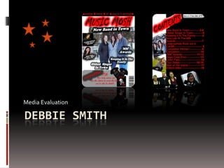
3. Final Contents Page Here is the final contents page for my magazine. I have kept within the red and black colour scheme to show continuity and professionalism throughout my magazine. I have tilted the images to take the readers attention off the amount of text used. They would be able to look at the most appealing image and be able to read it comfortably without being put off. The red Arial font is large enough and clear to read.
4. Final Double Page Spread Here is the final double page spread for my magazine. I have tried to keep within the red and black colour scheme for these pages but this proved difficult with the amount of text used. I have changed the images from they’re original background and placed them in a size order at the bottom of one page. I did this so the interview didn’t overlap the images and to highlight the importance of band members in following with the conventions of having the lead singer as the focal point.
5. Use of Conventions (Front Cover) Like most music magazines, I also decided to put the masthead at the top of the page. This was to draw the target audience towards the multiple images and headlines I have used. I have also used the conventions of real magazines by using a list of band names at the top of the page. I have used a large image depicting a band. This attracts the reader to the main story because the image takes up the whole page except for the two images on the left that show there is more in the magazine than just the band so this will increase the interest in the target audience. I have used a bar code at the bottom right hand side of the page this also uses the conventions of real magazines because each one has a barcode.
6. Use of Conventions (Contents Page) The use of a large title on the contents page uses the conventions because every magazine has a title on their contents page to show the readers what the page is for. The large images at the side of the page are a form of using the conventions because some of the magazines I have researched pick out a few of the pages from the contents and draw attention to them using pictures. I have also used the conventions of a real magazine by placing the contents on the left hand side of the page and showing the lettering clearly.
7. Use of Conventions (Double Page Spread) The title on the top of the page uses the conventions because it states what the story/interview is about. The title is easy to read and large so it attracts the audience more, every magazine that I have studied has a title on the double page spread. The way in which I have laid out my interview uses the conventions also because it shows professionalism and most magazines layout their interviews like this because it is tidy and easy to read. I have placed images at the bottom of the page to show the readers who the band members are all magazines place images within their pages.
8. Developing Conventions (Front Cover) I have developed conventions by using an image that represents the main story line. The image used in the real magazine at the bottom left of the slide has the lead singer of the band as the main focus and the image I have used does not place the main singer as the main focus but allows the whole band to be in focus. Most magazines I have seen during my research have the main singer of a band as the main focus or have numerous band members within the image. I have developed the use of a barcode further by placing in at a different angle to most magazines.
9. Developing Conventions (Contents Page) Placing the contents page on the left hand side of the page uses the conventions of real magazines but I have developed this further by leaving out the subheadings that explain what the different sections of the magazine are. I have also placed images at angles instead of one position; they are also overlapping each other whereas most magazines images are neatly next to each other in rows. The overlap matches the rebellious style of the magazine. The title of the page also uses the conventions but has been developed further because it has been placed at an angle and has a glow around it to make it stand out more and it matches the font on the front cover.
10. Developing Conventions (Double Page Spread) By putting the images into a size order of largest being most important develops the conventions of a real music magazines. Often real music magazines have a set size for each individual image but, my largest image takes up half the space on one page whereas the smaller image just about crosses over to the first page. This has been done to make the band members seem more noticeable to the reader.