The document summarizes the conventions and forms used in creating different elements of a magazine, including the cover, contents page, and article.
For the cover, conventions like the masthead, celebrity image, eye contact, color theme, and barcode are used. Forms include images, text, and graphics.
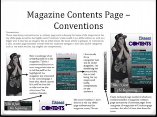
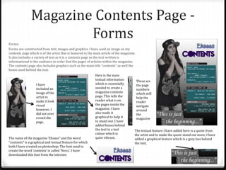
The contents page follows conventions such as the magazine name, "Contents" header, artist image, categories, and page numbers. Forms include image, informational text, and graphical elements.
The article uses conventions like a question and answer format, pull quote heading, and two celebrity images. Forms include textual interview, images, headings, and drop cap. Inspirations and some broken conventions