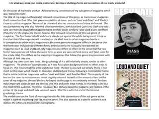
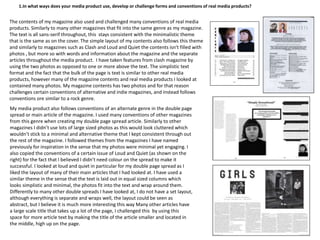
call girls in Kamla Market (DELHI) 🔝 >༒9953330565🔝 genuine Escort Service 🔝✔️✔️
Evaluation Question 1
1. 1.In what ways does your media product use, develop or challenge forms and conventions of real media products?
On the cover of my media product I followed many conventions of my sub-genre of magazine which
was ‘Indie/Alternate’.
The title of my magazine (Resonate) followed conventions of this genre, as many music magazines
that I researched had titles that gave connotations of noise, such as ‘Loud and Quiet’ and ‘Clash’. I
chose to call my magazine ‘Resonate’ as this word also has connotations of noise and sound. The
way I presented my title also followed these conventions, both Loud and Quiet and Clash use bold
sans-serif fonts to display the magazine name on their cover. Similarly I also used a sans-serif font
(Plaketta 5 SF) to display my master head as this followed conventions of this sub-genre of
magazine. The font I used is bold and clearly stands out against the white background, this is so
that the title of the magazine will stand out on the shelf next to other magazines beside it.
In comparison to other music magazines in the same genre my magazine differs in the sense that
the front cover includes two different fonts, where as only one is usually incorporated on
magazines such as Loud and Quiet. My magazine also differs to others in the sense that the two
fonts I have used do not follow the same form, as sone are sans-serf and one is serif (Vari, used for
the article title). This differs as the majority of magazines that follow this genre stay consistent with
the type of font they use.
Although my cover used two fonts , the graphology of it is still relatively simple, similar to other
magazines. The photo isn’t complicated, as it only has a plain background with no other areas to
focus on. This means that the artist stands out more. The text is also laid out simply. There is not
much on the cover which means its looks less cluttered and messy, following a minimalistic theme
that is similar to other magazines such as ‘Loud and Quiet’ and ‘Another Man’. The majority of the
text on the cover is monotone and is not brightly coloured. As well as the amount of text on the
cover of my magazine, the way the text is shaped on the page is also relatively minimal. The two
most important pieces of text are centred (the title and cover artist name), so that they stand out
the most to the audience. The other necessary text (details about the magazine) are located in the
corner of the page and don’t take up much space , this fits in with the rest of the minimal
graphology theme.
The model used on the front of my magazine also fits into conventions of the sub genre as the
model is clothed in clothing that fits into the genre. This also appeals to a specific audience as it
idolises the artist and incorporates iconography.
2. 1.In what ways does your media product use, develop or challenge forms and conventions of real media products?
The contents of my magazine also used and challenged many conventions of real media
products. Similarly to many other magazines that fit into the same genre as my magazine.
The text is all sans-serif throughout, this stays consistent with the minimalistic theme
that is the same as on the cover. The simple layout of my contents also follows this theme
and similarly to magazines such as Clash and Loud and Quiet the contents isn't filled with
photos , but more so with words and information about the magazine and the separate
articles throughout the media product. I have taken features from clash magazine by
using the two photos as opposed to one or more above the text. The simplistic text
format and the fact that the bulk of the page is text is similar to other real media
products, however many of the magazine contents and real media products I looked at
contained many photos. My magazine contents has two photos and for that reason
challenges certain conventions of alternative and indie magazines, and instead follows
conventions ore similar to a rock genre.
My media product also follows conventions of an alternate genre in the double page
spread or main article of the magazine. I used many conventions of other magazines
from this genre when creating my double page spread article. Similarly to other
magazines I didn’t use lots of large sized photos as this would look cluttered which
wouldn’t stick to a minimal and alternative theme that I kept consistent through out
the rest of the magazine. I followed themes from the magazines I have named
previously for inspiration in the sense that my photos were minimal yet engaging. I
also copied the conventions of a certain issue of Loud and Quiet (as shown on the
right) for the fact that I believed I didn’t need colour on the spread to make it
successful. I looked at loud and quiet in particular for my double page spread as I
liked the layout of many of their main articles that I had looked at. I have used a
similar theme in the sense that the text is laid out in equal sized columns which
looks simplistic and minimal, the photos fit into the text and wrap around them.
Differently to many other double spreads I have looked at, I do not have a set layout,
although everything is separate and wraps well, the layout could be seen as
abstract, but I believe it is much more interesting this way Many other articles have
a large scale title that takes up a lot of the page, I challenged this by using this
space for more article text by making the title of the article smaller and located in
the middle, high up on the page.