Improvements to magazine contents page layout for pop genre
1. The improvements for the contents page
were that I had started the contents page
with the masthead placed at the top. Then I
decided to include the editorial and place it
on the left. The image has been placed on
the right side and you find that the table of
contents of the magazine has been placed on
the bottom left of the page. The reasons why
I have chosen to place the masthead, image
and the table of contents in certain places is
because by looking at the pop magazine you
find that they place them in similar places.
The second improvement that I had
made to the contents page was that the
masthead has been placed more
towards the right side of the page and
the title of the magazine has been
included and has been placed on the left
side of the contents page.
Another improvement that I had
made to the contents page was that
by including shapes on the sides of
the contents page it made it more
similar to the actual pop magazine
contents page which means that it is
more likely to fit into the pop genre.
By using the colour blue means that it
contrasts more with the page and the
colours used. Also below the main
image you find that there are some
quotes that link within the double
page spread.
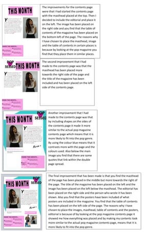
The final improvement that has been made is that you find the masthead
of the page has been placed in the middle but more towards the right of
the page. The title of the magazine has been placed on the left and the
image has been placed on the left below the masthead. The editorial has
been placed on the right side and the person who wrote it has been
shown. Also you find that the posters have been included of what
posters are included in the magazine. You find that the table of contents
has been placed on the left side of the page. The reasons why I have
chosen to place the images, masthead, table of contents and the posters,
editorial is because of by looking at the pop magazine contents page it
showed me how everything was placed and by making my contents look
more similar to the actual pop magazine contents page, means that it is
more likely to fit into the pop genre.