VVIP Pune Call Girls Hadapsar (7001035870) Pune Escorts Nearby with Complete ...
Annotated ancillary
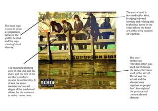
1. The entire band is
featured in this shot,
bringing in brand
identity and relating this
to the final scene in the
video where the band
are at this very location
all together.
The post-
production
reflection effect was
used here because
the same effect was
used in the advert.
This draws the
advert and the
album closer
together so people
don’t lose sight of
the product and
creates a brand
identity.
The matching clothing
used in this shot and the
video and the rest of the
ancillary products
creates brand identity. It
draws the same
members across all
stages of the media and
allows for the audience
to make connections.
The band logo
is used to draw
a comparison
between the
graffiti behind
and the logo,
creating brand
identity.
2. Placing the record
label not only creates
brand identity
between this and the
poster, it also creates
corporate brand
identity and links
between all of the
bands other products
and the record labels
other artists.
There is a big link
between the video
and this, where the
back cover was
taken from. In the
video, this clip is of
the protagonist
doing a big stunt
and is memorable.
This creates brand
identity and
assocaitions
between the two.
The protagonists
clothing is the same
across all media
platforms, featuring
the same brand
identity throughout.
The fact that a
protagonist is used
again on the back
cover creates brand
identity.
3. The skateboard is
again a reoccuring
theme across all
pieces of media.
Skating being an
integral part to the
video and the back
cover, inside cover
and advert adds a
sense of brand
identity.
The brand
identity link
between the
clothes across
platforms links
all ancillary
products and
the music video.
4. This box is visible in
the music video and is
used in the advert.
This link creates brand
identity.
The memorable blue
colour of the roll in can
be seen in this image.
This draws links to the
back cover and also the
music video.
The location again
is common across
all themes. The
skatepark theme
being reoccurant
creates brand
identity.
The font used in the
sidebar is the same
as the font used on
the front cover.
This creates brand
identity. It also
poses similarities to
the advert font, so
as not to get the
products confused.
This adds corporate
and brand identity.
There is also a QR code featured on
the back of the album, this adds
brand identity.
The background for the
sidebar was taken from
the front cover. This adds
definite brand identity
and a sense of flowing
from the front to side.
5.
6. The originally blue roll in is
the same in the other
Ancillary products,
drawing a brand identity
between them.
The font is the same in this
as in other ancillary
products. This creates
brand identity.
The record
label being
placed on the
advert, in a
different style
however, adds
brand identity
between this
and the back
cover.
The website being
featured on both the
advert and on the back
cover adds brand
identity.
The use of
reflection
identifies with
the front cover
and adds brand
identity.
Using the
same
protagonist
as the back
cover adds
brand
identity
The box used in this shot is the
same as the box seen in the video
and in other ancillary products.
This adds brand identity.