SlideShare a Scribd company logo
1 of 16
Initial Plans
Cameron Whapples
Initial Plans
Cameron Whapples
Initial Reaction
Presented with the brief, my plan is to create an advertising campaign. This was something that I enjoyed creating in the
introductory task. This focused on Irn Bru, however I believe that if the subject is something of my own choosing the end product
will be much more successful. The mistakes I made during my video rotation discouraged me from going into the film genre. This
said, the skills I picked up from both the video rotation and the print rotation will definitely help in the production of my final
project.
I was inspired by current advertising campaigns which included both a TV version and a printed poster version. These two
elements linked to create a campaign that I felt was powerful. One that stuck out was the Land Rover campaign which included
Bear Grylls. One particular advert did not include the vehicle, but a story of recovery from a parachuting accident.
The media I could use to portray these adverts in is something that I have thought about. I would like to produce a television
campaign, as well as a poster suitable for an advertising board or magazine.
Though an advert for an expensive vehicle may be something that I would enjoy, I would prefer to create an advert for something
equally prestigious, such as a high end watch. This appears to have a much wider market as it can appeal to many people in many
professions, businessmen with a taste for expensive jewellery, but also explorers and the outdoors type, pilots and divers. As long
as the watch is practical it can be sold to a larger audience than a purely aesthetically driven watch could.
The style of the adverts are also appealing. They generally have a calm and soothing approach with lots of imagery of greatness
and power, such as mountain ranges or other imposing landscapes. They are often inspirational, such as in the case of the Bear
Grylls ad in which he says that he was told he would never walk again.
Mind Map
Concept Board
Lots of details can be taken from this advert as many of the features are ones that I like and would replicate. The main one being
the obstruction of the brand name at the top of the page. It does not make the title unreadable but it shows the size of the
brand’s reputation as they are able to hide part of their name without fear of being misinterpreted.
The use of the lamps in the photograph is clever as they subtly border Daniel Craig’s face on either side. Both the actor and the
product unofficially have been allocated a side of the page each, despite the size difference between the two. The small image of
the watch, compared to the image of Craig, has the same amount of space. This suggests that the watch is just as important, if not
more as the actor is giving it plenty of room. The shine on the watch is a detail that compliments the rest of the image as it is so
dark.
Being an advert for the film Spectre as well as Omega, the theme is James Bond. Craig is in character and costume in an
environment similar to one seen in the film. The lamps give the impression of a workshop or garage which does appear. The
message of the advert is one that is not subtle: James Bond, the height of classiness, wears an Omega.
The sparse composition of the advert is a design that I find appealing. The small amount of information is centred around the
watch and does not include any unnecessary information.
Concept Board
The composition of this advert is the thing that is most appealing about it. The position of
the watch is something that I find interesting as a noticeable amount of the background is
shown behind it. The choice to make the product smaller and allow the image behind to be
seen is not something that I would have thought a good advertising choice.
The product is shown as the only item on the page. It can be seen facing upwards towards
the light source. This is one of two positions that watches are most commonly seen in on
an advert. The alternative is the watch face pointing towards the camera.
With the watch in the position shown the strap fades discretely into the background and
becomes lost in the texture. This texture is also intriguing as it appears to be a photograph
of water but taken from under the surface. The introduction of the light from the centre
gives the image a smoke-like quality. This light also draws the eye to the centre of the page
where the focal point of the image lies.
The information rests at the top of the page, headed by a striking title. I believe that
something like this is a smart strategy as it draws the eye with the intriguing title.
Underneath this is a paragraph of text explaining the product or details related to it. This is
finished with the model of the watch in a bold text, similar to the title. This means that the
title and the model name can be read at a glance if so desired.
The text is also in line with the image of the watch and does not exceed the borders of the
watch case. This keeps the advert very linear and neat as the empty spaces either side
become borders.
The brand logo is situated towards the bottom of the page. This is in a discreet position but
it means that the colours of the brand do not interfere with the colour scheme of the rest
of the image. It is tucked away to one side with the green background fading as gets closer
to the centre. I like this design as it enables the logo to be seen on the green background
but it means that it does not end abruptly.
Concept Board
The interesting thing about this advert is the use of the border at the bottom of the page.
This is something that is not commonly used by most adverts, though exceptionally helpful
when a lot of text needs to appear on the page. The details regarding the image and
product can be positioned here.
The product is shown to the right side of the page, however it is on its side with the crown
facing upwards. The strap goes slightly out of frame. The product is also seen on the wrist
of David Beckham. Something worth noting is the position of the logo which appears to be
in-line with the face of the watch.
Beckham is framed with the private jet to the left. The tagline on the image is placed in
such a way that it does not obstruct any important details and also so that the eye is drawn
to the product.
The advert is composed so it would seem that Beckham has just stepped of the jet and
onto the runway. This ties in with the slogan, ‘Worldclass travellers’.
The colour shceme is also interesting: the colours are powerful but they are not bright.
Although there are strong yellows they have been reduced by the blues in this image.
These spread in the darker areas where the yellow does not reach and balance the
brightness of the image. This can be seen on the jet, with the areas towards the back
soaked in sunlight and the areas further forward draped in a green-blue.
This colour scheme matches the product as the face of the watch contain both a ligher grey
colour and a blue.
Concept Board
The main focus of this advert is the image that everything is based around. The fighter jet behind the pilot is the main draw of the
eye which is why the colours and composition have been made to fit this. I like the way in which the black areas of the watch are
translated to the rest of the advert. The pilot’s clothing is very dark, with few light areas on it at all. The jet is entirely black and
actually casts a large shadow over the lighter runways. The shadow brings the eye to the product as the angle runs downwards,
past the image. The top of the page has been darkened artifically in post-production to enclose the eye into the centre of the
advert. This can be seen around the head of the person as it gets slighty brighter around his hair.
The advert is split into the left-right compositon, with the pilot on the left but the jet and the product on the right. The brand
name sits at the top-most point of the jet and is in line with the product. This is true of the text below and even of the quote
located on the left, which is in line with the pilot’s body. As seen in the other adverts the person faces away from the watch. This
would suggest that it leads the eye to the centre as eveything points away from it.
Concept Board
The main thing that is visible in this advert is the watch. Unlike some of the other adverts
this takes up a large portion of the image. I especially like the way in which it has been
photographed, breaking the tradition of it facing the camera straight on or at a slightly
angled position, looking above it. It is also slanted to the side, as though it is sinking
through the water unaccompanied or guided by anything. It is as though it has been
dropped by a diver or swimmer. The gradual gradient of the blue background would
suggest that the watch is deep underwater which subliminal makes the audience aware of
its capabilities. A more obvious indicator to the watch being submerged are the bubbles
surrounding it. These break up any monotony that may otherwise occur. This composition
is entirely original and a very good contrast to the other adverts that may come across as a
little more rigid and formal.
The watch takes up the majority of the image, but the face is present in only the top half of
the advert. This leaves room for the text beneath it. The font is bold and striking which is
what is needed for it to be noticed. It matches the theme of the watch, being round yet
strong and slightly rugged characters. The slogan ‘the watch for those on their way to the
bottom’ is one that is relevant to the image but it also suggests that it is built for more.
Although it suggests that it is intended for diving it does not state that this is its sole
purpose. It suggests that it will not fail wherever the wearer may go. ‘The bottom’ could be
interpreted in many different ways which is something that I particularly like.
Concept Board
An interesting feature of this advert is that it uses the left and right divide tradition but in a much different way. Usually the
photograph stretches acorss the page and the elements insdie are positioned to this divide strategy. This advert is entirely black
apart from a separate photograph to the side. This depicts an astronaut from the Moon Landing. The photograph fades into the
rest of the advert.
The product sits to the right of the centre of the pag. It rests on its side which is not a common position but it also appears to be
resting on a surface. This is not something that is often in luxury watch adverts as they usually appear to be floating unsuspended.
The top most bits of text are the Omega and Speedmaster logos. This is refreshing to see as these are normally located at the
bottom of the page, below everything else. ‘The Moon Watch’ sits towards the top of the page, in line with the visor of the
astronaut. Below this is the tagline, ‘The first and only watch worn on the Moon’. This is a bold statement that is the selling point
of this product. This sentence is also the starting point for a white fade that can be seen behind the product.
Something that I dislike is the way in which the photograph has been faded into the advert. The edge of the photo has not got a
stright divide, but bends around the astronaut. This keeps him in frame but means that it is not straight. This is also done to stop
the title being obscured by the image of the Moon’s surface, but it does not look very visually appealing.
Concept Board
This advert is so very different from all the ones before. The main reason for this is the colour scheme. Where as the adverts prior
have had muted and quite reserved color schemes, this one does not seem to follow the rules. The primarily blue photograph is
made so much brighter with the red surface which I believe to be the bonnet of a car.
The products are also very bright which is not normally a contributing factor to the colour scheme, but in this case what with the
tones of the other elements it only increases the brightness.
The composition is bizarre. I would describe the other adverts as being minimalist with their design but this is at another level.
The only text on the advert reads ‘Guess watches’. The font used is very elegant and fitting with the market but no other
information is given. The tradition of the left-right composition has not been followed either as the product is located on the
opposite side.
Despite this being such a contrast from the other adverts I do like it a lot. The design is sleek if a little bare. The colours are very
bright and outgoing compared to the rest but this means it stands out. My only conclusion to these decisions is that this advert
belongs to a lower-end brand of the market. The competition in this area of the industry is likely to be different from the extremes
of the high-end watches, where professionalism is key.
Concept Board
The advert starts with a title showing the brand name. I like this feature as it reveals the theme of the advert from the start. The
audience will know the main gist of the video from this point onwards. The advert is a compilation of jets flying across the states
of America during their two year tour. This is not a traditional advert format but this works very well for the content. In almost
every shot the product or brand name is shown, the watch seen on the wrists of the pilots and the name on the fusilage of the
jets. The graphics are something that I find very appealing. These show the name of the state or area that the team have travelled
to as they fly past a landmark. The text is keyframed to follow a specific point, a tower or a mountain, so that they appear to be
floating beside it. This is very aesthetically appealing.
Most of the shots are ones from the exterior, filming the planes from an aircraft separate from the formation. However at crucial
points the shot will cut to either a wing-mounted camera or one inside the cockpit to reveal a gripping close-up of the action. This
happens often during difficult stunts that the team perform
The editing is something that makes this advert work so well. The cuts are timed with the music which makes it so much more
fast-paced. One feature that I enjoy is the combination of three zooms in quick succesion that is timed with the beating of a drum.
The advert also includes radio chatte between the planes at certain points for that feeling of inclusion. The advert ends with a
slow-mo of the planes flying over the camera in an arrow formation. The Breitling logo and slogan is shown at the end.
Concept Board
This advert is one that I like very much. It is short, around thirty seconds, and it gets to the point. Wide shots of the scenery start
the advert, with a lone Bentley driving away from the camera. The way in which the red back lights shine through the darkness is
aesthetically pleasing, especially contrasting with the car’s blue colour scheme. It then shows the watch which ties the two
together. The image is a static shot with no camera movement. This is a change from other adverts where the camera seems to be
in almost constant motion when filming shots of the product. The car is then shown again, running through a small compilation of
different parts of the car. The similarities can be seen as it does this. The most noticeable is the diamond-shaped cross-hatched
bezel and the diamond-shaped lights reflected on the surface of the headlight.
The car is shown driving and almost passes the camera when it the advert cuts to the image of the watch. This is the second time
at can be seen and the full details are seen now. It fades to the ‘Breitling for Bentley’ screen and an effect plays across the
lettering, illuminating it in the same blue as the vehicle.
The colour grading is consistent throughout the advert which keeps it very uniformed and professional. The advert also has utilises
a number of graphics from the beginning to immediately show the audience what the advert is about. I believe this is because of
the short run time and the need for the message to be gotten across quickly.
Concept Board
The thing that I like most about this advert is the soundtrack. The music is very powerful in this advert although it does not use the
classic techniques of deep and resonating instruments. It begins with electronic sounding noise, perhaps from a keyboard. A beat
kicks in after a couple of bars along with an acoustic guitar that joins it later. This cuts away eventually, towards the end, to let the
keyboard return for the last few seconds. This music is inspiring and compliments the level of emotion in the advert. Combined
with the narration by George Clooney it works well to portray the product in a vey nostalgic way. My music production will be
influenced by this as I find this a very good piece of work.
The compilation of the footage is also something that I thoroughly enjoy as it is so unique. Many brands have their claim to fame,
their watches being part of a historical event, however none have been documented in such a way that the Speedmaster has. The
combination of shots from Clooney and the clips of television coverage makes for a very appealing advert and certainly one that
will find a place in the hearts of those who witnessed the historical event as a child, as Clooney did.
Concept Board
One of the most important things when creating a brand is the logo. There are many luxury watch brands but most of them have
similar logos and logos that follow the same rules.
A particular logo that I find interesting is the Breitling logo. This shows a combination between a ‘B’ and an anchor bearing a set of
wings. This is very clever as it represent a number of things to do with the brand. The B is the first letter of the brand name and
surname of the original founder, Leon Breitling. The anchor symbolises the application of a number of their products, such as their
line of diving watches. The most intricate part of the design is the set of wings which include a complex feather design. The wings
symbolise both their famous aviation watches but their history. What with the Wright brother and the Italian Air Force, they both
have supplied watches to these pilots.
The Tag Heuer logo is perhaps the most interesting logo out of all. Due to its colours and the way in which it arranges both words
inside of a shield-like box it is unlike so many other brands. So many brands go along the lines of Omega, using just a simple image
and name, instead of branching into bright colours and quirky fonts.
The IWC logo is alike so many of the existing brands on the market. They will use just text, often without a second line, to give
their brand its distinctive logo. Although this works well for them I do not believe that it is the correct approach for a successful
line of products.
Mood Board
Mood Board Analysis
A common strategy used by the watch adverts, especially the higher end brands, is to use famous actors. This trend is used by
brands such as Omega and Breitling. The latest James Bond film was used to promote a luxury watch from Omega as many enjoy
the film series. Actors are also shown to be in their ‘natural surroundings’, such as John Travolta. Famous for his acting career and
his experience as a pilot, he is shown sitting on a runway next to what is presumably one of his aircraft. The advert combines the
actor’s career by including the studio chair and lights while promoting his ability to fly with the use of the plane and more
importantly the executive pilots watch.
A repeated theme is power. Many of the Breitling advertisements use aircraft, especially fighter jets to create a feeling of power.
Another uses an image of a wave to demonstrate this effect. It is also used to show the water-proof aspect of the watch.
An unusual advert is the one produced by Guess. It displays a collection of watches resting on the bonnet of a car. The red paint
work contrasts with an ocean in the background and draws the eye. This suggests that the market that these watches are targeted
for is not the same as the market for brands such as Rolex or Omega.
The dull themes used by the high end brands relate to the prestige and seriousness of the products. The watches cost thousands
of pounds, making the market very competitive. They use the darker tones to appear more professional and to attract those
willing to depart with a portion of their hard earned cash. When these adverts are placed next to advertisements from Guess or
Origine they make them look out of place as the mood is just so different.
These adverts were the sort of thing that I had in mind when I first thought of the idea. They will definitely influence what I will
create as my final product. They have inspired lots of different ideas, especially the media in which they could be presented. It is
has also changed my awareness of the use of certain colours that I should use, as the art styles and themes that I had originally
thought of were slightly different.

More Related Content

Similar to Initial Plans

Film Magazine Analysis
Film Magazine AnalysisFilm Magazine Analysis
Film Magazine AnalysisTsykeira
 
Graphic design theory pro forma
Graphic design theory pro formaGraphic design theory pro forma
Graphic design theory pro formaHICKMAN98
 
Total Film – Magazine Analysis
Total Film – Magazine AnalysisTotal Film – Magazine Analysis
Total Film – Magazine AnalysisMonique Jackson
 
Liam barnes[1] new
Liam barnes[1] newLiam barnes[1] new
Liam barnes[1] newlbarnes14
 
Liam barnes[1] new
Liam barnes[1] newLiam barnes[1] new
Liam barnes[1] newlbarnes14
 
Presentation1 print - research and idea generation
Presentation1 print - research and idea generation Presentation1 print - research and idea generation
Presentation1 print - research and idea generation caleb wilcox
 
Ck billboard deconstruction
Ck billboard deconstructionCk billboard deconstruction
Ck billboard deconstructionNatalieCairns31
 
Shutter island magazine cover analysis
Shutter island magazine cover analysisShutter island magazine cover analysis
Shutter island magazine cover analysisjuliajulia97
 
Photography & Development of Magzine Cover
Photography & Development of Magzine CoverPhotography & Development of Magzine Cover
Photography & Development of Magzine Coverioji1
 
Billboard deconstruction
Billboard deconstructionBillboard deconstruction
Billboard deconstructionoliviadoug
 
Magazine Front Cover Analysis
Magazine Front Cover AnalysisMagazine Front Cover Analysis
Magazine Front Cover Analysisjamiedawsonvyners
 

Similar to Initial Plans (20)

Film Magazine Analysis
Film Magazine AnalysisFilm Magazine Analysis
Film Magazine Analysis
 
Graphic design theory pro forma
Graphic design theory pro formaGraphic design theory pro forma
Graphic design theory pro forma
 
Total Film – Magazine Analysis
Total Film – Magazine AnalysisTotal Film – Magazine Analysis
Total Film – Magazine Analysis
 
Liam barnes[1] new
Liam barnes[1] newLiam barnes[1] new
Liam barnes[1] new
 
Liam barnes[1] new
Liam barnes[1] newLiam barnes[1] new
Liam barnes[1] new
 
Production Experiments
Production ExperimentsProduction Experiments
Production Experiments
 
Magazine photo shoot
Magazine photo shootMagazine photo shoot
Magazine photo shoot
 
Evaluation
EvaluationEvaluation
Evaluation
 
Evaluation
EvaluationEvaluation
Evaluation
 
Evaluation
EvaluationEvaluation
Evaluation
 
Evaluation media
Evaluation mediaEvaluation media
Evaluation media
 
Presentation1 print - research and idea generation
Presentation1 print - research and idea generation Presentation1 print - research and idea generation
Presentation1 print - research and idea generation
 
Ck billboard deconstruction
Ck billboard deconstructionCk billboard deconstruction
Ck billboard deconstruction
 
1. Research
1. Research1. Research
1. Research
 
Research
ResearchResearch
Research
 
Shutter island magazine cover analysis
Shutter island magazine cover analysisShutter island magazine cover analysis
Shutter island magazine cover analysis
 
Advert analysis
Advert analysisAdvert analysis
Advert analysis
 
Photography & Development of Magzine Cover
Photography & Development of Magzine CoverPhotography & Development of Magzine Cover
Photography & Development of Magzine Cover
 
Billboard deconstruction
Billboard deconstructionBillboard deconstruction
Billboard deconstruction
 
Magazine Front Cover Analysis
Magazine Front Cover AnalysisMagazine Front Cover Analysis
Magazine Front Cover Analysis
 

More from Cameron Whapples (20)

3. evaluation
3. evaluation3. evaluation
3. evaluation
 
Evaluation new (1)
Evaluation new (1)Evaluation new (1)
Evaluation new (1)
 
Production planning
Production planningProduction planning
Production planning
 
Research (3)
Research (3)Research (3)
Research (3)
 
Ual ucas pro forma 1- (1)
Ual ucas pro forma 1- (1)Ual ucas pro forma 1- (1)
Ual ucas pro forma 1- (1)
 
Evaluation new
Evaluation newEvaluation new
Evaluation new
 
Presentation
PresentationPresentation
Presentation
 
Production planning
Production planningProduction planning
Production planning
 
My project
My projectMy project
My project
 
Presentation
PresentationPresentation
Presentation
 
Peer feedback
Peer feedbackPeer feedback
Peer feedback
 
Production diary
Production diary Production diary
Production diary
 
Evaluation
EvaluationEvaluation
Evaluation
 
Fmp proposal
Fmp proposalFmp proposal
Fmp proposal
 
Fmp pre proposal
Fmp pre proposalFmp pre proposal
Fmp pre proposal
 
Production planning
Production planningProduction planning
Production planning
 
Problem solving
Problem solvingProblem solving
Problem solving
 
Fmp pre proposal
Fmp pre proposalFmp pre proposal
Fmp pre proposal
 
Context research
Context researchContext research
Context research
 
Research
ResearchResearch
Research
 

Recently uploaded

Seal of Good Local Governance (SGLG) 2024Final.pptx
Seal of Good Local Governance (SGLG) 2024Final.pptxSeal of Good Local Governance (SGLG) 2024Final.pptx
Seal of Good Local Governance (SGLG) 2024Final.pptxnegromaestrong
 
How to Give a Domain for a Field in Odoo 17
How to Give a Domain for a Field in Odoo 17How to Give a Domain for a Field in Odoo 17
How to Give a Domain for a Field in Odoo 17Celine George
 
Food Chain and Food Web (Ecosystem) EVS, B. Pharmacy 1st Year, Sem-II
Food Chain and Food Web (Ecosystem) EVS, B. Pharmacy 1st Year, Sem-IIFood Chain and Food Web (Ecosystem) EVS, B. Pharmacy 1st Year, Sem-II
Food Chain and Food Web (Ecosystem) EVS, B. Pharmacy 1st Year, Sem-IIShubhangi Sonawane
 
Holdier Curriculum Vitae (April 2024).pdf
Holdier Curriculum Vitae (April 2024).pdfHoldier Curriculum Vitae (April 2024).pdf
Holdier Curriculum Vitae (April 2024).pdfagholdier
 
General Principles of Intellectual Property: Concepts of Intellectual Proper...
General Principles of Intellectual Property: Concepts of Intellectual  Proper...General Principles of Intellectual Property: Concepts of Intellectual  Proper...
General Principles of Intellectual Property: Concepts of Intellectual Proper...Poonam Aher Patil
 
Measures of Central Tendency: Mean, Median and Mode
Measures of Central Tendency: Mean, Median and ModeMeasures of Central Tendency: Mean, Median and Mode
Measures of Central Tendency: Mean, Median and ModeThiyagu K
 
Unit-IV- Pharma. Marketing Channels.pptx
Unit-IV- Pharma. Marketing Channels.pptxUnit-IV- Pharma. Marketing Channels.pptx
Unit-IV- Pharma. Marketing Channels.pptxVishalSingh1417
 
Python Notes for mca i year students osmania university.docx
Python Notes for mca i year students osmania university.docxPython Notes for mca i year students osmania university.docx
Python Notes for mca i year students osmania university.docxRamakrishna Reddy Bijjam
 
Application orientated numerical on hev.ppt
Application orientated numerical on hev.pptApplication orientated numerical on hev.ppt
Application orientated numerical on hev.pptRamjanShidvankar
 
ComPTIA Overview | Comptia Security+ Book SY0-701
ComPTIA Overview | Comptia Security+ Book SY0-701ComPTIA Overview | Comptia Security+ Book SY0-701
ComPTIA Overview | Comptia Security+ Book SY0-701bronxfugly43
 
Class 11th Physics NEET formula sheet pdf
Class 11th Physics NEET formula sheet pdfClass 11th Physics NEET formula sheet pdf
Class 11th Physics NEET formula sheet pdfAyushMahapatra5
 
microwave assisted reaction. General introduction
microwave assisted reaction. General introductionmicrowave assisted reaction. General introduction
microwave assisted reaction. General introductionMaksud Ahmed
 
Z Score,T Score, Percential Rank and Box Plot Graph
Z Score,T Score, Percential Rank and Box Plot GraphZ Score,T Score, Percential Rank and Box Plot Graph
Z Score,T Score, Percential Rank and Box Plot GraphThiyagu K
 
Unit-V; Pricing (Pharma Marketing Management).pptx
Unit-V; Pricing (Pharma Marketing Management).pptxUnit-V; Pricing (Pharma Marketing Management).pptx
Unit-V; Pricing (Pharma Marketing Management).pptxVishalSingh1417
 
Ecological Succession. ( ECOSYSTEM, B. Pharmacy, 1st Year, Sem-II, Environmen...
Ecological Succession. ( ECOSYSTEM, B. Pharmacy, 1st Year, Sem-II, Environmen...Ecological Succession. ( ECOSYSTEM, B. Pharmacy, 1st Year, Sem-II, Environmen...
Ecological Succession. ( ECOSYSTEM, B. Pharmacy, 1st Year, Sem-II, Environmen...Shubhangi Sonawane
 
Key note speaker Neum_Admir Softic_ENG.pdf
Key note speaker Neum_Admir Softic_ENG.pdfKey note speaker Neum_Admir Softic_ENG.pdf
Key note speaker Neum_Admir Softic_ENG.pdfAdmir Softic
 
PROCESS RECORDING FORMAT.docx
PROCESS      RECORDING        FORMAT.docxPROCESS      RECORDING        FORMAT.docx
PROCESS RECORDING FORMAT.docxPoojaSen20
 
Role Of Transgenic Animal In Target Validation-1.pptx
Role Of Transgenic Animal In Target Validation-1.pptxRole Of Transgenic Animal In Target Validation-1.pptx
Role Of Transgenic Animal In Target Validation-1.pptxNikitaBankoti2
 

Recently uploaded (20)

Seal of Good Local Governance (SGLG) 2024Final.pptx
Seal of Good Local Governance (SGLG) 2024Final.pptxSeal of Good Local Governance (SGLG) 2024Final.pptx
Seal of Good Local Governance (SGLG) 2024Final.pptx
 
Mehran University Newsletter Vol-X, Issue-I, 2024
Mehran University Newsletter Vol-X, Issue-I, 2024Mehran University Newsletter Vol-X, Issue-I, 2024
Mehran University Newsletter Vol-X, Issue-I, 2024
 
How to Give a Domain for a Field in Odoo 17
How to Give a Domain for a Field in Odoo 17How to Give a Domain for a Field in Odoo 17
How to Give a Domain for a Field in Odoo 17
 
Food Chain and Food Web (Ecosystem) EVS, B. Pharmacy 1st Year, Sem-II
Food Chain and Food Web (Ecosystem) EVS, B. Pharmacy 1st Year, Sem-IIFood Chain and Food Web (Ecosystem) EVS, B. Pharmacy 1st Year, Sem-II
Food Chain and Food Web (Ecosystem) EVS, B. Pharmacy 1st Year, Sem-II
 
Holdier Curriculum Vitae (April 2024).pdf
Holdier Curriculum Vitae (April 2024).pdfHoldier Curriculum Vitae (April 2024).pdf
Holdier Curriculum Vitae (April 2024).pdf
 
General Principles of Intellectual Property: Concepts of Intellectual Proper...
General Principles of Intellectual Property: Concepts of Intellectual  Proper...General Principles of Intellectual Property: Concepts of Intellectual  Proper...
General Principles of Intellectual Property: Concepts of Intellectual Proper...
 
Measures of Central Tendency: Mean, Median and Mode
Measures of Central Tendency: Mean, Median and ModeMeasures of Central Tendency: Mean, Median and Mode
Measures of Central Tendency: Mean, Median and Mode
 
Unit-IV- Pharma. Marketing Channels.pptx
Unit-IV- Pharma. Marketing Channels.pptxUnit-IV- Pharma. Marketing Channels.pptx
Unit-IV- Pharma. Marketing Channels.pptx
 
Python Notes for mca i year students osmania university.docx
Python Notes for mca i year students osmania university.docxPython Notes for mca i year students osmania university.docx
Python Notes for mca i year students osmania university.docx
 
Application orientated numerical on hev.ppt
Application orientated numerical on hev.pptApplication orientated numerical on hev.ppt
Application orientated numerical on hev.ppt
 
ComPTIA Overview | Comptia Security+ Book SY0-701
ComPTIA Overview | Comptia Security+ Book SY0-701ComPTIA Overview | Comptia Security+ Book SY0-701
ComPTIA Overview | Comptia Security+ Book SY0-701
 
Class 11th Physics NEET formula sheet pdf
Class 11th Physics NEET formula sheet pdfClass 11th Physics NEET formula sheet pdf
Class 11th Physics NEET formula sheet pdf
 
microwave assisted reaction. General introduction
microwave assisted reaction. General introductionmicrowave assisted reaction. General introduction
microwave assisted reaction. General introduction
 
Z Score,T Score, Percential Rank and Box Plot Graph
Z Score,T Score, Percential Rank and Box Plot GraphZ Score,T Score, Percential Rank and Box Plot Graph
Z Score,T Score, Percential Rank and Box Plot Graph
 
Unit-V; Pricing (Pharma Marketing Management).pptx
Unit-V; Pricing (Pharma Marketing Management).pptxUnit-V; Pricing (Pharma Marketing Management).pptx
Unit-V; Pricing (Pharma Marketing Management).pptx
 
Ecological Succession. ( ECOSYSTEM, B. Pharmacy, 1st Year, Sem-II, Environmen...
Ecological Succession. ( ECOSYSTEM, B. Pharmacy, 1st Year, Sem-II, Environmen...Ecological Succession. ( ECOSYSTEM, B. Pharmacy, 1st Year, Sem-II, Environmen...
Ecological Succession. ( ECOSYSTEM, B. Pharmacy, 1st Year, Sem-II, Environmen...
 
Key note speaker Neum_Admir Softic_ENG.pdf
Key note speaker Neum_Admir Softic_ENG.pdfKey note speaker Neum_Admir Softic_ENG.pdf
Key note speaker Neum_Admir Softic_ENG.pdf
 
Asian American Pacific Islander Month DDSD 2024.pptx
Asian American Pacific Islander Month DDSD 2024.pptxAsian American Pacific Islander Month DDSD 2024.pptx
Asian American Pacific Islander Month DDSD 2024.pptx
 
PROCESS RECORDING FORMAT.docx
PROCESS      RECORDING        FORMAT.docxPROCESS      RECORDING        FORMAT.docx
PROCESS RECORDING FORMAT.docx
 
Role Of Transgenic Animal In Target Validation-1.pptx
Role Of Transgenic Animal In Target Validation-1.pptxRole Of Transgenic Animal In Target Validation-1.pptx
Role Of Transgenic Animal In Target Validation-1.pptx
 

Initial Plans

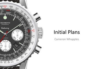
  • 1. Initial Plans Cameron Whapples Initial Plans Cameron Whapples
  • 2. Initial Reaction Presented with the brief, my plan is to create an advertising campaign. This was something that I enjoyed creating in the introductory task. This focused on Irn Bru, however I believe that if the subject is something of my own choosing the end product will be much more successful. The mistakes I made during my video rotation discouraged me from going into the film genre. This said, the skills I picked up from both the video rotation and the print rotation will definitely help in the production of my final project. I was inspired by current advertising campaigns which included both a TV version and a printed poster version. These two elements linked to create a campaign that I felt was powerful. One that stuck out was the Land Rover campaign which included Bear Grylls. One particular advert did not include the vehicle, but a story of recovery from a parachuting accident. The media I could use to portray these adverts in is something that I have thought about. I would like to produce a television campaign, as well as a poster suitable for an advertising board or magazine. Though an advert for an expensive vehicle may be something that I would enjoy, I would prefer to create an advert for something equally prestigious, such as a high end watch. This appears to have a much wider market as it can appeal to many people in many professions, businessmen with a taste for expensive jewellery, but also explorers and the outdoors type, pilots and divers. As long as the watch is practical it can be sold to a larger audience than a purely aesthetically driven watch could. The style of the adverts are also appealing. They generally have a calm and soothing approach with lots of imagery of greatness and power, such as mountain ranges or other imposing landscapes. They are often inspirational, such as in the case of the Bear Grylls ad in which he says that he was told he would never walk again.
  • 4. Concept Board Lots of details can be taken from this advert as many of the features are ones that I like and would replicate. The main one being the obstruction of the brand name at the top of the page. It does not make the title unreadable but it shows the size of the brand’s reputation as they are able to hide part of their name without fear of being misinterpreted. The use of the lamps in the photograph is clever as they subtly border Daniel Craig’s face on either side. Both the actor and the product unofficially have been allocated a side of the page each, despite the size difference between the two. The small image of the watch, compared to the image of Craig, has the same amount of space. This suggests that the watch is just as important, if not more as the actor is giving it plenty of room. The shine on the watch is a detail that compliments the rest of the image as it is so dark. Being an advert for the film Spectre as well as Omega, the theme is James Bond. Craig is in character and costume in an environment similar to one seen in the film. The lamps give the impression of a workshop or garage which does appear. The message of the advert is one that is not subtle: James Bond, the height of classiness, wears an Omega. The sparse composition of the advert is a design that I find appealing. The small amount of information is centred around the watch and does not include any unnecessary information.
  • 5. Concept Board The composition of this advert is the thing that is most appealing about it. The position of the watch is something that I find interesting as a noticeable amount of the background is shown behind it. The choice to make the product smaller and allow the image behind to be seen is not something that I would have thought a good advertising choice. The product is shown as the only item on the page. It can be seen facing upwards towards the light source. This is one of two positions that watches are most commonly seen in on an advert. The alternative is the watch face pointing towards the camera. With the watch in the position shown the strap fades discretely into the background and becomes lost in the texture. This texture is also intriguing as it appears to be a photograph of water but taken from under the surface. The introduction of the light from the centre gives the image a smoke-like quality. This light also draws the eye to the centre of the page where the focal point of the image lies. The information rests at the top of the page, headed by a striking title. I believe that something like this is a smart strategy as it draws the eye with the intriguing title. Underneath this is a paragraph of text explaining the product or details related to it. This is finished with the model of the watch in a bold text, similar to the title. This means that the title and the model name can be read at a glance if so desired. The text is also in line with the image of the watch and does not exceed the borders of the watch case. This keeps the advert very linear and neat as the empty spaces either side become borders. The brand logo is situated towards the bottom of the page. This is in a discreet position but it means that the colours of the brand do not interfere with the colour scheme of the rest of the image. It is tucked away to one side with the green background fading as gets closer to the centre. I like this design as it enables the logo to be seen on the green background but it means that it does not end abruptly.
  • 6. Concept Board The interesting thing about this advert is the use of the border at the bottom of the page. This is something that is not commonly used by most adverts, though exceptionally helpful when a lot of text needs to appear on the page. The details regarding the image and product can be positioned here. The product is shown to the right side of the page, however it is on its side with the crown facing upwards. The strap goes slightly out of frame. The product is also seen on the wrist of David Beckham. Something worth noting is the position of the logo which appears to be in-line with the face of the watch. Beckham is framed with the private jet to the left. The tagline on the image is placed in such a way that it does not obstruct any important details and also so that the eye is drawn to the product. The advert is composed so it would seem that Beckham has just stepped of the jet and onto the runway. This ties in with the slogan, ‘Worldclass travellers’. The colour shceme is also interesting: the colours are powerful but they are not bright. Although there are strong yellows they have been reduced by the blues in this image. These spread in the darker areas where the yellow does not reach and balance the brightness of the image. This can be seen on the jet, with the areas towards the back soaked in sunlight and the areas further forward draped in a green-blue. This colour scheme matches the product as the face of the watch contain both a ligher grey colour and a blue.
  • 7. Concept Board The main focus of this advert is the image that everything is based around. The fighter jet behind the pilot is the main draw of the eye which is why the colours and composition have been made to fit this. I like the way in which the black areas of the watch are translated to the rest of the advert. The pilot’s clothing is very dark, with few light areas on it at all. The jet is entirely black and actually casts a large shadow over the lighter runways. The shadow brings the eye to the product as the angle runs downwards, past the image. The top of the page has been darkened artifically in post-production to enclose the eye into the centre of the advert. This can be seen around the head of the person as it gets slighty brighter around his hair. The advert is split into the left-right compositon, with the pilot on the left but the jet and the product on the right. The brand name sits at the top-most point of the jet and is in line with the product. This is true of the text below and even of the quote located on the left, which is in line with the pilot’s body. As seen in the other adverts the person faces away from the watch. This would suggest that it leads the eye to the centre as eveything points away from it.
  • 8. Concept Board The main thing that is visible in this advert is the watch. Unlike some of the other adverts this takes up a large portion of the image. I especially like the way in which it has been photographed, breaking the tradition of it facing the camera straight on or at a slightly angled position, looking above it. It is also slanted to the side, as though it is sinking through the water unaccompanied or guided by anything. It is as though it has been dropped by a diver or swimmer. The gradual gradient of the blue background would suggest that the watch is deep underwater which subliminal makes the audience aware of its capabilities. A more obvious indicator to the watch being submerged are the bubbles surrounding it. These break up any monotony that may otherwise occur. This composition is entirely original and a very good contrast to the other adverts that may come across as a little more rigid and formal. The watch takes up the majority of the image, but the face is present in only the top half of the advert. This leaves room for the text beneath it. The font is bold and striking which is what is needed for it to be noticed. It matches the theme of the watch, being round yet strong and slightly rugged characters. The slogan ‘the watch for those on their way to the bottom’ is one that is relevant to the image but it also suggests that it is built for more. Although it suggests that it is intended for diving it does not state that this is its sole purpose. It suggests that it will not fail wherever the wearer may go. ‘The bottom’ could be interpreted in many different ways which is something that I particularly like.
  • 9. Concept Board An interesting feature of this advert is that it uses the left and right divide tradition but in a much different way. Usually the photograph stretches acorss the page and the elements insdie are positioned to this divide strategy. This advert is entirely black apart from a separate photograph to the side. This depicts an astronaut from the Moon Landing. The photograph fades into the rest of the advert. The product sits to the right of the centre of the pag. It rests on its side which is not a common position but it also appears to be resting on a surface. This is not something that is often in luxury watch adverts as they usually appear to be floating unsuspended. The top most bits of text are the Omega and Speedmaster logos. This is refreshing to see as these are normally located at the bottom of the page, below everything else. ‘The Moon Watch’ sits towards the top of the page, in line with the visor of the astronaut. Below this is the tagline, ‘The first and only watch worn on the Moon’. This is a bold statement that is the selling point of this product. This sentence is also the starting point for a white fade that can be seen behind the product. Something that I dislike is the way in which the photograph has been faded into the advert. The edge of the photo has not got a stright divide, but bends around the astronaut. This keeps him in frame but means that it is not straight. This is also done to stop the title being obscured by the image of the Moon’s surface, but it does not look very visually appealing.
  • 10. Concept Board This advert is so very different from all the ones before. The main reason for this is the colour scheme. Where as the adverts prior have had muted and quite reserved color schemes, this one does not seem to follow the rules. The primarily blue photograph is made so much brighter with the red surface which I believe to be the bonnet of a car. The products are also very bright which is not normally a contributing factor to the colour scheme, but in this case what with the tones of the other elements it only increases the brightness. The composition is bizarre. I would describe the other adverts as being minimalist with their design but this is at another level. The only text on the advert reads ‘Guess watches’. The font used is very elegant and fitting with the market but no other information is given. The tradition of the left-right composition has not been followed either as the product is located on the opposite side. Despite this being such a contrast from the other adverts I do like it a lot. The design is sleek if a little bare. The colours are very bright and outgoing compared to the rest but this means it stands out. My only conclusion to these decisions is that this advert belongs to a lower-end brand of the market. The competition in this area of the industry is likely to be different from the extremes of the high-end watches, where professionalism is key.
  • 11. Concept Board The advert starts with a title showing the brand name. I like this feature as it reveals the theme of the advert from the start. The audience will know the main gist of the video from this point onwards. The advert is a compilation of jets flying across the states of America during their two year tour. This is not a traditional advert format but this works very well for the content. In almost every shot the product or brand name is shown, the watch seen on the wrists of the pilots and the name on the fusilage of the jets. The graphics are something that I find very appealing. These show the name of the state or area that the team have travelled to as they fly past a landmark. The text is keyframed to follow a specific point, a tower or a mountain, so that they appear to be floating beside it. This is very aesthetically appealing. Most of the shots are ones from the exterior, filming the planes from an aircraft separate from the formation. However at crucial points the shot will cut to either a wing-mounted camera or one inside the cockpit to reveal a gripping close-up of the action. This happens often during difficult stunts that the team perform The editing is something that makes this advert work so well. The cuts are timed with the music which makes it so much more fast-paced. One feature that I enjoy is the combination of three zooms in quick succesion that is timed with the beating of a drum. The advert also includes radio chatte between the planes at certain points for that feeling of inclusion. The advert ends with a slow-mo of the planes flying over the camera in an arrow formation. The Breitling logo and slogan is shown at the end.
  • 12. Concept Board This advert is one that I like very much. It is short, around thirty seconds, and it gets to the point. Wide shots of the scenery start the advert, with a lone Bentley driving away from the camera. The way in which the red back lights shine through the darkness is aesthetically pleasing, especially contrasting with the car’s blue colour scheme. It then shows the watch which ties the two together. The image is a static shot with no camera movement. This is a change from other adverts where the camera seems to be in almost constant motion when filming shots of the product. The car is then shown again, running through a small compilation of different parts of the car. The similarities can be seen as it does this. The most noticeable is the diamond-shaped cross-hatched bezel and the diamond-shaped lights reflected on the surface of the headlight. The car is shown driving and almost passes the camera when it the advert cuts to the image of the watch. This is the second time at can be seen and the full details are seen now. It fades to the ‘Breitling for Bentley’ screen and an effect plays across the lettering, illuminating it in the same blue as the vehicle. The colour grading is consistent throughout the advert which keeps it very uniformed and professional. The advert also has utilises a number of graphics from the beginning to immediately show the audience what the advert is about. I believe this is because of the short run time and the need for the message to be gotten across quickly.
  • 13. Concept Board The thing that I like most about this advert is the soundtrack. The music is very powerful in this advert although it does not use the classic techniques of deep and resonating instruments. It begins with electronic sounding noise, perhaps from a keyboard. A beat kicks in after a couple of bars along with an acoustic guitar that joins it later. This cuts away eventually, towards the end, to let the keyboard return for the last few seconds. This music is inspiring and compliments the level of emotion in the advert. Combined with the narration by George Clooney it works well to portray the product in a vey nostalgic way. My music production will be influenced by this as I find this a very good piece of work. The compilation of the footage is also something that I thoroughly enjoy as it is so unique. Many brands have their claim to fame, their watches being part of a historical event, however none have been documented in such a way that the Speedmaster has. The combination of shots from Clooney and the clips of television coverage makes for a very appealing advert and certainly one that will find a place in the hearts of those who witnessed the historical event as a child, as Clooney did.
  • 14. Concept Board One of the most important things when creating a brand is the logo. There are many luxury watch brands but most of them have similar logos and logos that follow the same rules. A particular logo that I find interesting is the Breitling logo. This shows a combination between a ‘B’ and an anchor bearing a set of wings. This is very clever as it represent a number of things to do with the brand. The B is the first letter of the brand name and surname of the original founder, Leon Breitling. The anchor symbolises the application of a number of their products, such as their line of diving watches. The most intricate part of the design is the set of wings which include a complex feather design. The wings symbolise both their famous aviation watches but their history. What with the Wright brother and the Italian Air Force, they both have supplied watches to these pilots. The Tag Heuer logo is perhaps the most interesting logo out of all. Due to its colours and the way in which it arranges both words inside of a shield-like box it is unlike so many other brands. So many brands go along the lines of Omega, using just a simple image and name, instead of branching into bright colours and quirky fonts. The IWC logo is alike so many of the existing brands on the market. They will use just text, often without a second line, to give their brand its distinctive logo. Although this works well for them I do not believe that it is the correct approach for a successful line of products.
  • 16. Mood Board Analysis A common strategy used by the watch adverts, especially the higher end brands, is to use famous actors. This trend is used by brands such as Omega and Breitling. The latest James Bond film was used to promote a luxury watch from Omega as many enjoy the film series. Actors are also shown to be in their ‘natural surroundings’, such as John Travolta. Famous for his acting career and his experience as a pilot, he is shown sitting on a runway next to what is presumably one of his aircraft. The advert combines the actor’s career by including the studio chair and lights while promoting his ability to fly with the use of the plane and more importantly the executive pilots watch. A repeated theme is power. Many of the Breitling advertisements use aircraft, especially fighter jets to create a feeling of power. Another uses an image of a wave to demonstrate this effect. It is also used to show the water-proof aspect of the watch. An unusual advert is the one produced by Guess. It displays a collection of watches resting on the bonnet of a car. The red paint work contrasts with an ocean in the background and draws the eye. This suggests that the market that these watches are targeted for is not the same as the market for brands such as Rolex or Omega. The dull themes used by the high end brands relate to the prestige and seriousness of the products. The watches cost thousands of pounds, making the market very competitive. They use the darker tones to appear more professional and to attract those willing to depart with a portion of their hard earned cash. When these adverts are placed next to advertisements from Guess or Origine they make them look out of place as the mood is just so different. These adverts were the sort of thing that I had in mind when I first thought of the idea. They will definitely influence what I will create as my final product. They have inspired lots of different ideas, especially the media in which they could be presented. It is has also changed my awareness of the use of certain colours that I should use, as the art styles and themes that I had originally thought of were slightly different.

Editor's Notes

  1. Log your initial thoughts regarding the set brief- What could you make? What are you good at? Your opinions? Can be a list of bullet points of reactions- does not have to be full prose. Can be hand drawn and scanned in.
  2. Collection of images related to your product/inspirational/visually interesting At least 15 needed
  3. Bubbl.us or hand drawn-scanned using college printers exploring 3 potential ideas