
Recommended
More Related Content
What's hot
What's hot (20)
Viewers also liked
Viewers also liked (17)
Similar to Double page spread Analysis
Similar to Double page spread Analysis (20)
Recently uploaded
Recently uploaded (20)
Double page spread Analysis
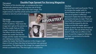
- 1. Double Page Spread For Kerrang Magazine TheText Kerrang have used a pull quote.This is to intrigue the reader with it’s attractiveness and to break up text. The use of gutters is effective because it makes the text like small and quick and easy to read.There are many little pull quotes in the text but they could be argued to also be kickers so that the reader gets a heads up about what the next topic of talk is about.The use of the drop cap doesn’t really have an effect on the text, it’s just the magazine following the basic conventions of a double page spread. The Layout The layout of this double page is considered the most aesthetically pleasing way of using the rule of thirds. The first thing the reader sees is the main image.This might entice to read the article and to put them in context to who the article is about. The Image The image is the magazine’s mode of address.They have the image look right at the camera so that the reader feels as if the image is looking right at them. The effect of this is that the makes the reader feel like the image and the reader themselves are making eye contact, this makes the reader feel that the person in the image is right there in front of them like they’re having their own personal convocation.The lighting on the image can suggest that the article is a cheerful one.The shot type is a neutral shot.
- 2. The Layout The layout of the double page spread is considered to be the most aesthetically pleasing way to lay out the page when taking the rules of thirds into account.The first thing the reader sees is the image on the left hand side which might encourage them to read the rest of the article. Double Page Spread ForVibe Magazine TheText The use of only one gutter straight down the middle of the text splits the text in two.This is a way of making a long text seem shorter.The lines look short so the reader thinks it’s quick t read.The use of the big drop cap really attracts the reader to the text. Also it links with the main image.The letter used is the first letter of the name of the person in the main image, it’s also one ofVibe’s conventions to make their magazine more unique. The Image The image is a slightly higher neutral shot.This could mean that the reader feels that they are slightly above the person in the main image, this makes the reader feel that they are more powerful than the person in the article.The mode of address here is that the person in the image is looking right at the camera.This makes the reader feel that they are looking directly at them, like they are there in the room with them.The facial expression used is shows anger or seriousness.This really sets the tone of the article.
- 3. Double Page Spread For NME Magazine TheText The drop cap is simple which doesn’t attract too much attention towards it and normal use of gutters.Their are some pull quotes that stand out because they are bolder and bigger but when looked at closer they resemble the 10 commandments.This goes against the way we use language and we find appropriate to use the 10 commandments in this way.This could be a way the magazine has targeted its audience , a misbehaved audience. The Layout NME has really challenged conventions of the rule of thirds. The main image is placed in the middle third but slightly to the right.The text is surrounding the main image which shows the image which shows that the image is the most powerful convention on the page.The text changes shape on the page, to the left of the image it’s shorter but on the right of the image its long and spreads down the page. The Image The camera shot is a neutral shot so that the camera is eye height with the image.This is the magazine’s mode of address.This creates a sense of eye contact with the reader, this makes the text seem like a convocation with the reader.This makes the text seem trust worthy and personal.The costume used resembles a zebra which suggests maybe that the person in the image is a wild.