
Recommended
More Related Content
What's hot
What's hot (20)
Viewers also liked
Viewers also liked (8)
Similar to question 1
Similar to question 1 (20)
More from claudiaohara
Recently uploaded
Recently uploaded (20)
question 1
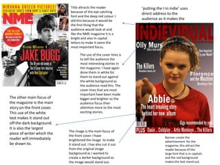
- 1. Title attracts the reader because of the eye catching font and the deep red colour. I did this because it would be the first thing that the audience would look at and like the NME magazine it is a bright and also in capital letters to make it seem the most important focus. Banner create the advertisement for the magazine, this attract the reader because of the large font that is in capitals and the red background makes the text stand out. The image is the main focus of the front cover. I have brightened the image to make it stand out. I has also cut it out from the original image background as I wanted to create a darker background so the image would stand out. The other main focus of the magazine is the main story on the front cover. This use of the white text makes it stand out off the dark background. It is also the largest piece of writer which the reader will immediately be drawn to. The use of the cover lines is to tell the audience the most interesting stories in the magazine. I have again done them in white for them to stand out against the white background as the audience read this. The cover lines that are most important have been made bigger and brighter so the audience focus their attention more to the most exciting stories. ‘putting the I in indie’ uses direct address to the audience as it makes the reader think about themselves
- 2. Large Image in which is the main focus of the page. I did this because I felt is was the most interesting picture as Olly Murs is famous so lots of people know him and also the closest and clearest so therefore the reader will be attract to this. Same font as front cover gives the magazine constants and there for reader will recognise this font every time they see it. Extra pictures to keep attract the reader as to what extra features are in the magazine and maybe even convince them to go the page the number says on the image. Eye catching red font keeps the readers attention through all the features of the magazine.
- 3. Image bleeds onto the second page. Gives the power to the artist. This is a typical use of an article which I looked at when doing my research. Quote from performer. This again gives the reader a small part of what the article is going to be about. Stand first before text gives the reader a small summary of what the article is going to be about and could persuade them to read it after finding out a small part of what its about. . Large S letter to start off the text. This commonly used in lots of articles. Name of the artist is big and bright to attract the reader. This gives the name more power and presence. This is used because the reader is lead to believe that this artist is very important. Medium close up of artist. Gives the reader the main focus of the article and as Nick is looking directly through the camera the reader feels involved with this.