The document discusses various design elements used in magazine layouts to engage readers, including large images, drop caps, consistent colors, contrasting text and image shapes, brief introductions, large headings, and inclusion of page numbers and mastheads to adhere to the publication's house style. These elements are intended to attract and maintain reader interest in the articles.
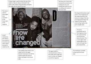
1. A large image is used to attract the eye of the
reader so they are always interested in the
article, with medium long shot being used gives
the reader the full view of the stars
The drop cap is a tool used
to entice the consumer into
reading the story and
making them want to carry
on reading and it sticks to
the house style.
The colours
used on
these pages
keep
consistent
to the
house style
of the
magazine
The shape of the article could
entice in the imagination of
the reader because of the
contrast in shape of the text
and image which allows the
reader to think that the
article will get right to the
point straight away.
The text is
positioned next to
the image too show
the contrast of the
size of the story
about the stars. This
is once again clever
editing again by the
editor so to get into
the minds of the
reader.
A brief
introduction
will relate to
the content of
the article and
inform about
the latest in
celebrities life.
The heading of the article is the
largest text on the pages
because its purpose is to tell the
audience what the article is
about and keeps to the house
style.
The page number is
introduced here to refer to
the reader which page they
are on so they can navigate
around the magazine.
The masthead is included
to keep with the house
style.