SlideShare a Scribd company logo
1 of 137
OCR –
Level 3 Cambridge Introductory Diploma in
Media
Unit 13:Planning and Pitching a Print based
Media Product
Evidence
Name: Bradley Gimber-Stone
Candidate Number: 3050
Center Name: St. Andrew’s Catholic School
Center Number: 64135
Set Brief - Print
Project/Brief –
Music Magazine & Promotion
Contents PageLO1:
- Slide 4: The Publisher
- Slide 5: Focus Publisher and Product
- Slide 6: Purpose And Meaning
- Slide 7+8+9: Front Cover Analysis
- Slide 10: Content
- Slide 11: Target Audience
- Slide 12: Content Page Analysis
- Slide 13: Deconstruction Of DPS
- Slide 14: Website Annotations
- Slide 15: Form And Style [Front cover]
- Slide 16: Form And Style [Contents]
- Slide 17: Form And Style [DPS]
- slide 18: Market Position
- Slide 19+20: Technological Convergence
- Slide 21: Social Media Synergy
- Slide 22: Retail Outlets
- Slide 23+24: Production Process
- Slide 25: Circulation and frequency
- Slide 27: The Publisher
- Slide 28: the genre
- Slide 29: purpose and meaning
- Slide 30: Deconstruction Of Front Cover
- Slide 31: Deconstruction Of DPS
- Slide 32: Deconstruction Of Contents
- Slide 33: production process
- Slide 34: market position
- Slide 35: Technological Convergence
- Slide 36: Synergy
- Slide 37: Form And Style [Contents]
- Slide 38: Form And Style [Front Cover]
- Slide 39: Form And Style [DPS]
- Slide 40: Target Audience
- Slide 41: retail outlets
- Slide 42: conclusion
LO2:
Slide 44: magazine of inspo
Slide 45: mind map
Slide 46: font style
Slide 47: my chosen font style
Slide 48+ 49: masthead conations
Slide 50: target audience
Slide 51: summary of ideas
Slide 52: form and style
Slide 53: inspo front cover
Slide 54: inspo dps
Slide 55: What Will You Repeat
(Steve Neale-1980)
Slide 56: What Will You Repeat
(Steve Neale-1980)
Slide 57: Mood Board 1
Slide 58: Mood Board 2
Slide 59: Mood board conclusion
Slide 60+63: Hand Drawn Drafts
Slide 64+ 75: graphic layout
Slide 76: LO2 Conclusion
LO3:
Slide 78+ 84: Graphic Layout
Slide 85: Proposal (Amplified)
Slide 86: Proposal (DeadRiff)
Slide 87: Magazine Flat Plan
Slide 88: Interview Draft
Slide 89+95: graphic layout
Slide 96: Colour Scheme
Slide 97: target audience
Slide 98:+99 test photography
Slide 101+ 110: step by step
Slide 111: production plan
Slide 112: equipment cost
Slide 113+ 120: staff and cost
Slide 121: printing quotes and costs
Slide 122: Distribution To Retailer Costs
Slide 123: advertising revenue
Slide 124: Profit and Loss breakdown
Slide 125+129: Ethical & Legal Issues
Slide 130: watermark
Slide 131: watermark on magazine
Slide 132: Copyright ©
Slide 133: Data Protection Act 1998
Slide 134: Editors Code of Practice
Slide 135: Calendar events
Slide 136+7: final results
The Publisher
Bauer is a privately owned media company, and is
one of the largest in Europe (in 2008). Currently
owned by the fifth generation of the family
ownership, it was founded in 1874, Hamburg. They
are located in 19 different countries and have
11,000 employees
Bauer media produce a number of different types
of magazines ranging from music to vintage
vehicles.
They are many different platforms such as: TV
Magazine Digital and radio
Source: http://www.bauermedia.co.uk/about/our-company
In the UK alone they reach out to 25 million readers,
listeners and watchers .
The company reach out to all sorts of people.
They do magazines for the old the young me and
women.
Focus Publisher and Product
Publisher Product
Bauer is a privately owned media company, and is
one of the largest in Europe [in 2008]. Currently
round by the fifth generation of the family
ownership, it was founded in 1874, Hamburg.
Kerrang! are a international rock/heavy metal
magazine ran and operated by Bauer media group.
The originally started Kerrang! 34 years ago and now
are one of the biggest rock magazines to date. Not
only are Kerrang! a magazine they are on the radio,
TV, android.Source:
http://www.bauermedia.co.uk/about/our-
company
Source:
https://www.bauermedia.co.uk/brands
/kerrang
Purpose And Meaning
Bauer media groups slogan is “we think popular”. This connotes that
they only think the best music in the industry to go in their magazines.
the words ‘we’ connote that they are like a family and they work
together, also ‘think’ can connote how they predict what will be the
new hottest thing.
The slogan “WE ARE” connotes that they are an
association and not just a company/magazine. Also it
states statistics, such as “22 million people” “107 brands”
“radio, digital, TV, magazine, live.” to reinforce their
status as a market leader and a lot of consumers trust
them on many different platforms.
Source: http://www.bauermedia.co.uk
The genre of Kerrang! Is metal and rock and applies
to people who like rock music and heavy metal
Kerrang! Is a rock/metal magazine which is issued every week. The indent of
Kerrang! Is that it has the shattered glass which connotes its edgy rough genre of
music.
Front Cover Analysis
Non-verbal code: body positons. In this front cover the band
is in a group and together and not just the lead singer,
connoting the article is about the whole band and not just one
of the band members.
Non-verbal code: hair - Their hairstyles also connote
that they are a heavy metal/rock band, as they have
similar hairstyles to other artists from the genre such as
metallica, slipknot, five fimger death punch and guns n’
roses
Non-verbal code: what other content is available in the
magazine
This for example is about artists that are “inked” and that some
people may see this and pick the magazine up and purchase it.
Non-verbal: denotes bands official logo, attracts
attention of fans of that band
Source: http://home.avengedsevenfold.com.br/wp-content/uploads/2010/07/kerrang118.jpg
Barcode: placed vertically to maximize
space for other content
Front Cover AnalysisSource: http://home.avengedsevenfold.com.br/wp-content/uploads/2010/07/kerrang118.jpg
Verbal code: the use of “exclusive” connotes that it will not be covered
anywhere else in any other magazines.
Verbal code: using a festival name such as “sonishphere”
attracts people wanting people into maybe going into
that festival and seeing a 8 page preview connotes that it is a big event.
Technical code: the photo is showing that they are a serious
band and that they are serious about the music they produce.
Verbal code: the masthead connotes that the shattered glass effect is
due to the loud intense music that the institution cover. The black font
helps people notice the mastehad first than anything else.
Verbal code: this connotes that inside the magazine you are able to have 3
free posters that are related to not only the genre of the company but are
artists from bands that they have recently covered
The masthead is behind the main image and is put on a white
background as it creates more of an impact on the masthead as it is
clearly read able and people can understand what it says.
Cover lines help promote other things that are in the magazine
for example this cover line is about 3 posters included in the
magazine of very famous artists. Also it uses star appeal so
people will see this and pick it up as they are intrigued on what
it is about.
Front Cover Analysis
Masthead: the masthead is the main title
for the magazine and it’s the most
recognizable. If the masthead wasn’t
there then noon would know who's
magazine it was.
Main Image: this connotes who the main article
is about. In this case its avenged sevenfold
talking about their new album. If the main
image was someone else and the main article
was on someone this is false advertising.
Strapline: quick line that will get the readers
attention, making them want to read onwards
Cover lines: this allows the reader to
know who else is in the magazine, like a
feature it allows the reader to easily
decide if they want to purchase them
magazine or not.
Barcode: it is placed like this because
it can allow more space to have the
cover lines.
Content
Kerrang offer a rang of content varying from interviews to relationship updates on famous artists. They also sell
merchandise and offer competitions to win tickets to see famous bands such as : Bring Me The Horizon, The
Amity Affliction, Asking Alexandra and many more.
In this double page spread we see Oli Skyes (singer of
band Bring The Horizon), he is most famous for his
company “drop dead” and his activity with BMTH. He
is also known to have a modeling career before he
became a singer and formed BMTH. He is a icon to
other band singers.
Kerrang! Covers all bands from bands that have
just formed to bands like Metallica and guns n’
roses. Recently they have been covering amity
afflictions newest album “this could be
heartbreak” that released on august 22nd of
2016.
Followed by Bring Me The Horizon on which
they released their newest album “that’s the
spirit” on September 11th of 2015.
Not only do they talk about the newest and
greatest things that are happening, they
advertise merchandise, not only theirs but
other bands that they have been covering in
that weekly issue, this means a lot of content is
covered every week.
Target Audience
Hartley’s Theory:
Age: the range would be from 14- 25 for this type of magazine. Also the music reflects people at this
age.
Gender: this genre of music applies to all genders. This applies to males a little more due to the black
coloring and the black, red and white color scheme. This applies to females with the red coloring on
the website and magazines
Class: people in ABC1 in the socio-economic needs because it would be the working class who would
purchase this magazine. This group consist of 14-25 year olds, so not many students will be categories
in A or B
Katz Theory:
Inform and educate: the reader can find out what BMTH or TAA will be doing next on the return and
learn facts about what is in the cover lines, for example:
-unseen photos
-untold stories
-unpublished interviews
Maslow’s Theory:
Explores: readers of Kerrang! Would be explorers because the magazine includes upcoming stories
about what is happening at one point in time to do with a certain band or artist, and the reader wants
to know this because thy can become more interested into the band or artist.
Content Page AnalysisMain Headline: this
connotes what the
biggest story is in the
magazine
Heading and Sub
line: “informed and
educated” (Katz) on
the news Advertisement:
persuasion to sign up to
their registration list for a
price of £6 and to have it
delivered to your door.
This may attract people as
they don’t have to
constantly go out and buy
it every week.
Reviews: other artist
of the same genre
review some of the
newest albums that
artists have brought
out, for example:
amity affliction
review BMTH’s
“That’s The Spirit”
Competition: Here they have
named the competition section
‘Swag’ – they may have named
this section ‘Swag’ to appeal to
their target readership 17- 25
year olds as this is the sort of
informal language they would
use.
‘Star Appeal’ (Richard Dyer)
This is important to the reader
as it a pull to read what is
happening, and why are they
being covered.
The contents page I this issue is
very picture lead.
Deconstruction Of DPS
Pull quote: this quote is from the guitarist of
BMTH (Lee Malia). Since their new album released
in 2015 (sept 11th) Lee is saying how this album
will be better than their previous (which is a
quote pulled out of the interview to pull in the
reader)
Stand first: this is what the whole
interview will contain. For example:
Wembley, weightlifting, custom
guitars and their new album. (That’s
The Spirit) also the guitar is know as
one of the most stereotypical items
of the rock genre
Magazine Credits:
this connotes who the
photo is of and who
took it
Drop Capital:
this connotes
where to start
reading the
interview
Reference to previous album
sempiternal. On this album
there was a song called “can
you feel my heart”
Differentiated questions and answers:
different types of questions are asked about
various things the artist likes . To make the
interview more interesting.
Website Annotations.
Social links: these help
fans of the magazine
connect with Kerrang!
and also see exclusive
content from Kerrang!
Advertisement:
this promotes
fans of other
bands and
Kerrang! To check
out other bands
to get the
reputation.
Advertisement:
this promotes
fans of other
bands and
Kerrang! To check
out other bands
to get the
reputation.
Logo: they
keep the same
house style all
the way
through out
the website
and keep the
logo scattered
everywhere.
Tabs: this helps people navigate around their
website. They stayed with the same color scheme
which is red and white
The latest:
this shows
all the latest
from
Kerrang!
And what's
been
happening
recently with
bands and
artists.
Form And Style [Front cover]
This is an old issue of Kerrang! On which they had a different house style compared to now, but
their concept is still the same
The masthead: this masthead is ALWAYS in the same place
and the colors are always black or white.
The colours: the colour scheme in this issue is blue, yellow
and white. The yellow means that it is important and
attracts your attention and makes you want to pick it up and
maybe purchase it. For example in this issue “Bring Me The
Horizon and 10 Posters” are highlighted in yellow catching
peoples eyes and drawing attention.
The masthead:
Similarity- always in the same place
The colours:
Difference: the same concept over all has not changed
but the colors have changed massively. For example
they have gone for red and white writing and no blue
and no yellow writing, this may be because red and
white appeal more to younger people
Form And Style [Contents]
In this contents page of Kerrang! There is a
competition going on to win a pair of
shoes.
Also in the contents page it states the issue
number and the cover date on when it was
released. Also on the bottom right of the
contents page it has a advertisement for a
subscription to get the magazine delivered
to you.
All throughout the magazine it sticks to the
same color scheme. (Red, black and white)
even with their actual contents it has the
yellow writing in black so it stands out to
people. It also highlights the page number
by the subject for example:
Features
24: Asking Alexandra VS motionless in
white
Form And Style [DPS]
The drop capital: this
indicates where to
start reading the
interview/ article.
The colour scheme on this double page still is consistent with all the other pages, on which it has stuck with
the red black and white house style. Doing this it implies that the company have their own unique style and
are professional when creating their magazines. With “my dinosaur life” they have put it in a font which
makes it look childish and that a child wrote it. This could connote that he still has he childhood with him and
continues to live like a child.
This illustrates who the article or
interview is about. In this case it is
Blink 182
Pull quote: this is a quote pulled out of
the interview to attract people to read
the whole interview/ article
Stand first: this is what the
whole interview will contain.
For example in this interview
it will contain: mark talking
about how the brassiest of
blink 182 came on a
incredible journey from
California to London.
Market Position
Kerrang! Is now bought by almost 77,000 people per week, according to the latest figures from the Audit Bureau of
Circulations (ABC), they produce one issue a week. In a month? That’s 385,000 copies sold. In a year? 4,620,000 copies
are sold every year. Meaning a lot of profit is made so they can produce more magazines and keep their profits up.
Source:
http://news.bbc.co.uk/1/hi/entertainment
/1823270.stm
Source:
http://www.statista.com/graphi
c/5/381704/kerrang-monthly-
reach-by-demographic-uk.jpg
Here we see what age range the Kerrang!
Magazine mostly applies to. In this case
its 15+ years old. This implies that the
market position of the magazine is quite
high since 15+ year olds bought over 673
copies in a month.
They are mostly know in Greater London
and the rest of Great Britain (according to
the chart) it also connotes that more
males buy this magazine (382) compared
to women (292).
NME sell around 20,000 copies a month
so Kerrang! Clearly sellout NME.
Kerrang! Is currently a market leader of
their genre and is out selling another
competition.
Technological Convergence
This connotes that Kerrang! Only post the
“Hottest” and “latest” new online comparing to
the physical copies on which it has a lot more
information on all the subjects on the front
cover. Although it produces the hottest and
latest on their website they also advertise
upcoming album and to order the newest issue.
This implies that they promote their magazine on
social media, such as twitter, facebook. Doing
this helps spread their popularity and to get
people to notice them. From the screenshot it
connotes that there is a online copy of the most
recent issue
Source: http://www.kerrang.com/hottest/
Source: https://twitter.com/kerrangmagazine
Technological Convergence (Continued)
Kerrang! Supply their own YouTube channel for each item for example (from the image)
podcasts, radio and TV. With these channels they post highlights of what's happened on
that day.
With these channels they don’t only upload
highlights but they upload exclusive
interviews and live playing bands. This can
let fans of the magazine see more things
that would not normally be in the
magazine. Also it lets people who aren't
subscribed look and watch exclusive
content for free.
Here they upload exclusive
interviews from the reading and
leads festival on which happened
earlier this year.
Source: http://www.youtube.com
Subscribe –When subscribing reader/
followers will gain exclusive access/
content when subscribing, the more
subscribers the more popularity, the more
views which means more ad revenue.
Currently KerrangPodcast have 59k,
Kerrang! radio have 7K and kerrang tv
have 228
Social Media Synergy
Likes And Followers
Likes are a key part of having a successful business as it
connotes how many people follow the magazine on that
platform (in this case Facebook and twitter.)
Although Kerrang! Reach out to many ages social media
promotes it to both ends of the age spectrum as some
adults tend to be on social networks, but the majority of
the time it is young adults. Also many young adults in their
teens, go through their ‘phase’. So magazines such as
Kerrang! Attract people like this. Although many ‘older’
people have stuck with the style of music they grew up
with as that was the trend in the 80s, 90s and they carry on
to love the music, bands that are like this are bands such as
Metallica, Allice in Chains, and Guns ‘n’ Roses
The relationship between social media and business in general is at a positive as the company get recognition for their
product or company so they can sell more and make more profit but it is also good for the creators of the social media
platform as the more people join twitter (for example) they make more money to use for development, meaning they
benefit each other as they are both making a profit and sales would be high.
Source:
https://twitter.com/kerrang
magazine
Retail Outlets
You can buy Kerrang! at any large supermarkets, newsagents, corner stores, petrol
stations, news-stands and hundreds of other places
Production Process
Process:
Decide Date Of Publication:
- First they decide the date on which they will publish the magazine. Once this has been figured out they
start to schedule when the other magazines will be coming out.
Manage A Schedule:
- This is where they organize a schedule not only for when the magazines will be realsed but for what people
do certain things.
Decide The Over All Budget:
- The editorial team will select the topics that would fit the weekly issue and they see how much money it
would cost them to make it. After this they figure out how much they should charge for them to sell it.
Decide Content That Will Be Included:
- At this stage the journalists go and set out to try and cover the story that they have been told to do. This
includes research, interviews, artwork/graphics . This helps to bring the magazine together.
Edit The Magazine:
- The editors edit and the magazine and make sure all the facts are 100% true and correct otherwise they will not
be able to put it into the magazine and if they do they will no be able to publish it due to false information.
Source: http://hosbeg.com/the-
magazine-production-process/
Production Process (Continued)Source: http://hosbeg.com/the-
magazine-production-process/
I have emailed the editorial of Kerrang! Asking them if they can tell
me what their production process is for their magazine. Unfortanlly
I did not get a reply regarding my request.
Circulation And Frequency
Kerrang! Is now bought by almost 77,000 people per week, according to the latest figures from the Audit
Bureau of Circulations (ABC), they produce one issue a week. In a month? That’s 385,000 copies sold. In a
year? 4,620,000 copies are sold every year. Meaning a lot of profit is made.
Source:
http://news.bbc.co.uk/1/hi/entertainment
/1823270.stm
Source:
http://www.statista.com/g
raphic/5/381704/kerrang-
monthly-reach-by-
demographic-uk.jpg
Here we see what age range the Kerrang!
Magazine mostly applies to. In this case
its 15+ years old. This implies that the
market position of the magazine is quite
high since 15+ year olds bought over 673
copies in a month.
They are mostly know in Greater London
and the rest of Great Britain (according to
the chart) it also connotes that more
males buy this magazine (382) compared
to women (292).
NME sell around 20,000 copies a month
so Kerrang! Clearly sellout NME.
Kerrang! Is currently a market leader of
their genre and is out selling another
competition.
The Publisher
Team rock are are privately own
company and they have recently been
brought up as they wanted to connect
people from metal hammer, classic
rock, prog and blues. The company first
became something in 2013 and has
been noticed by millions of people.
Source: http://teamrock.com/faqs
Metal hammer was officially founded
in 1986 and is still producing magazines
to this day. They produce an issue
every month and cover the latest
stories.
Source: https://www.tr-
tr.ro.connect.facebook.com/metalhammer/about/?entry_point=page_nav_
about_item&tab=page_info
Genre
Verbal code: the masthead is in
white so it pops out and it’s the first
thing you see. Also they
implemented the “metal” into the
“hammer so it looks like it is one
word.
Technical code: the full image has a
black and grey color scheme
suggesting it is about and old artist
that might of passed away recently,
and the color scheme is known to be
related with a old fashioned
atmosphere. The simple style of the
magazine cover could implies that he
was a simple artist and took
everything easily and was well
respected.
Verbal code: the font suggest
that they were an American
artist and a metal as the font
looks American and heavy.
The date implies that they
have passed away and the
quote at the bottom suggest
that they had that as their
merchandise and as their
moto
Source:
https://www.google.co.uk/url?sa=i&rct=j&q=&esrc=s&source=i
mages&cd=&cad=rja&uact=8&ved=0ahUKEwjHuvbmu57PAhVI0x
oKHXRzDhEQjRwIBw&url=https%3A%2F%2Fwww.pinterest.com
%2Fpin%2F240027855119168932%2F&psig=AFQjCNEqirYXlnGX
O4PNiruCmaajFQm9TA&ust=1474478819251942 Metal hammer covers more or less
the same type of genre as Kerrang!
For example, bring me the horizon,
of mice and men and other bands.
This is very similar to Kerrang! As
they cover the same music. Although
they may not cover the same music
stories at the same time at some
point they cover the exact same
subjects.
The genre of metal hammer can be
lighter than Kerrang! As they cover
people from the 90s and earlier as
they are most of the most iconic
artist of all time.
Purpose And Meaning
Metal hammer are currently
celebrating their 30th anniversary. They
do in depth reviews of the latest
albums and lots more such as video
interviews and news articles.
Their strap line is “Defending The Faith
since 1986”
Their strapline could connote that the
genre of music the cover is like a
religion and they have faith in their
music and they want to keep it going so
they use “defend” to try and keep the
music alive.
Source: https://www.tr-
tr.ro.connect.facebook.com/metalhammer/about/?en
try_point=page_nav_about_item&tab=page_info
Source:http://teamrock.com/metal-hammer
Deconstruction Of Front Cover
Masthead: the masthead is put
under the main photo and the rain
drops, over the masthead. It is
following the trend of the black,
red and white colour scheme.
Color and font: The main colour scheme
is Black, red and white. The quotes used
in this are white. And stands out from
the other writing. Also the font in this
front cover is very bold and stands out
from the other writing that is seen at
the bottom.
Main image: the main images is
very explicit in terms of
violence. This could connote
that their music is the same.
Deconstruction Of DPS
Drop capital:
to indicate
where to
start
reading.
Main image:
this tends to
be, a photo of
the person
that is in the
article
Secondary images: these are taken from there concerts or
other places they preformed
Extract taken
from article.
Quote taken
from article
or is the
person’s
moto in life.
also the font
looks like he
is holding the
writing.
Deconstruction Of Contents
Colour and font: in the contents page they have kept
the same colour scheme of black, red and white. This
is continuous throughout the magazine. The font of
this contents page is very gothic/old English.
Editor speaks section:
The editor “speaks” about the issue and his experience
writing the issue. And what issues he may of encountered
while editing the magazine
Images show a preview of what will
be coming up on them pages
The sub headline: The subhead lines on the
contents page tells the read what is on that page.
The sub lines: the contents page is under the
sub headline and tells the reader a short bit
about what is on that page.
Production Process
Process:
Decide Date Of Publication:
- First they decide the date on which they will publish the magazine. Once this has been figured out they
start to schedule when the other magazines will be coming out.
Manage A Schedule:
- This is where they organize a schedule not only for when the magazines will be realsed but for what people
do certain things.
Decide The Over All Budget:
- The editorial team will select the topics that would fit the weekly issue and they see how much money it
would cost them to make it. After this they figure out how much they should charge for them to sell it.
Decide Content That Will Be Included:
- At this stage the journalists go and set out to try and cover the story that they have been told to do. This
includes research, interviews, artwork/graphics . This helps to bring the magazine together.
Edit The Magazine:
- The editors edit and the magazine and make sure all the facts are 100% true and correct otherwise they will not
be able to put it into the magazine and if they do they will no be able to publish it due to false information.
Source: http://hosbeg.com/the-
magazine-production-process/
Market Position
I was unable to find the market position for
metal hammer or any information on where
they currently stand in the sales market.
Although in December 2016 metal hammer as
nearly bankrupt and the company “future”
bought metal hammer and 4 other magazines
for £800,000 GBP and metal hammer is no
longer bankrupt and continue to supply
magazines.
http://www.lse.co.uk/AllNews.asp?code=q7yi7js1&headline=Future_Spends_GBP800000_On_Portfolio_Of_Classic_Rock_Magazines
Technological Convergence
Metal Hammer have
over one million likes on
their Facebook page and
is increasing every
month. They include
exclusive videos from
the biggest rock artists
around the world. Also
they over over 100
thousand followers on
twitter and instagram.
Meaning they are a big,
well known magazine
company. Additionally it
means that a lot of
people will be buying
their magazines.
Synergy
Subscriber count: this connotes how many
people are subscribed to the channel. The
more subscribers the view increase. As the
views increase, the popularity gains and
word of mouth starts meaning more people
will look at the channel. If they like the
content they will subscribe.
Social media links: if people are
new to the channel and are
unaware of their social media sites,
this icons help the viewer to
redirect them to their social media
outlets on which they can follow
them and gain more exclusive
content.
These help promote other channels that are
associated with the current channel. For
example the produces of metal hammer is
team rock, on which metal hammer have put
the team rock channel into the “featured
channels” area.
If new people are seeing the channel for the
first time they are greeted with this video
that explains what their channel is about
and why people should subscribe and what
are the benefits of subscribing and what
exclusive content they can have.
Form And Style [Contents]
Source:https://georgiamedia.files.w
ordpress.com/2010/01/img029.jpg
Main contents:
This connotes
what is on each
page and how
many pages its
covered on
Main image:
The main stories
are put here to
attract the
reader, this is
followed by its
page number.
Editor speaks section:
The editor “speaks” about
the issue and his
experience writing the
issue. And what issues he
may of encountered while
editing the magazine
Drop capital: to
show where to start
reading, so the
reader knows
where to start.
Connotes a snip it of the
next issue.
Form And Style [Front Cover]
Source:http://www.avengedsevenfold.com/news/t
he-30-greatest-metal-hammer-front-covers-of-the-
last-30-years
Verbal code: the color scheme is red black and white,
which is constant through out the magazine
Verbal code: the writing “city of evil” connotes their
album that was realsed in the making of this issue. This
realtes to them as they produced the album.
Technical code: the photo is showing that they are a
serious band and that they are serious about the music
they produce. Also its adding drama into the photo
composition by having firearms and baseball bats.
Non-verbal code: hair - Their hairstyles also connote
that they are a heavy metal/rock band, as they have
similar hairstyles to other artists from the genre such as
metallica, slipknot, five finger death punch and guns n’
roses
Form And Style [DPS]
Source:http://ashleywelfarewgsbblog.blogspot.co.uk/2
011/01/magazine-double-spread-research.html
Logo:
This is the bands logo, this shows recognission
of the band incase anyone else sees this after
reading the magazine they know what it is
Drop capital:
This not only connotes where to start reading
but they followed the same font as the bands
logo which matches the house style of the page
Pull quote: this is a quote pulled out of
the interview to attract people to read
the whole interview/ article
Stand first:
This is a brief summary of what's in the whole
interview so readers can reads this and the
decide if they want to read the whole interview
or not.
This house style is very different comparing to the others that have been shown. This is more of a ice, antartica
feeling compared to the others (red black and white) this is more black and white and “snowy” effects. This
could connote they are cold hearted and produce cold hearted music.
Credits:
This shows who the editor or the interviewer was. As it needs to
give them credit as they went through all the work to produce
it.
Target Audience
Hartley’s Theory:
Age: the range would be from 14- 25 for this type of magazine. Also the music reflects people at this
age.
Gender: this genre of music applies to all genders. This applies to males a little more due to the black
coloring and the black, red and white color scheme. This applies to females with the red coloring on
the website and magazines
Class: people in ABC1 in the socio-economic needs because it would be the working class who would
purchase this magazine. This group consist of 14-25 year olds, so not many students will be categories
in A or B
Katz Theory:
Inform and educate: the reader can find out what BMTH or TAA will be doing next on the return and
learn facts about what is in the cover lines, for example:
-unseen photos
-untold stories
-unpublished interviews
Maslow’s Theory:
Explores: readers of Kerrang! Would be explorers because the magazine includes upcoming stories
about what is happening at one point in time to do with a certain band or artist, and the reader wants
to know this because thy can become more interested into the band or artist.
Retail Outlets
You can buy Metal Hammer at any large supermarkets, newsagents, corner stores,
petrol stations, news-stands and hundreds of other places
Conclusion
• In the first half of LO1 I looked into the details of
the magazine “Kerrang!” this included market
position, target audience and other items similar.
• The second half of LO1 I looked at a magazine
named “Metal Hammer” I also did the same with
this so I covered the market position, target
audience and analyzed the 3 main pieces in the
magazine.
Magazine Of Inspiration
Magazine Ideas
Color scheme
Black and whiteHint of Red,
white and
black
This style of color scheme could
connote that it will be an old
band being covered or to make it
more appealing to an older
audience.
Masthead
Types of images
Frequency
Target audience
This style of color scheme could
connote that it is a metal
magazine as they are dark colors
and that it represents the
darkness of the music and the
artist
Names for Magazine:
-Death Sector
-Dead Sector
-Amplified
-Mute
-Death Row
-Rock
-Riff
-DeadRiff
This would be a weekly issue, as it would keep
the reader up to date every week. As this will
be a weekly issue the prices will be reasonable
and affordable for my ages group on which my
target audience is in.
At the end of every
month there will be
a special edition
where a competition
is held with a mega
prize.
The target audience for the magazine will be
between ages of 16- 30. I chose this age range
mainly due to the fact that the genre of the
magazine will mainly consist of rock and metal
music. My ideal target gender of the magazine
will be mainly male as most males listen to this
type of music stereotypically . But may have
things for the female gender to. So the female
gender can also be able to read it.
The images I will use is, that I will use
picture of well known bands and well
known sponsors so more people would
want to read it, this would also gain more
attention as if they see a band that’s not on
the other magazines they would pick it up
out of curiosity. I will have to make sure
that my images are not copyrighted, if they
are this mean I cannot use the,.
Price
The price of this magazine will
be at £2.50, this is a
reasonable price on which
anyone will be able to buy it.
Font Style
The font styles I will use is a heavy grungy looking font on
which it gives the impact of what kind of magazine it is.
Dead Sector: Flesh
Wound
DeadRiff: flesh
wound
Amplified: flesh wound
Dead Sector: the dark
DeadRiff: the dark
Amplified: the dark
Dead Sector: A Gothique Time
DeadRiff: A Gothique Time
Amplified: A Gothique Time
My Chosen Font Style
The font I have chosen is called “the dark” and this font creates a
metal/rock look. It also has some pieces of derbies coming off
which gives the effect of how loud the music is.
I tried to relate my fonts to my magazine of inspiration which is in the image below
Masthead Connotations
The denotation of the masthead “amplified” is
that It tells how loud the music genre is and how
heavy it is. Additionally when doing a concert a
amp is need to ‘amplify’ the music out to the
crowd which is were the name has come from
Masthead Connotations (Continued)
The denotation of the masthead “Dead riff” is
that when playing guitar or bass there are
certain notes bonded together called a ‘riff’ so
this can be a melody of notes combined.
Additionally you can get something called ‘dead
notes’ which are complicated to explain but they
help flow the music better and easier.
Summary Of Ideas
Genre of magazine: the genre of my magazine will be a post hardcore, metal as I know a lot about this
genre compared to the other genres such as pop and rap.
The colours for magazine: the colorus of my magazine will be similar to my inspiration magazine, so the
colours will be red, white and black with a few other colours depending on the photo I use for my front
cover.
Target audience: my target audience will be in the range of 15-30 as many people at a young age are
starting to grow into this as part of a “phase” comparing to people older as they would have grown up
with the genre and appreciate it.
Price of magazine: the price of my magazine will be at a reasonable price of £2.50 this mean it is
affordable price for any teen that hasn’t/ has a job or a adult that has a job it is still very affordable.
What size is the magazine: the size of my magazine will be at A4 this is as it is the standard paper size
for the UK and is the cheapest.
The colors I will be using is red white black and blue my first ,again amplified will be red white and black
and the other will be blue white and black.
Target Audience
Age: the range would be from 15- 34 for this type of magazine. Also the music reflects people at this age.
Gender: this genre of music applies to all genders. This applies to males a little more due to the black coloring and the black, red and white
color scheme. This applies to females with the red coloring on the website and magazines
Class: people in ABC1 in the socio-economic needs because it would be the working class who would purchase this magazine. This group
consist of 14-25 year olds, so not many students will be categories in A or B
Inform and educate: the reader can find out what the chose band will be doing next and learn facts about what is in the cover lines, for
example:
-unseen photos
-untold stories
-unpublished interviews
Personal identification: the reader can relate to this sort as it is very
common for songs of this genre have a deeper meaning to the lyrics
comparing to other music genres. Bands that do this can vary from
heavy bands, such as The Amity Affliction, to softer bands/duo such
as Twenty One Pilots.
Personal relationship: the reader can build a emotional relationship
with a person by reading, this may be as they have gone through the
same situation and it was their story and how they dealt and over
came the situation or any other situation.
Diversion: if the reader is reading about their favorite band or artist,
for example an interview they could get “lost” in the interview and
began to understand what the artist or band is on about.
I will attempt to cover this range, for my target audience, as it would
be easier to sell as people would be willing to read it. It would also it
would let the reader to not only build a relationship with the the
artist on what they are reading about but it can help them get lost in
their own little world.
Also as seen in the image Kerrang!s target audience is 15-34
Form And Style
I will be putting my image in front of my masthead, like my magazine
of inspiration. The barcode will be in the same position and also the
font will be very similar to the magazine of inspiration. There will be
an advert advertising “win tickets to a concert”, this will help sell my
magazine. Also when making my magazine it will be on a A4 size. The
colours will be the same as my magazine of inspiration. The reason
why I will be doing A4 is because it is the most effective affordable
price for paper and printing. This applies to both my magazines. As
they are going to be the same genre of music and all I will have to do
is just change the color of the font and it’s a new magazine. So I will
be going with the same sort of design and layout.
Inspiration Slide (Front Cover)
The masthead used in my magazine is
very similar to the one of my inspiration.
This is due to the cracks in the logo and
the erosion of the logo could connote
how heavy the music genre is.
Headline: The concept of this certain
piece will be very similar to the one I will
be using in my magazine. This will be
because it is very bold and gets the point
across.
The barcode will be placed on the
back side of my magazine so I can
have more space for my
puff/promotion and it will look more
ascetically pleasing.
These are the main cover lines of the
magazine. I will be using this on my
magazine and trying to use each
element of my magazine on this.
Inspiration Slide (DPS)
Main Image: In my magazine I will
attempt to do the same as this as
this is similar to the genre I am
covering. Also I will be using this
color scheme of black and white
images with white and red text
The title: this tells what the article is about and is made
with a thought out graphic to catch the eye of the reader
so they read more. While doing my magazine I will use a
similar style font, with the erosion effect on it, I will also
be putting it in a similar place to where it is in this photo.
The drop capital tells
the reader where to
start reading the article
in the magazine. I will be
using this also in my
magazine as it one of
the must haves when
making one.
Stand First:
Pull Quote:
What Will You Repeat (Steve Neale-1980)
The things I will repeat are things such as:
the concept of the magazine (where the title
is. Also I will be putting my image in front of
my masthead, like my magazine of
inspiration. The barcode will be in the same
position and also the font will be very similar
to the magazine of inspiration. There will be
an advert advertising “win tickets to a
concert”, this will help sell my magazine.
What Will You Repeat (Steve Neale-1980)
In my magazine I will attempt to
do the same as this as this is
similar to the genre I am covering.
Also I will be using this color
scheme of black and white images
with white and red text
While doing my magazine I will use a similar style
font, with the erosion effect on it, I will also be
putting it in a similar place to where it is in this
photo.
The drop capital tells the
reader where to start
reading the article in the
magazine. I will be using
this also in my magazine
as it one of the must
haves when making one.
Mood Board 1
Mood Board 2
Mood board conclusion
My conclusion is that I will be that I shall wear
distressed t-shirt and a shirt, with ripped jeans.
Also I shall hole a prop, this could be anything
from a bb gun to a guitar. This will create a more
dramatic front cover image and would make
people want to click it. With my clothes I may
try a distressed ripped shirt with a very lightly
distressed t-shirt underneath.
Hand Drawn Drafts
Graphic Layout (Amplified, Front cover, Idea 1)
Mast head
Main image of artist
Secondary headline
strapline
Cover
lines
Graphic Layout (Amplified, Front cover, Idea 2)
Main headline and brief info
Masthead
Main image of artist
Graphic Layout (Amplified, DPS, Idea1 )
Band
name
Main Image
inteviwew
Graphic Layout (Amplified, DPS, Idea2)
news
interview
Hand Drawn Drafts And Graphic Layout (Final
Amplified Double Page Spread)
news
interview
Main article
Graphic Layout (DeadRiff, DPS, Idea 1)
Main image
Other news
Other news
Graphic Layout (DeadRiff, Front cover, Idea 1)
Mast head
Cover lines
Graphic Layout (DeadRiff, Front cover, Idea 2)
Mast head
Main image
Competition
headline
Cover lines
Cover lines
Hand Drawn Drafts And Graphic Layout (Final
DeadRiff Double Page Spread)
Main articleMain image
Other news
Graphic Layout (DeadRiff, DPS, Idea 2)
news
interview
Graphic layout conclusion (Front cover)
These will be my final 4 ideas for both my
magazines both front cover and double page
spread.
Mast head
Main image
Competition
headline
Cover
lines
Cover
lines
Mast head
Secondary headline
strapline
Cover
lines
Graphic Layout Conclusion (DPS)
news
interview
Main articleMain image
Other
news
LO2 Conclusion
In conclusion to this learning objective. I looked
at all the different types of things I need to use
to make my music magazine. For example I
create a hand drawn draft and graphic layouts to
tell me how I want my magazine to look.
Additionally I looked at font styles and other
things that I need to look at following my
magazine of inspiration.
Graphic Layout (Amplified, Front cover, Idea 1)
Mast head
Main image of artist
Secondary headline
strapline
Cover
lines
Hand Drawn Drafts And Graphic Layout (Final
Amplified Front Cover)
Mast head
Secondary headline
strapline
Cover
lines
Graphic Layout (Amplified, Front cover, Idea 2)
Main headline and brief info
Masthead
Main image of artist
Graphic Layout (Amplified, DPS, Idea1 )
Band
name
Main Image
inteviwew
Graphic Layout (Amplified, DPS, Idea2)
news
interview
Hand Drawn Drafts And Graphic Layout (Final
Amplified Double Page Spread)
news
interview
Hand Drawn Drafts And Graphic Layout (Final
Amplified Front Cover)
Mast head
Secondary headline
strapline
Cover
lines
Proposal (Amplified)
My proposal is a word
document, that connotes how
I will be making my magazine
on which includes:
-how I will be making it
-the software I will use
-the tools in the software
interface I will use
-the size
- The length of my magazine
- the frequency
- The audience
- And the genre
Proposal (DeadRiff)
• My proposal is a word
document, that connotes how I
will be making my magazine on
which includes:
• -how I will be making it
• -the software I will use
• -the tools in the software
interface I will use
• -the size
- The length of my magazine
- the frequency
- The audience
- And the genre
Magazine Flat Plan
c o n t e n t s
advert
editorial
advert
headline
article
headline
headline
headline
headline
headline review review Next
issue
preview
H E A D L I N E D P S
article
article
headline
articlearticle
article article
article
article article
articlearticle
headline
article
D P S P O S T E R
headline
D P S P O S T E R
review
article
advert
Interview Draft
Interview draft:
Good afternoon violet hows your day been?
Its been good thanks. Yourself?
Its been good thanks. Ive heard you got a new album out soon can we get some info about it?
Yes my album is releasing in june of 2017 and I personally think this is gonna be the album to beat. I personally love this album as it talks about my
childhood and growing up.
And do we have a name for this new record?
At the moment its called “the fooled star of death” this may be changed but im 99% sure on that.
Amazing name violet im looking forward to it. Violet where/when did you start your
Well when I was 10, I wasn't able to sing however I could play the guitar and I had my heart set on becoming what I wanted to be. So I self taught my self
how to sing, by finding videos on the Internet. By the age of 16 I was busking on the streets, uploading videos to YouTube. Then finally I got into a band,
which made my career have different paths.
Where do you get your lyrical/ musical inspiration from?
The people that I find most inspiring are, Marilyn Manson, Taylor Momsen, Amy whinehouse, Queen, The Rolling stones, BMTH, Royal blood and
surprisingly folk music. I've always liked a wide of music but these artists have reached to me because the lyrics mean something deeper that's gives the
song the character.
What song from your album do you like the most?
That's a hard one. I would say "Oh no" because I find it a bit cheeky, it's up beat, catchy but not annoying. Also it's to do with all the things how I gained
my confidence and started to rebel.
You were saying how this new album is about your childhood and growing up can you expand on that for us?
sure, I didn't have much when I was growing up, I was just a regular girl, doing normal things. It was hard growing up with a single parent, but I
appreciate everything I had, and how my mum supported me, and if I needed something important she would help as much to get that thing. Other than
that, the family was pretty lively, we would always meet on Sundays and sing or do what we do best and it brought us together.
I hear you were working with Marilyn Manson on your next album after “the fooled star of death” is that true?
Oh damn that got out fast ahaha. it is true, looking up at him, then to think he's actually working with me, is quite shocking. We've made good
acquaintances over the year. And I hope you all like the duos we do. I will also be joined with other famous guests, but you'll have to wait till the songs
come out.
Main article
Graphic Layout (DeadRiff, DPS, Idea 1)
Main image
Other news
Other news
Graphic Layout (DeadRiff, Front cover, Idea 1)
Mast head
Cover lines
Graphic Layout (DeadRiff, Front cover, Idea 2)
Mast head
Main image
Competition
headline
Cover lines
Cover lines
Main article
Graphic Layout (DeadRiff, DPS, Idea 1)
Main image
Other news
Other news
Hand Drawn Drafts And Graphic Layout (Final
DeadRiff Front cover)
Mast head
Cover lines
Hand Drawn Drafts And Graphic Layout (Final
DeadRiff Double Page Spread)
Main articleMain image
Other news
Graphic Layout (DeadRiff, DPS, Idea 2)
news
interview
Colour Scheme
In my colour scheme for both my magazine is
that I will be using similar colors than one. In my
first magazine the color will be red black and
white (Amplified) . The colour red connotes…
In my second magazine (Deadriff) I will be doing
white black and blue. This will make it a
complety different magazine. I will be using a
different main image on both magazines.
Target audience
My target audience will be the same as my
magazine of inspiration (Kerrang!) this means the
range will be from 15-34 (Hartley) years old, and
will be able to be read by men and women but
mainly men.
For my magazine amplified I will be focusing on the
15-34 year old. In this friendly language will be used
and appropriate imagers will be used to just to
make sure no offence by anyone is taken. This is the
same with Deadriff too.
Test Photography
In these I experimented what type of poses and
body language can do to make a magazine cover
look good or really bad. In this case I picked the
best ones I think would suit my front cover. and
edited them to fit the cover and they worked
amazingly .
Test Photography
(Continued II)
LO3 FRONT COVER STEP-BY-STEP AND ANYALISE
Step-By-Step: Front Cover (Overview)
After this step-by-step guide the
end product will look very similar to
this magazine I made previous to
making the step by step guide.
In the step-by-step guide it will
show you how to take the photo,
use certain tools, make the fonts
look aesthetically pleasing and
other things such as the barcode
and other detailed things needs to
make a magazine really stand out.
Now that we’ve covered what we
are going to do lets get straight into
it and make our front cover for our
magazine!
Step-By-Step: Front Cover (Creating
The Bases)
First we need to open our photoshop document. There's two ways to do this file new or cmd+N to create a
new document. After this is done we need to chose the size we want to make our magazine. Most typically its
A4 (2480pxx3508px) this is done by using the drop down and selecting “international paper "make sure the
resolution is on 300 DPI or the magazine wont look as clean and HD as it is. although this is already set by
photoshop. After this is done u will be greeted with a A4 white background. This is just the base layer so don’t
worry. There will be a padlock next to the layer this will make the layer rasterized and then we can change the
colour of our background. In the magazine I used I resulted to a midnight black background (pure black)
Double click the padlock and it will
turn into a layer so we can change
the colour
There is a couple of ways that we can change the colour of the layer the
easiest way to do it is press alt+backspace. If it doesn't’t do anything
press the X key and it should change from white to black (this is only if
you want a black or white background). The other way and the slightly
longer way is to double click on the layer and go to the option “colour
overlay” and then select the colour you are wanting.
Step-By-Step: Front Cover (Creating
The Barcode)
The barcode is one of the most technical and astatically complicated pieces to do as it, needs
to be correct and show the correct price when scanned, as if the price was different then it
will be classed as false advertising by the company. So the barcode needs to match the price.
Also the lines on the barcode need to be exactly the same height. The barcode below is my
barcode I used for my magazine. As you can see I have labeled the web address issue number,
and date of issue. I also included the social media logos and my magazine logo as well as
price. The When making the black lines if the barcode I made one thin
black line and duplicated the layer (cmd+J) and controlled
the thickness of each bar individually. Make sure the last
and the first bar are slightly longer than the other lines.
Once these lines are created we need to add random
numbers. I used 4 text boxes so I can get the most accurate
spacing I wanted. I added the issue number the website
address and the date it was published. This needs to be on
the barcode as if its not there or if its on another piece of
the front cover people wont see it and get confused.
Adding price, the logo and the social media icons help fill up space in the barcode section.
The logo and price have to be there but the social networks are mainly there to fill up space
and make the area look more full.
Step-By-Step: Front Cover (Adding The
Masthead)
There's 2 ways to add a masthead onto your magazine. The easiest way to do
it is to find a font you like and that will suit your magazine and download the
font and add it in by typing it out in a text box on Photoshop. The other way
of doing it is to make your own custom font or logo. This can be done by
drawing out your writing logo and putting it in to either Photoshop or
illustrator. Illustrator will be better as it is vector based so you can clean out
lines and make it seamless.
For example here I have drawn out
multiple logos, and I will chose the
best ones to do. In this case it’s
the bottom one as it is all on one
line. I will put these into illustrator
and do the line work for the
lettering then I will export it into
Photoshop so it as seamless as
possible.
Step-By-Step: Front Cover (Adding The
Masthead Continued II)
I scanned my design into the computer and now in illustrator. If you want the cleanest
seamless lines possible I recommend to use a tablet as it is a lot easy to control and to use
the paintbrush tool. In this instance we do not own a tablet so will will go over with the pen
tool and making a few anchor points so we can adjust the letters to flow and look clean.
Photoshop Illustrator Here I show an example of why many use illustror compared to
Photoshop. As iluustar can make smoother cleaner curves than
photoshop. This is because of 1 reason. One is that photosop is
pixel based so it uses tiny squares to create an image,
compared to illustrator where it is vector based meaning it
follows path and shapes to create an image. This mean if you
scale up a image in illustrator it will not pixelate like in
Photoshop.
Step-By-Step: Front Cover (Adding The
Masthead Continued III)
Now that we've gone over our design and made it solid black we can add a slight hint of white
to give it that vintage feel. As the image below, this is the final result of our sketch. Now that
we have finished our logo we can place it into Photoshop and start to create the rest of our
front cover. The next step of what we have to do is to export it from illustrator to Photoshop
and this is simple.
First what we do is file> export> export as then you will be greeted with this window. As you
can see we can choose where to save the document and also we can decide what format to
save it in, some of the examples we can save it in are PSD, JPG, PNG
once this is saved we can now open our file in photoshop. If you
saved it as a PSD then just double click the file and it will open in
Photoshop, if you saved it as a jpg or png then u can drag the file
into your photoshop document.
Step-By-Step: Front Cover (Making
The Main image Seamless)
To make our main image seem real and professional there's a number of things we need to do. One is to have good
lighting in your photo cause it may be to dark or too light, but we can edit this in affinity photo or Photoshop. I
personally like to use affinity photo, but for this step-by-step guide I will be using Photoshop. Firstly open your photo
that you took into Photoshop, if your photo has a crazy background like brick walls or wallpaper this will mean you need
to do a little more work. The ideal background for doing this type of photography is either a black or white black ground.
Once we have our image we need to start to edit it. If we have a pure white background we can use the quick selection
tool and press delete (make sure you rasterize the layer) then its done, but if you have a slightly more complicated
background then a little more work needs to be done.
So we've put our image into photoshop, and we need to get this background out of our image. For this example I will be
using a photo I rejected for my front cover.
I will be using this photo
for this demonstration
as it is simple and yet
not so simple at the
same time. But as you
can see the background
is not pure white or
black and needs some
editing to so we will go
into photoshop and edit
it
As you can see I have used the quick
selection tool and went round my photo
(the background) Now we need to mask
the layer so go round the subject in the
quick selection tool and then we do this by
clicking this button here.
Now the background will be transparent
and we have only our subject in the
document. But we have encounter an issue
as with the hair on the left hand side we
still have some of the wall in the
background. We need this to be gone. (this
will continue on the next slide)
Step-By-Step: Front Cover (Making The
Main image Seamless Continued II)
Now we've got our transparent background we can start to touch up the hair (from last slide) now we have are
layer mask with are subject white and the back ground black we double click on the layer mask and press enter
layer mask. Then we are greeted with this tab (bottom right of the PowerPoint) and we can move the pins and
find what's best for us and for our image. Once this is complete we can add curves and other things just to
enhance the image and make it more clean. Then after we can now drag it into our Photoshop document and
place the photo on where we think it will look appropate.
As you can see ive added the
refinement. Ive raised the contrast a
tad and smoothed out the image
round the images and made the image
a lot softer round the edges. As shown
you can see how much I raised the
contrast and other sliders to make this
image as best as I can. I am still going
to add curves and levels to it to make
it look a lot better. And then we are
ready to add it to our main front cover.
We are ready add curves now, so there
are two ways to get to the curves
adjustments. The first way and easiest
for beginner of Photoshop is to go
image>adjustment> curves the second
way is a lot quicker and a good
shortcut to learn on which is cmd+M
Step-By-Step: Front Cover (Making The
Main image Seamless Continued III)
Now we are ready to add our curves, so continue from last said we press cmd+m and it brings up
our curves adjustment layer. Here we can control the darks and lights. Here I have set the curves
and it brings out the dark side and the light side of my subject which is what I am going for. Now
we are going to add our subject into our composition. As you see here the curves make a massive
different to images.
Now from using a example made for my
actual magazine (next slide) we need to
think about placement and other sources
for example how the main image covers
the masthead or how the subject is
posing. All these aspects make a good
magazine front cover and makes it pop.
So here is an example of
the work I have done for
my actual magazine as you
can see I have placed the
subject in the middle so
the main focus is on her.
Step-By-Step: Front Cover (Adding
Cover Lines And Cover Images)
To add cover lines its very simple it simply just text and a few boxes. The are many ways we
can the easiest is to get a image of a person that on the cover line so for say meticalla, and
use a photo put a border round the image and on the bottom of the magazine we can out
the other people that are include in the magazine. As you can see here ive put 3 photos over
lapping each other and some titles of artists and bands at the bottom. These are the cover
lines and very simple to do. These are very important in a magazine front cover as it shows
the reader what is included in the entire magazine without them looking through the
magazine.
Production Plan
Process: 4 weeks
Decide Date Of Publication:
-First i will decide the date on which i will publish the magazine. Once
this has been figured out I start to schedule when the other magazines
will be coming out. On which will be either monthly or weekly. The first
date of publisment will be December 17th 2017 the end date for
publisment will be December 17th 2019
Saturday and Sunday staff will have the days off as it is he law. This may
mean the magazine will have to be done monthly to ease pressure off
staff. Also it will help the staff to do monthly as then they can have a
longer time to work on their section of the magazine meaning it will be
more detailed and professional, also the more time we have will equal
more prints so we can sell more magazines to people in the monthly
bases we run.
Equipment and Cost
The cost of not only equipment but also
software is a big deal as profit is needed
to create sales and income. For my
magazine to run well I will need the
following things:
-office space
-laptops (macbook pro)
-software (adobe collection)
-desks
-chairs
-a high quality printer
-cameras (a7s II)
-pen
-high quality paper
This will all total up as if I have 3 sony a7s
II it will cost me over £5,000 just on
cameras
Staff And Cost (Publisher)Media Sales Positions ( Sales Executives and Account Managers) are available at a successful glossy magazine publisher. The company is a
privately owned media business with offices in London and Cheltenham. The company has expanded rapidly in recent years, adding market
leading titles across many lifestyle sectors. To support their continued growth they have opportunities for talented individuals with all levels
of experience to join their sales team as Sales Executives and Account Managers. They offer rapid career development through training and
promotion
You will play a key role in the growth of the company, building relationships with existing and new clients.
What to expect:
• Competitive salary and commission structure
• Fast paced, exciting working environment
• Rapid career progression based on performance
• On-the-job sales training
• Sales and client account management focus with personal and team targets
• Building excellent relationships with a client base to ensure client renewals
• Responsible for increasing the revenue from your portfolio
• Negotiating contract renewals including series bookings and up sales
• Autonomous role as main point-of-contact for your client base
• Attending client meetings
Essential criteria:
• Educated to degree level
• Dedicated to a career in Sales
• Commercially aware and target-driven
• Drive to deliver results beyond expectations
• Committed and ambitious individuals with a thirst to learn and develop
• People who thrive under pressure and enjoy working in a fast-paced environment
• Impeccable interpersonal and communication skills
• Strong organisational skills and meticulous attention to detail
• Technically proficient in the use of Microsoft Office (Word, Excel and Powerpoint)
Staff And Cost (Editor)The IET are seeking an experienced and motivated Technology Editor to take responsibility for providing the best possible in-depth coverage of technical subjects for Engineering & Technology (E&T)
magazine.Engineering & Technology is an award-wining magazine with one of the highest circulations of any B2B magazines in the UK. Its print magazine, website and app cover subjects ranging from sustainable
energy, HS2 and driverless cars to artificial intelligence, cybersecurity and the internet of things. The Technology Editor will write, commission and edit in-depth features and other media for our worldwide
readership of 150,000 professional engineers who receive E&T magazine as part of their membership of the Institution of Engineering & Technology, the largest organisation of its type in Europe.We are looking
for a highly experienced journalist from the features desk of a similar industry title in the engineering or technology space. A degree in a relevant subject is an advantage but not essential. The ability to
understand and explain complex technologies to the readers in a compelling and attractive way is essential.Please apply by sending in your CV and enclosing examples of work from your portfolio. Please also be
sure to confirm your salary expectations.
Main Duties and Responsibilities (summary)
To manage Assistant Features Editors and work with them to achieve the following objectives.
To formulate and propose ideas for in-depth features in the specialist areas of energy, transport, production, control, test & measurement, the built environment, IT, communications, electronics and related
engineering or technology subject areas.
To plan, write and commission these articles to enable publication of issues of E&T, to a predetermined schedule and page budget
To ensure articles are written and presented in the correct style and tone for E&T as determined by the Editor-in-Chief.
To seek out and work with high quality authors for E&T, ensuring that they continue to produce well-written work and that their work is presented to maximise readership.
To edit and prepare articles and other content to high editorial/production standards, in a cost-effective manner
To plan features and cover stories for the coming year
To liaise with the Managing Editor and/or Advertising Sales Department to ensure that space is provided for advertising and that editorial coverage is attractive to potential advertisers
To work with authors, designers and the Picture Editor to ensure high quality visual presentation of features
To work with the Managing Editor to enable good flat-planning of the features section
To stay up to date with technology developments and issues by reading, conversing or attending events
To contribute occasional news and comment to the E&T website
To ensure regular news emails are checked before mailing.
Person Specification:
Essential Criteria:
Education to at least degree level, or equivalent
Portfolio demonstrating extensive experience in writing, commissioning and editing articles on STEM subjects for national or specialist newspapers, magazines, books or websites
Knowledge of and contacts in engineering and technology industries
Ability to understand technical material and to produce clear and accurate English, to the highest editorial standards, with meticulous attention to accuracy and details.
Knowledge of industry-standard editorial techniques and conventions
Knowledge of print and publishing processes for magazines
Good communication skills to work with authors, colleagues and contacts
Organisational and planning skills to ensure a stream of articles, cover lines and images for future issues, with an eye to overall editorial direction of the magazine and balance with the needs of the
Advertising Sales Department
Experience of word processing packages, graphics and picture formats and e-mail.
Ability to motivate members and other engineers to participate in the generation of content
Desirable Criteria:
Educated to degree level, or equivalent, in a science or engineering subject
Experience of picture research and editing
Experience of flat-planning
Experience of writing cover lines
Sub-editing experience.
Knowledge of an additional language
Staff And Cost (Journalists)We are looking for passionate freelance journalists to be in charge of spreading the amazing, compelling and disruptive story of Blasting News. The story of journalism by the people, for
the people!
Main Goal
• Report news and great stories.
Main Responsibilities
• Publish high quality news and stories about the topics covered by Blasting News including: Breaking News, Business/Finance, Sport, Showbiz & TV, Style, Entertainment and Tech.
• Use a variety of formats, such as written articles, videos, photos and audio.
• Share and promote the news on social media platforms and through social networks (such as Facebook, Twitter, Google +, Youtube) to increase the number of the readers.
Competences and Experience
• Extremely passionate about innovative online media paradigms, social journalism and democracy in the information system.
• Some/strong knowledge of publishing content on the web.
• Ability to verify sources and fact-check articles.
• SEO skills.
• Real interest in social media marketing.
• English Native Speaker.
Operating Details
• Type of contract: freelance.
• Job Location: Anywhere. The Blaster is not required to check in at an office.
• Working hours: Flexible. The Blaster can work on a flexible basis.
Compensation
• Earn up to £200 per article.
COMPANY DESCRIPTION
• Blasting News is the largest global social news publisher - set up in mid-2013, it is now the 142nd most visited websites in the world (Alexa Ranking), thanks to 102+ million
monthly unique on-site visitors. Blasting News has readers in five continents and offices in London, New York, Sao Paulo, Milan, Rome, and soon Singapore. Blasting News is a new
disruptive concept of journalism, being made by the people, for the people. News is produced by delocalized freelance contributors (Blasters), fact-checked and curated by a quality
team of senior professionals. Furthermore, news is distributed by Social Blasters, a global team of top digital influencers. All the processes are fueled by the crowd, without any
central newsroom - thanks to an extensive use of technology (the core stages are managed by algorithms, some of which are patent-pending).
• Blasting News has a very innovative proposition:
• 100% Independent
• Blasting News encourages a wide range of points of view. All blasters can freely choose the topic and the medium of their contents. Blasting News has adopted George Whitefield’s
principle "We’ll just have to agree to disagree."
• 100% Democratic
• Blasting News does not have any central editorial office: we have developed a technology that promotes the most interesting, highest quality news, taking into account a huge
number of factors.
• 100% Meritocratic
• Blasters earn money thanks to a simple quality-based system: the more people that read the content, the more money the Blaster receives. Money comes from advertisement sold
on the webpages.
Staff And Cost (Writers)
Reed are working with an established international business who are looking for a
writer. This is an exciting opportunity for a Passionate Writer to provide content for
the client’s website.
Responsibilities
- You will join a friendly team, writing descriptions about the company products
- To deliver clear, grammatically correct, compelling and engaging content
- You will upload this information onto the website
Requirements
- You will have experience in writing content
- Able to work to deadlines
- Have attention to detail
- Sub-editing and proof reading experience
Staff And Cost (Photography)
• You will be based in NW, London and the hours are 9:00am – 5:30pm (Monday to
Friday)
• My client is looking for an experienced Photographer to join the team. It is
preferable that you have had experience in this area and have knowledge of
Photoshop and Capture One as well as working with Canon equipment. It is
crucial that you are flexible and are able to support the E-commerce team and
the Press Team with imagery.
• Responsibilities include-
• Fully support the E-commerce Team to keep on schedule with product uploads
• Manage all Studio Kit and Equipment
• Shoot and produce a high standard of product photography
• Ensure product is shown to its best advantage in order to maximise sales and
avoid reshooting
• Other office admin jobs
Staff And Cost (Marketing)Job Description
Senior Magazine Marketing Executive - Publishing Division
The Opportunity
Our client is an award winning Media and Events Company. It's one of the leading players in the industry, and runs some of the most iconic and successful events and magazines in the
UK, Shanghai and South Africa. These include popular consumer shows and some of the most recognised trade shows in Architecture & Design. Their magazine portfolio includes
household named consumer titles and trade titles.
As a fun and creative company, with great people and great ideas, they are passionate about delivering the very best results in everything they do. They've won over 70 industry
awards in the last 10 years and are continuing to grow, taking over and launching more magazines and events each year.
The Candidate
As the ideal candidate, you possess endless energy. You're fun to work with and you come with a strong contacts book built-up from four or more years in marketing. You are an
ideas person with a strong creative edge. You think outside of the box and think big in your ambitions. You possess excellent organisational skills and thrive at multi-tasking. Excel is
your best friend and data floats your boat. You're a strong communicator who loves getting out and meeting leading brands. You love print and digital platforms and captivatingcopy-
writing comes naturally to you.
The Role
• Key responsibilities
Sourcing and establishing effective working relationships with aligned brand partners for competitions, reader offers, covermounts and catalogues
Managing the subscriptions strategy, implementing and driving sales initiatives to maximum sales affect across all print and digital sales platforms
Develop, establish and maintain marketing strategies
Analysing direct marketing data, producing reports which shows full campaign analysis, including ROI
Social media campaign management
Event planning and providing support at shows and events to capitalise on all magazine marketing opportunities
The ability to 'think outside the box' and show a creative sales development flair and devise sound and robust business plans around these ideas
Responsible for all aspects of projects, including organising print orders, polybag schedules and collation of monthly marketing reports for internal meetings
Line management of the Marketing Executive
Internal reporting and other duties as assigned
Copywriting
• Candidate Requirements
Strong organisational skills, ability to prioritise and multi-task projects
Strong presentational skills
Exceptional communication skills, both written and verbal
Good copywriting skills
Excellent analytical skills - experience in analysing KPIs from response rates, ROI, lifetime value, click throughs, open rates and conversions etc…
A team player, passionate and full of energy
Ability to 'think outside the box'
Subscriptions marketing experience preferable
Circulation marketing experience would be advantageous
4 years direct marketing experience preferably in magazines
Staff And Cost (Finance)Digital Account Executive, Award winning events agency, Manchester
This is an exciting opportunity for a Digital Account Executive to work for a leading integrated agency as part of their growing digital team.
Working with a renowned client base across retail, FMCG, and finance you'll be involved with a variety of digital campaigns and will play an
important role in adding digital input to new business pitches and proposals. This role would suit an Account Executive or Digital Marketing
Executive who is proactive and used to dealing with clients and delivering digital projects on time and to budget.
As Digital Account Executive you will manage a variety of digital projects that will support the large scale events and exhibitions that the
agency produces. Experience of managing web builds and content management systems would be ideal due to the nature of digital work
that the team collaborates on.
Responsibilities:
You will take responsibility for the delivery of projects, ranging from a content piece, blog article or a webpage build to support the event.
Working with the team to prepare creative digital responses to briefs as well as campaign strategy.
Working alongside the Digital Director you will communicate across different account teams including film, technical and exhibitions and
ensure that digital is incorporated with each project worked on.
Ensuring you are commercially aware at all times, and have a full understanding of clients requirements.
Requirements:
Experience of digital systems (e.g Wordpress)
A solid understanding of digital marketing (web builds, social media, content etc)
Attention to detail and ability to manage budgets
IT and Mac proficiency
Ability to manage stakeholders, with excellent communication skills
A real can-do attitude and someone who is willing to learn new skills
As Digital Account Executive you will have the ability to communicate client’s digital needs to other members of the team, and will be able to
relay progress of digital campaigns back to the client. This agency is looking for someone who is hands-on, highly personable and a real team
player who wants to join an award winning team.
This is a brilliant opportunity to join an outstanding events agency and be part of a digital growing team, working with immediately
recognisable brands! Apply now!
Digital Account Executive, Award winning events agency, Manchester
As the North West's leading Marketing, Analytics, Digital and Creative recruitment agency, we are continually receiving new assignments to
work on so keep a close eye on our website, Facebook, Linkedin and Twitter pages for a full list of current opportunities as well as market
place news and fun stuff.
Staff And Cost (Design)An award winning national agency specialising in creative content, animation, design and digital are on the lookout for an all round digital
expert in design. This agency are known for their thought provoking fun approach to design and due to growth in the agency they need more
people like you. With this role you will be heading up a team and working closely with the rest of the senior creatives to produce excellent
work.
Job Description:
- Produce eye catching animations for social media content, PR in both long and short form.
Produce designs for websites, social media content, HTML emails and all round digital design solutions.
- Step in and design for print when the work load is heavy.
Mentor and manage other designers in the team.
What We're Looking For:
- A portfolio demonstrating mainly digital design but with some print works for clients across the following sectors: food and drink, retail,
lifestyle, property and finance.
- - A show reel displaying your very strong skills in after effects.
- - Adobe Photoshop, InDesign and Illustrator.
- A strong positive attitude with the ability to motivate your peers and drive creativity.
To Apply:
If you think this role would suit you, please apply via the link below.
About Us:
The Book is the sister company of Network Marketing and specialises in creative and digital recruitment for agencies and in–house creative
studios throughout the UK.
We are an Equal Opportunities and Age Positive Employer and are acting as an Employment Agency in relation to this vacancy.
The Book is an equal opportunities employer and welcome applications from all suitably qualified persons regardless of their race, sex,
disability, religion/belief, sexual orientation or ageApply now
Printing Quotes and Costs
Printing costs r also very important as if the printing is low, the quality overall might
be low. Compared to when the price is high the quality is a lot better. Also paper
needs to be included on this as high quality gloss paper is going to be the best for
printing out magazines compared to stock paper. So the total for the print will be
777 pounds this means I have to make profit or break even to keep making my
magazine.
Distribution To Retailer Costs
The aim is to distribute my magazine in nearly every small independent shop available to me.
If this work out well then I will slowly make my way up the ladder and start to retail out to the
bigger branches just as WHSmith and ASDA and other major brands. Which will increase the
sale costs meaning more profit. Retail relationships are a key part of making a successful business.
As you may know someone that runs a bigger retail outlet. But if
your not nice to them and don’t build that relationship your not
gonna get to build the relationship with the bigger outlet. This is
why being nice to everyone is key as then more people will like you
meaning more outlet connections can be opened up by the people
you know.
Promotional calendar: this helps plan key events and helps plan
when you are going to release your magazine. This helps the
business have structure.
http://www.fro
ntlinedistributi
on.co.uk
Advertising revenue
I will be charging for adverts in my magazine as this will be a bonus
for making profit. I will be having 10 full page adverts in my
magazine. And I will have 5 half page adverts so even more profit
can be made. For 10 full page adverts it will cost £50,000 and 5
half pages will cost nearly £10,000.
I will be charging £5,005 for a single full page advert and £2,752
for a half page
Profit and Loss breakdown
How much profit are you going to make?
I hope to make over £3,000 in profit as this will help make the next magazine and more
profit will be made
How much are you going to loose?
Hopefully I will loose a little amount. Every company looses money and I will be aiming
to loose maybe a £4,000
How much will it cost to produce 15,000 copies.
£11,665
How much are you selling your magazine for?
£2.50
If you sell your magazine at 2.50 for example and you sell at least 10,000 how much
will you then make?
£25,000
Now deduct the printing costs – what are you left with?
£18,235
The difference between legal and ethical issues differs from the division between
the core areas of law and ethics; law controls what people can and cannot do,
while ethics are moral standards that govern what people should or should not
do. Legal and ethical issues arise frequently, and are commonly encountered in
certain fields such as medicine, healthcare and politics. In some instances, legal
regulations prohibit people from carrying out certain tasks, such as administering
life-saving support, that are considered morally permissible actions. Also it can
also cost the company millions of pounds if they get into this situation as they
could be sued. If the company does end up being sued it can resort into bad
reputation and will be hard for them to gain trust of there readers if they were
giving false information about a certain topic. Furthermore not only will they loose
their readers trust but it will be very hard for the company to start making profit.
Ethical & Legal Issues.
Source:
//www.reference.com/world-view/difference-between-legal-ethical-issues-b59c4a38f6029883
The following slides will consider what is important for my magazine to implement such as
the privacy of certain topics and accuracy and many other points that need to be taken into
consideration. If this is not met the company would be facing a massive downfall or
reputation and finance
Ethical & Legal Issues (Continued II)
My magazine needs to be accurate other wise they could be facing legal issues and in the worst case sued.
If the magazine is not factual/accurate then not only will it give the magazine a bad reputation on how well they can be
trusted to put out the truth, but it will put a bad reputation on the person on which whom its about.
My magazine Has to be accurate in many of the biggest parts of their magazine for example big stories surrounding big
singers need to be accurate it could not only give the artist a band name on them and give them a band reputation but
it will look bad for the magazine as cause one of their articles is wrong it could mean many of their other articles could
be false as well.
Source:
https://www.ipso.co.uk/editors-code-of-practice/
IPSO – Independent Press Standards Organization
The date and issue number need to be accurate
otherwise they may get a lot of slander or be
confused about what issue the magazine is on, for
example if they were on issue 235 and they labeled
it 253 the reader will be confused and if they are a
big reader they will want to buy the other issues.
Source:
http://4.bp.blogspot.com/_la0TwKrDzew/SwVCQOZ4KDI/AAA
AAAAAACM/Wjz7SqWKbH0/s1600/kerrang_front_cover.jpg
The MUST make sure that all the names of bands,
artists and festivals are spelt correctly with the
correct capital letters and punctuation.
Additionally the whole front cover of the
magazine needs to be accurate, this could
be from the artist on the main image, this
needs to be relevant to the main headline
otherwise there may be confusing on why a
different artist is on the front cover with a
different headline.
Ethical & Legal Issues (Continued II)
Source:
https://www.ipso.co.uk/editors-code-of-practice/
My magazine needs to be ensure that their privacy policy is up to the standard of my
publisher set other wise they could be facing legal issues and in worse case sued. If the
magazine does not provide this privacy policy in their content weather it be an interview or a
story then not only will it give the magazine bad reputation on how well they can be trusted
to put out public information of private info such as to put photos of an artist with out their
consent. My magazine Needs to ensure this privacy policy is kept up to my publishers
regulations, this may include the smallest of things such as something's full name or age. As
said before if this is not for filled then the company could be in court with the artist to sue
them for disobeying the privacy policy or using a photo or any other material without their
consent.
Ethical & Legal Issues (Continued III)
Source:
https://www.ipso.co.uk/editors-code-of-practice/
My magazine needs to be ensure none of their journalists engage in any inappropriate
actions on a famous artist, this could include harassment or intimidation. If this does happen
then not only my magazine But my publisher as well can be taken to court ad sue for violent
behavior towards the artist. Also if this does happen the editor needs to make sure he/she
does not publish this information and keep it private as this would brake the privacy policy.
Watermark
Water marks are very important for security and certain
guide lines. The most known watermark and stock image
company is “shutterstock” these images are water
marked protected so people can not use the images for
commercial use they are own for personal use. Here is an
example of shutter stock images. They have a website
were u can search any type of image that is available,
make an account and subscribe to a monthly or yearly
contract to get royalty free images for commercial use.
Watermark On My Magazine
Copyright ©
Copyright- is when there is a legal right which lasts for a certain amount of years so you
can’t print, publish, perform, film, or record literary, artistic or musical material that
already exists.
As illustrated from this image it is not copyrighted as it does not have the symbol
connected to it. This means this means that it can be used by any person without any legal
action being pursued. Although he logo is not copyrighted the name and the company
brand is by my publisher. This means if anyone else makes a music magazine called my
magazine .my publisher can take legal action and send these people to court and possibly
sue them for thousands or even millions of pounds.
I can relate this back to my magazine as copyright is something everyone needs this. And if
I use a copyrighted image without the proper legal agreements I could be fined or sent to
court. So I must make sure I follow the legal agreements people use on their photography.
Also I must make sure I use copyright on my logos and my images ive taken for my
magazine, as if someone were to take them and claim them as theirs then I can not do
anything about it cause I have not got copyright on them
Source:
http://www.bauerlegal.co.uk/website-terms.html
Data Protection Act 1998
The Data Protection Act protects any personal information and how personal information is used within
business
My magazine will be accurate of
information about artists, big or
small stories or any other thing that
may be in my magazine I will make
sure everything is 100% accurate.
Additionally my magazine articles
are not only accurate but politically
correct, ethically and religiously
accurate as if its not I could deal a
big lose towards the magazine and
and the publisher
Editors Code of Practice
All the items listed on the code of practice must be applied to my magazine. If not I could
be facing legal issues and may be getting sued. This would mean a big loss in the
companies money.
I have to make sure my accuracy is 100% accurate otherwise this can lead me into the
legal issues. No matter what I do I have to meet all the rules and regulations other wise no
matter what my magazine will get a bad reputation and possibly sued by the people its
about.
Calendar events
The main keys events that are happening are that the download festival
and reading festival are shortly approaching. This means what I can do is
make a partner with download and reading. This means my magazine can
be bought at the festivals which mean more magazines will be sold.
Although the only issue with doing this is that I may not be able to get the
partner and if I was able to get it I would be paying big sums of money for
it. Meaning if anything I would be making a los or just breaking even and
not making any profit at all.
My magazine will start to be released in December of 2017. this will mean
people that get money for Christmas can buy the magazine meaning a
higher profit rate than any other month. Additionally releasing it in
December means that I can do a first edition special. Meaning I can fill the
magazine up with the biggest things that happened over the year as a one
off, this will promote the magazine and more people will buy it as it shows
the entire year and not just a month.
Unit 13: Planning and pitching a print based media product

More Related Content

What's hot (17)

Preliminary task and planning and research
Preliminary task and planning and researchPreliminary task and planning and research
Preliminary task and planning and research
 
Unit 13
Unit 13Unit 13
Unit 13
 
Music magazine evaluation
Music magazine evaluationMusic magazine evaluation
Music magazine evaluation
 
UNIT 13 LO1
UNIT 13 LO1UNIT 13 LO1
UNIT 13 LO1
 
Lo 3 proposal template
Lo 3 proposal   templateLo 3 proposal   template
Lo 3 proposal template
 
Unit 1
Unit 1Unit 1
Unit 1
 
UNIT 30 LO3
UNIT 30 LO3UNIT 30 LO3
UNIT 30 LO3
 
Evaluation question 2 media
Evaluation question 2 media Evaluation question 2 media
Evaluation question 2 media
 
Preliminary task and planning & research
Preliminary task and planning & research  Preliminary task and planning & research
Preliminary task and planning & research
 
As unit g321 research and planning presentation
As unit g321 research and planning presentationAs unit g321 research and planning presentation
As unit g321 research and planning presentation
 
AS media
AS mediaAS media
AS media
 
Unit 1 LO2 PowerPoint
Unit 1 LO2 PowerPointUnit 1 LO2 PowerPoint
Unit 1 LO2 PowerPoint
 
Media evaluation
Media evaluationMedia evaluation
Media evaluation
 
Media evaluation
Media evaluationMedia evaluation
Media evaluation
 
BOOM Magazine Pitch
BOOM Magazine PitchBOOM Magazine Pitch
BOOM Magazine Pitch
 
Unit 13 LO1 Powerpoint
Unit 13 LO1 PowerpointUnit 13 LO1 Powerpoint
Unit 13 LO1 Powerpoint
 
As evaluation 2
As evaluation 2As evaluation 2
As evaluation 2
 

Similar to Unit 13: Planning and pitching a print based media product (20)

Unit 01: Analysing a print based media product
Unit 01: Analysing a print based media productUnit 01: Analysing a print based media product
Unit 01: Analysing a print based media product
 
Lewis millard unit 1
Lewis millard unit 1Lewis millard unit 1
Lewis millard unit 1
 
Lewis millard unit 1
Lewis millard unit 1Lewis millard unit 1
Lewis millard unit 1
 
Lewis millard unit 1
Lewis millard unit 1Lewis millard unit 1
Lewis millard unit 1
 
Unit 13 LO1
Unit 13 LO1Unit 13 LO1
Unit 13 LO1
 
UNIT 13 LO1 10TH JAN
UNIT 13 LO1 10TH JANUNIT 13 LO1 10TH JAN
UNIT 13 LO1 10TH JAN
 
Unit 13 lo1 corrected
Unit 13 lo1 correctedUnit 13 lo1 corrected
Unit 13 lo1 corrected
 
Unit 13 - LO1
Unit 13 - LO1Unit 13 - LO1
Unit 13 - LO1
 
Production Log & Questionnaire Research
Production Log & Questionnaire Research Production Log & Questionnaire Research
Production Log & Questionnaire Research
 
Unit 13 : LO1 NEW NEW
Unit 13 : LO1 NEW NEWUnit 13 : LO1 NEW NEW
Unit 13 : LO1 NEW NEW
 
Unit 13 - LO1
Unit 13 - LO1Unit 13 - LO1
Unit 13 - LO1
 
Unit 13 L01
Unit 13  L01Unit 13  L01
Unit 13 L01
 
Unit1 LO1-5
Unit1 LO1-5Unit1 LO1-5
Unit1 LO1-5
 
Unit1 LO1-5
Unit1 LO1-5Unit1 LO1-5
Unit1 LO1-5
 
Unit1 LO1-5
Unit1 LO1-5Unit1 LO1-5
Unit1 LO1-5
 
Unit 13 - LO1
Unit 13 - LO1Unit 13 - LO1
Unit 13 - LO1
 
Unit 13 LO1
Unit 13 LO1Unit 13 LO1
Unit 13 LO1
 
New log book & evaluation
New log book & evaluation New log book & evaluation
New log book & evaluation
 
Unit 01
Unit 01   Unit 01
Unit 01
 
Preliminary task and planning and research
Preliminary task and planning and researchPreliminary task and planning and research
Preliminary task and planning and research
 

More from BradleyStone3050 (12)

Unit 30 new
Unit 30 newUnit 30 new
Unit 30 new
 
Unit 35
Unit 35Unit 35
Unit 35
 
Unit 15
Unit 15Unit 15
Unit 15
 
Unit 30 lo4v2
Unit 30 lo4v2Unit 30 lo4v2
Unit 30 lo4v2
 
Unit 30 Learning Objective 5
Unit 30 Learning Objective 5Unit 30 Learning Objective 5
Unit 30 Learning Objective 5
 
Unit 30 Learning Objective 4
Unit 30 Learning Objective 4Unit 30 Learning Objective 4
Unit 30 Learning Objective 4
 
Unit 30 Learning Objective 3
Unit 30 Learning Objective 3Unit 30 Learning Objective 3
Unit 30 Learning Objective 3
 
Unit 30 Learning Objective 2
Unit 30 Learning Objective 2Unit 30 Learning Objective 2
Unit 30 Learning Objective 2
 
Unit 30 Learning Objective 1
Unit 30 Learning Objective 1Unit 30 Learning Objective 1
Unit 30 Learning Objective 1
 
L04 and l05 unit 13 2
L04 and l05 unit 13 2L04 and l05 unit 13 2
L04 and l05 unit 13 2
 
Unit 14: Producing a print based media product
Unit 14: Producing a print based media productUnit 14: Producing a print based media product
Unit 14: Producing a print based media product
 
Unit 13: Planning and pitching a print based media product: L04&LO5
Unit 13: Planning and pitching a print based media product: L04&LO5Unit 13: Planning and pitching a print based media product: L04&LO5
Unit 13: Planning and pitching a print based media product: L04&LO5
 

Recently uploaded

The basics of sentences session 3pptx.pptx
The basics of sentences session 3pptx.pptxThe basics of sentences session 3pptx.pptx
The basics of sentences session 3pptx.pptx
heathfieldcps1
 
Activity 01 - Artificial Culture (1).pdf
Activity 01 - Artificial Culture (1).pdfActivity 01 - Artificial Culture (1).pdf
Activity 01 - Artificial Culture (1).pdf
ciinovamais
 
1029 - Danh muc Sach Giao Khoa 10 . pdf
1029 -  Danh muc Sach Giao Khoa 10 . pdf1029 -  Danh muc Sach Giao Khoa 10 . pdf
1029 - Danh muc Sach Giao Khoa 10 . pdf
QucHHunhnh
 
Seal of Good Local Governance (SGLG) 2024Final.pptx
Seal of Good Local Governance (SGLG) 2024Final.pptxSeal of Good Local Governance (SGLG) 2024Final.pptx
Seal of Good Local Governance (SGLG) 2024Final.pptx
negromaestrong
 

Recently uploaded (20)

2024-NATIONAL-LEARNING-CAMP-AND-OTHER.pptx
2024-NATIONAL-LEARNING-CAMP-AND-OTHER.pptx2024-NATIONAL-LEARNING-CAMP-AND-OTHER.pptx
2024-NATIONAL-LEARNING-CAMP-AND-OTHER.pptx
 
Presentation by Andreas Schleicher Tackling the School Absenteeism Crisis 30 ...
Presentation by Andreas Schleicher Tackling the School Absenteeism Crisis 30 ...Presentation by Andreas Schleicher Tackling the School Absenteeism Crisis 30 ...
Presentation by Andreas Schleicher Tackling the School Absenteeism Crisis 30 ...
 
Ecological Succession. ( ECOSYSTEM, B. Pharmacy, 1st Year, Sem-II, Environmen...
Ecological Succession. ( ECOSYSTEM, B. Pharmacy, 1st Year, Sem-II, Environmen...Ecological Succession. ( ECOSYSTEM, B. Pharmacy, 1st Year, Sem-II, Environmen...
Ecological Succession. ( ECOSYSTEM, B. Pharmacy, 1st Year, Sem-II, Environmen...
 
The basics of sentences session 3pptx.pptx
The basics of sentences session 3pptx.pptxThe basics of sentences session 3pptx.pptx
The basics of sentences session 3pptx.pptx
 
Basic Civil Engineering first year Notes- Chapter 4 Building.pptx
Basic Civil Engineering first year Notes- Chapter 4 Building.pptxBasic Civil Engineering first year Notes- Chapter 4 Building.pptx
Basic Civil Engineering first year Notes- Chapter 4 Building.pptx
 
Food Chain and Food Web (Ecosystem) EVS, B. Pharmacy 1st Year, Sem-II
Food Chain and Food Web (Ecosystem) EVS, B. Pharmacy 1st Year, Sem-IIFood Chain and Food Web (Ecosystem) EVS, B. Pharmacy 1st Year, Sem-II
Food Chain and Food Web (Ecosystem) EVS, B. Pharmacy 1st Year, Sem-II
 
Z Score,T Score, Percential Rank and Box Plot Graph
Z Score,T Score, Percential Rank and Box Plot GraphZ Score,T Score, Percential Rank and Box Plot Graph
Z Score,T Score, Percential Rank and Box Plot Graph
 
Grant Readiness 101 TechSoup and Remy Consulting
Grant Readiness 101 TechSoup and Remy ConsultingGrant Readiness 101 TechSoup and Remy Consulting
Grant Readiness 101 TechSoup and Remy Consulting
 
Class 11th Physics NEET formula sheet pdf
Class 11th Physics NEET formula sheet pdfClass 11th Physics NEET formula sheet pdf
Class 11th Physics NEET formula sheet pdf
 
psychiatric nursing HISTORY COLLECTION .docx
psychiatric  nursing HISTORY  COLLECTION  .docxpsychiatric  nursing HISTORY  COLLECTION  .docx
psychiatric nursing HISTORY COLLECTION .docx
 
Activity 01 - Artificial Culture (1).pdf
Activity 01 - Artificial Culture (1).pdfActivity 01 - Artificial Culture (1).pdf
Activity 01 - Artificial Culture (1).pdf
 
Advanced Views - Calendar View in Odoo 17
Advanced Views - Calendar View in Odoo 17Advanced Views - Calendar View in Odoo 17
Advanced Views - Calendar View in Odoo 17
 
1029 - Danh muc Sach Giao Khoa 10 . pdf
1029 -  Danh muc Sach Giao Khoa 10 . pdf1029 -  Danh muc Sach Giao Khoa 10 . pdf
1029 - Danh muc Sach Giao Khoa 10 . pdf
 
Unit-IV- Pharma. Marketing Channels.pptx
Unit-IV- Pharma. Marketing Channels.pptxUnit-IV- Pharma. Marketing Channels.pptx
Unit-IV- Pharma. Marketing Channels.pptx
 
Measures of Central Tendency: Mean, Median and Mode
Measures of Central Tendency: Mean, Median and ModeMeasures of Central Tendency: Mean, Median and Mode
Measures of Central Tendency: Mean, Median and Mode
 
Python Notes for mca i year students osmania university.docx
Python Notes for mca i year students osmania university.docxPython Notes for mca i year students osmania university.docx
Python Notes for mca i year students osmania university.docx
 
Seal of Good Local Governance (SGLG) 2024Final.pptx
Seal of Good Local Governance (SGLG) 2024Final.pptxSeal of Good Local Governance (SGLG) 2024Final.pptx
Seal of Good Local Governance (SGLG) 2024Final.pptx
 
PROCESS RECORDING FORMAT.docx
PROCESS      RECORDING        FORMAT.docxPROCESS      RECORDING        FORMAT.docx
PROCESS RECORDING FORMAT.docx
 
Nutritional Needs Presentation - HLTH 104
Nutritional Needs Presentation - HLTH 104Nutritional Needs Presentation - HLTH 104
Nutritional Needs Presentation - HLTH 104
 
Unit-IV; Professional Sales Representative (PSR).pptx
Unit-IV; Professional Sales Representative (PSR).pptxUnit-IV; Professional Sales Representative (PSR).pptx
Unit-IV; Professional Sales Representative (PSR).pptx
 

Unit 13: Planning and pitching a print based media product

  • 1. OCR – Level 3 Cambridge Introductory Diploma in Media Unit 13:Planning and Pitching a Print based Media Product Evidence Name: Bradley Gimber-Stone Candidate Number: 3050 Center Name: St. Andrew’s Catholic School Center Number: 64135 Set Brief - Print Project/Brief – Music Magazine & Promotion
  • 2. Contents PageLO1: - Slide 4: The Publisher - Slide 5: Focus Publisher and Product - Slide 6: Purpose And Meaning - Slide 7+8+9: Front Cover Analysis - Slide 10: Content - Slide 11: Target Audience - Slide 12: Content Page Analysis - Slide 13: Deconstruction Of DPS - Slide 14: Website Annotations - Slide 15: Form And Style [Front cover] - Slide 16: Form And Style [Contents] - Slide 17: Form And Style [DPS] - slide 18: Market Position - Slide 19+20: Technological Convergence - Slide 21: Social Media Synergy - Slide 22: Retail Outlets - Slide 23+24: Production Process - Slide 25: Circulation and frequency - Slide 27: The Publisher - Slide 28: the genre - Slide 29: purpose and meaning - Slide 30: Deconstruction Of Front Cover - Slide 31: Deconstruction Of DPS - Slide 32: Deconstruction Of Contents - Slide 33: production process - Slide 34: market position - Slide 35: Technological Convergence - Slide 36: Synergy - Slide 37: Form And Style [Contents] - Slide 38: Form And Style [Front Cover] - Slide 39: Form And Style [DPS] - Slide 40: Target Audience - Slide 41: retail outlets - Slide 42: conclusion LO2: Slide 44: magazine of inspo Slide 45: mind map Slide 46: font style Slide 47: my chosen font style Slide 48+ 49: masthead conations Slide 50: target audience Slide 51: summary of ideas Slide 52: form and style Slide 53: inspo front cover Slide 54: inspo dps Slide 55: What Will You Repeat (Steve Neale-1980) Slide 56: What Will You Repeat (Steve Neale-1980) Slide 57: Mood Board 1 Slide 58: Mood Board 2 Slide 59: Mood board conclusion Slide 60+63: Hand Drawn Drafts Slide 64+ 75: graphic layout Slide 76: LO2 Conclusion LO3: Slide 78+ 84: Graphic Layout Slide 85: Proposal (Amplified) Slide 86: Proposal (DeadRiff) Slide 87: Magazine Flat Plan Slide 88: Interview Draft Slide 89+95: graphic layout Slide 96: Colour Scheme Slide 97: target audience Slide 98:+99 test photography Slide 101+ 110: step by step Slide 111: production plan Slide 112: equipment cost Slide 113+ 120: staff and cost Slide 121: printing quotes and costs Slide 122: Distribution To Retailer Costs Slide 123: advertising revenue Slide 124: Profit and Loss breakdown Slide 125+129: Ethical & Legal Issues Slide 130: watermark Slide 131: watermark on magazine Slide 132: Copyright © Slide 133: Data Protection Act 1998 Slide 134: Editors Code of Practice Slide 135: Calendar events Slide 136+7: final results
  • 3.
  • 4. The Publisher Bauer is a privately owned media company, and is one of the largest in Europe (in 2008). Currently owned by the fifth generation of the family ownership, it was founded in 1874, Hamburg. They are located in 19 different countries and have 11,000 employees Bauer media produce a number of different types of magazines ranging from music to vintage vehicles. They are many different platforms such as: TV Magazine Digital and radio Source: http://www.bauermedia.co.uk/about/our-company In the UK alone they reach out to 25 million readers, listeners and watchers . The company reach out to all sorts of people. They do magazines for the old the young me and women.
  • 5. Focus Publisher and Product Publisher Product Bauer is a privately owned media company, and is one of the largest in Europe [in 2008]. Currently round by the fifth generation of the family ownership, it was founded in 1874, Hamburg. Kerrang! are a international rock/heavy metal magazine ran and operated by Bauer media group. The originally started Kerrang! 34 years ago and now are one of the biggest rock magazines to date. Not only are Kerrang! a magazine they are on the radio, TV, android.Source: http://www.bauermedia.co.uk/about/our- company Source: https://www.bauermedia.co.uk/brands /kerrang
  • 6. Purpose And Meaning Bauer media groups slogan is “we think popular”. This connotes that they only think the best music in the industry to go in their magazines. the words ‘we’ connote that they are like a family and they work together, also ‘think’ can connote how they predict what will be the new hottest thing. The slogan “WE ARE” connotes that they are an association and not just a company/magazine. Also it states statistics, such as “22 million people” “107 brands” “radio, digital, TV, magazine, live.” to reinforce their status as a market leader and a lot of consumers trust them on many different platforms. Source: http://www.bauermedia.co.uk The genre of Kerrang! Is metal and rock and applies to people who like rock music and heavy metal
  • 7. Kerrang! Is a rock/metal magazine which is issued every week. The indent of Kerrang! Is that it has the shattered glass which connotes its edgy rough genre of music. Front Cover Analysis Non-verbal code: body positons. In this front cover the band is in a group and together and not just the lead singer, connoting the article is about the whole band and not just one of the band members. Non-verbal code: hair - Their hairstyles also connote that they are a heavy metal/rock band, as they have similar hairstyles to other artists from the genre such as metallica, slipknot, five fimger death punch and guns n’ roses Non-verbal code: what other content is available in the magazine This for example is about artists that are “inked” and that some people may see this and pick the magazine up and purchase it. Non-verbal: denotes bands official logo, attracts attention of fans of that band Source: http://home.avengedsevenfold.com.br/wp-content/uploads/2010/07/kerrang118.jpg Barcode: placed vertically to maximize space for other content
  • 8. Front Cover AnalysisSource: http://home.avengedsevenfold.com.br/wp-content/uploads/2010/07/kerrang118.jpg Verbal code: the use of “exclusive” connotes that it will not be covered anywhere else in any other magazines. Verbal code: using a festival name such as “sonishphere” attracts people wanting people into maybe going into that festival and seeing a 8 page preview connotes that it is a big event. Technical code: the photo is showing that they are a serious band and that they are serious about the music they produce. Verbal code: the masthead connotes that the shattered glass effect is due to the loud intense music that the institution cover. The black font helps people notice the mastehad first than anything else. Verbal code: this connotes that inside the magazine you are able to have 3 free posters that are related to not only the genre of the company but are artists from bands that they have recently covered The masthead is behind the main image and is put on a white background as it creates more of an impact on the masthead as it is clearly read able and people can understand what it says. Cover lines help promote other things that are in the magazine for example this cover line is about 3 posters included in the magazine of very famous artists. Also it uses star appeal so people will see this and pick it up as they are intrigued on what it is about.
  • 9. Front Cover Analysis Masthead: the masthead is the main title for the magazine and it’s the most recognizable. If the masthead wasn’t there then noon would know who's magazine it was. Main Image: this connotes who the main article is about. In this case its avenged sevenfold talking about their new album. If the main image was someone else and the main article was on someone this is false advertising. Strapline: quick line that will get the readers attention, making them want to read onwards Cover lines: this allows the reader to know who else is in the magazine, like a feature it allows the reader to easily decide if they want to purchase them magazine or not. Barcode: it is placed like this because it can allow more space to have the cover lines.
  • 10. Content Kerrang offer a rang of content varying from interviews to relationship updates on famous artists. They also sell merchandise and offer competitions to win tickets to see famous bands such as : Bring Me The Horizon, The Amity Affliction, Asking Alexandra and many more. In this double page spread we see Oli Skyes (singer of band Bring The Horizon), he is most famous for his company “drop dead” and his activity with BMTH. He is also known to have a modeling career before he became a singer and formed BMTH. He is a icon to other band singers. Kerrang! Covers all bands from bands that have just formed to bands like Metallica and guns n’ roses. Recently they have been covering amity afflictions newest album “this could be heartbreak” that released on august 22nd of 2016. Followed by Bring Me The Horizon on which they released their newest album “that’s the spirit” on September 11th of 2015. Not only do they talk about the newest and greatest things that are happening, they advertise merchandise, not only theirs but other bands that they have been covering in that weekly issue, this means a lot of content is covered every week.
  • 11. Target Audience Hartley’s Theory: Age: the range would be from 14- 25 for this type of magazine. Also the music reflects people at this age. Gender: this genre of music applies to all genders. This applies to males a little more due to the black coloring and the black, red and white color scheme. This applies to females with the red coloring on the website and magazines Class: people in ABC1 in the socio-economic needs because it would be the working class who would purchase this magazine. This group consist of 14-25 year olds, so not many students will be categories in A or B Katz Theory: Inform and educate: the reader can find out what BMTH or TAA will be doing next on the return and learn facts about what is in the cover lines, for example: -unseen photos -untold stories -unpublished interviews Maslow’s Theory: Explores: readers of Kerrang! Would be explorers because the magazine includes upcoming stories about what is happening at one point in time to do with a certain band or artist, and the reader wants to know this because thy can become more interested into the band or artist.
  • 12. Content Page AnalysisMain Headline: this connotes what the biggest story is in the magazine Heading and Sub line: “informed and educated” (Katz) on the news Advertisement: persuasion to sign up to their registration list for a price of £6 and to have it delivered to your door. This may attract people as they don’t have to constantly go out and buy it every week. Reviews: other artist of the same genre review some of the newest albums that artists have brought out, for example: amity affliction review BMTH’s “That’s The Spirit” Competition: Here they have named the competition section ‘Swag’ – they may have named this section ‘Swag’ to appeal to their target readership 17- 25 year olds as this is the sort of informal language they would use. ‘Star Appeal’ (Richard Dyer) This is important to the reader as it a pull to read what is happening, and why are they being covered. The contents page I this issue is very picture lead.
  • 13. Deconstruction Of DPS Pull quote: this quote is from the guitarist of BMTH (Lee Malia). Since their new album released in 2015 (sept 11th) Lee is saying how this album will be better than their previous (which is a quote pulled out of the interview to pull in the reader) Stand first: this is what the whole interview will contain. For example: Wembley, weightlifting, custom guitars and their new album. (That’s The Spirit) also the guitar is know as one of the most stereotypical items of the rock genre Magazine Credits: this connotes who the photo is of and who took it Drop Capital: this connotes where to start reading the interview Reference to previous album sempiternal. On this album there was a song called “can you feel my heart” Differentiated questions and answers: different types of questions are asked about various things the artist likes . To make the interview more interesting.
  • 14. Website Annotations. Social links: these help fans of the magazine connect with Kerrang! and also see exclusive content from Kerrang! Advertisement: this promotes fans of other bands and Kerrang! To check out other bands to get the reputation. Advertisement: this promotes fans of other bands and Kerrang! To check out other bands to get the reputation. Logo: they keep the same house style all the way through out the website and keep the logo scattered everywhere. Tabs: this helps people navigate around their website. They stayed with the same color scheme which is red and white The latest: this shows all the latest from Kerrang! And what's been happening recently with bands and artists.
  • 15. Form And Style [Front cover] This is an old issue of Kerrang! On which they had a different house style compared to now, but their concept is still the same The masthead: this masthead is ALWAYS in the same place and the colors are always black or white. The colours: the colour scheme in this issue is blue, yellow and white. The yellow means that it is important and attracts your attention and makes you want to pick it up and maybe purchase it. For example in this issue “Bring Me The Horizon and 10 Posters” are highlighted in yellow catching peoples eyes and drawing attention. The masthead: Similarity- always in the same place The colours: Difference: the same concept over all has not changed but the colors have changed massively. For example they have gone for red and white writing and no blue and no yellow writing, this may be because red and white appeal more to younger people
  • 16. Form And Style [Contents] In this contents page of Kerrang! There is a competition going on to win a pair of shoes. Also in the contents page it states the issue number and the cover date on when it was released. Also on the bottom right of the contents page it has a advertisement for a subscription to get the magazine delivered to you. All throughout the magazine it sticks to the same color scheme. (Red, black and white) even with their actual contents it has the yellow writing in black so it stands out to people. It also highlights the page number by the subject for example: Features 24: Asking Alexandra VS motionless in white
  • 17. Form And Style [DPS] The drop capital: this indicates where to start reading the interview/ article. The colour scheme on this double page still is consistent with all the other pages, on which it has stuck with the red black and white house style. Doing this it implies that the company have their own unique style and are professional when creating their magazines. With “my dinosaur life” they have put it in a font which makes it look childish and that a child wrote it. This could connote that he still has he childhood with him and continues to live like a child. This illustrates who the article or interview is about. In this case it is Blink 182 Pull quote: this is a quote pulled out of the interview to attract people to read the whole interview/ article Stand first: this is what the whole interview will contain. For example in this interview it will contain: mark talking about how the brassiest of blink 182 came on a incredible journey from California to London.
  • 18. Market Position Kerrang! Is now bought by almost 77,000 people per week, according to the latest figures from the Audit Bureau of Circulations (ABC), they produce one issue a week. In a month? That’s 385,000 copies sold. In a year? 4,620,000 copies are sold every year. Meaning a lot of profit is made so they can produce more magazines and keep their profits up. Source: http://news.bbc.co.uk/1/hi/entertainment /1823270.stm Source: http://www.statista.com/graphi c/5/381704/kerrang-monthly- reach-by-demographic-uk.jpg Here we see what age range the Kerrang! Magazine mostly applies to. In this case its 15+ years old. This implies that the market position of the magazine is quite high since 15+ year olds bought over 673 copies in a month. They are mostly know in Greater London and the rest of Great Britain (according to the chart) it also connotes that more males buy this magazine (382) compared to women (292). NME sell around 20,000 copies a month so Kerrang! Clearly sellout NME. Kerrang! Is currently a market leader of their genre and is out selling another competition.
  • 19. Technological Convergence This connotes that Kerrang! Only post the “Hottest” and “latest” new online comparing to the physical copies on which it has a lot more information on all the subjects on the front cover. Although it produces the hottest and latest on their website they also advertise upcoming album and to order the newest issue. This implies that they promote their magazine on social media, such as twitter, facebook. Doing this helps spread their popularity and to get people to notice them. From the screenshot it connotes that there is a online copy of the most recent issue Source: http://www.kerrang.com/hottest/ Source: https://twitter.com/kerrangmagazine
  • 20. Technological Convergence (Continued) Kerrang! Supply their own YouTube channel for each item for example (from the image) podcasts, radio and TV. With these channels they post highlights of what's happened on that day. With these channels they don’t only upload highlights but they upload exclusive interviews and live playing bands. This can let fans of the magazine see more things that would not normally be in the magazine. Also it lets people who aren't subscribed look and watch exclusive content for free. Here they upload exclusive interviews from the reading and leads festival on which happened earlier this year. Source: http://www.youtube.com Subscribe –When subscribing reader/ followers will gain exclusive access/ content when subscribing, the more subscribers the more popularity, the more views which means more ad revenue. Currently KerrangPodcast have 59k, Kerrang! radio have 7K and kerrang tv have 228
  • 21. Social Media Synergy Likes And Followers Likes are a key part of having a successful business as it connotes how many people follow the magazine on that platform (in this case Facebook and twitter.) Although Kerrang! Reach out to many ages social media promotes it to both ends of the age spectrum as some adults tend to be on social networks, but the majority of the time it is young adults. Also many young adults in their teens, go through their ‘phase’. So magazines such as Kerrang! Attract people like this. Although many ‘older’ people have stuck with the style of music they grew up with as that was the trend in the 80s, 90s and they carry on to love the music, bands that are like this are bands such as Metallica, Allice in Chains, and Guns ‘n’ Roses The relationship between social media and business in general is at a positive as the company get recognition for their product or company so they can sell more and make more profit but it is also good for the creators of the social media platform as the more people join twitter (for example) they make more money to use for development, meaning they benefit each other as they are both making a profit and sales would be high. Source: https://twitter.com/kerrang magazine
  • 22. Retail Outlets You can buy Kerrang! at any large supermarkets, newsagents, corner stores, petrol stations, news-stands and hundreds of other places
  • 23. Production Process Process: Decide Date Of Publication: - First they decide the date on which they will publish the magazine. Once this has been figured out they start to schedule when the other magazines will be coming out. Manage A Schedule: - This is where they organize a schedule not only for when the magazines will be realsed but for what people do certain things. Decide The Over All Budget: - The editorial team will select the topics that would fit the weekly issue and they see how much money it would cost them to make it. After this they figure out how much they should charge for them to sell it. Decide Content That Will Be Included: - At this stage the journalists go and set out to try and cover the story that they have been told to do. This includes research, interviews, artwork/graphics . This helps to bring the magazine together. Edit The Magazine: - The editors edit and the magazine and make sure all the facts are 100% true and correct otherwise they will not be able to put it into the magazine and if they do they will no be able to publish it due to false information. Source: http://hosbeg.com/the- magazine-production-process/
  • 24. Production Process (Continued)Source: http://hosbeg.com/the- magazine-production-process/ I have emailed the editorial of Kerrang! Asking them if they can tell me what their production process is for their magazine. Unfortanlly I did not get a reply regarding my request.
  • 25. Circulation And Frequency Kerrang! Is now bought by almost 77,000 people per week, according to the latest figures from the Audit Bureau of Circulations (ABC), they produce one issue a week. In a month? That’s 385,000 copies sold. In a year? 4,620,000 copies are sold every year. Meaning a lot of profit is made. Source: http://news.bbc.co.uk/1/hi/entertainment /1823270.stm Source: http://www.statista.com/g raphic/5/381704/kerrang- monthly-reach-by- demographic-uk.jpg Here we see what age range the Kerrang! Magazine mostly applies to. In this case its 15+ years old. This implies that the market position of the magazine is quite high since 15+ year olds bought over 673 copies in a month. They are mostly know in Greater London and the rest of Great Britain (according to the chart) it also connotes that more males buy this magazine (382) compared to women (292). NME sell around 20,000 copies a month so Kerrang! Clearly sellout NME. Kerrang! Is currently a market leader of their genre and is out selling another competition.
  • 26.
  • 27. The Publisher Team rock are are privately own company and they have recently been brought up as they wanted to connect people from metal hammer, classic rock, prog and blues. The company first became something in 2013 and has been noticed by millions of people. Source: http://teamrock.com/faqs Metal hammer was officially founded in 1986 and is still producing magazines to this day. They produce an issue every month and cover the latest stories. Source: https://www.tr- tr.ro.connect.facebook.com/metalhammer/about/?entry_point=page_nav_ about_item&tab=page_info
  • 28. Genre Verbal code: the masthead is in white so it pops out and it’s the first thing you see. Also they implemented the “metal” into the “hammer so it looks like it is one word. Technical code: the full image has a black and grey color scheme suggesting it is about and old artist that might of passed away recently, and the color scheme is known to be related with a old fashioned atmosphere. The simple style of the magazine cover could implies that he was a simple artist and took everything easily and was well respected. Verbal code: the font suggest that they were an American artist and a metal as the font looks American and heavy. The date implies that they have passed away and the quote at the bottom suggest that they had that as their merchandise and as their moto Source: https://www.google.co.uk/url?sa=i&rct=j&q=&esrc=s&source=i mages&cd=&cad=rja&uact=8&ved=0ahUKEwjHuvbmu57PAhVI0x oKHXRzDhEQjRwIBw&url=https%3A%2F%2Fwww.pinterest.com %2Fpin%2F240027855119168932%2F&psig=AFQjCNEqirYXlnGX O4PNiruCmaajFQm9TA&ust=1474478819251942 Metal hammer covers more or less the same type of genre as Kerrang! For example, bring me the horizon, of mice and men and other bands. This is very similar to Kerrang! As they cover the same music. Although they may not cover the same music stories at the same time at some point they cover the exact same subjects. The genre of metal hammer can be lighter than Kerrang! As they cover people from the 90s and earlier as they are most of the most iconic artist of all time.
  • 29. Purpose And Meaning Metal hammer are currently celebrating their 30th anniversary. They do in depth reviews of the latest albums and lots more such as video interviews and news articles. Their strap line is “Defending The Faith since 1986” Their strapline could connote that the genre of music the cover is like a religion and they have faith in their music and they want to keep it going so they use “defend” to try and keep the music alive. Source: https://www.tr- tr.ro.connect.facebook.com/metalhammer/about/?en try_point=page_nav_about_item&tab=page_info Source:http://teamrock.com/metal-hammer
  • 30. Deconstruction Of Front Cover Masthead: the masthead is put under the main photo and the rain drops, over the masthead. It is following the trend of the black, red and white colour scheme. Color and font: The main colour scheme is Black, red and white. The quotes used in this are white. And stands out from the other writing. Also the font in this front cover is very bold and stands out from the other writing that is seen at the bottom. Main image: the main images is very explicit in terms of violence. This could connote that their music is the same.
  • 31. Deconstruction Of DPS Drop capital: to indicate where to start reading. Main image: this tends to be, a photo of the person that is in the article Secondary images: these are taken from there concerts or other places they preformed Extract taken from article. Quote taken from article or is the person’s moto in life. also the font looks like he is holding the writing.
  • 32. Deconstruction Of Contents Colour and font: in the contents page they have kept the same colour scheme of black, red and white. This is continuous throughout the magazine. The font of this contents page is very gothic/old English. Editor speaks section: The editor “speaks” about the issue and his experience writing the issue. And what issues he may of encountered while editing the magazine Images show a preview of what will be coming up on them pages The sub headline: The subhead lines on the contents page tells the read what is on that page. The sub lines: the contents page is under the sub headline and tells the reader a short bit about what is on that page.
  • 33. Production Process Process: Decide Date Of Publication: - First they decide the date on which they will publish the magazine. Once this has been figured out they start to schedule when the other magazines will be coming out. Manage A Schedule: - This is where they organize a schedule not only for when the magazines will be realsed but for what people do certain things. Decide The Over All Budget: - The editorial team will select the topics that would fit the weekly issue and they see how much money it would cost them to make it. After this they figure out how much they should charge for them to sell it. Decide Content That Will Be Included: - At this stage the journalists go and set out to try and cover the story that they have been told to do. This includes research, interviews, artwork/graphics . This helps to bring the magazine together. Edit The Magazine: - The editors edit and the magazine and make sure all the facts are 100% true and correct otherwise they will not be able to put it into the magazine and if they do they will no be able to publish it due to false information. Source: http://hosbeg.com/the- magazine-production-process/
  • 34. Market Position I was unable to find the market position for metal hammer or any information on where they currently stand in the sales market. Although in December 2016 metal hammer as nearly bankrupt and the company “future” bought metal hammer and 4 other magazines for £800,000 GBP and metal hammer is no longer bankrupt and continue to supply magazines. http://www.lse.co.uk/AllNews.asp?code=q7yi7js1&headline=Future_Spends_GBP800000_On_Portfolio_Of_Classic_Rock_Magazines
  • 35. Technological Convergence Metal Hammer have over one million likes on their Facebook page and is increasing every month. They include exclusive videos from the biggest rock artists around the world. Also they over over 100 thousand followers on twitter and instagram. Meaning they are a big, well known magazine company. Additionally it means that a lot of people will be buying their magazines.
  • 36. Synergy Subscriber count: this connotes how many people are subscribed to the channel. The more subscribers the view increase. As the views increase, the popularity gains and word of mouth starts meaning more people will look at the channel. If they like the content they will subscribe. Social media links: if people are new to the channel and are unaware of their social media sites, this icons help the viewer to redirect them to their social media outlets on which they can follow them and gain more exclusive content. These help promote other channels that are associated with the current channel. For example the produces of metal hammer is team rock, on which metal hammer have put the team rock channel into the “featured channels” area. If new people are seeing the channel for the first time they are greeted with this video that explains what their channel is about and why people should subscribe and what are the benefits of subscribing and what exclusive content they can have.
  • 37. Form And Style [Contents] Source:https://georgiamedia.files.w ordpress.com/2010/01/img029.jpg Main contents: This connotes what is on each page and how many pages its covered on Main image: The main stories are put here to attract the reader, this is followed by its page number. Editor speaks section: The editor “speaks” about the issue and his experience writing the issue. And what issues he may of encountered while editing the magazine Drop capital: to show where to start reading, so the reader knows where to start. Connotes a snip it of the next issue.
  • 38. Form And Style [Front Cover] Source:http://www.avengedsevenfold.com/news/t he-30-greatest-metal-hammer-front-covers-of-the- last-30-years Verbal code: the color scheme is red black and white, which is constant through out the magazine Verbal code: the writing “city of evil” connotes their album that was realsed in the making of this issue. This realtes to them as they produced the album. Technical code: the photo is showing that they are a serious band and that they are serious about the music they produce. Also its adding drama into the photo composition by having firearms and baseball bats. Non-verbal code: hair - Their hairstyles also connote that they are a heavy metal/rock band, as they have similar hairstyles to other artists from the genre such as metallica, slipknot, five finger death punch and guns n’ roses
  • 39. Form And Style [DPS] Source:http://ashleywelfarewgsbblog.blogspot.co.uk/2 011/01/magazine-double-spread-research.html Logo: This is the bands logo, this shows recognission of the band incase anyone else sees this after reading the magazine they know what it is Drop capital: This not only connotes where to start reading but they followed the same font as the bands logo which matches the house style of the page Pull quote: this is a quote pulled out of the interview to attract people to read the whole interview/ article Stand first: This is a brief summary of what's in the whole interview so readers can reads this and the decide if they want to read the whole interview or not. This house style is very different comparing to the others that have been shown. This is more of a ice, antartica feeling compared to the others (red black and white) this is more black and white and “snowy” effects. This could connote they are cold hearted and produce cold hearted music. Credits: This shows who the editor or the interviewer was. As it needs to give them credit as they went through all the work to produce it.
  • 40. Target Audience Hartley’s Theory: Age: the range would be from 14- 25 for this type of magazine. Also the music reflects people at this age. Gender: this genre of music applies to all genders. This applies to males a little more due to the black coloring and the black, red and white color scheme. This applies to females with the red coloring on the website and magazines Class: people in ABC1 in the socio-economic needs because it would be the working class who would purchase this magazine. This group consist of 14-25 year olds, so not many students will be categories in A or B Katz Theory: Inform and educate: the reader can find out what BMTH or TAA will be doing next on the return and learn facts about what is in the cover lines, for example: -unseen photos -untold stories -unpublished interviews Maslow’s Theory: Explores: readers of Kerrang! Would be explorers because the magazine includes upcoming stories about what is happening at one point in time to do with a certain band or artist, and the reader wants to know this because thy can become more interested into the band or artist.
  • 41. Retail Outlets You can buy Metal Hammer at any large supermarkets, newsagents, corner stores, petrol stations, news-stands and hundreds of other places
  • 42. Conclusion • In the first half of LO1 I looked into the details of the magazine “Kerrang!” this included market position, target audience and other items similar. • The second half of LO1 I looked at a magazine named “Metal Hammer” I also did the same with this so I covered the market position, target audience and analyzed the 3 main pieces in the magazine.
  • 43.
  • 45. Magazine Ideas Color scheme Black and whiteHint of Red, white and black This style of color scheme could connote that it will be an old band being covered or to make it more appealing to an older audience. Masthead Types of images Frequency Target audience This style of color scheme could connote that it is a metal magazine as they are dark colors and that it represents the darkness of the music and the artist Names for Magazine: -Death Sector -Dead Sector -Amplified -Mute -Death Row -Rock -Riff -DeadRiff This would be a weekly issue, as it would keep the reader up to date every week. As this will be a weekly issue the prices will be reasonable and affordable for my ages group on which my target audience is in. At the end of every month there will be a special edition where a competition is held with a mega prize. The target audience for the magazine will be between ages of 16- 30. I chose this age range mainly due to the fact that the genre of the magazine will mainly consist of rock and metal music. My ideal target gender of the magazine will be mainly male as most males listen to this type of music stereotypically . But may have things for the female gender to. So the female gender can also be able to read it. The images I will use is, that I will use picture of well known bands and well known sponsors so more people would want to read it, this would also gain more attention as if they see a band that’s not on the other magazines they would pick it up out of curiosity. I will have to make sure that my images are not copyrighted, if they are this mean I cannot use the,. Price The price of this magazine will be at £2.50, this is a reasonable price on which anyone will be able to buy it.
  • 46. Font Style The font styles I will use is a heavy grungy looking font on which it gives the impact of what kind of magazine it is. Dead Sector: Flesh Wound DeadRiff: flesh wound Amplified: flesh wound Dead Sector: the dark DeadRiff: the dark Amplified: the dark Dead Sector: A Gothique Time DeadRiff: A Gothique Time Amplified: A Gothique Time
  • 47. My Chosen Font Style The font I have chosen is called “the dark” and this font creates a metal/rock look. It also has some pieces of derbies coming off which gives the effect of how loud the music is. I tried to relate my fonts to my magazine of inspiration which is in the image below
  • 48. Masthead Connotations The denotation of the masthead “amplified” is that It tells how loud the music genre is and how heavy it is. Additionally when doing a concert a amp is need to ‘amplify’ the music out to the crowd which is were the name has come from
  • 49. Masthead Connotations (Continued) The denotation of the masthead “Dead riff” is that when playing guitar or bass there are certain notes bonded together called a ‘riff’ so this can be a melody of notes combined. Additionally you can get something called ‘dead notes’ which are complicated to explain but they help flow the music better and easier.
  • 50. Summary Of Ideas Genre of magazine: the genre of my magazine will be a post hardcore, metal as I know a lot about this genre compared to the other genres such as pop and rap. The colours for magazine: the colorus of my magazine will be similar to my inspiration magazine, so the colours will be red, white and black with a few other colours depending on the photo I use for my front cover. Target audience: my target audience will be in the range of 15-30 as many people at a young age are starting to grow into this as part of a “phase” comparing to people older as they would have grown up with the genre and appreciate it. Price of magazine: the price of my magazine will be at a reasonable price of £2.50 this mean it is affordable price for any teen that hasn’t/ has a job or a adult that has a job it is still very affordable. What size is the magazine: the size of my magazine will be at A4 this is as it is the standard paper size for the UK and is the cheapest. The colors I will be using is red white black and blue my first ,again amplified will be red white and black and the other will be blue white and black.
  • 51. Target Audience Age: the range would be from 15- 34 for this type of magazine. Also the music reflects people at this age. Gender: this genre of music applies to all genders. This applies to males a little more due to the black coloring and the black, red and white color scheme. This applies to females with the red coloring on the website and magazines Class: people in ABC1 in the socio-economic needs because it would be the working class who would purchase this magazine. This group consist of 14-25 year olds, so not many students will be categories in A or B Inform and educate: the reader can find out what the chose band will be doing next and learn facts about what is in the cover lines, for example: -unseen photos -untold stories -unpublished interviews Personal identification: the reader can relate to this sort as it is very common for songs of this genre have a deeper meaning to the lyrics comparing to other music genres. Bands that do this can vary from heavy bands, such as The Amity Affliction, to softer bands/duo such as Twenty One Pilots. Personal relationship: the reader can build a emotional relationship with a person by reading, this may be as they have gone through the same situation and it was their story and how they dealt and over came the situation or any other situation. Diversion: if the reader is reading about their favorite band or artist, for example an interview they could get “lost” in the interview and began to understand what the artist or band is on about. I will attempt to cover this range, for my target audience, as it would be easier to sell as people would be willing to read it. It would also it would let the reader to not only build a relationship with the the artist on what they are reading about but it can help them get lost in their own little world. Also as seen in the image Kerrang!s target audience is 15-34
  • 52. Form And Style I will be putting my image in front of my masthead, like my magazine of inspiration. The barcode will be in the same position and also the font will be very similar to the magazine of inspiration. There will be an advert advertising “win tickets to a concert”, this will help sell my magazine. Also when making my magazine it will be on a A4 size. The colours will be the same as my magazine of inspiration. The reason why I will be doing A4 is because it is the most effective affordable price for paper and printing. This applies to both my magazines. As they are going to be the same genre of music and all I will have to do is just change the color of the font and it’s a new magazine. So I will be going with the same sort of design and layout.
  • 53. Inspiration Slide (Front Cover) The masthead used in my magazine is very similar to the one of my inspiration. This is due to the cracks in the logo and the erosion of the logo could connote how heavy the music genre is. Headline: The concept of this certain piece will be very similar to the one I will be using in my magazine. This will be because it is very bold and gets the point across. The barcode will be placed on the back side of my magazine so I can have more space for my puff/promotion and it will look more ascetically pleasing. These are the main cover lines of the magazine. I will be using this on my magazine and trying to use each element of my magazine on this.
  • 54. Inspiration Slide (DPS) Main Image: In my magazine I will attempt to do the same as this as this is similar to the genre I am covering. Also I will be using this color scheme of black and white images with white and red text The title: this tells what the article is about and is made with a thought out graphic to catch the eye of the reader so they read more. While doing my magazine I will use a similar style font, with the erosion effect on it, I will also be putting it in a similar place to where it is in this photo. The drop capital tells the reader where to start reading the article in the magazine. I will be using this also in my magazine as it one of the must haves when making one. Stand First: Pull Quote:
  • 55. What Will You Repeat (Steve Neale-1980) The things I will repeat are things such as: the concept of the magazine (where the title is. Also I will be putting my image in front of my masthead, like my magazine of inspiration. The barcode will be in the same position and also the font will be very similar to the magazine of inspiration. There will be an advert advertising “win tickets to a concert”, this will help sell my magazine.
  • 56. What Will You Repeat (Steve Neale-1980) In my magazine I will attempt to do the same as this as this is similar to the genre I am covering. Also I will be using this color scheme of black and white images with white and red text While doing my magazine I will use a similar style font, with the erosion effect on it, I will also be putting it in a similar place to where it is in this photo. The drop capital tells the reader where to start reading the article in the magazine. I will be using this also in my magazine as it one of the must haves when making one.
  • 59. Mood board conclusion My conclusion is that I will be that I shall wear distressed t-shirt and a shirt, with ripped jeans. Also I shall hole a prop, this could be anything from a bb gun to a guitar. This will create a more dramatic front cover image and would make people want to click it. With my clothes I may try a distressed ripped shirt with a very lightly distressed t-shirt underneath.
  • 61.
  • 62.
  • 63.
  • 64. Graphic Layout (Amplified, Front cover, Idea 1) Mast head Main image of artist Secondary headline strapline Cover lines
  • 65. Graphic Layout (Amplified, Front cover, Idea 2) Main headline and brief info Masthead Main image of artist
  • 66. Graphic Layout (Amplified, DPS, Idea1 ) Band name Main Image inteviwew
  • 67. Graphic Layout (Amplified, DPS, Idea2) news interview
  • 68. Hand Drawn Drafts And Graphic Layout (Final Amplified Double Page Spread) news interview
  • 69. Main article Graphic Layout (DeadRiff, DPS, Idea 1) Main image Other news Other news
  • 70. Graphic Layout (DeadRiff, Front cover, Idea 1) Mast head Cover lines
  • 71. Graphic Layout (DeadRiff, Front cover, Idea 2) Mast head Main image Competition headline Cover lines Cover lines
  • 72. Hand Drawn Drafts And Graphic Layout (Final DeadRiff Double Page Spread) Main articleMain image Other news
  • 73. Graphic Layout (DeadRiff, DPS, Idea 2) news interview
  • 74. Graphic layout conclusion (Front cover) These will be my final 4 ideas for both my magazines both front cover and double page spread. Mast head Main image Competition headline Cover lines Cover lines Mast head Secondary headline strapline Cover lines
  • 75. Graphic Layout Conclusion (DPS) news interview Main articleMain image Other news
  • 76. LO2 Conclusion In conclusion to this learning objective. I looked at all the different types of things I need to use to make my music magazine. For example I create a hand drawn draft and graphic layouts to tell me how I want my magazine to look. Additionally I looked at font styles and other things that I need to look at following my magazine of inspiration.
  • 77.
  • 78. Graphic Layout (Amplified, Front cover, Idea 1) Mast head Main image of artist Secondary headline strapline Cover lines
  • 79. Hand Drawn Drafts And Graphic Layout (Final Amplified Front Cover) Mast head Secondary headline strapline Cover lines
  • 80. Graphic Layout (Amplified, Front cover, Idea 2) Main headline and brief info Masthead Main image of artist
  • 81. Graphic Layout (Amplified, DPS, Idea1 ) Band name Main Image inteviwew
  • 82. Graphic Layout (Amplified, DPS, Idea2) news interview
  • 83. Hand Drawn Drafts And Graphic Layout (Final Amplified Double Page Spread) news interview
  • 84. Hand Drawn Drafts And Graphic Layout (Final Amplified Front Cover) Mast head Secondary headline strapline Cover lines
  • 85. Proposal (Amplified) My proposal is a word document, that connotes how I will be making my magazine on which includes: -how I will be making it -the software I will use -the tools in the software interface I will use -the size - The length of my magazine - the frequency - The audience - And the genre
  • 86. Proposal (DeadRiff) • My proposal is a word document, that connotes how I will be making my magazine on which includes: • -how I will be making it • -the software I will use • -the tools in the software interface I will use • -the size - The length of my magazine - the frequency - The audience - And the genre
  • 87. Magazine Flat Plan c o n t e n t s advert editorial advert headline article headline headline headline headline headline review review Next issue preview H E A D L I N E D P S article article headline articlearticle article article article article article articlearticle headline article D P S P O S T E R headline D P S P O S T E R review article advert
  • 88. Interview Draft Interview draft: Good afternoon violet hows your day been? Its been good thanks. Yourself? Its been good thanks. Ive heard you got a new album out soon can we get some info about it? Yes my album is releasing in june of 2017 and I personally think this is gonna be the album to beat. I personally love this album as it talks about my childhood and growing up. And do we have a name for this new record? At the moment its called “the fooled star of death” this may be changed but im 99% sure on that. Amazing name violet im looking forward to it. Violet where/when did you start your Well when I was 10, I wasn't able to sing however I could play the guitar and I had my heart set on becoming what I wanted to be. So I self taught my self how to sing, by finding videos on the Internet. By the age of 16 I was busking on the streets, uploading videos to YouTube. Then finally I got into a band, which made my career have different paths. Where do you get your lyrical/ musical inspiration from? The people that I find most inspiring are, Marilyn Manson, Taylor Momsen, Amy whinehouse, Queen, The Rolling stones, BMTH, Royal blood and surprisingly folk music. I've always liked a wide of music but these artists have reached to me because the lyrics mean something deeper that's gives the song the character. What song from your album do you like the most? That's a hard one. I would say "Oh no" because I find it a bit cheeky, it's up beat, catchy but not annoying. Also it's to do with all the things how I gained my confidence and started to rebel. You were saying how this new album is about your childhood and growing up can you expand on that for us? sure, I didn't have much when I was growing up, I was just a regular girl, doing normal things. It was hard growing up with a single parent, but I appreciate everything I had, and how my mum supported me, and if I needed something important she would help as much to get that thing. Other than that, the family was pretty lively, we would always meet on Sundays and sing or do what we do best and it brought us together. I hear you were working with Marilyn Manson on your next album after “the fooled star of death” is that true? Oh damn that got out fast ahaha. it is true, looking up at him, then to think he's actually working with me, is quite shocking. We've made good acquaintances over the year. And I hope you all like the duos we do. I will also be joined with other famous guests, but you'll have to wait till the songs come out.
  • 89. Main article Graphic Layout (DeadRiff, DPS, Idea 1) Main image Other news Other news
  • 90. Graphic Layout (DeadRiff, Front cover, Idea 1) Mast head Cover lines
  • 91. Graphic Layout (DeadRiff, Front cover, Idea 2) Mast head Main image Competition headline Cover lines Cover lines
  • 92. Main article Graphic Layout (DeadRiff, DPS, Idea 1) Main image Other news Other news
  • 93. Hand Drawn Drafts And Graphic Layout (Final DeadRiff Front cover) Mast head Cover lines
  • 94. Hand Drawn Drafts And Graphic Layout (Final DeadRiff Double Page Spread) Main articleMain image Other news
  • 95. Graphic Layout (DeadRiff, DPS, Idea 2) news interview
  • 96. Colour Scheme In my colour scheme for both my magazine is that I will be using similar colors than one. In my first magazine the color will be red black and white (Amplified) . The colour red connotes… In my second magazine (Deadriff) I will be doing white black and blue. This will make it a complety different magazine. I will be using a different main image on both magazines.
  • 97. Target audience My target audience will be the same as my magazine of inspiration (Kerrang!) this means the range will be from 15-34 (Hartley) years old, and will be able to be read by men and women but mainly men. For my magazine amplified I will be focusing on the 15-34 year old. In this friendly language will be used and appropriate imagers will be used to just to make sure no offence by anyone is taken. This is the same with Deadriff too.
  • 99. In these I experimented what type of poses and body language can do to make a magazine cover look good or really bad. In this case I picked the best ones I think would suit my front cover. and edited them to fit the cover and they worked amazingly . Test Photography (Continued II)
  • 100. LO3 FRONT COVER STEP-BY-STEP AND ANYALISE
  • 101. Step-By-Step: Front Cover (Overview) After this step-by-step guide the end product will look very similar to this magazine I made previous to making the step by step guide. In the step-by-step guide it will show you how to take the photo, use certain tools, make the fonts look aesthetically pleasing and other things such as the barcode and other detailed things needs to make a magazine really stand out. Now that we’ve covered what we are going to do lets get straight into it and make our front cover for our magazine!
  • 102. Step-By-Step: Front Cover (Creating The Bases) First we need to open our photoshop document. There's two ways to do this file new or cmd+N to create a new document. After this is done we need to chose the size we want to make our magazine. Most typically its A4 (2480pxx3508px) this is done by using the drop down and selecting “international paper "make sure the resolution is on 300 DPI or the magazine wont look as clean and HD as it is. although this is already set by photoshop. After this is done u will be greeted with a A4 white background. This is just the base layer so don’t worry. There will be a padlock next to the layer this will make the layer rasterized and then we can change the colour of our background. In the magazine I used I resulted to a midnight black background (pure black) Double click the padlock and it will turn into a layer so we can change the colour There is a couple of ways that we can change the colour of the layer the easiest way to do it is press alt+backspace. If it doesn't’t do anything press the X key and it should change from white to black (this is only if you want a black or white background). The other way and the slightly longer way is to double click on the layer and go to the option “colour overlay” and then select the colour you are wanting.
  • 103. Step-By-Step: Front Cover (Creating The Barcode) The barcode is one of the most technical and astatically complicated pieces to do as it, needs to be correct and show the correct price when scanned, as if the price was different then it will be classed as false advertising by the company. So the barcode needs to match the price. Also the lines on the barcode need to be exactly the same height. The barcode below is my barcode I used for my magazine. As you can see I have labeled the web address issue number, and date of issue. I also included the social media logos and my magazine logo as well as price. The When making the black lines if the barcode I made one thin black line and duplicated the layer (cmd+J) and controlled the thickness of each bar individually. Make sure the last and the first bar are slightly longer than the other lines. Once these lines are created we need to add random numbers. I used 4 text boxes so I can get the most accurate spacing I wanted. I added the issue number the website address and the date it was published. This needs to be on the barcode as if its not there or if its on another piece of the front cover people wont see it and get confused. Adding price, the logo and the social media icons help fill up space in the barcode section. The logo and price have to be there but the social networks are mainly there to fill up space and make the area look more full.
  • 104. Step-By-Step: Front Cover (Adding The Masthead) There's 2 ways to add a masthead onto your magazine. The easiest way to do it is to find a font you like and that will suit your magazine and download the font and add it in by typing it out in a text box on Photoshop. The other way of doing it is to make your own custom font or logo. This can be done by drawing out your writing logo and putting it in to either Photoshop or illustrator. Illustrator will be better as it is vector based so you can clean out lines and make it seamless. For example here I have drawn out multiple logos, and I will chose the best ones to do. In this case it’s the bottom one as it is all on one line. I will put these into illustrator and do the line work for the lettering then I will export it into Photoshop so it as seamless as possible.
  • 105. Step-By-Step: Front Cover (Adding The Masthead Continued II) I scanned my design into the computer and now in illustrator. If you want the cleanest seamless lines possible I recommend to use a tablet as it is a lot easy to control and to use the paintbrush tool. In this instance we do not own a tablet so will will go over with the pen tool and making a few anchor points so we can adjust the letters to flow and look clean. Photoshop Illustrator Here I show an example of why many use illustror compared to Photoshop. As iluustar can make smoother cleaner curves than photoshop. This is because of 1 reason. One is that photosop is pixel based so it uses tiny squares to create an image, compared to illustrator where it is vector based meaning it follows path and shapes to create an image. This mean if you scale up a image in illustrator it will not pixelate like in Photoshop.
  • 106. Step-By-Step: Front Cover (Adding The Masthead Continued III) Now that we've gone over our design and made it solid black we can add a slight hint of white to give it that vintage feel. As the image below, this is the final result of our sketch. Now that we have finished our logo we can place it into Photoshop and start to create the rest of our front cover. The next step of what we have to do is to export it from illustrator to Photoshop and this is simple. First what we do is file> export> export as then you will be greeted with this window. As you can see we can choose where to save the document and also we can decide what format to save it in, some of the examples we can save it in are PSD, JPG, PNG once this is saved we can now open our file in photoshop. If you saved it as a PSD then just double click the file and it will open in Photoshop, if you saved it as a jpg or png then u can drag the file into your photoshop document.
  • 107. Step-By-Step: Front Cover (Making The Main image Seamless) To make our main image seem real and professional there's a number of things we need to do. One is to have good lighting in your photo cause it may be to dark or too light, but we can edit this in affinity photo or Photoshop. I personally like to use affinity photo, but for this step-by-step guide I will be using Photoshop. Firstly open your photo that you took into Photoshop, if your photo has a crazy background like brick walls or wallpaper this will mean you need to do a little more work. The ideal background for doing this type of photography is either a black or white black ground. Once we have our image we need to start to edit it. If we have a pure white background we can use the quick selection tool and press delete (make sure you rasterize the layer) then its done, but if you have a slightly more complicated background then a little more work needs to be done. So we've put our image into photoshop, and we need to get this background out of our image. For this example I will be using a photo I rejected for my front cover. I will be using this photo for this demonstration as it is simple and yet not so simple at the same time. But as you can see the background is not pure white or black and needs some editing to so we will go into photoshop and edit it As you can see I have used the quick selection tool and went round my photo (the background) Now we need to mask the layer so go round the subject in the quick selection tool and then we do this by clicking this button here. Now the background will be transparent and we have only our subject in the document. But we have encounter an issue as with the hair on the left hand side we still have some of the wall in the background. We need this to be gone. (this will continue on the next slide)
  • 108. Step-By-Step: Front Cover (Making The Main image Seamless Continued II) Now we've got our transparent background we can start to touch up the hair (from last slide) now we have are layer mask with are subject white and the back ground black we double click on the layer mask and press enter layer mask. Then we are greeted with this tab (bottom right of the PowerPoint) and we can move the pins and find what's best for us and for our image. Once this is complete we can add curves and other things just to enhance the image and make it more clean. Then after we can now drag it into our Photoshop document and place the photo on where we think it will look appropate. As you can see ive added the refinement. Ive raised the contrast a tad and smoothed out the image round the images and made the image a lot softer round the edges. As shown you can see how much I raised the contrast and other sliders to make this image as best as I can. I am still going to add curves and levels to it to make it look a lot better. And then we are ready to add it to our main front cover. We are ready add curves now, so there are two ways to get to the curves adjustments. The first way and easiest for beginner of Photoshop is to go image>adjustment> curves the second way is a lot quicker and a good shortcut to learn on which is cmd+M
  • 109. Step-By-Step: Front Cover (Making The Main image Seamless Continued III) Now we are ready to add our curves, so continue from last said we press cmd+m and it brings up our curves adjustment layer. Here we can control the darks and lights. Here I have set the curves and it brings out the dark side and the light side of my subject which is what I am going for. Now we are going to add our subject into our composition. As you see here the curves make a massive different to images. Now from using a example made for my actual magazine (next slide) we need to think about placement and other sources for example how the main image covers the masthead or how the subject is posing. All these aspects make a good magazine front cover and makes it pop. So here is an example of the work I have done for my actual magazine as you can see I have placed the subject in the middle so the main focus is on her.
  • 110. Step-By-Step: Front Cover (Adding Cover Lines And Cover Images) To add cover lines its very simple it simply just text and a few boxes. The are many ways we can the easiest is to get a image of a person that on the cover line so for say meticalla, and use a photo put a border round the image and on the bottom of the magazine we can out the other people that are include in the magazine. As you can see here ive put 3 photos over lapping each other and some titles of artists and bands at the bottom. These are the cover lines and very simple to do. These are very important in a magazine front cover as it shows the reader what is included in the entire magazine without them looking through the magazine.
  • 111. Production Plan Process: 4 weeks Decide Date Of Publication: -First i will decide the date on which i will publish the magazine. Once this has been figured out I start to schedule when the other magazines will be coming out. On which will be either monthly or weekly. The first date of publisment will be December 17th 2017 the end date for publisment will be December 17th 2019 Saturday and Sunday staff will have the days off as it is he law. This may mean the magazine will have to be done monthly to ease pressure off staff. Also it will help the staff to do monthly as then they can have a longer time to work on their section of the magazine meaning it will be more detailed and professional, also the more time we have will equal more prints so we can sell more magazines to people in the monthly bases we run.
  • 112. Equipment and Cost The cost of not only equipment but also software is a big deal as profit is needed to create sales and income. For my magazine to run well I will need the following things: -office space -laptops (macbook pro) -software (adobe collection) -desks -chairs -a high quality printer -cameras (a7s II) -pen -high quality paper This will all total up as if I have 3 sony a7s II it will cost me over £5,000 just on cameras
  • 113. Staff And Cost (Publisher)Media Sales Positions ( Sales Executives and Account Managers) are available at a successful glossy magazine publisher. The company is a privately owned media business with offices in London and Cheltenham. The company has expanded rapidly in recent years, adding market leading titles across many lifestyle sectors. To support their continued growth they have opportunities for talented individuals with all levels of experience to join their sales team as Sales Executives and Account Managers. They offer rapid career development through training and promotion You will play a key role in the growth of the company, building relationships with existing and new clients. What to expect: • Competitive salary and commission structure • Fast paced, exciting working environment • Rapid career progression based on performance • On-the-job sales training • Sales and client account management focus with personal and team targets • Building excellent relationships with a client base to ensure client renewals • Responsible for increasing the revenue from your portfolio • Negotiating contract renewals including series bookings and up sales • Autonomous role as main point-of-contact for your client base • Attending client meetings Essential criteria: • Educated to degree level • Dedicated to a career in Sales • Commercially aware and target-driven • Drive to deliver results beyond expectations • Committed and ambitious individuals with a thirst to learn and develop • People who thrive under pressure and enjoy working in a fast-paced environment • Impeccable interpersonal and communication skills • Strong organisational skills and meticulous attention to detail • Technically proficient in the use of Microsoft Office (Word, Excel and Powerpoint)
  • 114. Staff And Cost (Editor)The IET are seeking an experienced and motivated Technology Editor to take responsibility for providing the best possible in-depth coverage of technical subjects for Engineering & Technology (E&T) magazine.Engineering & Technology is an award-wining magazine with one of the highest circulations of any B2B magazines in the UK. Its print magazine, website and app cover subjects ranging from sustainable energy, HS2 and driverless cars to artificial intelligence, cybersecurity and the internet of things. The Technology Editor will write, commission and edit in-depth features and other media for our worldwide readership of 150,000 professional engineers who receive E&T magazine as part of their membership of the Institution of Engineering & Technology, the largest organisation of its type in Europe.We are looking for a highly experienced journalist from the features desk of a similar industry title in the engineering or technology space. A degree in a relevant subject is an advantage but not essential. The ability to understand and explain complex technologies to the readers in a compelling and attractive way is essential.Please apply by sending in your CV and enclosing examples of work from your portfolio. Please also be sure to confirm your salary expectations. Main Duties and Responsibilities (summary) To manage Assistant Features Editors and work with them to achieve the following objectives. To formulate and propose ideas for in-depth features in the specialist areas of energy, transport, production, control, test & measurement, the built environment, IT, communications, electronics and related engineering or technology subject areas. To plan, write and commission these articles to enable publication of issues of E&T, to a predetermined schedule and page budget To ensure articles are written and presented in the correct style and tone for E&T as determined by the Editor-in-Chief. To seek out and work with high quality authors for E&T, ensuring that they continue to produce well-written work and that their work is presented to maximise readership. To edit and prepare articles and other content to high editorial/production standards, in a cost-effective manner To plan features and cover stories for the coming year To liaise with the Managing Editor and/or Advertising Sales Department to ensure that space is provided for advertising and that editorial coverage is attractive to potential advertisers To work with authors, designers and the Picture Editor to ensure high quality visual presentation of features To work with the Managing Editor to enable good flat-planning of the features section To stay up to date with technology developments and issues by reading, conversing or attending events To contribute occasional news and comment to the E&T website To ensure regular news emails are checked before mailing. Person Specification: Essential Criteria: Education to at least degree level, or equivalent Portfolio demonstrating extensive experience in writing, commissioning and editing articles on STEM subjects for national or specialist newspapers, magazines, books or websites Knowledge of and contacts in engineering and technology industries Ability to understand technical material and to produce clear and accurate English, to the highest editorial standards, with meticulous attention to accuracy and details. Knowledge of industry-standard editorial techniques and conventions Knowledge of print and publishing processes for magazines Good communication skills to work with authors, colleagues and contacts Organisational and planning skills to ensure a stream of articles, cover lines and images for future issues, with an eye to overall editorial direction of the magazine and balance with the needs of the Advertising Sales Department Experience of word processing packages, graphics and picture formats and e-mail. Ability to motivate members and other engineers to participate in the generation of content Desirable Criteria: Educated to degree level, or equivalent, in a science or engineering subject Experience of picture research and editing Experience of flat-planning Experience of writing cover lines Sub-editing experience. Knowledge of an additional language
  • 115. Staff And Cost (Journalists)We are looking for passionate freelance journalists to be in charge of spreading the amazing, compelling and disruptive story of Blasting News. The story of journalism by the people, for the people! Main Goal • Report news and great stories. Main Responsibilities • Publish high quality news and stories about the topics covered by Blasting News including: Breaking News, Business/Finance, Sport, Showbiz & TV, Style, Entertainment and Tech. • Use a variety of formats, such as written articles, videos, photos and audio. • Share and promote the news on social media platforms and through social networks (such as Facebook, Twitter, Google +, Youtube) to increase the number of the readers. Competences and Experience • Extremely passionate about innovative online media paradigms, social journalism and democracy in the information system. • Some/strong knowledge of publishing content on the web. • Ability to verify sources and fact-check articles. • SEO skills. • Real interest in social media marketing. • English Native Speaker. Operating Details • Type of contract: freelance. • Job Location: Anywhere. The Blaster is not required to check in at an office. • Working hours: Flexible. The Blaster can work on a flexible basis. Compensation • Earn up to £200 per article. COMPANY DESCRIPTION • Blasting News is the largest global social news publisher - set up in mid-2013, it is now the 142nd most visited websites in the world (Alexa Ranking), thanks to 102+ million monthly unique on-site visitors. Blasting News has readers in five continents and offices in London, New York, Sao Paulo, Milan, Rome, and soon Singapore. Blasting News is a new disruptive concept of journalism, being made by the people, for the people. News is produced by delocalized freelance contributors (Blasters), fact-checked and curated by a quality team of senior professionals. Furthermore, news is distributed by Social Blasters, a global team of top digital influencers. All the processes are fueled by the crowd, without any central newsroom - thanks to an extensive use of technology (the core stages are managed by algorithms, some of which are patent-pending). • Blasting News has a very innovative proposition: • 100% Independent • Blasting News encourages a wide range of points of view. All blasters can freely choose the topic and the medium of their contents. Blasting News has adopted George Whitefield’s principle "We’ll just have to agree to disagree." • 100% Democratic • Blasting News does not have any central editorial office: we have developed a technology that promotes the most interesting, highest quality news, taking into account a huge number of factors. • 100% Meritocratic • Blasters earn money thanks to a simple quality-based system: the more people that read the content, the more money the Blaster receives. Money comes from advertisement sold on the webpages.
  • 116. Staff And Cost (Writers) Reed are working with an established international business who are looking for a writer. This is an exciting opportunity for a Passionate Writer to provide content for the client’s website. Responsibilities - You will join a friendly team, writing descriptions about the company products - To deliver clear, grammatically correct, compelling and engaging content - You will upload this information onto the website Requirements - You will have experience in writing content - Able to work to deadlines - Have attention to detail - Sub-editing and proof reading experience
  • 117. Staff And Cost (Photography) • You will be based in NW, London and the hours are 9:00am – 5:30pm (Monday to Friday) • My client is looking for an experienced Photographer to join the team. It is preferable that you have had experience in this area and have knowledge of Photoshop and Capture One as well as working with Canon equipment. It is crucial that you are flexible and are able to support the E-commerce team and the Press Team with imagery. • Responsibilities include- • Fully support the E-commerce Team to keep on schedule with product uploads • Manage all Studio Kit and Equipment • Shoot and produce a high standard of product photography • Ensure product is shown to its best advantage in order to maximise sales and avoid reshooting • Other office admin jobs
  • 118. Staff And Cost (Marketing)Job Description Senior Magazine Marketing Executive - Publishing Division The Opportunity Our client is an award winning Media and Events Company. It's one of the leading players in the industry, and runs some of the most iconic and successful events and magazines in the UK, Shanghai and South Africa. These include popular consumer shows and some of the most recognised trade shows in Architecture & Design. Their magazine portfolio includes household named consumer titles and trade titles. As a fun and creative company, with great people and great ideas, they are passionate about delivering the very best results in everything they do. They've won over 70 industry awards in the last 10 years and are continuing to grow, taking over and launching more magazines and events each year. The Candidate As the ideal candidate, you possess endless energy. You're fun to work with and you come with a strong contacts book built-up from four or more years in marketing. You are an ideas person with a strong creative edge. You think outside of the box and think big in your ambitions. You possess excellent organisational skills and thrive at multi-tasking. Excel is your best friend and data floats your boat. You're a strong communicator who loves getting out and meeting leading brands. You love print and digital platforms and captivatingcopy- writing comes naturally to you. The Role • Key responsibilities Sourcing and establishing effective working relationships with aligned brand partners for competitions, reader offers, covermounts and catalogues Managing the subscriptions strategy, implementing and driving sales initiatives to maximum sales affect across all print and digital sales platforms Develop, establish and maintain marketing strategies Analysing direct marketing data, producing reports which shows full campaign analysis, including ROI Social media campaign management Event planning and providing support at shows and events to capitalise on all magazine marketing opportunities The ability to 'think outside the box' and show a creative sales development flair and devise sound and robust business plans around these ideas Responsible for all aspects of projects, including organising print orders, polybag schedules and collation of monthly marketing reports for internal meetings Line management of the Marketing Executive Internal reporting and other duties as assigned Copywriting • Candidate Requirements Strong organisational skills, ability to prioritise and multi-task projects Strong presentational skills Exceptional communication skills, both written and verbal Good copywriting skills Excellent analytical skills - experience in analysing KPIs from response rates, ROI, lifetime value, click throughs, open rates and conversions etc… A team player, passionate and full of energy Ability to 'think outside the box' Subscriptions marketing experience preferable Circulation marketing experience would be advantageous 4 years direct marketing experience preferably in magazines
  • 119. Staff And Cost (Finance)Digital Account Executive, Award winning events agency, Manchester This is an exciting opportunity for a Digital Account Executive to work for a leading integrated agency as part of their growing digital team. Working with a renowned client base across retail, FMCG, and finance you'll be involved with a variety of digital campaigns and will play an important role in adding digital input to new business pitches and proposals. This role would suit an Account Executive or Digital Marketing Executive who is proactive and used to dealing with clients and delivering digital projects on time and to budget. As Digital Account Executive you will manage a variety of digital projects that will support the large scale events and exhibitions that the agency produces. Experience of managing web builds and content management systems would be ideal due to the nature of digital work that the team collaborates on. Responsibilities: You will take responsibility for the delivery of projects, ranging from a content piece, blog article or a webpage build to support the event. Working with the team to prepare creative digital responses to briefs as well as campaign strategy. Working alongside the Digital Director you will communicate across different account teams including film, technical and exhibitions and ensure that digital is incorporated with each project worked on. Ensuring you are commercially aware at all times, and have a full understanding of clients requirements. Requirements: Experience of digital systems (e.g Wordpress) A solid understanding of digital marketing (web builds, social media, content etc) Attention to detail and ability to manage budgets IT and Mac proficiency Ability to manage stakeholders, with excellent communication skills A real can-do attitude and someone who is willing to learn new skills As Digital Account Executive you will have the ability to communicate client’s digital needs to other members of the team, and will be able to relay progress of digital campaigns back to the client. This agency is looking for someone who is hands-on, highly personable and a real team player who wants to join an award winning team. This is a brilliant opportunity to join an outstanding events agency and be part of a digital growing team, working with immediately recognisable brands! Apply now! Digital Account Executive, Award winning events agency, Manchester As the North West's leading Marketing, Analytics, Digital and Creative recruitment agency, we are continually receiving new assignments to work on so keep a close eye on our website, Facebook, Linkedin and Twitter pages for a full list of current opportunities as well as market place news and fun stuff.
  • 120. Staff And Cost (Design)An award winning national agency specialising in creative content, animation, design and digital are on the lookout for an all round digital expert in design. This agency are known for their thought provoking fun approach to design and due to growth in the agency they need more people like you. With this role you will be heading up a team and working closely with the rest of the senior creatives to produce excellent work. Job Description: - Produce eye catching animations for social media content, PR in both long and short form. Produce designs for websites, social media content, HTML emails and all round digital design solutions. - Step in and design for print when the work load is heavy. Mentor and manage other designers in the team. What We're Looking For: - A portfolio demonstrating mainly digital design but with some print works for clients across the following sectors: food and drink, retail, lifestyle, property and finance. - - A show reel displaying your very strong skills in after effects. - - Adobe Photoshop, InDesign and Illustrator. - A strong positive attitude with the ability to motivate your peers and drive creativity. To Apply: If you think this role would suit you, please apply via the link below. About Us: The Book is the sister company of Network Marketing and specialises in creative and digital recruitment for agencies and in–house creative studios throughout the UK. We are an Equal Opportunities and Age Positive Employer and are acting as an Employment Agency in relation to this vacancy. The Book is an equal opportunities employer and welcome applications from all suitably qualified persons regardless of their race, sex, disability, religion/belief, sexual orientation or ageApply now
  • 121. Printing Quotes and Costs Printing costs r also very important as if the printing is low, the quality overall might be low. Compared to when the price is high the quality is a lot better. Also paper needs to be included on this as high quality gloss paper is going to be the best for printing out magazines compared to stock paper. So the total for the print will be 777 pounds this means I have to make profit or break even to keep making my magazine.
  • 122. Distribution To Retailer Costs The aim is to distribute my magazine in nearly every small independent shop available to me. If this work out well then I will slowly make my way up the ladder and start to retail out to the bigger branches just as WHSmith and ASDA and other major brands. Which will increase the sale costs meaning more profit. Retail relationships are a key part of making a successful business. As you may know someone that runs a bigger retail outlet. But if your not nice to them and don’t build that relationship your not gonna get to build the relationship with the bigger outlet. This is why being nice to everyone is key as then more people will like you meaning more outlet connections can be opened up by the people you know. Promotional calendar: this helps plan key events and helps plan when you are going to release your magazine. This helps the business have structure. http://www.fro ntlinedistributi on.co.uk
  • 123. Advertising revenue I will be charging for adverts in my magazine as this will be a bonus for making profit. I will be having 10 full page adverts in my magazine. And I will have 5 half page adverts so even more profit can be made. For 10 full page adverts it will cost £50,000 and 5 half pages will cost nearly £10,000. I will be charging £5,005 for a single full page advert and £2,752 for a half page
  • 124. Profit and Loss breakdown How much profit are you going to make? I hope to make over £3,000 in profit as this will help make the next magazine and more profit will be made How much are you going to loose? Hopefully I will loose a little amount. Every company looses money and I will be aiming to loose maybe a £4,000 How much will it cost to produce 15,000 copies. £11,665 How much are you selling your magazine for? £2.50 If you sell your magazine at 2.50 for example and you sell at least 10,000 how much will you then make? £25,000 Now deduct the printing costs – what are you left with? £18,235
  • 125. The difference between legal and ethical issues differs from the division between the core areas of law and ethics; law controls what people can and cannot do, while ethics are moral standards that govern what people should or should not do. Legal and ethical issues arise frequently, and are commonly encountered in certain fields such as medicine, healthcare and politics. In some instances, legal regulations prohibit people from carrying out certain tasks, such as administering life-saving support, that are considered morally permissible actions. Also it can also cost the company millions of pounds if they get into this situation as they could be sued. If the company does end up being sued it can resort into bad reputation and will be hard for them to gain trust of there readers if they were giving false information about a certain topic. Furthermore not only will they loose their readers trust but it will be very hard for the company to start making profit. Ethical & Legal Issues. Source: //www.reference.com/world-view/difference-between-legal-ethical-issues-b59c4a38f6029883 The following slides will consider what is important for my magazine to implement such as the privacy of certain topics and accuracy and many other points that need to be taken into consideration. If this is not met the company would be facing a massive downfall or reputation and finance
  • 126. Ethical & Legal Issues (Continued II) My magazine needs to be accurate other wise they could be facing legal issues and in the worst case sued. If the magazine is not factual/accurate then not only will it give the magazine a bad reputation on how well they can be trusted to put out the truth, but it will put a bad reputation on the person on which whom its about. My magazine Has to be accurate in many of the biggest parts of their magazine for example big stories surrounding big singers need to be accurate it could not only give the artist a band name on them and give them a band reputation but it will look bad for the magazine as cause one of their articles is wrong it could mean many of their other articles could be false as well. Source: https://www.ipso.co.uk/editors-code-of-practice/ IPSO – Independent Press Standards Organization
  • 127. The date and issue number need to be accurate otherwise they may get a lot of slander or be confused about what issue the magazine is on, for example if they were on issue 235 and they labeled it 253 the reader will be confused and if they are a big reader they will want to buy the other issues. Source: http://4.bp.blogspot.com/_la0TwKrDzew/SwVCQOZ4KDI/AAA AAAAAACM/Wjz7SqWKbH0/s1600/kerrang_front_cover.jpg The MUST make sure that all the names of bands, artists and festivals are spelt correctly with the correct capital letters and punctuation. Additionally the whole front cover of the magazine needs to be accurate, this could be from the artist on the main image, this needs to be relevant to the main headline otherwise there may be confusing on why a different artist is on the front cover with a different headline.
  • 128. Ethical & Legal Issues (Continued II) Source: https://www.ipso.co.uk/editors-code-of-practice/ My magazine needs to be ensure that their privacy policy is up to the standard of my publisher set other wise they could be facing legal issues and in worse case sued. If the magazine does not provide this privacy policy in their content weather it be an interview or a story then not only will it give the magazine bad reputation on how well they can be trusted to put out public information of private info such as to put photos of an artist with out their consent. My magazine Needs to ensure this privacy policy is kept up to my publishers regulations, this may include the smallest of things such as something's full name or age. As said before if this is not for filled then the company could be in court with the artist to sue them for disobeying the privacy policy or using a photo or any other material without their consent.
  • 129. Ethical & Legal Issues (Continued III) Source: https://www.ipso.co.uk/editors-code-of-practice/ My magazine needs to be ensure none of their journalists engage in any inappropriate actions on a famous artist, this could include harassment or intimidation. If this does happen then not only my magazine But my publisher as well can be taken to court ad sue for violent behavior towards the artist. Also if this does happen the editor needs to make sure he/she does not publish this information and keep it private as this would brake the privacy policy.
  • 130. Watermark Water marks are very important for security and certain guide lines. The most known watermark and stock image company is “shutterstock” these images are water marked protected so people can not use the images for commercial use they are own for personal use. Here is an example of shutter stock images. They have a website were u can search any type of image that is available, make an account and subscribe to a monthly or yearly contract to get royalty free images for commercial use.
  • 131. Watermark On My Magazine
  • 132. Copyright © Copyright- is when there is a legal right which lasts for a certain amount of years so you can’t print, publish, perform, film, or record literary, artistic or musical material that already exists. As illustrated from this image it is not copyrighted as it does not have the symbol connected to it. This means this means that it can be used by any person without any legal action being pursued. Although he logo is not copyrighted the name and the company brand is by my publisher. This means if anyone else makes a music magazine called my magazine .my publisher can take legal action and send these people to court and possibly sue them for thousands or even millions of pounds. I can relate this back to my magazine as copyright is something everyone needs this. And if I use a copyrighted image without the proper legal agreements I could be fined or sent to court. So I must make sure I follow the legal agreements people use on their photography. Also I must make sure I use copyright on my logos and my images ive taken for my magazine, as if someone were to take them and claim them as theirs then I can not do anything about it cause I have not got copyright on them Source: http://www.bauerlegal.co.uk/website-terms.html
  • 133. Data Protection Act 1998 The Data Protection Act protects any personal information and how personal information is used within business My magazine will be accurate of information about artists, big or small stories or any other thing that may be in my magazine I will make sure everything is 100% accurate. Additionally my magazine articles are not only accurate but politically correct, ethically and religiously accurate as if its not I could deal a big lose towards the magazine and and the publisher
  • 134. Editors Code of Practice All the items listed on the code of practice must be applied to my magazine. If not I could be facing legal issues and may be getting sued. This would mean a big loss in the companies money. I have to make sure my accuracy is 100% accurate otherwise this can lead me into the legal issues. No matter what I do I have to meet all the rules and regulations other wise no matter what my magazine will get a bad reputation and possibly sued by the people its about.
  • 135. Calendar events The main keys events that are happening are that the download festival and reading festival are shortly approaching. This means what I can do is make a partner with download and reading. This means my magazine can be bought at the festivals which mean more magazines will be sold. Although the only issue with doing this is that I may not be able to get the partner and if I was able to get it I would be paying big sums of money for it. Meaning if anything I would be making a los or just breaking even and not making any profit at all. My magazine will start to be released in December of 2017. this will mean people that get money for Christmas can buy the magazine meaning a higher profit rate than any other month. Additionally releasing it in December means that I can do a first edition special. Meaning I can fill the magazine up with the biggest things that happened over the year as a one off, this will promote the magazine and more people will buy it as it shows the entire year and not just a month.

Editor's Notes

  1. Stand first Pull quote Please go into detail
  2. What the colours connote and how they will fit in with the genre of your magazine. Go onto the internet and find out what the colours connote
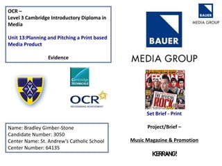
  3. KATZ MASLOW – add these in please