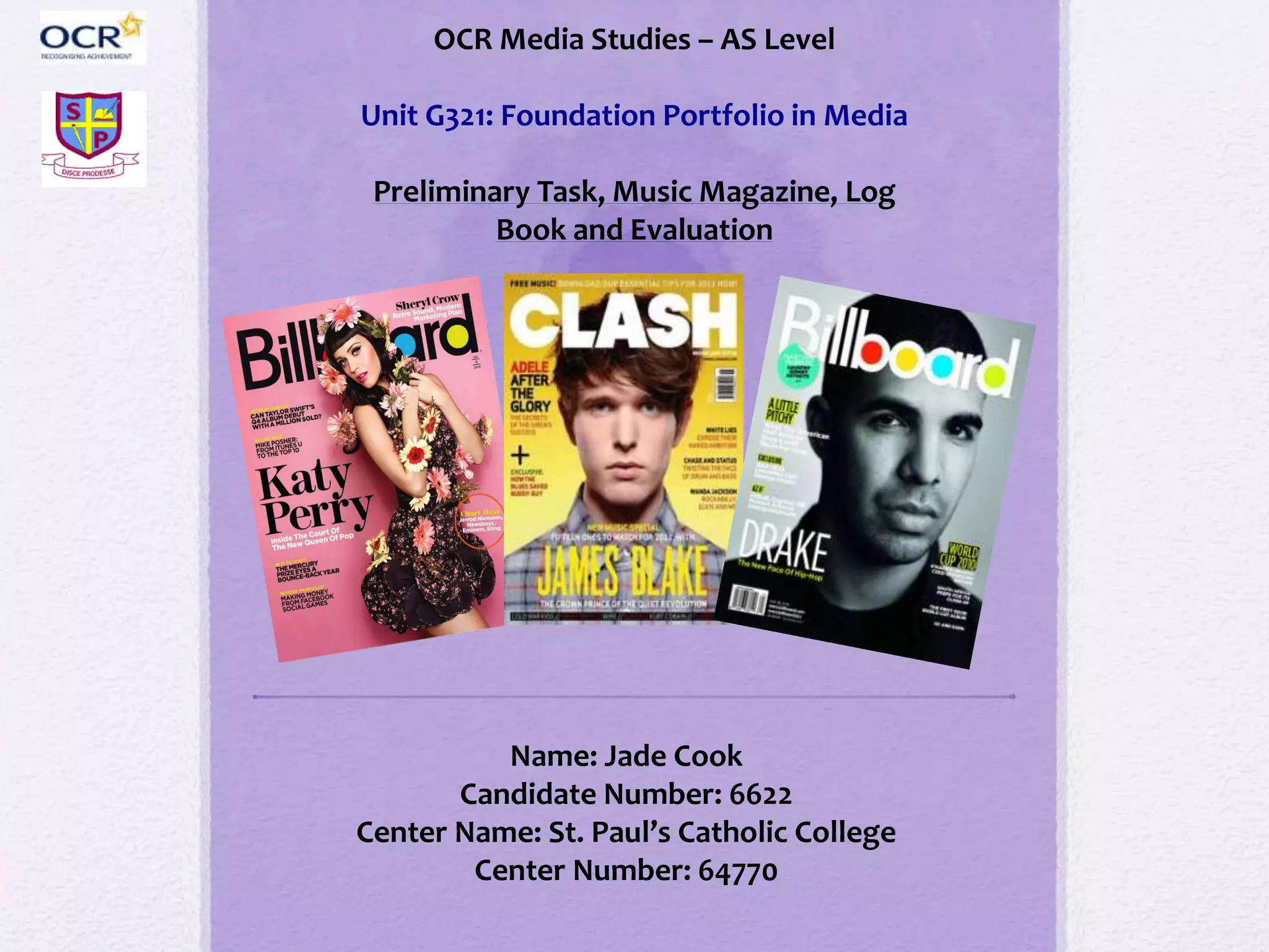
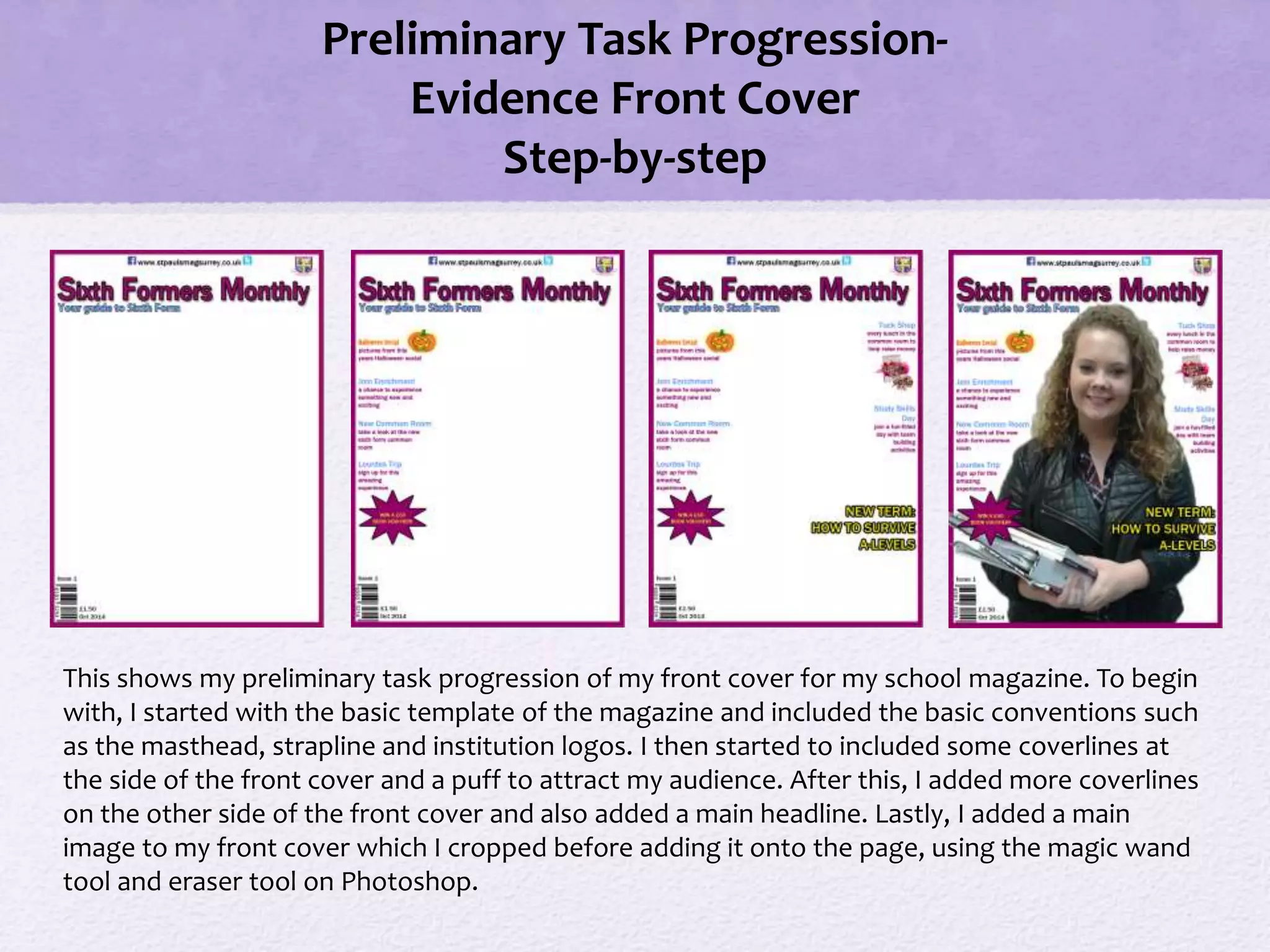
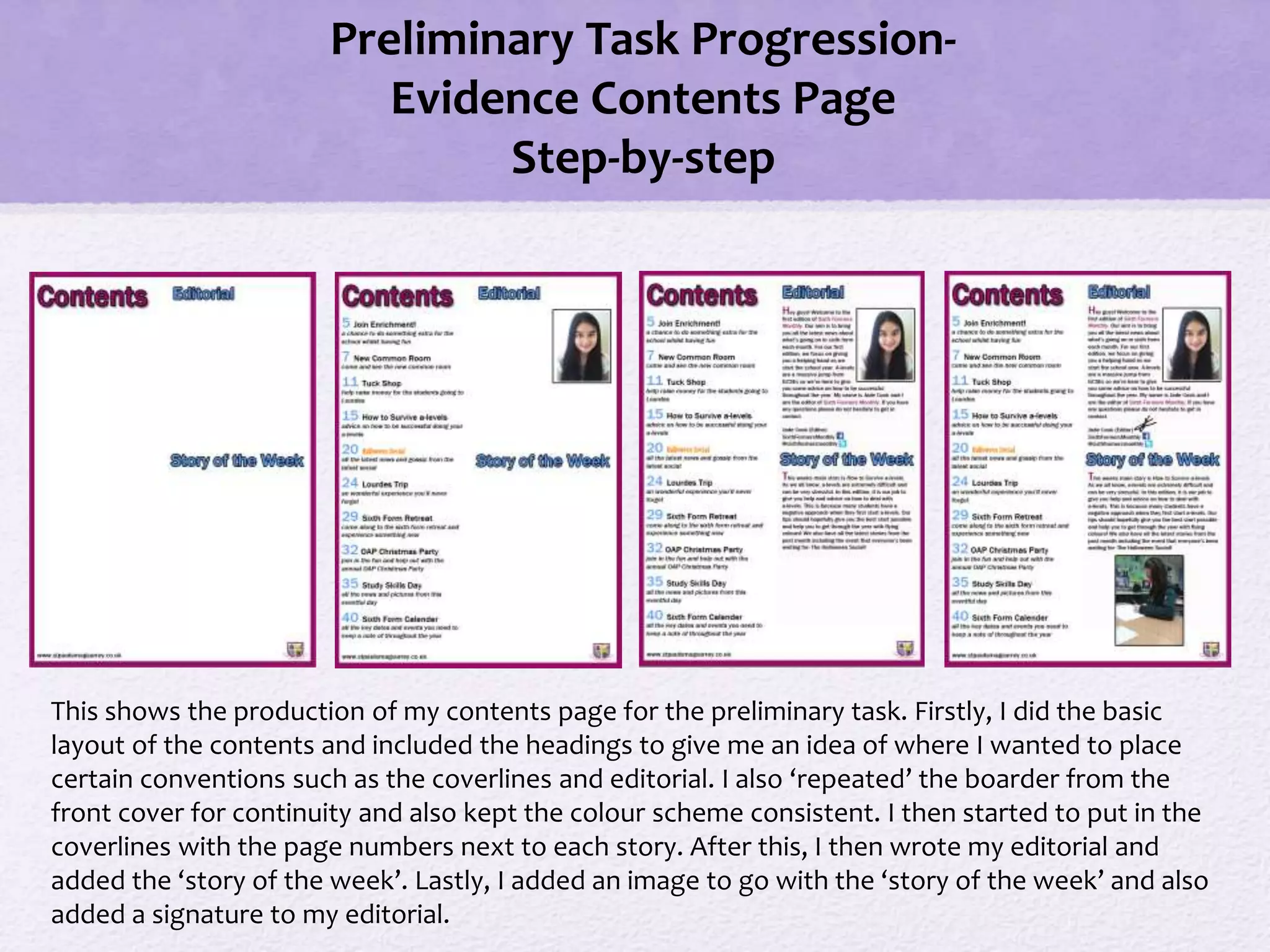
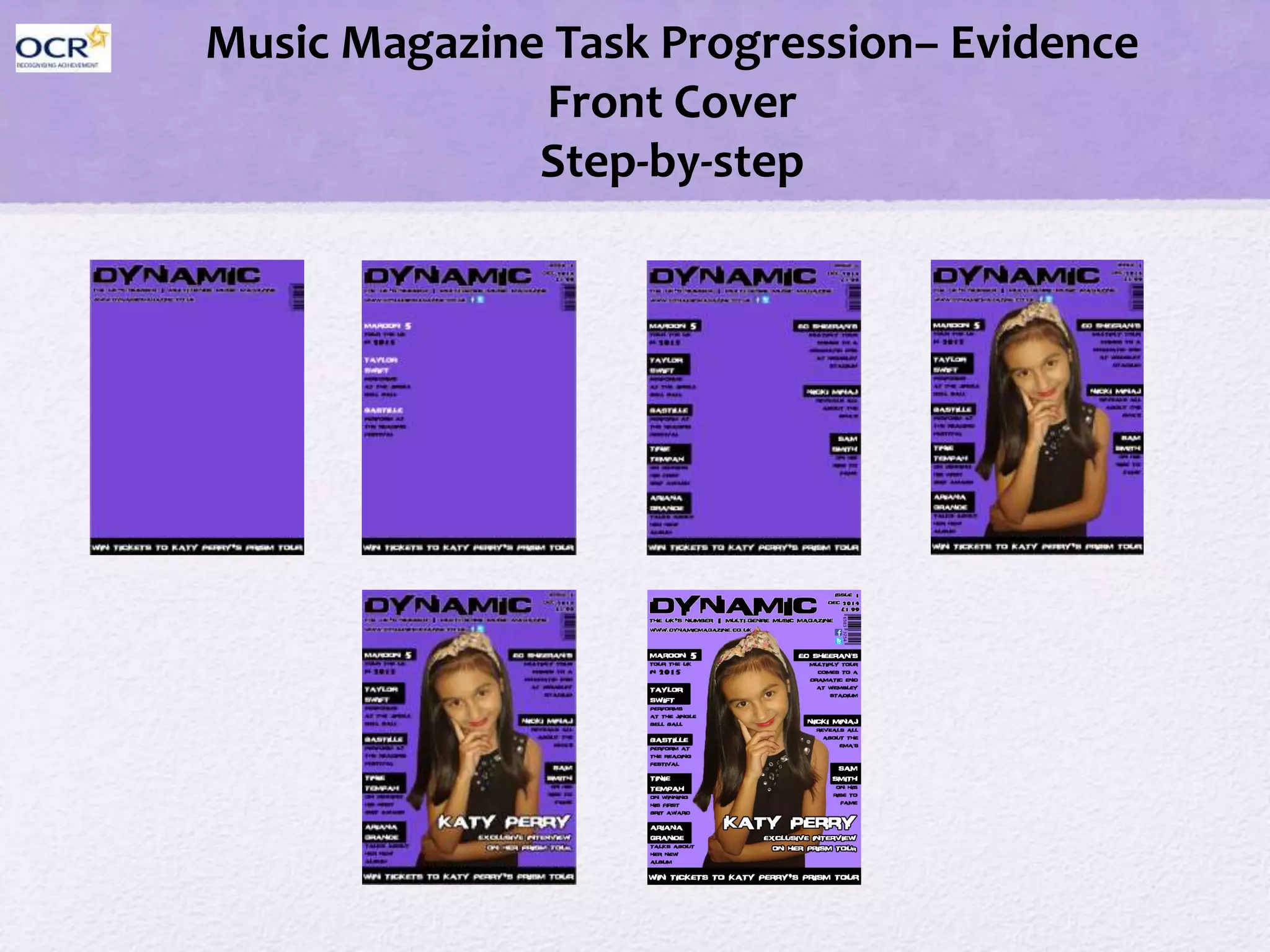
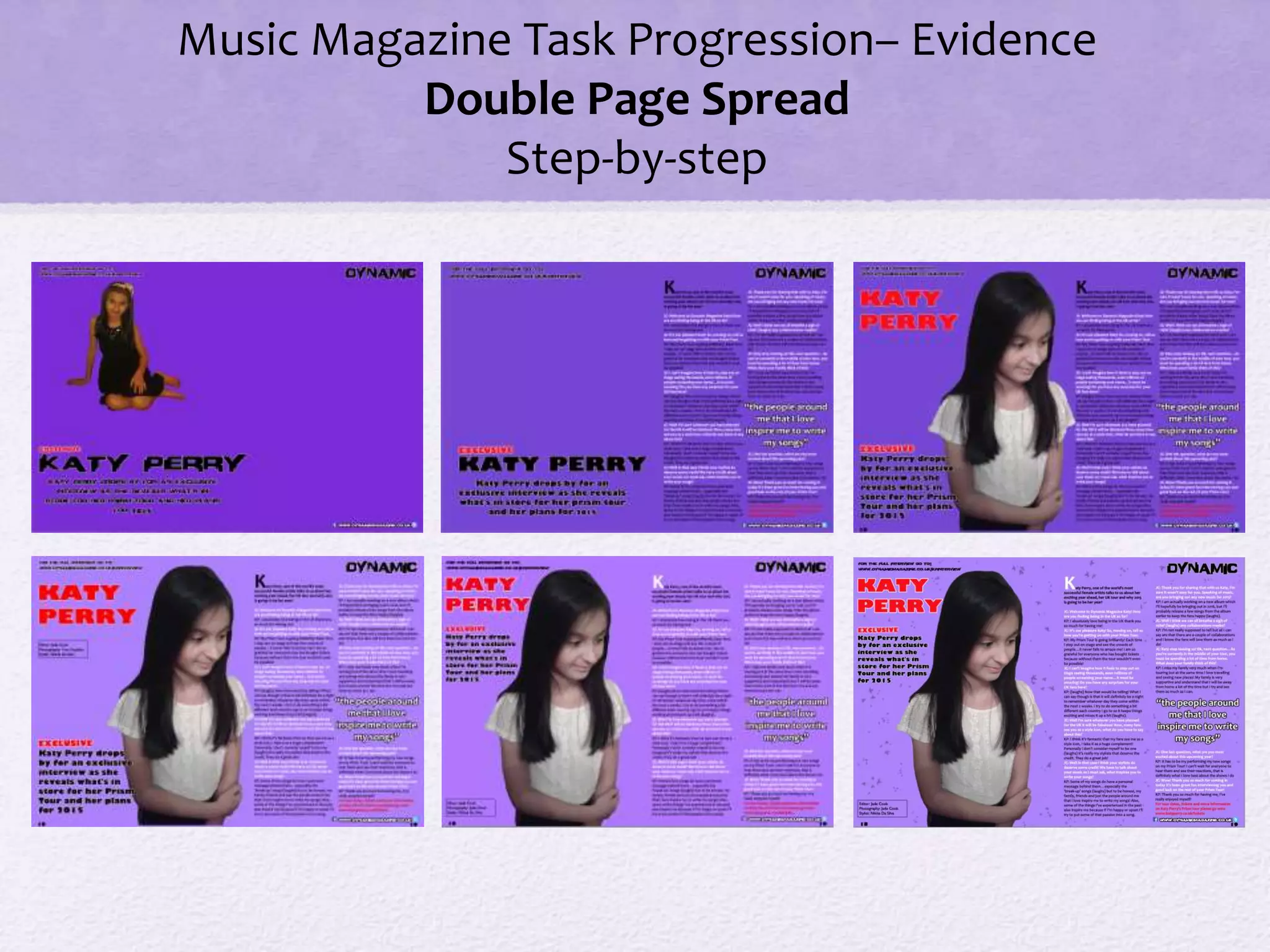
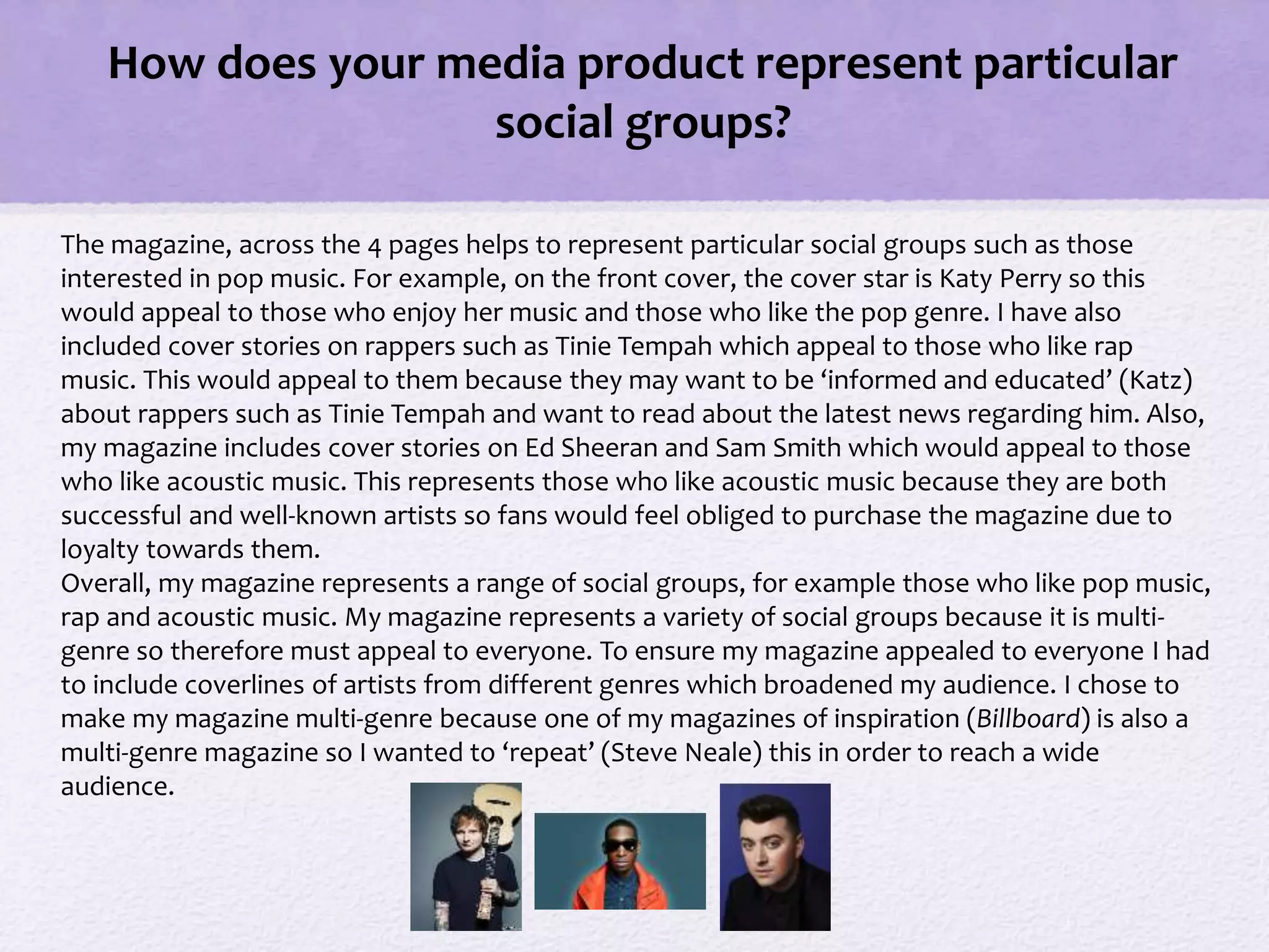
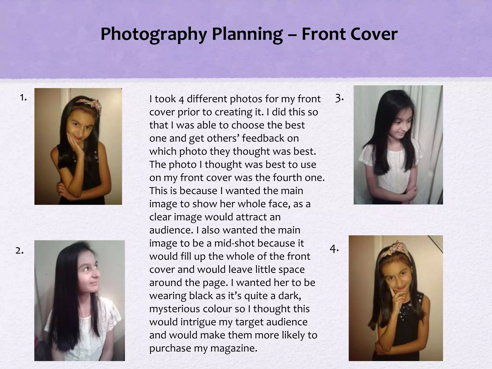
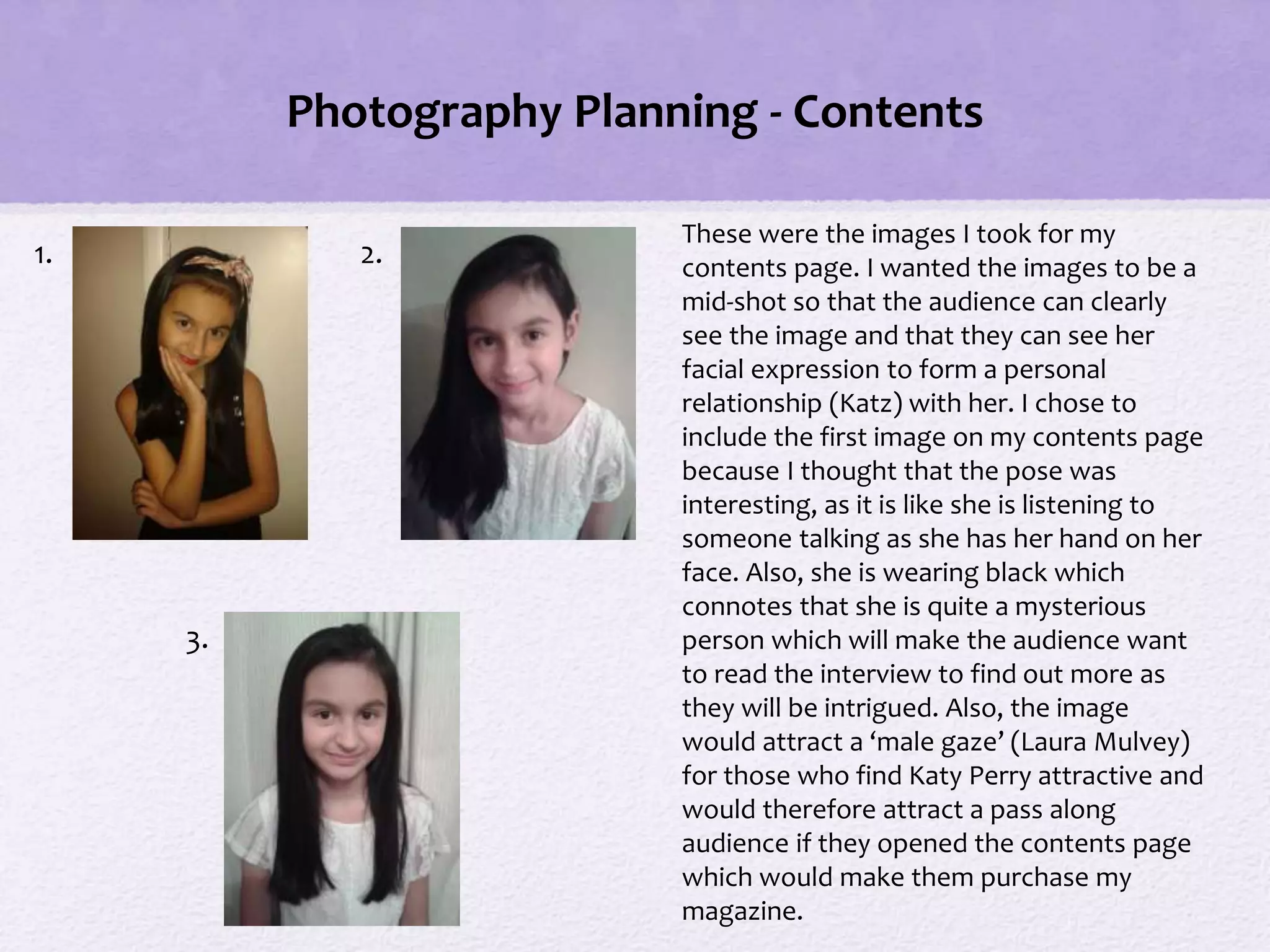
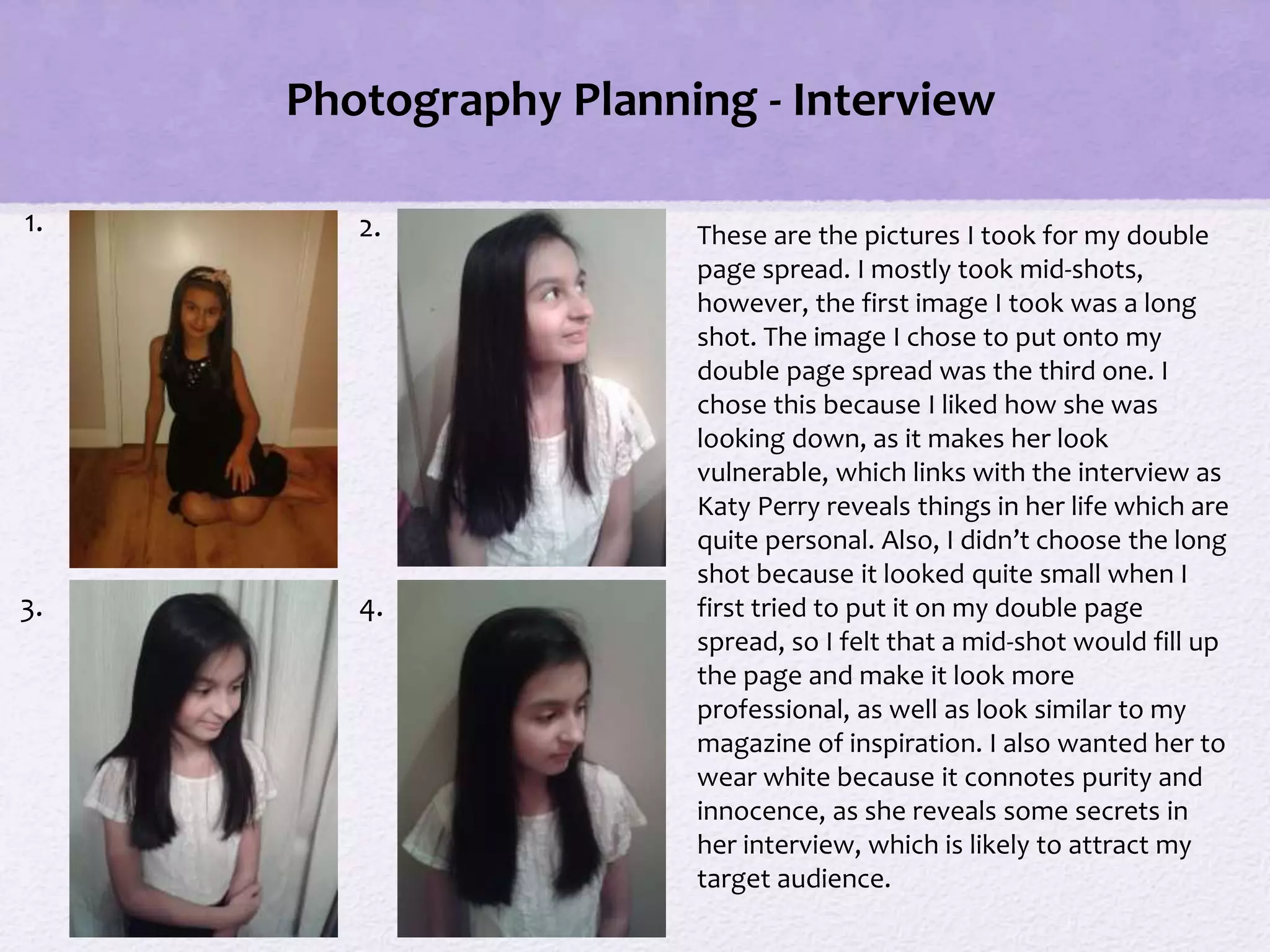
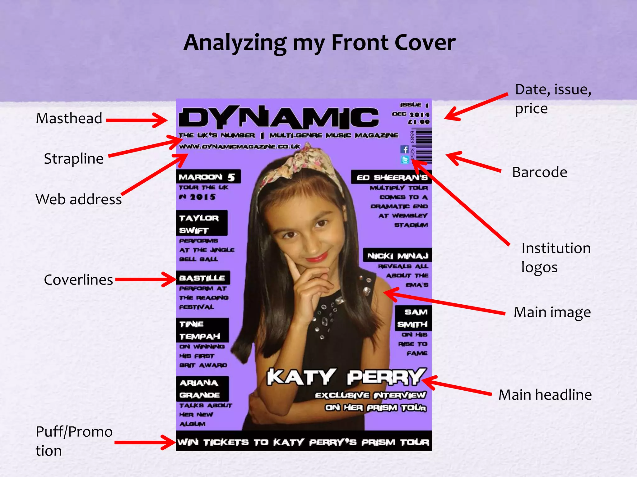
꧁❤ Greater Noida Call Girls Delhi ❤꧂ 9711199012 ☎️ Hard And Sexy Vip Call
New log book & evaluation
1. OCR Media Studies – AS Level
Unit G321: Foundation Portfolio in Media
Preliminary Task, Music Magazine, Log
Book and Evaluation
Name: Jade Cook
Candidate Number: 6622
Center Name: St. Paul’s Catholic College
Center Number: 64770
2. Preliminary Task Progression-
Evidence Front Cover
Step-by-step
This shows my preliminary task progression of my front cover for my school magazine. To begin
with, I started with the basic template of the magazine and included the basic conventions such
as the masthead, strapline and institution logos. I then started to included some coverlines at
the side of the front cover and a puff to attract my audience. After this, I added more coverlines
on the other side of the front cover and also added a main headline. Lastly, I added a main
image to my front cover which I cropped before adding it onto the page, using the magic wand
tool and eraser tool on Photoshop.
3. Preliminary Task Progression-
Evidence Contents Page
Step-by-step
This shows the production of my contents page for the preliminary task. Firstly, I did the basic
layout of the contents and included the headings to give me an idea of where I wanted to place
certain conventions such as the coverlines and editorial. I also ‘repeated’ the boarder from the
front cover for continuity and also kept the colour scheme consistent. I then started to put in the
coverlines with the page numbers next to each story. After this, I then wrote my editorial and
added the ‘story of the week’. Lastly, I added an image to go with the ‘story of the week’ and also
added a signature to my editorial.
8. Music Magazine – Genre Research
Billboard magazine is an American music magazine which is based in New York and
owned by Prometheus Global Media. It was first published on November 1, 1894
and is known as one of the oldest trade magazines in the world. Billboard magazine
publish weekly and their circulation is around 48,000. Their target audience are
mostly teenagers and young adults aged around 16-25 because from the statistics
below, you can see that college graduates are the highest percentage of people
who read Billboard Magazine, however there are older readers as well. It’s USP is
that Billboard contains a number of genres which helps to appeal to a wider
audience.
Statistics from:
http://advertising.billboard
.com/magazine
9. Established Magazine for my Research
Masthead
Main Image
Main Headline
Coverlines
Billboard is one of my magazines of
inspiration because it is a modern music
magazine which appeals to teenagers and
young adults like myself. I chose Billboard
as one of my magazine’s of inspiration
because I like their choice of cover stars,
for example, Katy Perry. By using ‘star
appeal’ they are able to attract a wide
audience as fans of these stars are likely to
purchase this magazine.
One of the conventions which is missing
from this front cover is a strapline. A
strapline is something above or below the
masthead which tells the audience a bit
about the magazine for example, “the
UK’s number 1 music magazine”.
Puff/Promotion is another convention
which is missing from this front cover. This
is used to attract readers to buy the
magazine by including a competition of
some kind that will make people want to
buy the magazine and enter the
competition.
10. Established Magazine for my Research
Masthead
Main
image
Main
headlineBarcode
Strapline
Coverlines
Price
My other magazine of inspiration is
Clash. I chose this as one of my
magazines of inspiration because of
the simple layout as I thought that it
was appealing as they haven’t
overcrowded the page. As well as
this, the main headline stands out as
they have used an effect to make it
look 3D. They have also used ‘star
appeal’ for the main image which will
attract a pass along audience, as fans
of Rita Ora are likely to purchase this
magazine. Clash is a multi-genre
magazine which I will ‘repeat’ when
producing my magazine as it targets a
broader audience.
Conventions not included on this
front cover which I would like to
include on my magazine is institution
logos and a puff. This is because
institution logos give readers an
alternative way to read and interact
with the magazine. Including a puff
would also attract a wider audience as
they are likely to purchase the
magazine if they are interested in the
puff.
11. Music Magazine – Audience
The target audience for Billboard can be denoted as a magazine for teenagers and
young adults aged between 16-25. This connotes that Billboard are trying to attract
a younger audience, which they do by generally putting more modern musicians on
the front cover of each issue. According to Katz, readers will use Billboard magazine
for their own personal gratifications depending on who is on the front cover or
who is being interviewed. For example, Bruno Mars on the front cover of Billboard
will attract mostly young girls because he is seen as an attractive man and
therefore young girls will buy the magazine for the fact that he is on the front
cover.
From the research completed into this media product, I think the USP is that
Billboard include a variety of music genres in their magazine so that they appeal to
a wider audience, however they still aim the magazine at young people. For
example, they use star appeal to attract their target audience-in this case, Taylor
Swift and Eminem. These are two completely different musicians as one of them is
a country singer, and the other a rapper. This is a USP for Billboard because by using
different musicians on the front cover, this broadens the target audience because
they include something which appeals to all young people.
12. Publisher research
The publisher of Billboard magazine is Prometheus Global Media. On December
10, 2009 the Nielsen Company announced that it would sell its Business Media
division, which included brands such as Billboard to a new company called Global
Media – a joint company between Guggenheim Partners and Pluribus Capital
Management led by James Finkelstein, Matthew Doul, and George Green. In
January 2013, Guggenheim took over Pluribus's stake in the company, giving it full
ownership.
Statistics from:
http://www.prometheus
gm.com/billboard
14. The magazine, across the 4-pages, ‘repeats’ (Steve Neale) codes and conventions from Billboard
and Clash. For example, Clash doesn’t use images for each coverline but instead gives a brief
sentence about the story to give readers an enigma clue (Rowland Barthes) of what the story is
about. Also, I have repeated codes and conventions from Billboard, for example, the bold
masthead at the top of the front cover. I chose to repeat this because one of the first things
people notice when buying a magazine is the masthead so I wanted to make it stand out so the
audience know the name of the magazine.
There are examples of some ‘difference’, however, in terms of the codes and conventions in my
own media product for example I have included convergence on my front cover such as a web
address and institution logos. I decided to include convergence because as technology is
progressing, more people are using social media and the internet to connect with one another so
I thought it would be a good idea to use convergence as it gives the audience an alternative way
to explore the magazine and find out more information about the publisher. Another difference
in my magazine is that I have included a strapline whereas Clash and Billboard have not. I have
included a strapline on my magazine because it gives the audience a brief overview of what the
magazine is about and what it represents. For example, my strapline is “The UK’s number one
multi-genre music magazine”. This gives the audience an idea of what genre of music my
magazine is, in this case multi-genre, so therefore my magazine would appeal to the majority of
music lovers as it includes stories on artists of all genres.
In what ways does your Media product use, develop or
challenge forms and conventions of real media
products?
15. The magazine, across the 4 pages helps to represent particular social groups such as those
interested in pop music. For example, on the front cover, the cover star is Katy Perry so this
would appeal to those who enjoy her music and those who like the pop genre. I have also
included cover stories on rappers such as Tinie Tempah which appeal to those who like rap
music. This would appeal to them because they may want to be ‘informed and educated’ (Katz)
about rappers such as Tinie Tempah and want to read about the latest news regarding him. Also,
my magazine includes cover stories on Ed Sheeran and Sam Smith which would appeal to those
who like acoustic music. This represents those who like acoustic music because they are both
successful and well-known artists so fans would feel obliged to purchase the magazine due to
loyalty towards them.
Overall, my magazine represents a range of social groups, for example those who like pop music,
rap and acoustic music. My magazine represents a variety of social groups because it is multi-
genre so therefore must appeal to everyone. To ensure my magazine appealed to everyone I had
to include coverlines of artists from different genres which broadened my audience. I chose to
make my magazine multi-genre because one of my magazines of inspiration (Billboard) is also a
multi-genre magazine so I wanted to ‘repeat’ (Steve Neale) this in order to reach a wide
audience.
How does your media product represent particular
social groups?
16. From the research completed before production, I think that Prometheus Global Media is most
likely to publish ‘Dynamic’ because they are the publishers of Billboard which is the same genre of
magazine. Prometheus have also made Billboard successful through the use of convergence as
Billboard have their own website. I decided to ‘repeat’ (Steve Neale) this by including a web
address as well as institution logos for social media websites such as Facebook so readers can
stay connected to the magazine and interact with the editor to form a ‘personal relationship’
(Katz).
The similarities of my magazine to Billboard also ‘signifies’ (De Saussure) that Prometheus would
be likely to publish my magazine because Billboard “serves diverse constituents-from music’s
most passionate fans to the industry’s most influential people”. I decided to ‘repeat’ this by
including modern artists of a variety of genres, for example Katy Perry on the front cover
because it gives readers a ‘window into the world’ (Wendy Helsby) that celebrities, such as
singers, are becoming more and more influential on the public and that in today’s world, people
aspire to be like them and look up to them.
What kind of media institution (Publisher) might
distribute your media product and why?
17. According to Hartley’s seven subjectivities, the audience for my magazine will be teenagers and
young adults aged between 16 and 25. This is because the artists which I have included in my
magazine are quite young and modern so it would appeal more to a younger audience. As my
magazine is multi-genre it is likely to appeal to both genders. This is because there is a variety of
music genres included so there is something for both males and females to enjoy.
According to Katz’ Uses & Gratifications theory, readers my form a ‘personal relationship’ with
the artists in the magazine, for example the cover star Katy Perry. This is because people may read
her interview and feel closer to her, as if they are actually interviewing her, and form a close
relationship with her as they feel as if they know her. People may also read the magazine to be
‘informed and educated’, for example, they may want to read about the latest news and gossip of
the artists featured in the magazine. This is because when people buy magazines, they are usually
‘informed’ of some news into someone’s life, or ‘educated’ and learn something by reading the
article or interview.
According to Maslow’s Hierarchy of Needs, ‘caregivers’ may sympathize with some of the artists
featured in the magazine, for example, if Katy Perry says something upsetting or personal in her
interview. This may attract ‘caregivers’ as they would want to read the interview to be informed
of the situation. It may also attract ‘survivors’ as they would read the interview and want her
problems and worries to be resolved. Also, according to Maslow, the magazine will also be aimed
at those who want to build their ‘esteem’. This is because people will read the magazine and feel
respect for others, for example, the artists featured in my magazine as they will read about their
achievements and success and will look up to them.
Who would be the audience for your media
product and why?
18. In order to attract the intended target audience of ‘Dynamic’ I decided to include a well-
known artist (Katy Perry) on the front cover. This is because looking at my magazines of
inspiration, Clash and Billboard, they both include many popular as well as modern artists to
attract their audience. I felt that Katy Perry would be a good cover star for ‘Dynamic’
because she is a successful, young artist who my target audience are likely to aspire to be
like. I also decided to make the masthead bold and positioned it at the top of the magazine
so that it stands out and that it would be one of the first things the audience notice when
they look at the magazine. Another convention that I included to attract my target audience
was a strapline. By including this, I was able to attract my audience as the strapline “The
UK’s number 1 multi-genre music magazine” will attract a broad audience because the
magazine is multi-genre so would therefore appeal to many people.
As well as this, I also decided to include an editorial to address my audience. I felt that this
was important because the readers can form a ‘personal relationship’ (Katz) with the editor
as they will know more about them. In the editorial, I also decided to use colloquial
language to address my audience, for example, I started my editorial with “hello” because
it makes them feel as if I am actually having a conversation with them.
How did you attract/address your audience?
19. The software I used to create my music magazine ‘Dynamic’ was Adobe Photoshop CS4. I
chose this because it allowed me to manipulate the images for my magazine, for example,
when cropping my images. It also allowed me to choose from a range of tools which helped
when deciding on the layout of my magazine, for example, the line tool and the pen tool.
When creating my front cover, the shape tool helped me with conventions such as the
coverlines. I used the shape tool because I felt that it was best suited, as I wanted a box
around the names of the artists in the coverlines to make them stand out and to attract my
target audience. When creating my contents page, I used the line tool to help me set the
page out as I had a lot of different sections which needed to be separated. This helped me
because it made my contents page look neat and consistent as all the coverlines were kept
the same. Also, for my double page spread I used the pen tool to help me when typing the
interview. I used this tool because it helped to make my interview neat and I was able to set
it out the way I wanted to, by creating an outline for the text to go in.
In conclusion, I have learnt how to use tools such as the pen tool, which allowed me to
place my text wherever I wanted, such as around images and quotes. This was useful
because it made my magazine look tidier and more professional.
What have you learnt about technologies from the
process of constructing this product?
20. 1.
2.
3.
4.
I took 4 different photos for my front
cover prior to creating it. I did this so
that I was able to choose the best
one and get others’ feedback on
which photo they thought was best.
The photo I thought was best to use
on my front cover was the fourth one.
This is because I wanted the main
image to show her whole face, as a
clear image would attract an
audience. I also wanted the main
image to be a mid-shot because it
would fill up the whole of the front
cover and would leave little space
around the page. I wanted her to be
wearing black as it’s quite a dark,
mysterious colour so I thought this
would intrigue my target audience
and would make them more likely to
purchase my magazine.
Photography Planning – Front Cover
21. Photography Planning - Contents
These were the images I took for my
contents page. I wanted the images to be a
mid-shot so that the audience can clearly
see the image and that they can see her
facial expression to form a personal
relationship (Katz) with her. I chose to
include the first image on my contents page
because I thought that the pose was
interesting, as it is like she is listening to
someone talking as she has her hand on her
face. Also, she is wearing black which
connotes that she is quite a mysterious
person which will make the audience want
to read the interview to find out more as
they will be intrigued. Also, the image
would attract a ‘male gaze’ (Laura Mulvey)
for those who find Katy Perry attractive and
would therefore attract a pass along
audience if they opened the contents page
which would make them purchase my
magazine.
1. 2.
3.
22. Photography Planning - Interview
1. 2.
3. 4.
These are the pictures I took for my double
page spread. I mostly took mid-shots,
however, the first image I took was a long
shot. The image I chose to put onto my
double page spread was the third one. I
chose this because I liked how she was
looking down, as it makes her look
vulnerable, which links with the interview as
Katy Perry reveals things in her life which are
quite personal. Also, I didn’t choose the long
shot because it looked quite small when I
first tried to put it on my double page
spread, so I felt that a mid-shot would fill up
the page and make it look more
professional, as well as look similar to my
magazine of inspiration. I also wanted her to
wear white because it connotes purity and
innocence, as she reveals some secrets in
her interview, which is likely to attract my
target audience.
23. Analyzing my Front Cover
Masthead
Coverlines
Puff/Promo
tion
Strapline
Web address
Date, issue,
price
Barcode
Institution
logos
Main image
Main headline
24. Analyzing my Contents Page
Masthead
Page
number
Cover
stories
Editorial
Editorial
image
Screengrab of
front cover
Institution logos
Web address
Contents image
Signatur
e
25. Analyzing my Double Page spread Interview
Masthead
Pull
quote
Web addressPage number
Main
headline
Main image
Interview
Drop
capital
Magazine
responsibilities
Brief
introduction
to story
Institutio
n logos
26. Audience Feedback
For my audience feedback, I have decided to ask 6 questions on sheets of paper, and ask a
number of people to answer them and ask for their feedback on my magazine. I also
decided to get more feedback by creating a group chat and sending people pictures of my
magazine pages and asking what they thought of them. I chose to get feedback this way
as they are simple methods of getting others to give their opinion on the successes of my
magazine, as well as what could be improved.
30. I feel that, having completed the preliminary task and learning about the demands of this
production process, I have learnt how to effectively use the software Photoshop to make
my magazine look more professional. For example, I learnt how to use the pen tool for my
editorial on my contents page. This was helpful because it made my contents page look
neat and I was able to write around the editorial image next to the editorial which made my
magazine look even more professional.
For my music magazine, I have also learnt how important colours and fonts are and that if
you choose a certain font or colour scheme, it may not always look aesthetically pleasing
and may not always appeal to your target audience. This helped me when progressing with
my music magazine because I had to change the background colour and make it a bit lighter
as looking at my feedback, I could see that people thought the background was a bit dark
and the writing was hard to read. As well as this, I also had to change some of my fonts,
including the font used for the stories on my contents page. I decided to change this
because the font I used first was quite hard to read and as well as this, I had added a stroke
effect on it which made the text look even smaller and even harder to read. It was
important that I changed this feature on my contents page because I wanted to make sure
that people could easily read my magazine, otherwise they may not know what is included
and may not be attracted to it.
Looking back at your Preliminary task, what do you
feel you have learnt in the progression from it to
the full product?
Editor's Notes
Once Complete you MUST:
1) Ensure all slides are neatly and consistently (i.e Same Background/colour scheme) presented
2) You have filled in ALL the details (Name, Candidate number, Center number) on Slide 1
3) Check you have completed EVERYTHING you have been asked to complete
4) Remove this comment