
Recommended
More Related Content
What's hot
What's hot (17)
Viewers also liked
Similar to (Final evalution)
Similar to (Final evalution) (20)
Recently uploaded
Recently uploaded (20)
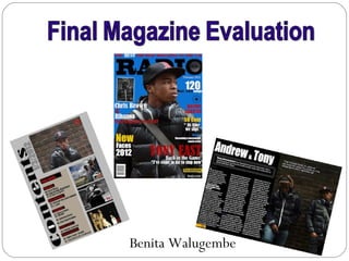
(Final evalution)
- 2. My idea came from the magazine ‘Vibe’. My reason for using this magazine was to help me create my own which was similar to it, as it had the same music genre. The information on the my magazine follows the convention of a real magazine in several ways. Firstly with the information, my text is written in a large bold front in the colour black so that it stands out from the background. Also the layout of my magazine follows the forms of a real magazine. My masthead is positioned behind my model’s head, covering mainly the letters ‘a’ and ‘d’. The magazine vibe is also laid out in this way. This is because the music artist is the selling point and he must be seen on the magazine visibly, as he is our target’s focus to want to buy and read more about a well known music artist. The Vibe magazine uses a settled, composed dark colour for the background which is a mellow red. This is to allow the information that is written in the colours black, white and green stand out. These colours give the magazine a hip hop, cool look so that its appealing to those with an interest of this kind of genre. My magazine does the same. It also follows the typical convention of having cover lines down each side of the page in horizontal lines. I noticed that on the magazine, a well- known music artists name is a large front size to all the other cover lines. I took this and also did the same to my magazine cover lines.
- 3. I chose a ‘Kerrang’ magazine contents page to help me create my own contents page. I looked at the different conventions it had, which I also followed. I noticed that the page had several images and less information on it. The layout of the page is neat and has been categorised. In the middle of the page, one photograph has been enlarged to out stand the other photos. This indicates to the target audience that he is our main focus on the page so we are now drawn into turning to the page to read more about him. My contents page also does the same. I have selected photographs of models that look appealing to its audience. Also I have one photo that is bigger than the others for the same reason as stated above. To improved my contents page I would have included a caption on each photograph to explain what the page is about, as the kerrang magazine has done this. This is to give a slight information on the images before turning to the page. On my page I have also put each topic in a category, reason being is to make it easier for the audience to know what topics that are in the magazine, who may have an interest in a particular topic where they can easily and quickly turn to the page. I used dark colours such as grey, black and red. This was to keep the hip hop style to it, I chose these colours by looking at the vibe contents pages below as it is a hip hop magazine .
- 4. I used a Double page spread to help me follow the codes and conventions of a hip hop magazine. The font of the masthead is written in a large White bold text with a black background to make the information stand out, I also did the same with my double page spread. Whilst observing The double page spread I noticed one side of the page had an image that took up the whole page. The photograph used is of a well- known hip hop artist, along with information written on the other side of the page. The text is written in three neat paragraphs. At the beginning of the text, the first letter “I” is outsized from the rest of the information, reason being is to indicate to the audience that the article was a one to one interview with the artist himself. This attracts the audience to read the magazine as they would want to know what the artist himself maybe putting out there. My magazine also follows this code for the same purpose. In the corner of the page, below the photograph, a quote is taken from the article and placed alone to standout, as this maybe some important information that needs to be seen and make known of. My double page spread also had a quote positioned on the top left of my photo page.
- 5. I used several conventions of a hip hop magazine to represent my social group. Firstly I chose my model to have a specific look, I forced on what prop I was going to use to make my magazine more appealing to its target audience. On my front page I used headphones, as this object is well used by young teens as they have a great interest in music, therefore they tend to listen to music allot ,also in society nowadays headphones are as well used as a fashion trend. My model was told to wear in a way that represented the social group I was aiming for. This was to attract and be more appealing to my audience. He wore a bomber black jacket with a hood and a baseball hat with a side bag. This dress sense is now worn by young teenage boys, this very well represents the teens of London today. My location of my photograph also represents my social group, reason being is that young teens are known as hanging around on streets, sitting on walls in a group of friends, I included this in my photograph to portray this. I also thought about the information to include on my front page. This is important as it will attract your audience into reading an article that is relatable to them or that fascinates them. So I included information on well- known artists such as Rihanna and Chris brown as their story is something that young people will gossip about and have an interest in. also the topic being on their relationship is relatable to young teenagers.