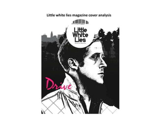
2. Having the little white lies
logo/masthead that is on every
one of their magazine covers in the
middle makes it recognisable to
people. The placement also makes
it more eye catching.
Having the name of the film
featured in the magazine in a
different colour makes it stand
out against the black and
white. The font also makes it
stand out.
3. Image – The mid shot of the
actor in the film means that
people are able to identify
what the magazine is about.
This image is interesting as it
has been drawn and he’s not
looking at the camera. I like
that this differentiates from
other magazines. The style of
the image and that it is in
black and white also makes
this magazine stand out from
the crowd.