
Recommended
More Related Content
What's hot
What's hot (20)
Viewers also liked
Viewers also liked (20)
Similar to Magazine Advert Analysis
Similar to Magazine Advert Analysis (20)
Recently uploaded
Recently uploaded (20)
Magazine Advert Analysis
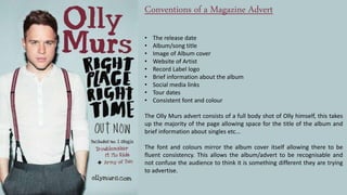
- 1. Conventions of a Magazine Advert • The release date • Album/song title • Image of Album cover • Website of Artist • Record Label logo • Brief information about the album • Social media links • Tour dates • Consistent font and colour The Olly Murs advert consists of a full body shot of Olly himself, this takes up the majority of the page allowing space for the title of the album and brief information about singles etc... The font and colours mirror the album cover itself allowing there to be fluent consistency. This allows the album/advert to be recognisable and not confuse the audience to think it is something different they are trying to advertise.
- 2. The magazine advert consist of a main image which is commonly the image of the artist or the image used on the album cover. This Is used to make sure the advert is recognisable to the target audience, it also establishes the theme of the album making it consistent throughout all advertising products. The image is a medium close up, a front shot of the artist creates direct address with the audience. It is instantly eye catching and draws in the reader. In this example the artist is at the top of the advert while her name and title of the album are underneath. There is a fluent colour code of white and gold writing, this makes it clear for readers to recognise the titles of each song. The font of “Jessie J” is in a bold gold colour, this is the same colour and font as on the album cover making it recognisable. It is in the centre of the advert allowing it to be the 2nd main focus after the image of the artist. Usually the advert will consist of the top songs included in the album, commonly already released singles which draw in the audience to buy the album. Production and recording company information is at the bottom of the advert, this includes company logos. The artists website and social media information may also be present on the advert allowing the audience to know where they are able to purchase the album or find out more information.
- 3. ADELE21magazine advert is a less complex version than the Jessy J advert. The subtleness of the advert reflects the relaxing, slow pace music of the album and artist. The title of the album is replicated onto the advert establishing the theme of the album. On the left side there is a black and white image of Adele looking down similar to the image used on her album cover. The use of a similar image makes the advert very recognisable to the target audience and in the music market. Viewers are able to identify the album by just seeing the image because it is well established. In the lower right hand corner a smaller image of the album is present, this allows the audience to know what the album looks like, it also makes the advert more eye catching and enticing. Record label and social media information is found underneath the image of the album image. Being in a small font reflects its importance, because it is not relevant information it is placed where it cannot take the focus of what is being sold.
- 4. The advert consists of : • The artist name • Album cover • Title of Album • Names of released singles • Record label logo The Rated R magazine advert represents the rock genre through the use of the colours Black and Red. The advert composition is crafted so that the actual album cover is the main image on the advert. Using a teared effect the information of the Artist and Album are revealed underneath at the bottom of the advert. In my own magazine advert I will be establishing the same them throughout all my products. Analysing existing adverts has showed me that the shot type of the artist or album cover varies between a close up, medium close up and full body shot.